
Whistler is the codename of Windows XP.
Wallpapers[]
Build 2416 and eariler[]
Until build 2416, Whistler did not feature many new wallpapers. All of its wallpapers were reused from Windows 2000, due to it being fairly early in development. By build 2210, the branding wallpaper was replaced with the one from Windows Me, but is still file named Windows 2000.jpg. However, build 2264 introduced a new wallpaper titled Watercolor, although it was not set as default until build 2410; every build of Windows in general has a picture as the default wallpaper from this point onwards.
Builds 2419 to 2463[]
While build 2264 introduced the Watercolor wallpaper (default in builds 2410 to 2419), build 2419 introduced a small selection of the wallpapers that would feature in the final release of XP, while removing all of Windows 2000’s wallpapers. Build 2423 changed the default wallpaper to Red moon desert, which would remain as default until build 2465. Testers allegedly compared Red moon desert’s appearance to buttocks,[1] although it was more likely that the wallpaper was set as a decoy and that Bliss was intended as the default wallpaper from the beginning.
The installation of Lab06 build 2415 shown at CES 2001 shows Bliss set as the wallpaper, possibly as the default.
Build 2465 onwards[]
Build 2465 introduced all of the wallpapers that appear in the final release of XP. Bliss became the new default wallpaper. It also introduced a branding wallpaper, featuring a blue-white radial gradient background with the XP logo in the center. Unlike the rest. it’s at 1024×768 as opposed to 800×600. Starting with build 2485, the branding wallpaper was replaced with one featuring a CGI Windows logo. Between this build and 2532, it was set as the default wallpaper; however, builds 2535 onwards revert it back to Bliss. This could imply that Microsoft had second thoughts about using Bliss as the default wallpaper.
A similar wallpaper is featured in a screenshot of build 2446 by Paul Thurrott.[2] This one features a smaller logo with a transparent skewed “xp” in the center behind the logo, while the radial gradient is in the center left and the background is overall darker compared to the wallpaper introduced in build 2465. However, this wallpaper is not known to actually appear in any build, making it most likely that it was a promotional wallpaper Microsoft provided Thurrott themselves, although the file has surfaced, meaning it was either publically available or it leaked.
Sample pictures[]
Five sample pictures at 480×336 were added in build 2474, with Orange canyon (which was at 336×480 instead) being replaced with Sail in build 2481. With the exception of Winter forest (renamed to Winter), none of these were included in builds 2486 onwards, where sample pictures are at 800×600 instead.
All of the sample pictures here (except Sail, which was introduced later) appear on the Plus! My Pictures screensaver graphic shown in Microsoft Plus! for Windows XP’s launcher. Additionally a dog picture is shown, which is currently not known to have appeared in any builds. No information regarding the original image has been found, although it was likely licensed from Corbis like the rest here.
User account pictures[]
Build 2419 introduced a small selection of user account pictures, compared to the final release. At this point, none of them are licensed from PhotoDisc; ones with known origins are licensed from Corbis, making it likely the unknown ones came from there too.
Setup backgrounds[]
The setup background varies depending on edition.
References[]
- ↑ Chen, Raymond (25 August 2003). Windows brings out the Rorschach test in everyone.
- ↑ Thurrott, Paul (24 August 2001). Windows XP: The Road to Gold (Part Three).
This is a theme inspired by the «Windows Whistler» operating system, which I believe was an old code name for Windows XP.
Notes
Tucows, Inc has graciously donated a copy of this software to the Internet Archive’s Tucows Software Archive for long term preservation and access. Please check the Tucows website for all current versions of the software.
- Addeddate
- 2004-11-02 14:39:22
- Identifier
- tucows_176434_Windows_Whistler_True_Color
comment
Reviews
There are no reviews yet. Be the first one to
write a review.
Microsoft изменила мир пользовательских компьютеров навсегда. Именно Windows популяризировала графические интерфейсы, создав привычную и комфортную многим среду для работы и развлечений. Но не только удобством единым — дизайн системы тоже повлиял на успех системы. Сегодня я расскажу, как менялся внешний вид Windows на протяжении всей истории.
Windows 3.0 — маленькая революция
История и успех Windows сложились именно так из-за одного случайного события. В 1987 году дизайнер Вирджиния Хоулетт, специализировавшаяся на печати, осознала пробел в стратегии развития системы, когда к ней начали обращаться за советом о дизайне инженеры компании. Она написала письмо Биллу Гейтсу про важность внешнего вида системы и о том, каким это может быть конкурентным преимуществом.
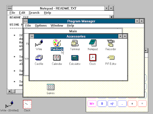
Ответ не заставил себя долго ждать — вскоре Вирджиния присоединилась к первой в Microsoft группе, специализировавшейся на дизайне и архитектуре пользовательских интерфейсов. В команду вошло много талантливых людей. Среди них был Тэнди Троуер, который спроектировал множество встроенных приложений, например: блокнот, Paint, файловый менеджер, календарь, предок Word с названием Windows Write, а также панель управления. Когда состав был сформирован, группа сразу же приступила к работе над Windows 3.0, которая вышла в 1990 году.
Результат был действительно впечатляющим. Кислотные цвета превратились в приятные глазу оттенки белого, а акцентным цветом системы был выбран синий. Иконография была создана в сотрудничестве с бывшим графическим дизайнером Apple — Сьюзан Кэр. Именно она нарисовала значок мусорной корзины в Macintosh, рисунок клавиши Command на устройствах Mac, а также знаменитую карточную колоду для пасьянса «Косынка».
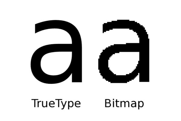
Параллельно с разработкой Windows 3.0, компания также работала над улучшением технологий типографии. Apple в сотрудничестве с Microsoft разработали TrueType — это стандарт контурных шрифтов, который значительно улучшил отображение текста и применяется в операционных системах и по сей день. Появление этой технологии поспособствовало к созданию первой группы шрифтов Windows, сформированной в 1990 году.
Главные дизайнерские нововведения в Windows 3.0:
- обновлённые иконки в едином стиле;
- интерфейс обрёл глубину, а цвета стали более мягкими и приятными глазу;
- появление первых контурных шрифтов.
Windows 95 — плановый апгрейд
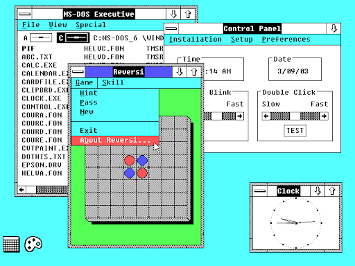
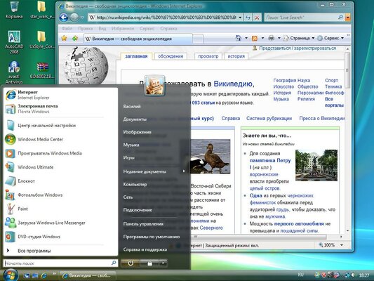
Выпуск Windows 95 стал невероятно успешным. За первый год компания продала аж 40 миллионов копий. Неудивительно, ведь это было действительно крупное обновление — поддержка 32-битных процессоров и шины USB, появление знаменитого Internet Explorer и не только. Но мы сейчас не об этом. Именно эта версия познакомила мир с фирменной кнопкой «Пуск» и панелью задач, которые стали визитными карточками Windows. На рабочем столе теперь можно размещать ярлыки приложений, а также файлы и папки.
Релизы после Windows 98 и вплоть до ME (Millenium) не привносили значительных визуальных изменений. Сильнее всего отличается Windows 2000: интерфейс стал светлее, а также были обновлены иконки. Это первая ОС от Microsoft с поддержкой прозрачности у окон, которой могли пользоваться сторонние разработчики и дизайнеры тем для Windows.
Главные нововведения в Windows 95 — 2000:
- появление меню «Пуск» и панели задач;
- обновлённые иконки;
- поддержка прозрачности у окон;
- кнопки закрытия, сворачивания и разворачивания окон теперь справа.
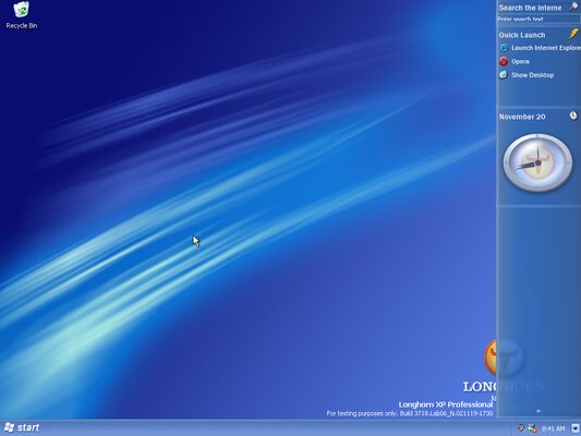
Windows XP — новые краски в знакомый интерфейс
К началу 2000-х операционная система от Microsoft начала устаревать как в функциональном плане, так и в визуальном — пора бы уже что-то изменить. Мало кто знает, но на начальных этапах разработки Windows XP выглядела совсем иначе.
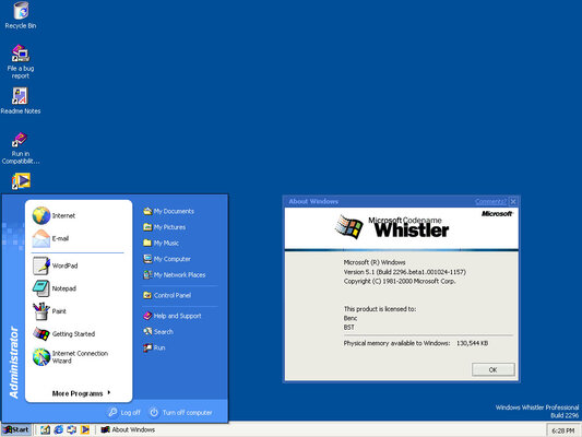
Windows Whistler — таким было кодовое имя будущей ОС от Microsoft. Уже на первых сборках появилось новое меню «Пуск» с двумя столбцами, новый дизайн установщика, а также обои под названием Bliss — знаменитый пейзаж с облаками и зелёным холмом. Компания хотела удивить публику, поэтому бета-версии системы поставлялись без фирменной темы Luna — её приберегли на будущее. Окна стали красочнее и получили закругления. Иконки были значительно переработаны и по максимуму использовали 24-битную глубину цвета.
Главные нововведения в Windows XP:
- красивые окна с закруглёнными краями в теме Luna;
- обновлённое меню «Пуск» с двумя столбцами;
- новые красочные иконки в стиле скевоморфизма.
- знаменитые обои Bliss.
Windows Vista и 7 — появление Aero
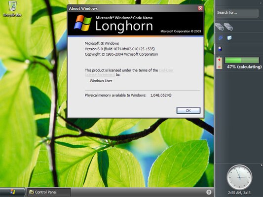
Windows XP принесла много денег компании, но нужно было двигаться дальше. Luna выглядела хорошо, но даже на момент выпуска была менее современной, чем OS X, которая вышла на месяц позже. Компания сразу начала разработку новой версии системы с кодовым названием Longhorn, которую позже назвали Windows Vista.
Из-за внутренних проблем в компании разработку можно было назвать одним словом — ад. Неудивительно, что система провалилась, количество ошибок и «синих экранов смерти» было уж слишком большое. Но одного у неё не отнять — несмотря на все последствия разработки в спешке, внешний вид у неё был хорош. Это первая ОС Microsoft, выполненная в стиле Aero. Эффекты размытия впечатляют, а скевоморфические иконки выглядят хорошо даже сегодня. Однако, это вылилось в другую проблему — ресурсоёмкость. Интерфейс Vista был слишком технологичным для компьютеров той эпохи.
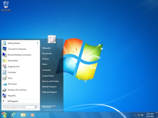
Через три года вышла Windows 7. По сути, это та же Vista, но с урезанными визуальными эффектами и улучшенной панелью задач. Среди других изменений можно отметить изменённые иконки папок, выполненные в более ярком стиле, а также другие обои.
Главные нововведения в Windows Vista:
- первое появление стиля Aero, с размытием и полупрозрачностью;
- виджеты на рабочем столе;
- Aero Flip — 3D-эффект при переключении окон с помощью сочетания клавиш Alt + Tab.
Windows 8 — неудачная попытка привнести что-то новое
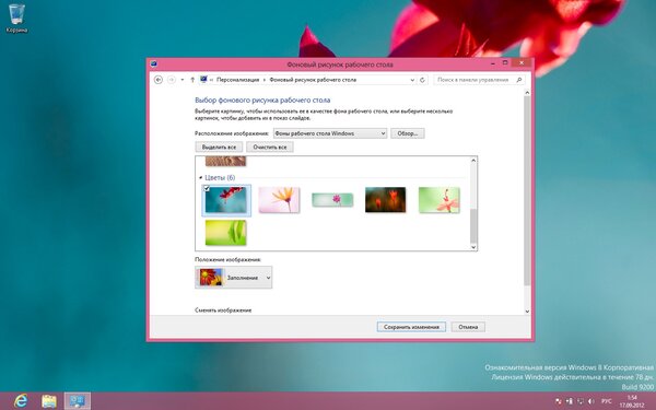
Windows 8 — одно из самых масштабных обновлений дизайна. Кроме более современных иконок, это первая десктопная ОС от Microsoft в стиле Metro. Переработано почти всё — на место «стеклянных» окон и кнопок пришёл Flat, а размытие заменили на прозрачность. Вероятно, компания намеренно упростила внешний вид системы специально для маломощных планшетов и нетбуков.
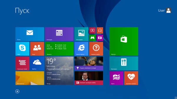
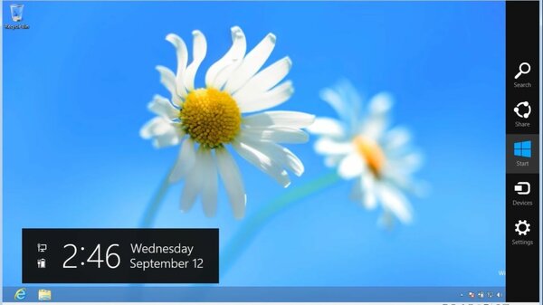
Самым крупным изменением можно назвать новое меню «Пуск» с плитками, которое вызвало у пользователей вопросы. Например, почему оно такое огромное? И где всеми любимая кнопка на панели задач? Очевидно, что компания ориентировалась в первую очередь на переносную технику с небольшими экранами и сенсорным вводом. Ещё одним нововведением стала боковая панель Charms Bar. С её помощью пользователи могут быстро менять яркость, включать режим «Не беспокоить» и не только.
Новый «Пуск» выглядел действительно круто и свежо, чего стоит одна только анимация открытия. Но ухудшенное юзабилити, к сожалению, красота не заменит. Концепция плиток была действительно хороша. Компании стоило просто перенести их на рабочий стол, либо оставить в «Пуске», заметно уменьшив его на компьютерах, но руководство под управлением Стива Балмера решило иначе.
Ещё большее удивление вызывает внешний вид Metro-приложений, как и то, что они могут отображаться лишь в полноэкранном режиме. Все приложения будто взяты напрямую из Windows Phone и растянуты для отображения на больших мониторах. Microsoft попыталась загладить этот недостаток, добавив разделение экрана в Windows 8.1, но этого было недостаточно.
Главные нововведения в Windows 8:
- кардинально новый «Пуск»;
- новые полноэкранные приложения в стиле Metro;
- отказ от размытия окон;
- Charms Bar для более удобного управления компьютером.
Windows 10
После смены руководства, компания провела масштабную работу над ошибками. От многих спорных идей пришлось отказаться. Например, «Пуск» теперь не занимает весь экран, как и UWP и Metro-приложения. Плитки, в свою очередь никуда не делись, но стали одноцветными. Кроме этого, вернулось размытие, хоть и не такое, как в Windows 7. Часть функционала Charm Bar перешла в новую панель уведомлений.
Windows 10 — это первая ОС от Microsoft, выполненная в концепции сервиса. Если раньше компания выпускала уже готовые версии систем и патчи безопасности, то теперь обновления Windows значительно меняют систему. Уже на протяжении пяти лет корпорация доводит операционную систему до совершенства, выпуская новые сборки каждые полгода.
Одним из значительных апдейтов стал Windows April 2018 Update (у нас был его полноценный обзор). Начиная с этой версии, обычное размытие фона было решено заменить на «акрил». Именно так компания называет новый эффект прозрачности. Кроме этого, плитки и другие элементы теперь подсвечиваются при наведении иначе — курсор теперь излучает свет на границы и фон кнопок. Это были первые шаги к внедрению в ОС нового стиля компании — Fluent Design, чем компания занимается уже на протяжении трёх лет.
Главные нововведения в Windows 10:
- использования нового стиля Fluent Design;
- полный редизайн иконок;
- более компактное меню «Пуск»;
- появление панели уведомлений;
From Windows Wallpaper Wiki
Whistler is the codename of Windows XP. This page lists images from both before and after Whistler was renamed, for the sake of convenience, but does not list final image sets. Note that this wiki will refer to Whistler as the codename alone rather than «Windows Whistler», due to that phrasing not being used by Microsoft.
Wallpapers
Build 2416 and earlier
Until build 2416, Whistler did not feature many new wallpapers. All of its wallpapers were reused from Windows 2000, due to it being fairly early in development. By build 2210, the branding wallpaper was replaced with the one from Windows Me, but is still file named Windows 2000.jpg. However, build 2264 introduced a new wallpaper titled Watercolor, although it was not set as default until build 2410; every build of Windows in general has a picture as the default wallpaper from this point onwards.
Builds 2419 to 2463
While build 2264 introduced the Watercolor wallpaper (default in builds 2410 to 2419), build 2419 introduced a small selection of the wallpapers that would feature in the final release of XP, while removing all of Windows 2000’s wallpapers. Build 2423 changed the default wallpaper to Red moon desert, which would remain as default until build 2465. Testers allegedly compared Red moon desert’s appearance to buttocks,[1] although it was more likely that the wallpaper was set as a decoy and that Bliss was intended as the default wallpaper from the beginning.
The installation of Lab06 build 2415 shown at CES 2001 shows Bliss set as the wallpaper, possibly as the default.
| Image | Name | Original filename | Licensed from | Originates from | Photographer/artist | Notes |
|---|---|---|---|---|---|---|
| Azul | 60131 | Corbis | Westlight | Bill Ross | ||
| Bliss | 71810 | Corbis | Westlight | Charles O’Rear |
|
|
| Follow me | 57025 | Corbis | Westlight | Warren Morgan |
|
|
| Moon flower | imagery_1 | Corbis (original image) |
|
|
|
|
| Red moon desert | OR006712 | Corbis | Corbis | Charles O’Rear |
|
|
| Vortec space | 60054 | Corbis | Westlight | Digital Art (Tim Alt) | ||
| Watercolor | unknown | N/A | Microsoft | unknown |
|
|
| Windows 2000 | unknown | N/A | Microsoft | unknown |
|
Build 2465 onwards
Build 2465 introduced all of the wallpapers that appear in the final release of XP. Bliss became the new default wallpaper. It also introduced a branding wallpaper, featuring a blue-white radial gradient background with the XP logo in the center. Unlike the rest. it’s at 1024×768 as opposed to 800×600. Starting with build 2485, the branding wallpaper was replaced with one featuring a CGI Windows logo. Between this build and 2532, it was set as the default wallpaper; however, builds 2535 onwards revert it back to Bliss. This could imply that Microsoft had second thoughts about using Bliss as the default wallpaper.
A similar wallpaper is featured in a screenshot of build 2446 by Paul Thurrott.[2] This one features a smaller logo with a transparent skewed “xp” in the center behind the logo, while the radial gradient is in the center left and the background is overall darker compared to the wallpaper introduced in build 2465. However, this wallpaper is not known to actually appear in any build, making it most likely that it was a promotional wallpaper Microsoft provided Thurrott themselves, although the file has surfaced, meaning it was either publically available or it leaked.
Another version of this wallpaper, with the same gradient as Thurrott’s screenshot but with the logo being a similar size to the wallpaper in builds, is shown in screenshots on Microsoft’s website[3] and showcased at an event on February 28, 2001 at the Westin Seattle hotel (where the 2001 Nisqually earthquake interrupted the event),[4] and the Windows XP Expert Zone event.[5]
-
The branding wallpaper in build 2465 to 2481.
-
An earlier version of the wallpaper.
-
A screenshot from Microsoft’s website showing another version of the wallpaper.
-
The event on February 28, 2001 at the Westin Seattle hotel, showing an earlier version of the wallpaper.
Sample pictures
Five sample pictures at 480×336 were added in build 2474, with Orange canyon (which was at 336×480 instead) being replaced with Sail in build 2481. With the exception of Winter forest (renamed to Winter), none of these were included in builds 2486 onwards, where sample pictures are at 800×600 instead.
All of the sample pictures here (except Sail, which was introduced later) appear on the Plus! My Pictures screensaver graphic shown in Microsoft Plus! for Windows XP’s launcher. Additionally a dog picture is shown, which is currently not known to have appeared in any builds. No information regarding the original image has been found, although it was likely licensed from Corbis like the rest here.
| Image | Name | Original filename | Licensed from | Originates from | Photographer/artist | Notes |
|---|---|---|---|---|---|---|
| Crew | crew | Corbis | Westlight | Warren Morgan | ||
| Mountain vista | mountainvista | Corbis | Corbis | unknown | ||
| Orange canyon | orangecanyon | Corbis | Corbis | Danny Lehman |
|
|
| Sail | sail | Corbis | Corbis | unknown |
|
|
| Surfer | unknown | Corbis | Westlight | Craig Aurness | ||
| Winter forest | winterforest | Corbis | Digital Stock | Mark Karrass |
|
User account pictures
Build 2419 introduced a small selection of user account pictures, compared to the final release. At this point, none of them are licensed from PhotoDisc; ones with known origins are licensed from Corbis, making it likely the unknown ones came from there too.
| Image | Name | Licensed from | Originates from | Photographer/artist | Notes |
|---|---|---|---|---|---|
| airplane | Corbis | Corbis | Clark Dunbar | ||
| astronaut | unknown | NASA | Robert L. Gibson | ||
| ball | Corbis | Westlight | Michael Neveux | ||
| butterfly | Corbis | Westlight | Kurt Stier | ||
| cat | Corbis | Corbis | Aaron Horowitz | ||
| chess (builds 2475 and 2486 only) | N/A | Microsoft | unknown |
|
|
| fish | Corbis | Westlight | Warren Morgan |
|
|
| flower | unknown | unknown | unknown |
|
|
| guitar | Corbis | Corbis | Bob Jacobson |
|
|
| snowflake | Corbis | Westlight | Jim Zuckerman |
Setup backgrounds
The setup background varies depending on edition.
-
The version used in build 2250
-
The version used in builds 2257-2481
References
- ↑ Chen, Raymond (25 August 2003). «Windows brings out the Rorschach test in everyone». The Old New Thing.
- ↑ Thurrott, Paul (24 August 2001). «Windows XP: The Road to Gold (Part Three)». Paul Thurrott’s SuperSite for Windows. Archived from the original on 7 June 2002.
- ↑ http://web.archive.org/web/20010413170943/http://microsoft.com/windowsxp/pro/guide/productive.asp
- ↑ https://historylink.org/File/3039
- ↑ https://youtu.be/-R6-1BIXokg?t=327