
Сегодня корпорация Microsoft представила очередную версию Windows. Среди изменений — обновленное меню “Пуск”. Я решил поностальгировать и вольно перевел статью Ars Techinca о том, как изменялось от версии к версии самое популярное меню в пользовательских компьютерах.
Chicago Project
Windows 95
Windows NT 4.0
Windows 98
Windows 98 SE
Windows ME/2000
Windows XP
Windows Vista
Windows 7
Windows 8
Windows 8.1
Windows 10
Windows 11
Бонус
Впервые что-то похожее на “Пуск” появляется в бета-версии Windows под кодовым названием Шикака. Тут целых три кнопки: первая управляет окнами, вторая запускает приложения, а третья – это поиск и помощь.
К оглавлению ↑
Дебют бессмертного меню. Три кнопки соединили в одну, добавили иконки и надпись “Start”. Просто и гениально.
Русская версия называется “Пуск”, в принципе нормально, но почему было не перевести буквально “Старт”?
К оглавлению ↑
Меню такое же как в Windows 95, только “Программы” разделены на те, что установлены для данного пользователя и на общие для всех пользователей. В дальнейшем от такого разделения отказались.
К оглавлению ↑
Добавили папку “Избранное” с закладками из браузера, добавили пункт “Выйти из системы”, чтобы сменить пользователя. На самый верх добавили “Windows Update”. Интересно, каково это – качать обновы для Win в 98-ом?
Появилась возможность кликнуть правой кнопкой мыши и перетаскивать элементы меню.
К оглавлению ↑
Появилась возможность упорядочить по имени элементы меню.
К оглавлению ↑
Убрали пункт “Выйти из системы…”.
К оглавлению ↑
Новый пластилиновый стиль, “Пуск” теперь состоит из двух колонок: в левой недавно использованные приложения, в правой – папки и настройки. Новые приложения подсвечиваются.
К оглавлению ↑
В “Пуске” появился поиск по файлам и программам с индексированием. С кнопки исчезла надпись. В правой колонке больше нет иконок.
К оглавлению ↑
Кнопка выключения стала текстовой.
К оглавлению ↑
Вот это было мощно. Кнопку с панели задач убрали. Представляю себе ужас тех, кто после обновления просто не обнаружил ее на привычном месте. Меню сделали полноэкранным, с живыми плитками, в плоском стиле, убрали кнопку выключения, все программы вызывались теперь правой кнопкой мыши. Поставили пользователей перед фактом. Все офигели. Уж слишком это было непохоже на предыдущий интерфейс.
Эталонный пример того как не надо менять UX.
К оглавлению ↑
Вернули кнопку на панель задач.
К оглавлению ↑
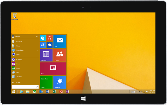
Попытка взять лучшее из двух парадигм. Меню вернулось к своему классическому варианту, но с плитками. Добавили голосового ассистента.
К оглавлению ↑
Убрали плитки, убрали голосового ассистента. Поместили меню в центр. По сути “Пуск” образца 2021 года – тот же, что и в 1995 с поправкой на визуальные тренды и технические возможности компьютеров.
К оглавлению ↑
К оглавлению ↑
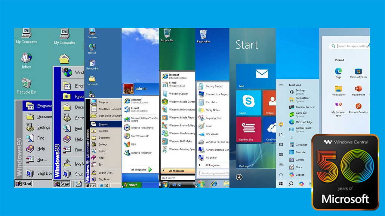
(Image credit: Windows Central)
In celebration of Microsoft’s 50th anniversary in 2025, it’s an appropriate moment to look at the evolution of one of its most iconic features.
Of course, I’m referring to the Start menu for Windows. The menu was originally introduced in 1995, and it has undergone significant transformations, adapting to user needs and advances in technology.
The company has worked on many different menus over the decades. However, the Start menu available on Windows 10 is arguably (by far) the best approach as it combines modern ideas with a hint of classic elements and the best selection of customization options.
Thirty years is a long time for any feature to be around, so let’s look at how the Start menu has evolved over the years.
Windows 95: The birth of the Start menu
On August 24, 1995, Microsoft introduced the Start menu as a central hub for accessing programs, documents, and system settings with the launch of Windows 95.
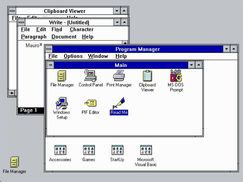
This innovation replaced the «Program Manager,» offering a more intuitive and organized user experience.
In contrast, the «Program Manager» was technically something we can refer to today as a folder containing a list of items with sub-containers to access the different programs with no real organization.
All the latest news, reviews, and guides for Windows and Xbox diehards.
An interesting fact is that the Taskbar (and Start button) also arrived alongside the Start menu with the release of Windows 95.
The menu was simple, with a pop-up in a cascading format, providing access to programs, documents, and system settings. Also, it had a left-hand sidebar that contained the «Windows 95» text.
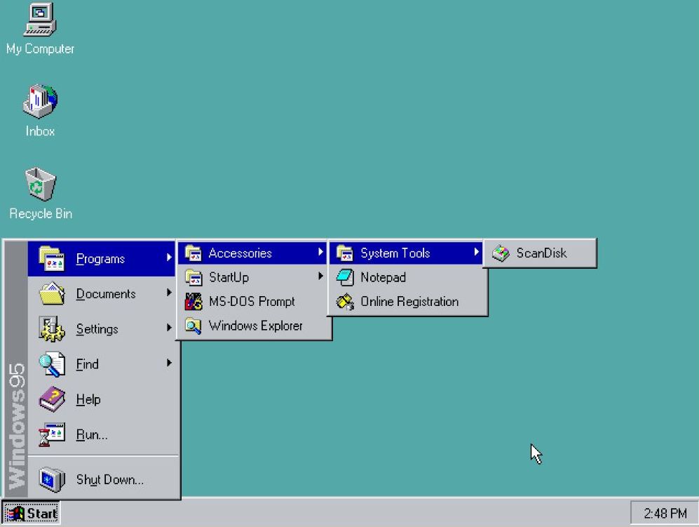
The «Programs» folder provided a hierarchical list of installed applications, making it easy to launch programs.
The «Documents» folder displayed a list of recently opened files, allowing for quick access to frequently used documents.
The «Settings» folder provided access to the Control Panel, which allows users to configure their system. This menu also provided quick access to the Printers and Taskbar settings.
The Taskbar settings also included a few customization options for the Start menu, but the settings were limited.
The «Find» option enabled users to search for files and folders on their computer. However, the search didn’t occur in the Start menu. Instead, the option would open the «Find» app on Windows 95.
The «Run» command allowed users to directly execute programs or open files by typing their names (just like we do today).
The «Shutdown» option provided a convenient way to turn off the computer.
Windows 98: Refinement and expansion
Although the Start menu for Windows 98 didn’t look significantly different from the original design, the menu incorporated a new «Log off» option for the new multi-user functionality.
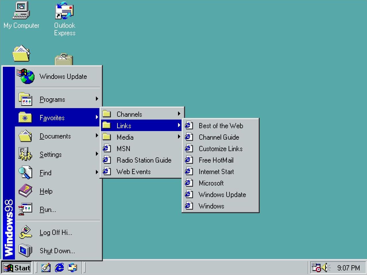
In addition, Microsoft added an option to access the «Windows Update» service through Internet Explorer to scan and download the available system updates.
Furthermore, the Start menu added a «Favorites» submenu to complement Internet Explorer’s presence in the operating system.
Windows Me: Minor adjustments
Microsoft launched the Windows Millennium Edition (ME) in 2000, but the design of the Start menu didn’t receive any significant changes.
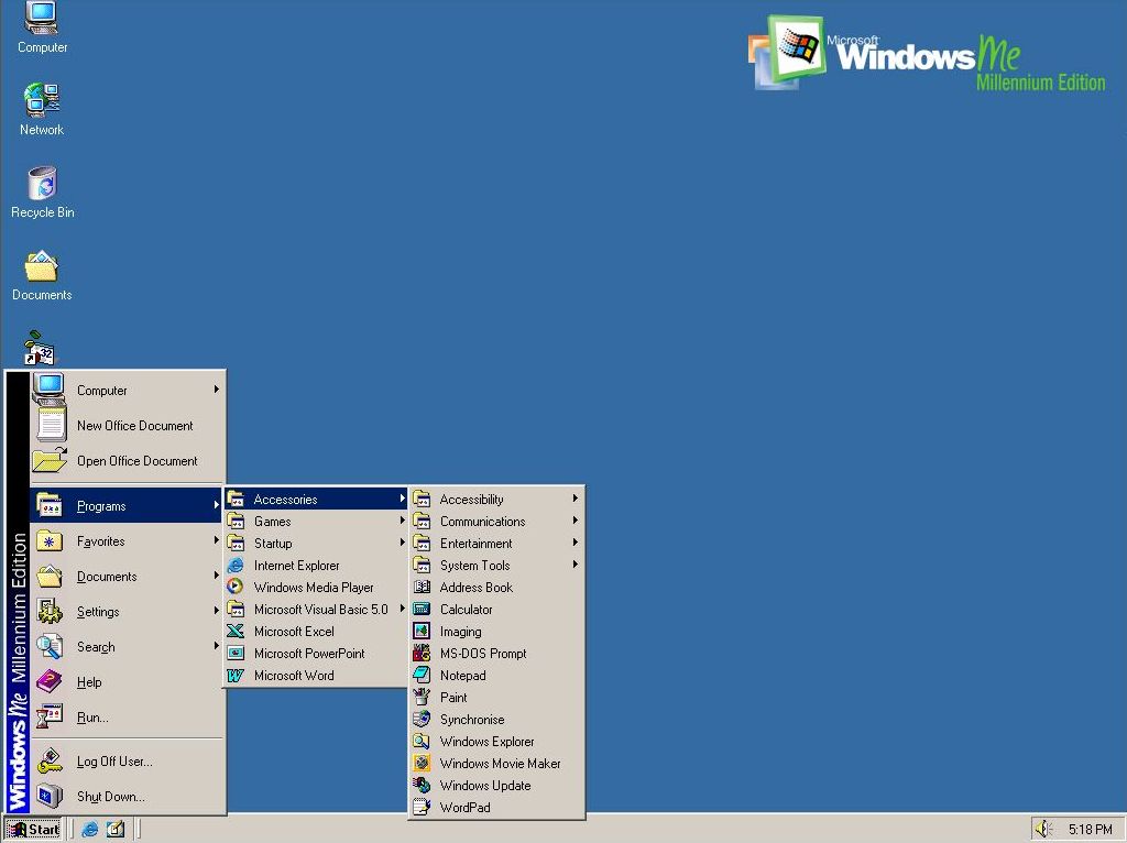
The menu was identical to the version in Windows 98; the only difference was the branding on the side that indicated the name of the operating system.
This was the last time we had seen this version of this menu.
It’s important to note that the classic version of the menu was an option until Windows Vista.
Windows XP: A new era
Windows XP was launched in 2001, and it unveiled a redesigned Start menu with a two-column layout. The left column featured pinned and recently used apps, while the right provided access to user-specific folders («My Documents,» «My Pictures,» «My Computer,» and «Control Panel») and system functionalities.
This design aimed to streamline navigation and enhance productivity.
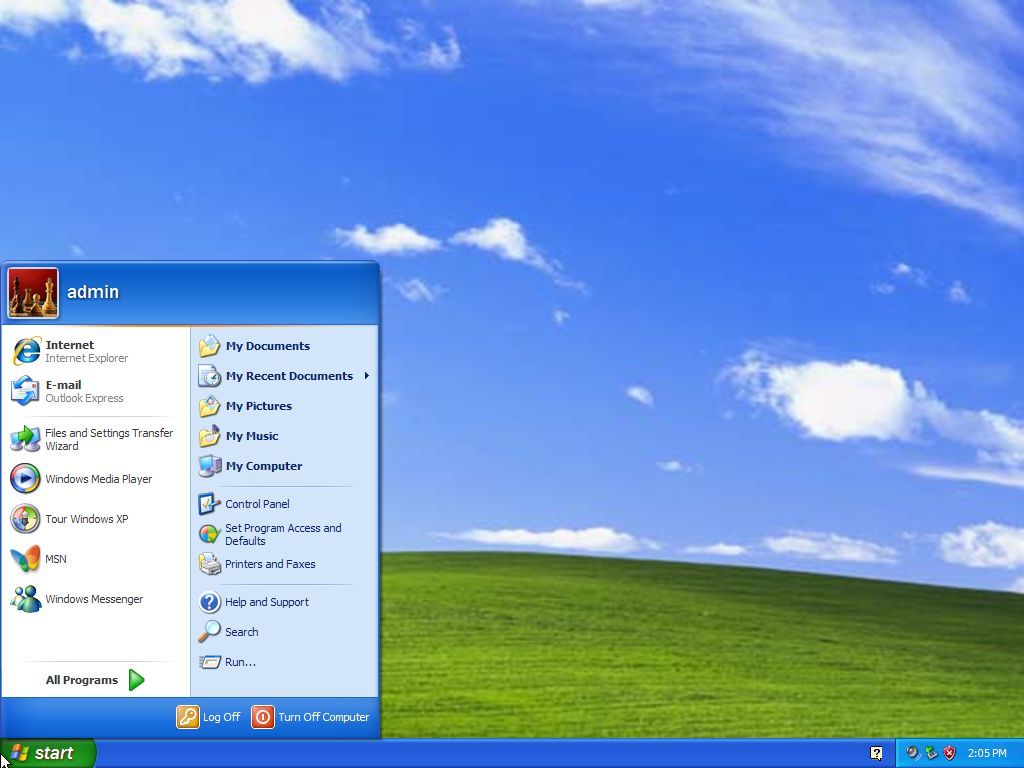
A prominent user account picture was displayed at the top of the left column, adding a touch of personalization.
The left column dynamically displayed frequently used programs, making it easier to access commonly used apps. However, users could also pin apps to this section for quick access.
The «All Programs» menu, accessible from the left column, provided a hierarchical list of all installed apps.
The shutdown option was conveniently located at the bottom of the right column, making it easy to turn off or restart the computer.
On Windows XP, Microsoft introduced the «Luna» visual style, which gave the Start menu a more modern and polished look with rounded corners and vibrant colors.
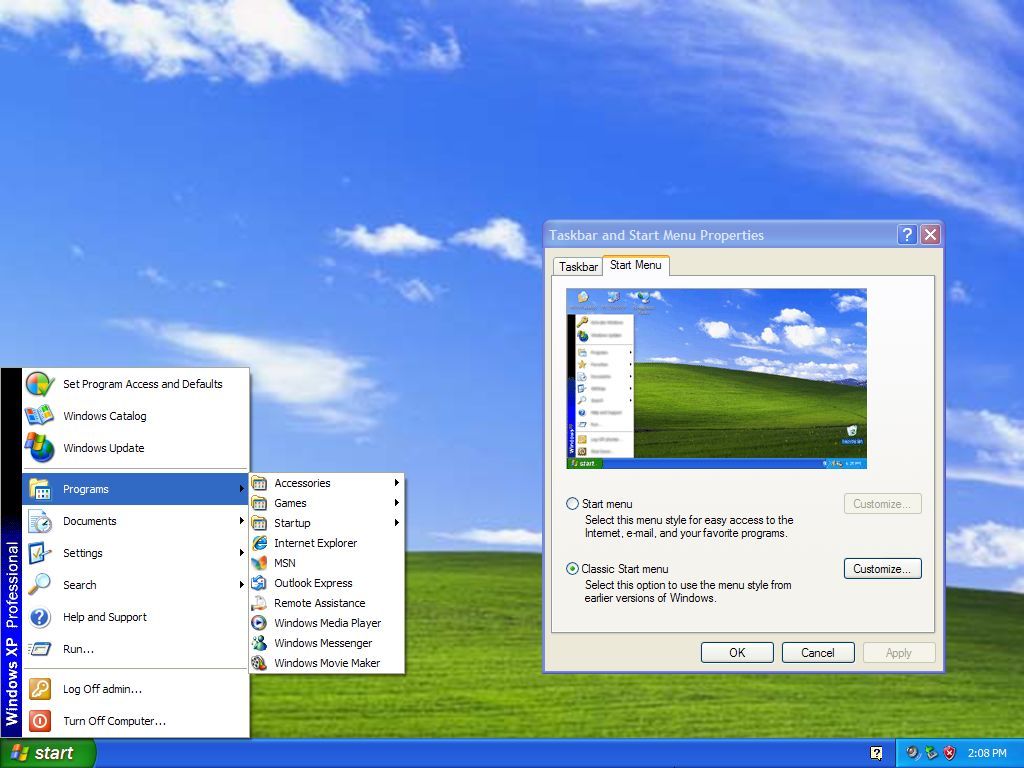
However, the operating system also allowed users to revert to the «classic» Start menu style for those who wanted a more traditional experience.
Windows Vista: Enhanced search and organization
In 2007, Microsoft launched Windows Vista, a version of the operating system that also included a new Start menu version with search integration, allowing users to locate files and programs quickly without having to jump to another experience.
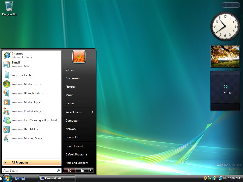
However, the interface and elements of the new menu were pretty much identical to the design of Windows XP.
The menu featured a two-column layout. The left column featured pinned and recently used apps, while the right provided access to user-specific folders and system settings.
In this release, the user account menu was located at the top-right corner, and elements like «My Documents» and «My Computer» dropped the «My» suffixed. So, the items became «Documents,» «Computer,» etc.
Windows 7: Just tweaks
In 2009, Windows 7 was released with an updated version of the Start menu that was identical to the one available in Vista. However, it added «Jump Lists,» offering quick access to recent documents and tasks directly from the Start menu.
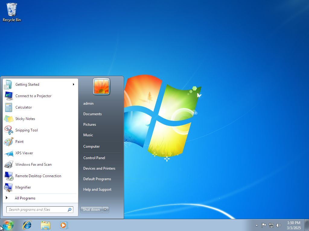
Also, the power options removed the «Lock» item and added it to the «Shut down» menu. Furthermore, on Windows 7, you were able to change the power button action, something that wasn’t available on Vista.
Finally, in this version of the operating system, Microsoft also removed the ability to switch to the classic Start menu.
Windows 8 and 8.1: A bold departure
Things changed drastically in 2012 when the company released Windows 8. This version ditched the Start menu for a Start screen that covered the entire desktop and removed the Start button.
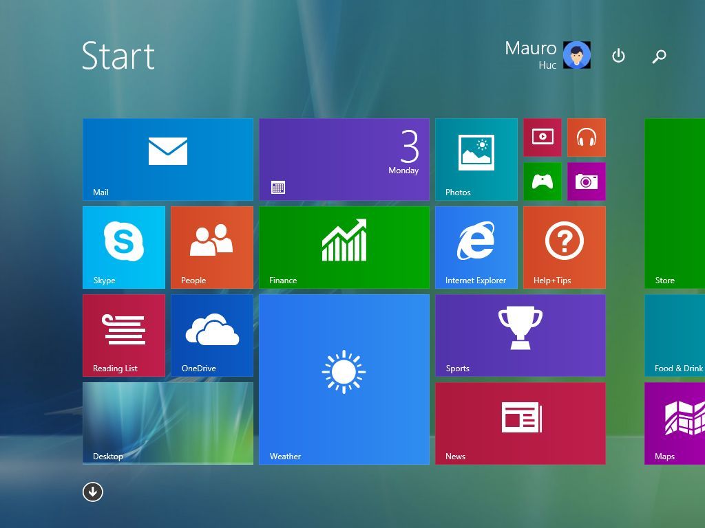
This shift aimed to create a unified experience across touch and mouse-keyboard devices but received mixed feedback.
This is one of the biggest mistakes Microsoft made for the operating system.
This full-screen approach was a core element of Microsoft’s vision for a touch-centric operating system.
The Start screen was dominated by «Live Tiles,» which represented applications and websites. These tiles could display dynamic, real-time information like weather updates, news headlines, and social media feeds.
Also, tiles came in various sizes, allowing users to customize the layout and prioritize information.
In addition, the Start screen introduced the «Metro» (later «Modern») design language, which is characterized by clean (flat interfaces), bold typography, and a focus on content rather than visual chrome.
One of the many problems was that the Start screen was heavily optimized for touch input, with large, easily tappable tiles. This design philosophy aimed to provide a consistent and intuitive experience across touch-enabled devices.
However, this change was a significant source of user frustration, particularly for those using desktop computers with a mouse and keyboard.
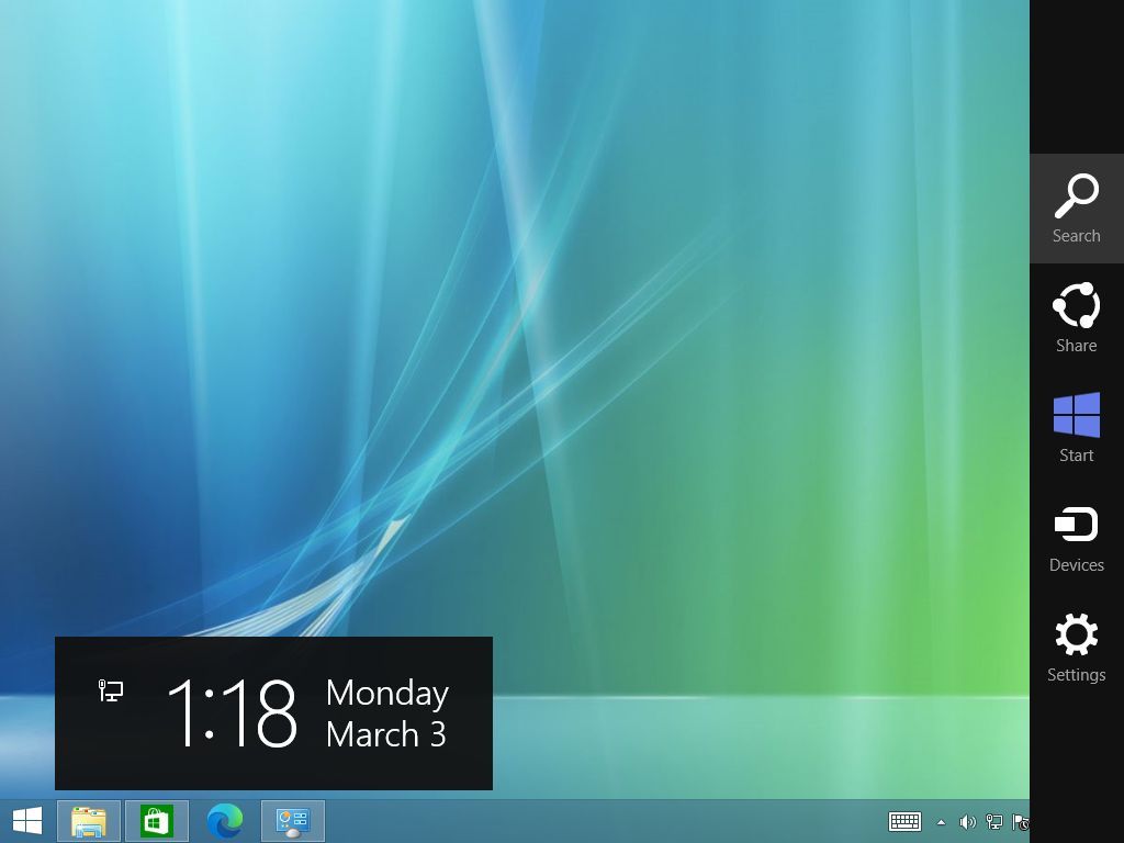
Since this version of the operating system didn’t include a Start button either, Microsoft added the Charms bar, a sidebar that appeared with a swipe from the right side of the screen or by moving the mouse to the upper or lower right-hand corners of the screen. This bar contained common functions like search, settings, and share.
In a way, the Windows 8 Start screen represented a radical shift in the user interface, prioritizing touch interaction and live information. While it aimed to modernize the experience, it faced significant criticism for its departure from familiar desktop elements.
Then, in 2013, Windows 8.1 was launched; this time around, the company didn’t bring back the Start menu. However, the Start button was reintroduced, linking users back to the Start Screen.
Windows 10: Merging legacy and modern design
Windows 10, launched in 2015, brought back the Start menu, combining the classic menu with modern Live Tiles in a customizable two-pane design, similar to the menus for Windows 7 and Vista.
This hybrid approach was aimed at desktop and touch users, balancing familiarity with innovation with a traditional left-hand column and a tile-based right-hand section.
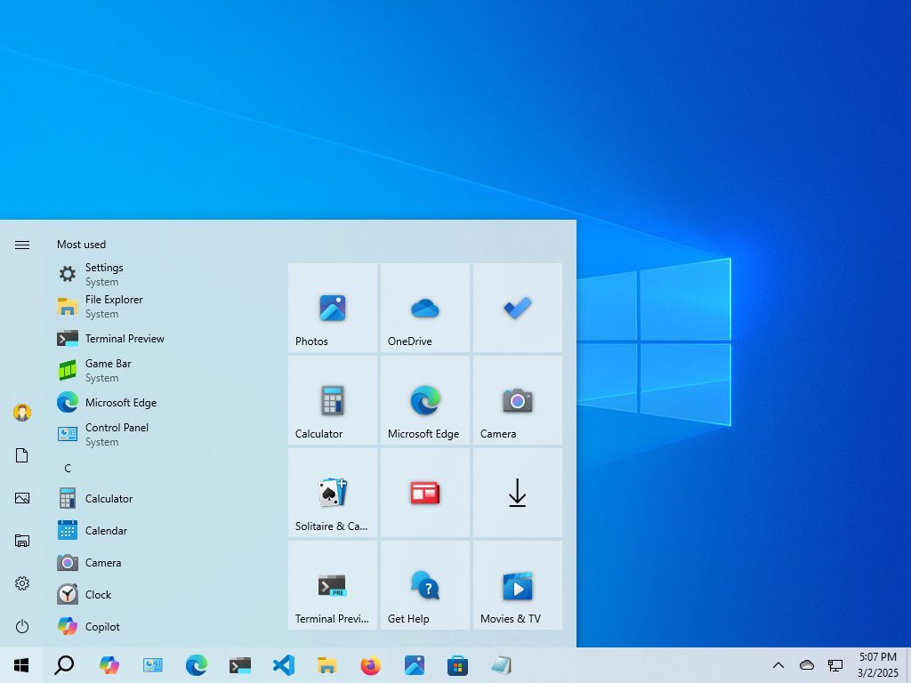
The left column featured an alphabetical list of all installed apps, making it easy to find programs.
The left rail included access to the profile settings and quick access to folders (such as Documents, Pictures, File Explorer, and Settings). In this section, you can also find the power options (Shutdown, Restart, Sleep).
The right column displayed Live Tiles, allowing users to pin frequently used apps and receive dynamic updates.
Using the context menu in the Start menu, it was possible to resize, rearrange, and group Live Tiles. You were also able to turn tiles on or off, giving you control over the information displayed.
Windows 10 addressed the widespread criticism of Windows 8 by bringing back the familiar Start menu, and the hybrid design provided a balance between traditional navigation and modern tile-based access.
Furthermore, this version offered (perhaps) the most control over the appearance and functionality of the Start menu I’ve ever seen on Windows. You even had an option to show a full-screen version of the Start menu.
It’s important to note that on Windows 10, Microsoft began to decouple search from the Start menu. Although you can start a search from the menu, in this version of the operating system, Windows Search has its own entry in the Taskbar and home interface. This also continues to be true on Windows 11.
On Windows 7 and Vista, the search occurred within the Start menu experience.
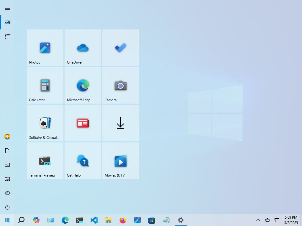
Windows 11: A centered and simplified design
In 2021, Microsoft launched Windows 11, which also introduced a centered Taskbar and a revamped Start menu that brought a significant visual overhaul to the menu, and it’s safe to say they’ve generated a range of reactions.
One of the most noticeable changes was the centered Start button and Taskbar items, giving Windows 11 a more modern and streamlined look.
Some have argued about this placement, as it deviates from the traditional left-aligned Start button. As a result, changing the alignment to the left is one of the first configurations that users usually apply to a new setup.
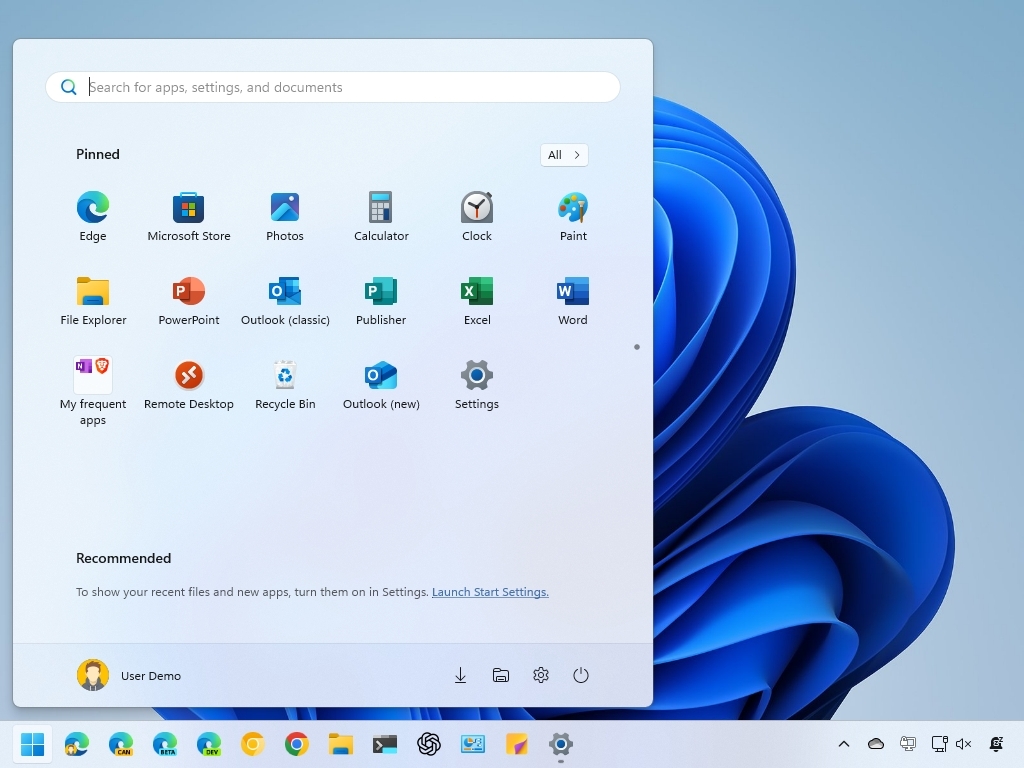
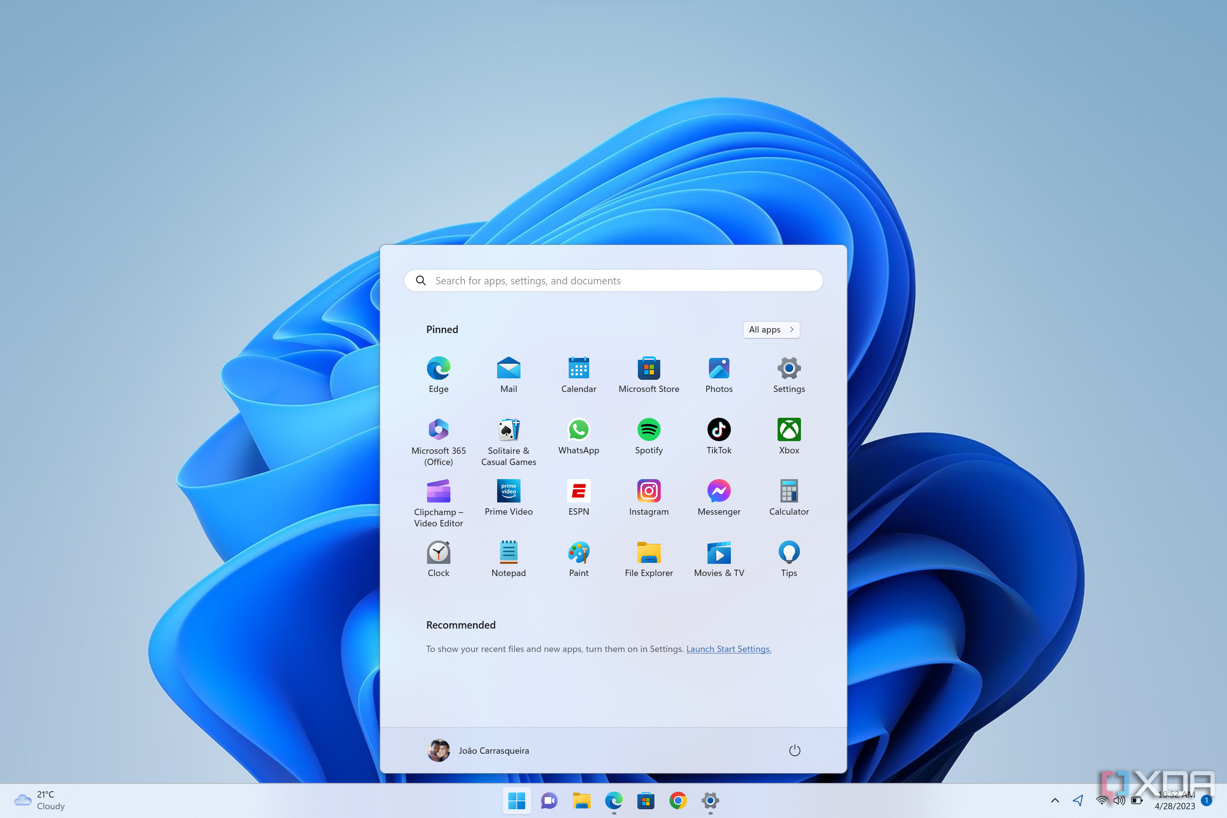
The Start menu itself features a simplified layout, with pinned apps at the top and a «Recommended» section below, displaying recently opened files and applications.
Also, Live Tiles have been replaced with more traditional static icons, and this menu emphasizes rounded corners and a cleaner, more minimalist aesthetic.
You can also pin as many apps as you want by creating scrollable pages in the menu, and you can even organize apps in groups. However, many users who were accustomed to the Windows 10 Start menu have expressed frustration with the lack of customization.
A common criticism is the limited customization options compared to previous versions. For example, you can’t resize the menu, remove the «Recommended» section, and it’s no longer possible to show Live Tiles.
Another aspect of the Start menu is that Microsoft has been using it to push even more advertisements. Although the company has been known to promote apps from partners, you only used to notice this in new installations. However, on Windows 11, the «Recommended» section is also used to promote apps from the Microsoft Store dynamically.
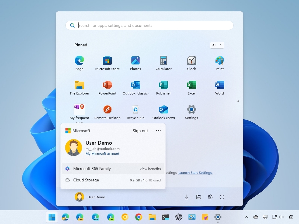
Also, in the user menu, the company uses this area to promote its cloud services by luring users into backing up their files to OneDrive and Microsoft 365 subscriptions.
One thing you will notice about this menu is that it has a horizontal design, while the previous menus had a vertical design.
Although the Start menu for Windows 11 lacks customization options, you will continue to find familiar elements, such as the box to access Windows Search, the profile menu, power options, the ability to show folders, and the «All» menu to access all your installed apps.
Over the past three decades, Microsoft’s Start Menu has continually been trying to adapt, reflecting the company’s commitment to evolving with user needs and advances in technology. However, the company did not always get it right.
More resources
Find in-depth guides, troubleshooting tips, and the latest updates on Windows 11 and 10 here:
- Windows 11 on Windows Central — All you need to know
- Windows 10 on Windows Central — All you need to know
Mauro Huculak has been a Windows How-To Expert contributor for WindowsCentral.com for nearly a decade and has over 15 years of experience writing comprehensive guides. He also has an IT background and has achieved different professional certifications from Microsoft, Cisco, VMware, and CompTIA. He has been recognized as a Microsoft MVP for many years.
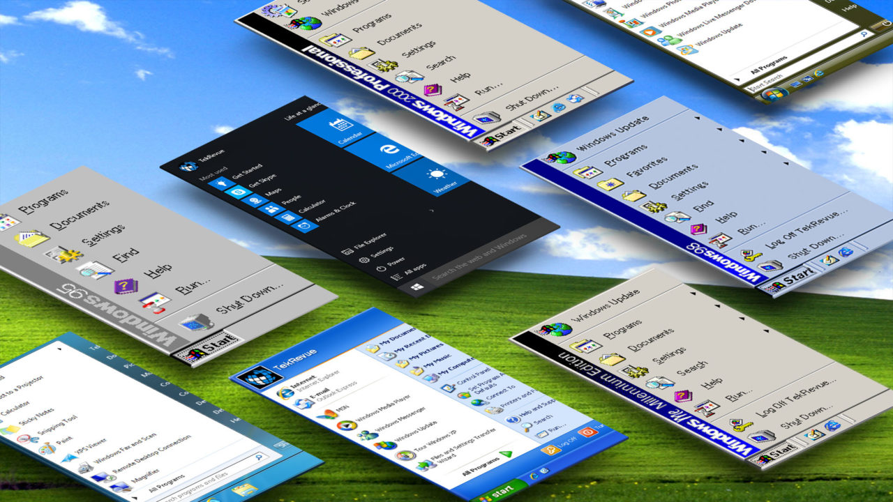
The new Start Menu in Windows 10 is a major feature for many users who avoided the Windows 8 upgrade, which infamously replaced the Start Menu with a full-screen, touch-optimized Start Screen. But as we’ve mentioned previously, the Windows 10 Start Menu isn’t quite the same as the “traditional” Start Menu found in operating systems like Windows XP and Windows 7.
So that got us thinking about how the Start Menu has changed in the nearly 20 years since it made its consumer debut with Windows 95. Older Windows users like us have experienced each iteration over the years, but things changed so gradually that it’s hard to imagine a direct comparison between the different Windows versions, and those who are younger or new to Windows may have never seen the early Start Menus at all.
To help us keep things in perspective as we adjust to the new Windows 10 Start Menu, we thought that a nice high quality comparison of the history of the Windows Start Menu was in order. We keep at least one VM from every major operating system on hand at all times, so we decided to fire up all consumer versions of Windows dating back to Windows 95 and grab some screenshots illustrating the evolution of the Start Menu. You can find the gallery on the following pages, along with some information about each Windows release. Just use the buttons below to navigate, and click on any image to get a full-sized view.
Are any of the Windows Start Menus, particularly the early ones, new to you? Now that you’ve seen the clear evolution of the Start Menu, what are your thoughts on the direction that Microsoft is taking it in Windows 10? Let us know in the comments!
[one_half padding=”0 5px 20px 0″]
1. Introduction
2. Windows 95
3. Windows 98
4. Windows 2000 Professional
5. Windows ME
[/one_half]
[one_half_last padding=”0 0px 20px 5px”]
6. Windows XP
7. Windows Vista
8. Windows 7
9. Windows 8.1
10. Windows 10
[/one_half_last]
How To Factory Reset Samsung Galaxy Note 5
Read Next
Уровень сложностиПростой
Время на прочтение4 мин
Количество просмотров3.2K

В мире разработки операционных систем немногие элементы пользовательского интерфейса могут похвастаться такой же узнаваемостью и функциональной значимостью, как меню «Пуск» в Windows. Этот компонент, ставший неотъемлемой частью пользовательского опыта Microsoft, прошел долгий путь эволюции, отражающий технологический прогресс и изменения в подходах к проектированию интерфейсов. Давайте вспомним, каким оно было и поговорим про технические аспекты создания меню «Пуск», опираясь на инсайдерскую информацию от Дэйва Пламмера, одного из ключевых разработчиков этого элемента.
Когда появилось меню Пуск в Windows
Меню «Пуск» впервые появилось в Windows 95, ознаменовав собой революцию в пользовательском взаимодействии с операционной системой. Правда, понятно это стало много позже. Тем более, что реализация этого компонента в Windows 95 на техническом уровне отличалась не только от того, что мы видим в ОС сегодня, но даже от исполнения в Windows NT.
В Windows 95 меню «Пуск» базировалось на предварительно подготовленных растровых, или битмаповых изображениях. Этот подход, хотя и эффективный для своего времени, имел ряд ограничений:
-
Фиксированный размер и разрешение
-
Ограниченная масштабируемость
-
Высокое потребление ресурсов памяти
-
Сложности с локализацией и кастомизацией
При разработке Windows NT команда Microsoft, включая Дэйва Пламмера, приняла решение о радикальном переосмыслении технической реализации меню «Пуск». Ключевой целью стало создание компонента, который бы отрисовывался в реальном времени посредством программного кода, а не полагался на предварительно подготовленные изображения.

У такого подхода, в отличие от битмап-методики, был ряд существенных преимуществ:
-
Динамическая адаптация к различным разрешениям экрана
-
Уменьшение объема используемой памяти
-
Гибкость в локализации и кастомизации
-
Возможность программного управления визуальными эффектами
Как менялось меню Пуск
При имплементации нового подхода Пламмер столкнулся с рядом проблем, одной из которых была необходимость отображения вертикального текста для боковой панели меню. На тот момент Windows API не предоставляло прямых способов для решения этой задачи.
Решение было найдено благодаря уникальным возможностям Windows NT. Эта версия позволяла осуществлять ротацию контекста устройства (device context, DC). Этот механизм открыл путь к программной реализации вертикального текста без необходимости в специальных растровых изображениях.
Процесс рендеринга меню «Пуск» в Windows NT состоял из следующих этапов:
-
Создание виртуального контекста устройства (memory DC)
-
Ротация контекста устройства на 90 градусов
-
Отрисовка текста в повернутом контексте
-
Возврат контекста в исходное положение
-
Блиттинг результата на экран
Этот подход позволил создать гибкую и эффективную систему отрисовки меню «Пуск», которая могла адаптироваться к различным языковым настройкам и разрешениям экрана без необходимости в множестве предварительно подготовленных изображений.

Помимо решения проблемы с вертикальным текстом, новая реализация меню «Пуск» включала программную генерацию градиентного фона. Это было достигнуто путем использования GDI-функций для создания плавных цветовых переходов. Разработчики использовали алгоритмы интерполяции цвета для создания визуально привлекательного фона, который мог динамически адаптироваться к различным размерам и пропорциям экрана.
Современное состояние меню Пуск
Меню «Пуск» продолжало эволюционировать с каждым новым релизом Windows, адаптируясь к меняющимся требованиям пользователей и технологическим возможностям. Однако не все изменения были успешными. Наиболее заметным экспериментом стало удаление классического меню «Пуск» в Windows 8 в пользу полноэкранного интерфейса Metro.
Этот радикальный отход от привычной парадигмы вызвал значительное недовольство пользователей, включая самого Дэйва Пламмера, который быстро вернулся к использованию Windows 7. Негативная реакция сообщества привела к возвращению модифицированного меню «Пуск» в Windows 10, которое сочетало в себе элементы классического дизайна с новыми функциональными возможностями.
В актуальных версиях Windows меню «Пуск» продолжает играть центральную роль в пользовательском интерфейсе, но его техническая реализация значительно эволюционировала. Современное меню «Пуск» использует комбинацию передовых технологий:
1. XAML (eXtensible Application Markup Language) для описания структуры интерфейса, что обеспечивает более гибкий и декларативный подход к созданию UI.
2. DirectComposition для аппаратно-ускоренной композиции элементов, что позволяет достичь плавной анимации и высокой производительности даже на устройствах с ограниченными ресурсами.
3. Fluent Design System для обеспечения согласованности визуального стиля across различных приложений и компонентов Windows.
Использование XAML позволяет разработчикам создавать более сложные и интерактивные интерфейсы, легко поддающиеся кастомизации и адаптации под различные форм-факторы устройств. DirectComposition обеспечивает плавность анимаций и переходов, что критически важно для современного пользовательского опыта. Fluent Design System привносит единообразие и эстетическую привлекательность, сохраняя при этом функциональность и узнаваемость меню «Пуск».
А как вы считаете, насколько интересным был путь развития меню «Пуск»? Помогает ли опыт разработчиков (как позитивный и негативный), думать о ваших собственных продуктах? Наконец, нравится ли вам меню «Пуск» таким, каким оно является сегодня?
Sign in to your XDA account
Quick Links
-
Windows 95 (through Windows ME)
In its more than 40-year-long history, Windows has introduced a fair share of iconic features that we can’t imagine our computers without. From the very concept of the desktop to things like the File Explorer, not everything we know today was the same back when Windows first made its debut. The Start menu is one such element that only appeared later in the operating system’s life, starting with Windows 95. It’s been a staple of every Windows OS release ever since, but it’s changed a lot throughout the years.
Personally, I’ve lived through every iteration of the Start menu since Windows XP, but I thought it would be interesting to take a look back at all the different versions of it to see how it’s evolved since its debut and whether we’re better or worse off today.
Windows 95 (through Windows ME)
Humble beginnings, but a solid foundation
The introduction of the Start menu in Windows 95 was a pretty big deal, at least from the perspective of someone more used to later versions of Windows. Prior to this, getting to your apps or settings was all done through the Windows Explorer window that opened by default when you booted up Windows, but this new concept enabled the desktop to be the home for all your icons without anything getting in the way.
The Windows 95 Start menu was already loaded with pretty much anything you’d want to do on your computer, too. It truly was the starting point for using your PC. Start housed a folder containing all your programs, one for your documents, and one for your system settings, plus the Find option along with the ability to run a program or turn off or suspend the computer. There wasn’t anything overly fancy, but really, anything you could want was there. All your apps would go in the programs folder, and if you wanted to change any settings, the Control Panel was quickly accessible from the Settings folder. Because all of these options were suspended menus, you also didn’t need to click all these UI elements, and hovering your mouse over them would show you all the options inside it.
This iteration of the Start menu didn’t see a ton of changes in the follow-up Windows releases. Windows 98, 2000, and ME kept the same overall design, but added some new options to accommodate other Windows features. For example, your favorites from Internet Explorer could be found here, and Windows ME also added a new option to log off your current account, since Windows supported multiple accounts at this point.
Windows XP
The iconic dual-pane design
The first major shake-up for the Start menu came with Windows XP, which introduced a dual-column layout that would become the style we’d see for the next decade. This is also a style many users prefer today, kept alive by tools like Start11 (with some changes).
In Windows XP, the Start menu prioritizes the apps you care about the most. The primary column houses your pinned and recent apps. If you have an app you use all the time, you can pin it to the top area (Internet Explorer and the built-in email client lived here by default), so it’s always there for you. Below that, you’ll see apps that you opened recently, so you can quickly get back to what you were doing before. The Programs menu that was found in the first iteration of the menu became an All programs menu at the bottom, but it still worked pretty much the same way, with suspended menus for subsets of apps and tools.
The remaining options in the Start menu were given their own column for faster access. You had a quick link to your documents, music, and pictures folders, as well as the Control Panel, printer settings, and more. There was also a new quick menu for your recent documents, letting you get back into your workflow easily. More options than ever were available with a single click, which made things a lot faster.
Of course, the visual style was also completely modernized (for the time), so things looked a lot more rounded and much prettier.
Windows Vista and 7
Refinements and visual updates
It’s very clear that Microsoft struck gold with the Start menu in Windows XP because the company mostly left the formula untouched for the follow-ups. The major changes here are mostly in the visual design, with Windows Vista introducing some translucency and glass effects, which were significantly improved and refined with Windows 7. Leveraging the more powerful hardware that was becoming available, these versions of the Start menu looked a lot nicer on compatible hardware.
Functionally, the changes were smaller. Vista changed the All Programs menu from a suspended menu to instead take the place of the main column, making for a more self-contained design, but one that required more clicks to open the folder you wanted to get to. Meanwhile, the second columns added links to a Games folder as well as the general user folder. The search button was replaced with a Search bar that now lives underneath the main column, and it can also be used to run programs, since the dedicated Run button was removed. Meanwhile, the power and log off buttons were simplified into new icons, with a sub-menu available for additional options, rather than them, being presented to you later.
Windows 7 made even fewer changes, with only the Log off button being removed, making the Shut down button more prominent and text-based, rather than using a simple icon. Otherwise, the Windows 7 Start menu is very much like the one in Vista.
Windows 8 and 8.1
Aiming for the tablet market
This is the big one. In 2012, Microsoft saw the potential in tablet devices after the popularity of the iPad and sought to replicate that success in the Windows world with the Surface brand. To go with it, we got Windows 8 and the first touch-focused version of Windows for desktop computers.
The Start menu was no longer a menu, and it became the Start screen, completely taking over the desktop with a new design paradigm called tiles. Tiles were square icons for apps, which could also double as widgets. That means that tiles would usually update themselves to show the latest information from the respective app, giving you more at-a-glance information. Of course, while this made total sense for tablets, it wasn’t the best experience for desktops, and it was forced on desktop and laptop users all the same.
To access the Start menu, you no longer had a button, and instead, you had to move your mouse to the corner until the visual indicator appeared so you could click it. The Start screen then took over the desktop, and it created a weird split between apps that run in the desktop and «modern» apps that used the entire screen space.
From there, the options were also far more limited. The Start screen focused entirely on tiles, with only the user profile icon in the top right with options to log off or switch accounts. To see your list of installed apps, you had to swipe up on this screen, which you couldn’t do on a non-touch PC, requiring you to right-click an empty area and then choose the All apps view. Even the option to turn off the computer was hidden away in the Charms bar, and that required you to move the mouse over either the top or bottom right corners and then move the mouse slightly along the edge of the screen to bring up the bar. You’d then have to click the Settings button to see the power options appear. It was a mess.
To keep fast access to certain desktop features, Windows 8 did introduce the Quick Link menu, which is shown when you right-click the Start link on the desktop. This includes links to things like Control Panel, File Explorer, and Device Manager, and it’s been around ever since.
Windows 8.1 tried to correct the course
After Windows 8’s disastrous reception, Microsoft sought to fix some of the pain points of the new experience. The Start screen in Windows 8.1 got the ability to display smaller tiles so you could fit more apps into a single view, and it also has a power and search button in the top right corner, so you can access these common features more easily.
Accessing the All apps list also became easier with a small arrow at the bottom of the screen, and Microsoft also gave you a bit more customization by allowing the desktop background to also be the background for the Start screen, so things felt a bit more cohesive. Windows 8.1 also brought the Start menu icon back to the taskbar, though it still opened the full-screen interface.
Regardless of these improvements, the Windows 8.1 Start screen was jarring for desktop users and it couldn’t change the perception users had already developed toward Windows 8 as a whole.
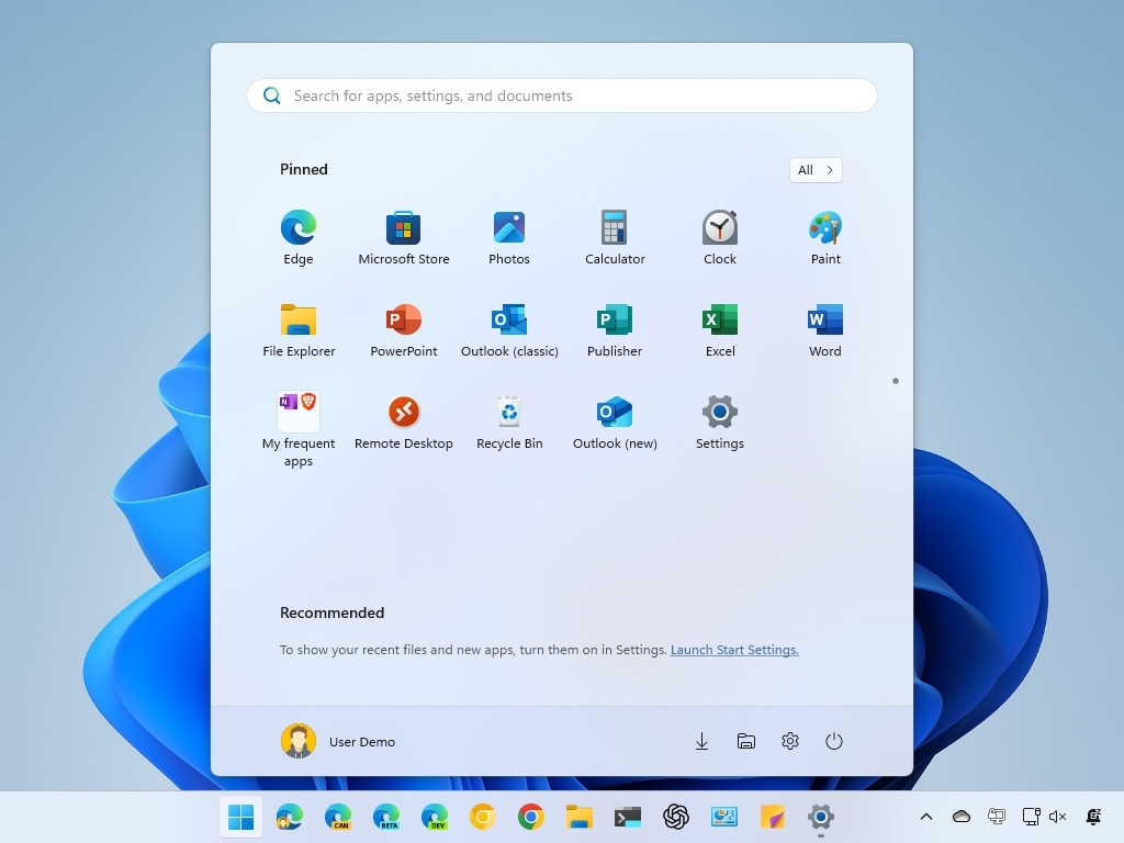
Windows 10
Bringing two worlds together
Windows 10 was Microsoft’s real shot at redemption, simultaneously trying to keep what made Windows 8 great for touch screens while making it appealing to long-time desktop users. With that, Windows 10 brought the Start menu back to the bottom left corner of the screen, along with two primary areas.
The column on the left housed the list of recent apps used on the computer, with links to things like the Settings app and File Explorer at the bottom — which could be customized through the Settings app — along with the option to view the list of all apps. In later updates, the Windows 10 Start menu eventually replaced the recent apps list with the all apps list.
On the right side of the menu was an area dedicated to the tiles that made their debut in Windows 8. Just like before, Tiles could be resized and grouped to make it easier to organize them, and Windows 10 also introduced the ability to group multiple tiles together in a folder, making better use of limited space. Because it kept receiving major updates for a few years, Windows 10 made multiple changes to the Start menu over that time, including the introduction of «transparent» tiles that followed your system theme rather than having different colors from each other. One notable quirk about this Start menu is that it’s the only version to be resizeable, so you can make it as big or small as you need to.
Related
How to use Start menu folders in Windows 11 version 22H2
Windows 11 version 22H2 comes with the ability to create folders on the Start menu. Here’s what you need to know to do it yourself.
Notably, Windows 10 also kept a full-screen Start menu available as an option for tablet devices. Just like Windows 8 and 8.1, this mode focused on the tile area, with all the improvements that Windows 10 introduced, like folders. You could still access the all apps list and other links through a menu on the left edge of the screen, which replicated the main column of the typical Start menu view in a more compact form.
Windows 8.1 RT got its own update
Because Windows 10 didn’t support Arm-based devices when it first launched, Microsoft crafted a special update for Windows 8.1 RT — the version that ran on Arm devices like the Surface RT and Surface 2 — with some of the enhancements of Windows 10. Essentially, this update included a compact Start menu that lived in the bottom left corner of the screen, complete with a dual-pane layout where one part included recent apps and the all apps list, and the other housed the tiles.
This version of the Start menu is closer to what was offered in early preview stages of Windows 10, but it even has some features not available there. For example, it’s possible to pin apps and folders to the top of the left pane, similar to what was possible in Windows XP, Vista, and 7.
Windows 11
It’s all led up to this
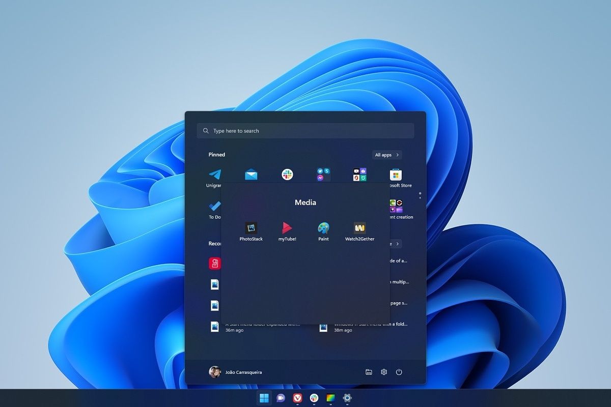
All of that brings us to the current era of the Start menu. Windows 11 finally did away with tiles, nearly 10 years after they appeared in Windows 8, and instead, we now have app icons front and center. The primary area of the Start screen allows you to have pinned apps across multiple pages, and with the latest updates, it also lets you create folders for those apps. The all apps list can be accessed through a button on the top right of the menu, which takes over the Start menu view.
Below that, there’s a Recommended area, where you can see recently installed apps or recent files you downloaded or created. This section can also be expanded to show a longer list of items.
Related
How to turn off Start menu recommended content in Windows 11
The Windows 11 Start menu has a new section for recommended content, but it may not be useful for everyone. Here’s how you can turn it off.
At the bottom is the user profile menu and the power button, along with customizable shortcuts similar to Windows 10. These can be set to include the Settings app, the user folder, or other folders like Documents, Pictures, and Music.
Of course, the biggest change is that, by default, the Start menu is now in the center of the taskbar, rather than the bottom left corner, though you can move it back to its usual location. What’s more the Windows 11 Start menu lacks a full-screen mode for tablets, though it does support touch gestures to make navigation easier.
Related
How to use touch gestures on Windows 11
Touch gestures make using a Windows 11 tablet much more intuitive, but they’re not very obvious. Here’s everything you need to know.
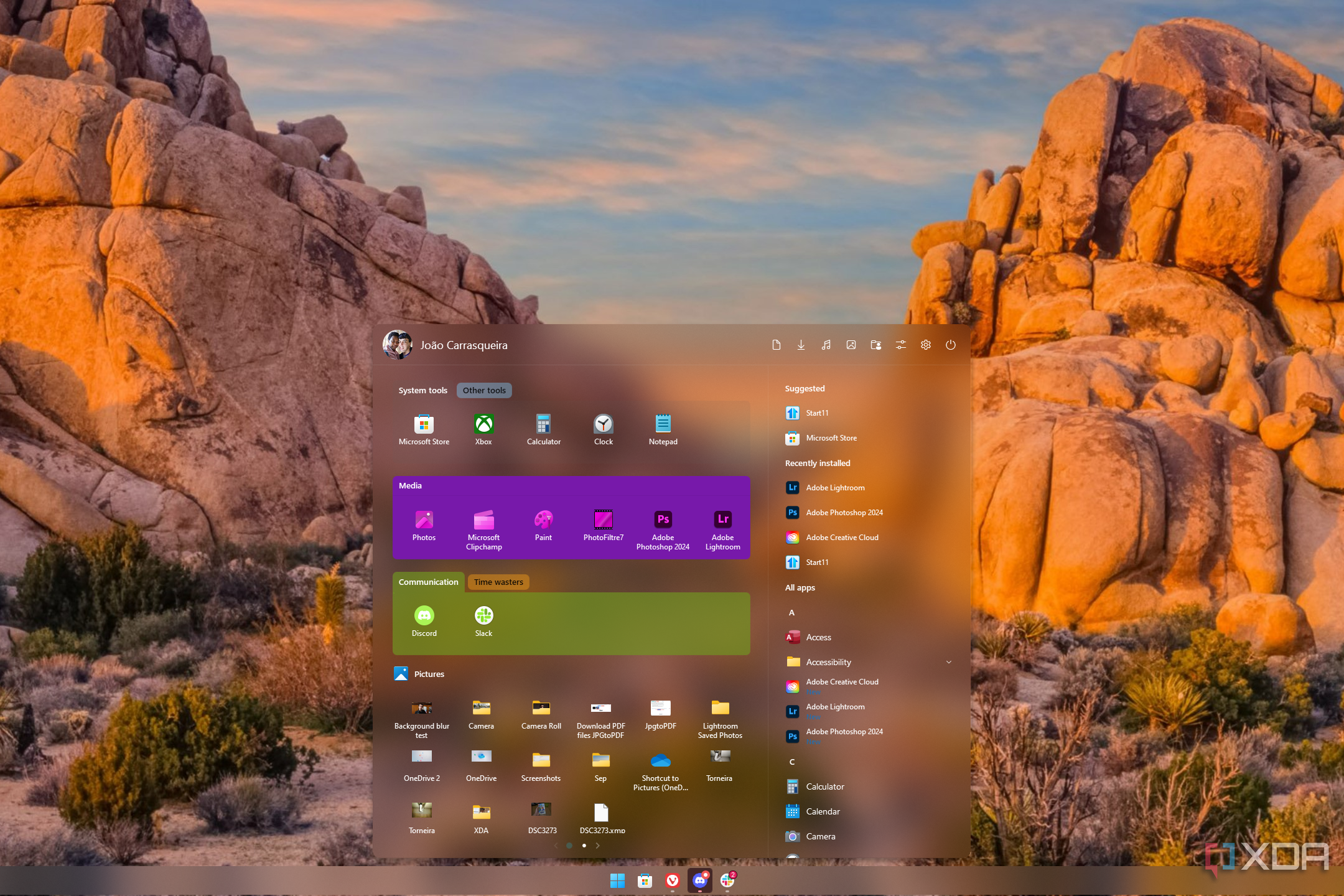
Overall, the Start menu in Windows 11 feels like a very bare implementation, focusing strictly on apps and a couple of recent items, and stalling access to Windows features that were previously accessible in the past. While the focused approach works well in some ways, many have felt like it isn’t enough, and that’s why apps like Start11 exist. Having personally tried and reviewed it, I find Start11 to unlock so much more in the Start menu that Microsoft no longer offers. While I do like simplicity, I’ve found myself appreciating the more densely-packed menus of years past as I try to get more done more quickly.
Related
Start11 v2 review: Making the Windows 11 Start menu actually useful
With tons of configuration options for appearance and organization, Start11 makes the Start menu and taskbar so much richer
However, it’s also true that you can use a search bar to get to almost anything you want nowadays, and that’s something I do a lot on Windows 11 so I don’t even have to touch my mouse. With Microsoft trying to push Copilot as the new launchpad for everything you do on your devices, maybe that kind of interface is the future, and complex menus like what we saw on Windows XP will soon be behind us.