
In this tutorial we want to learn about PyQt5 Input Widgets, we are going to talk about PyQt5 TextBox, SpinBox and Slider, we already know that PyQt5 is one of the most popular GUI framework for Python programming language, so now let’s start from PyQt5 TextBox.
Using PyQt5 TextBoxes you can enter and edit text data. They are commonly used for inputting names, addresses or any textual information. PyQt5 offers the QLineEdit widget, which is perfect for handling text input.
|
1 2 3 4 5 6 7 8 9 10 11 12 13 14 15 16 17 18 19 20 21 22 23 24 25 26 27 28 29 30 31 32 33 34 35 36 37 38 39 40 41 42 43 44 45 46 47 |
from PyQt5.QtWidgets import QApplication, QWidget, QVBoxLayout, QLabel, QLineEdit import sys class RegistrationForm(QWidget): def __init__(self): super().__init__() self.initUI() def initUI(self): # Set window title self.setWindowTitle(‘Registration Form’) # Create a vertical layout vbox = QVBoxLayout() # Create a label for the name field nameLabel = QLabel(‘Name:’, self) # Create a text input field for the name nameTextBox = QLineEdit(self) # Connect the textChanged signal of the text input field to the onNameChanged method nameTextBox.textChanged.connect(self.onNameChanged) # Create a label for displaying the result self.result = QLabel() # Add widgets to the vertical layout vbox.addWidget(nameLabel) vbox.addWidget(nameTextBox) vbox.addWidget(self.result) # Set the layout of the widget to the vertical layout self.setLayout(vbox) # Method called when the text in the name text input field changes def onNameChanged(self, text): # Set the text of the result label to the entered name self.result.setText(text) if __name__ == ‘__main__’: # Create the application instance app = QApplication(sys.argv) # Create an instance of the RegistrationForm widget form = RegistrationForm() # Show the RegistrationForm widget form.show() # Start the application event loop sys.exit(app.exec_()) |
In the above example, we have created a QLineEdit widget and connect its textChanged signal to a custom slot onNameChanged. Whenever the user enters or modifies text in the Text Box, the slot is triggered, and we the label text to the TextBox text.
Run the code and this will be the result

PyQt5 SpinBox
SpinBoxes are useful when you want users to input numeric values within a specified range. They provide an easy way to increase or decrease the value by using up and down arrow buttons or by directly typing in the value. you can use PyQt5 QSpinBox widget for this purpose.
|
1 2 3 4 5 6 7 8 9 10 11 12 13 14 15 16 17 18 19 20 21 22 23 24 25 26 27 28 29 30 31 32 33 34 35 36 37 38 39 40 41 42 43 44 45 46 47 48 49 50 51 |
from PyQt5.QtWidgets import QApplication, QWidget, QVBoxLayout, QLabel, QSpinBox import sys class AgeForm(QWidget): def __init__(self): super().__init__() self.initUI() def initUI(self): # Set window title self.setWindowTitle(‘Age Form’) # Create a vertical layout vbox = QVBoxLayout() # Create a label for the age field ageLabel = QLabel(‘Age:’, self) # Create a spin box for selecting age ageSpinBox = QSpinBox(self) # Create a label for displaying the result self.result = QLabel() # Connect the valueChanged signal of the spin box to the onAgeChanged method ageSpinBox.valueChanged.connect(self.onAgeChanged) # Set minimum and maximum allowed values for the spin box ageSpinBox.setMinimum(0) ageSpinBox.setMaximum(120) # Add widgets to the vertical layout vbox.addWidget(ageLabel) vbox.addWidget(ageSpinBox) vbox.addWidget(self.result) # Set the layout of the widget to the vertical layout self.setLayout(vbox) # Method called when the value of the age spin box changes def onAgeChanged(self, value): # Set the text of the result label to the selected age self.result.setText(str(value)) if __name__ == ‘__main__’: # Create the application instance app = QApplication(sys.argv) # Create an instance of the AgeForm widget form = AgeForm() # Show the AgeForm widget form.show() # Start the application event loop sys.exit(app.exec_()) |
In the above example, we have created a QSpinBox widget, we set its minimum and maximum values, and connect its valueChanged signal to the onAgeChanged slot. Whenever the user modifies the value in the Spin Box, the slot is invoked, and we show the value of spinbox in the label.
This will be the result
PyQt5 Slider
Sliders provide a visually appealing way to select values within a specified range. They are commonly used for volume control, brightness adjustments, or any other continuous value selection. you can use PyQt5 QSlider widget for this purpose.
|
1 2 3 4 5 6 7 8 9 10 11 12 13 14 15 16 17 18 19 20 21 22 23 24 25 26 27 28 29 30 31 32 33 34 35 36 37 38 39 40 41 42 43 44 45 46 47 48 49 |
from PyQt5.QtWidgets import QApplication, QWidget, QLabel, QSlider, QVBoxLayout from PyQt5.QtCore import Qt import sys class VolumeControlForm(QWidget): def __init__(self): super().__init__() self.initUI() def initUI(self): # Set window title self.setWindowTitle(‘Volume Control’) # Create label for volume control volumeLabel = QLabel(‘Volume:’, self) volumeLabel.setAlignment(Qt.AlignCenter) # Create horizontal slider for adjusting volume volumeSlider = QSlider(Qt.Horizontal, self) volumeSlider.setRange(0, 100) # Connect slider’s valueChanged signal to onVolumeChanged method volumeSlider.valueChanged.connect(self.onVolumeChanged) # Create label to display volume changes self.result = QLabel() # Create vertical layout and add widgets layout = QVBoxLayout() layout.addWidget(volumeLabel) layout.addWidget(volumeSlider) layout.addWidget(self.result) # Set layout for the widget self.setLayout(layout) # Method called when volume slider value changes def onVolumeChanged(self, value): # Display volume changes in the result label self.result.setText(‘Volume changed:’ + str(value)) if __name__ == ‘__main__’: # Create application instance app = QApplication(sys.argv) # Create instance of the VolumeControlForm widget form = VolumeControlForm() # Show the VolumeControlForm widget form.show() # Start the application event loop sys.exit(app.exec_()) |
In the above example, we have created a horizontal QSlider widget, set its range from 0 to 100, and connect its valueChanged signal to the onVolumeChanged slot. As the user changes the slider, the slot is triggered, and we add the value to the label.
This will be the result
- PyQt5 Progress Bar and Status Bar Widgets
Subscribe and Get Free Video Courses & Articles in your Email
Python hosting: Host, run, and code Python in the cloud!
In this comprehensive guide, discover how to leverage a textbox widget in PyQt5. This essential widget, named QLineEdit, offers methods such as setText() for setting the textbox’s value and text() to retrieve the value.
By harnessing the resize(width,height) method, the dimensions of the textbox can be easily adjusted. Meanwhile, its position can be defined using the move(x,y) method or by employing a grid layout.
Related Course:
- Create GUI Apps with PyQt5
Creating a PyQt5 Textbox:
Constructing a textbox in PyQt5 is a breeze. Below is a snippet showcasing the creation process:
self.textbox = QLineEdit(self)
self.textbox.move(20, 20)
self.textbox.resize(280,40)
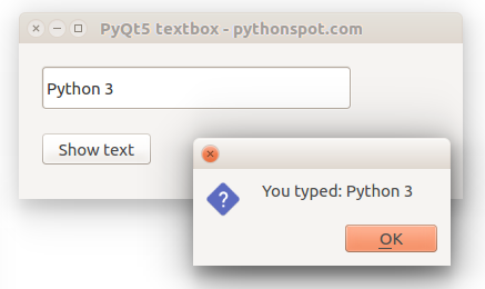
An Example of PyQt5 Textbox Implementation:
The ensuing example illustrates a window that houses a textbox. It’s pivotal to note that widgets, which can exhibit media such as images, are components of qwidget.
import sys
from PyQt5.QtWidgets import QMainWindow, QApplication, QWidget, QPushButton, QAction, QLineEdit, QMessageBox
from PyQt5.QtGui import QIcon
from PyQt5.QtCore import pyqtSlot

class App(QMainWindow):

    def __init__(self):
        super().__init__()
        self.title = 'PyQt5 textbox - pythonspot.com'
        self.left = 10
        self.top = 10
        self.width = 400
        self.height = 140
        self.initUI()

    def initUI(self):
        self.setWindowTitle(self.title)
        self.setGeometry(self.left, self.top, self.width, self.height)


        self.textbox = QLineEdit(self)
        self.textbox.move(20, 20)
        self.textbox.resize(280,40)


        self.button = QPushButton('Show text', self)
        self.button.move(20,80)


        self.button.clicked.connect(self.on_click)
        self.show()

    @pyqtSlot()
    def on_click(self):
        textboxValue = self.textbox.text()
        QMessageBox.question(self, 'Message - pythonspot.com', "You typed: " + textboxValue, QMessageBox.Ok, QMessageBox.Ok)
        self.textbox.setText("")

if __name__ == '__main__':
    app = QApplication(sys.argv)
    ex = App()
    sys.exit(app.exec_())
Looking to delve deeper? Download the extensive PyQt Code Collection here.
Navigate the tutorials: < Previous | Next >
Добавим строку
в заголовочный файл.
Использование статических функций класса:
|
QMessageBox::warning(this, «Внимание»,«Это очень важный текст\n www.itmathrepetitor.ru»); |
Результат:
Наряду с warning доступны information, critical, question (и еще about, aboutQt). Описание функции:
| StandardButton | information(QWidget * parent, const QString & title, const QString & text, StandardButtons buttons = Ok, StandardButton defaultButton = NoButton) |
Создание объекта:
|
QMessageBox msgBox; msgBox.setWindowTitle(«Пример»); msgBox.setText(«Тестовое сообщение»); msgBox.exec(); |
Результат:
Обработка выбора пользователя:
|
QMessageBox msgBox; //www.itmathrepetitor.ru msgBox.setText(«Внимательно прочтите!»); msgBox.setInformativeText(«Ок — процесс пошел\nCancel — замести следы»); msgBox.setStandardButtons(QMessageBox::Ok | QMessageBox::Cancel); msgBox.setIcon(QMessageBox::Information); msgBox.setDefaultButton(QMessageBox::Ok); int res = msgBox.exec(); if (res == QMessageBox::Ok) //нажата кнопка Ok doSomething(); else //отмена stopSomething(); // отмена |
Результат:
Здесь мы добавляем иконку QMessageBox::Information. Еще варианты QMessageBox::Question, QMessageBox::Warning, QMessageBox::Critical и QMessageBox::NoIcon. Их изображения:
все материалы
The text box QLineEdit developed by Go-Qt5
- Case description
- demo.go
Case description
-
QLineEdit is a control used to enter or edit a single line of text.
-
It also has undo redo, cut, copy and drag functions.
-
The example shows a QLineEdit and a QLabel.
The text we input in QLineEdit will be displayed in QLabel control in real time.
demo.go
package main

import (
	"github.com/therecipe/qt/core"
	"github.com/therecipe/qt/gui"
	"github.com/therecipe/qt/widgets"
	"os"
)

/*
QLineEdit is a control used to enter or edit a single line of text.
 It also has undo redo, cut, copy and drag functions.

 The example shows a QLineEdit and a QLabel.
 The text we enter in QLineEdit will be displayed in QLabel control in real time.
*/

func InitUi() *widgets.QMainWindow {
	// Create window
	app := widgets.NewQMainWindow(nil, 0)

	// Set the title of the window
	app.SetWindowTitle("Qt Tutorial")

	// Set the position and size of the window
	app.SetGeometry2(300, 300, 300, 220)

	// Set the icon of the window, refer to the web.png picture in the current directory
	app.SetWindowIcon(gui.NewQIcon5("images/app.ico"))

	// Layout window component carrier
	widget := widgets.NewQWidget(app, core.Qt__Widget)
	//widget.SetGeometry(core.NewQRect4(300, 300, 300, 220))
	widget.SetGeometry2(0, 0, 300, 220)
	app.SetCentralWidget(widget)
	// Status Bar
	app.StatusBar()

	// label
	lbl := widgets.NewQLabel(widget, 0)
	lbl.Move2(60, 40)

	// text box
	qle := widgets.NewQLineEdit(widget)
	qle.Move2(60, 100)
	// When the content of the text box changes, the method will be called
	qle.ConnectTextChanged(func(text string) {
		//In the method, we set the text of the QLabel control as the input content.
		lbl.SetText(text)
		//Adjust the size of the QLabel control to the length of the text by calling the adjustSize() method.
		lbl.AdjustSize()
	})

	return app
}

func main() {
	// Create an application object
	// sys.argv parameter is a list, input parameters from the command line
	widgets.NewQApplication(len(os.Args), os.Args)

	// Initialize the window
	app := InitUi()

	// display component
	app.Show()

	// Ensure that the application exits cleanly
	widgets.QApplication_Exec()
}
Последнее обновление: 23.12.2023
К одним из наиболее используемых элементов относятся текстовые поля ввода. Для создания однострочного текстового поля применяется элемент TextField из
пакета «QtQuick.Controls». Простейшее текстовое поле:
import QtQuick
import QtQuick.Controls

Window {
    width: 250
    height: 200
    visible: true
    title: "METANIT.COM"

    Column{
        anchors.fill: parent
        padding: 10
        TextField {
            width: 160
            height: 25
            text: "Hello World"
        }
    }
}
Основную часть функционала, связанного с вводом текста, элемент TextField наследует от типа TextInput. Рассмотрим основные
возможности TextField.
Установка шрифта
Для настройки шрифта применяется ряд свойств:
-
color: устанавливает цвет текста
-
font.bold: устанавливает выделение жирным при значении
true -
font.capitalization: устанавливает режим перевода в верхний регистр. Возможные значения:
-
Font.MixedCase: регистр символов не изменяется -
Font.AllUppercase: весь текст переводится в верхний регистр -
Font.AllLowercase: весь текст переводится в нижний регистр -
Font.SmallCaps: текст отображается прописными буквами -
Font.Capitalize: первая буква каждого слова переводится в верхний регистр
-
-
font.family: устанавливает применяемое семейство шрифтов
-
font.italic: устанавливает выделение курсивом при значении
true -
font.letterSpacing: устанавливает отступы между буквами
-
font.pixelSize: устанавливает высоту шрифта в пикселях
-
font.pointSize: устанавливает высоту шрифта в точках
-
font.strikeout: устанавливает зачеркивание текста при значении
true -
font.styleName: устанавливает имя стиля шрифта
-
font.underline: устанавливает подчеркивание текста при значении
true -
font.weight: устанавливает вес текста
-
font.wordSpacing: устанавливает отступы между словами
Применение некоторых свойств:
import QtQuick
import QtQuick.Controls

Window {
    width: 250
    height: 200
    visible: true
    title: "METANIT.COM"

    Column{
        anchors.fill: parent
        padding: 10
        TextField {
            width: 200
            height: 25
            color: "navy"
            text: "Hello world"
            font.family: "Verdana"
            font.pixelSize: 16
            font.capitalization: Font.Capitalize
        }
    }
}
Получение введенного текста
Для управления введенным и отображаемым текстом поле TextField предоставляет три свойства:
-
text: собственно введенный текст
-
placeholderText: приглашение к вводу, которое отображается при отсутствии текста
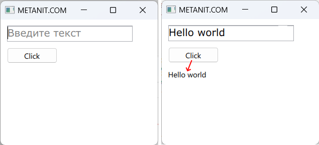
Например, получим введенный текст по нажатию на кнопку:
import QtQuick
import QtQuick.Controls

Window {
    width: 250
    height: 200
    visible: true
    title: "METANIT.COM"

    Column{
        anchors.fill: parent
        padding: 10
        spacing: 10
        TextField {
            id: input
            width: 200
            height: 25
            placeholderText: "Введите текст"
            font.family: "Verdana"
            font.pixelSize: 16
        }
        Button{
            width: 80
            height: 25
            text: "Click"
            onClicked: {
                output.text = input.text
            }
        }
        Text{
            id: output
        }
    }
}
Здесь по нажатию на кнопку текст, введенный в текстовое поле ввода, выводится в элементе Text. Для обращения к этим элементам им назначены идентиикаторы с помощью свойства id
Режим ввода текста
Свойство echoMode позволяет задать режим ввода текста и обычно применяется при вводе пароля или каких-то чуствительных данных, которые нажо визуально скрыть при вводе.
Это свойство может принимать следующие значения:
-
TextInput.Normal: отображает текст как он введен в текстовое поле -
TextInput.Password: отображает символ маски, который скрывает введенный символ (символ маски зависит от платформы) -
TextInput.NoEcho: ничего не делает -
TextInput.PasswordEchoOnEdit: во время ввода отображает символы как есть, а после завершения ввода скрывает с помощью маски аналогичноTextInput.Password
Причем через свойство text мы также сможем получить введенный текст:
import QtQuick
import QtQuick.Controls

Window {
    width: 250
    height: 200
    visible: true
    title: "METANIT.COM"

    Column{
        anchors.fill: parent
        padding: 10
        spacing: 10
        TextField {
            id: input
            width: 200
            height: 25
            placeholderText: "Введите текст"
            echoMode: TextInput.Password  // применяем маску при вводе
            font.family: "Verdana"
            font.pixelSize: 16
        }
        Button{
            width: 80
            height: 25
            text: "Click"
            onClicked: {
                output.text = input.text
            }
        }
        Text{
            id: output
        }
    }
}
Дополнительно с помощью свойства passwordCharacter можно задать символ маски, если, к примеру, стандартные точки не устраивают. Например, зададим символ «!»
TextField {
    id: input
    width: 200
    height: 25
    placeholderText: "Введите пароль"
    echoMode: TextInput.Password  // применяем маску при вводе
    passwordCharacter: "!"      // символ маски
    font.family: "Verdana"
    font.pixelSize: 16
}
Определение маски ввода
Свойство inputMask позволяет задать маску ввода. Маска может применяться для автоматической валидации ввода. Для создания маски могут применяться следующие символы:
|
Символ |
Значение |
|
|
обязательный алфавитный символ |
|
|
разрешенный, но необязательный алфавитный символ |
|
|
обязательный алфавитно-цифровой символ |
|
|
разрешенный, но необязательный алфавитно-цифровой символ |
|
|
обязательный символ, который не является пробелом |
|
|
разрешенный, но необязательный символ, который не является пробелом |
|
|
обязательный цифровой символ |
|
|
разрешенный, но необязательный цифровой симво. |
|
|
обязательный цифровой символ, который больше 0 |
|
|
разрешенный, но необязательный цифровой символ, который больше 0 |
|
|
разрешенный, но необязательный цифровой символ или символ «+»/»-« |
|
|
обязательный шестнадцатеричный цифровой символ (например, A-F, a-f, 0-9). |
|
|
разрешенный, но необязательный шестнадцатеричный цифровой символ |
|
|
обязательный двоичный цифровой символ, например, 0-1. |
|
|
разрешенный, но необязательный двоичный цифровой символ |
|
|
все последующие алфавитные символы в нижнем регистре |
|
|
отключает преобразование регистра. |
Например, установим маску для ввода текста:
import QtQuick
import QtQuick.Controls

Window {
    width: 250
    height: 200
    visible: true
    title: "METANIT.COM"

    Column{
        anchors.fill: parent
        padding: 10
        spacing: 10
        TextField {
            id: input
            width: 200
            height: 25
            placeholderText: "Введите номер телефона"
            font.family: "Verdana"
            font.pixelSize: 16

            inputMask: "+9(999)-999-9999"
        }
        Button{
            width: 80
            height: 25
            text: "Click"
            onClicked: {
                output.text = input.text
            }
        }
        Text{
            id: output
        }
    }
}
В данном случае применяется маска «+9(999)-999-9999», то есть нам надо обязательно ввести 11 цифр (символ «9» подразумевает обязательный ввод цифрового символа). Для больше понимания я определил вывод введенного текста в элемент Text по нажатию кнопки.
В частности, мы можем увидеть, что в него также попадают дополнительные символы маски, как символы «+», «(«, «)» и «-» в примере выше:
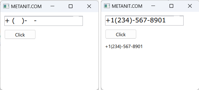
Если символы не являются цифровыми, то их нельзя будет ввести.
Если мы хотим, чтобы номер телефона начинался с какой-то конкретной цифры, то ее можно указать:
inputMask:"+7(999)-999-9999"
В данном случае номер всегда будет начинаться с цифры 7. Но что, если мы хотим, чтобы первая цифра телефона всегда представляла цифру 9? Поскольку «9» — это специальный символ, то его надо экранировать:
inputMask:"+\9(999)-999-9999"
Аналогично можно определять и другие маски с помощью других символов.
Максимальное количество символов
Свойство maximumLength устанавливает максимальное количество символов, которые можно ввести в поле. По умолчанию оно равно 32767. Если текст большей длины,
то он усекается
TextField {
    width: 200
    height: 25
    text: "Hello World"
    font.family: "Verdana"
    font.pixelSize: 16
    maximumLength: 5    // не более 5 символов
}
Реально введенное количество символов (включая символы маски) можно получить с помощью свойства length
Выделение текста
Для управления выделением текста элемент TextField предоставляет ряд свойств:
-
Свойство mouseSelectionMode указывает, как будет выделяться текст, и для этого может принимать одно из двух значений:
-
TextInput.SelectCharacters: можно выделять отдельные символы (значение по умолчанию) -
TextInput.SelectWords: можно выделять только по словам
Стоит отметить, что это свойство применяется, если только другое свойство — selectByMouse равно
true. -
-
Свойство persistentSelection указывает, должно ли текстовое поле сохранять выделение текста после потери фокуса.
По умолчанию значениеfalse(выделение текста сбрасывается) -
Свойство selectByMouse указывает, можно ли выделять мышью текст. Текст выделяется при значении
true, которое является значением по умолчанию -
Свойство selectedText возвращает выделенный текст
-
Свойство selectedTextColor устанавливает цвет выделенного текста
-
Свойство selectionColor устанавливает цвет фона выделенного текста
Применение некоторых свойств:
import QtQuick
import QtQuick.Controls

Window {
    width: 250
    height: 200
    visible: true
    title: "METANIT.COM"

    Column{
        anchors.fill: parent
        padding: 10
        spacing: 10
        TextField {
            id: input
            width: 200
            height: 25
            font.family: "Verdana"
            font.pixelSize: 16
            persistentSelection: true   // сохраняем выделение после потери фокуса
            selectionColor: "red"       // цвет фона выделения
            selectedTextColor: "yellow" // цвет выделенного текста
        }
        Button{
            width: 80
            height: 25
            text: "Click"
            onClicked: {
                output.text = input.selectedText
            }
        }
        Text{
            id: output
        }
    }
}
В данном случае текст выделяется желтым цветом, а его фон — красным. При потере фокуса сохраняем выделение, а при нажатии на кнопку отображаем выделение в элементе Text:
Установка внешних отступов
Ряд свойств позволяют задать внешние отступы:
-
leftInset: отступ слева
-
topInset: отступ сверху
-
bottomInset: отступ снизу
-
rightInset: отступ справа
Применение:
import QtQuick
import QtQuick.Controls

Window {
    width: 250
    height: 200
    visible: true
    title: "METANIT.COM"

    Column{
        anchors.fill: parent

        TextField {
            width: parent.width
            font.family: "Verdana"
            font.pixelSize: 16
            // отступы от краев контейнера
            leftInset:10
            topInset: 10
            bottomInset:10
            rightInset: 8
        }
    }
}
События ввода
При вводе текста возникает ряд событий-сигналов. Прежде всего:
-
pressed: возникает при нажатии на текстовое поле и обрабатывается обработчиком
onPressed -
released: возникает при уходе с места ввода (на другую позицию в текстовом поле или на ждругой элемент) и обрабатывается обработчиком
onReleased -
textEdited: возникает при каждом изменении введенных символов в поле за исключением программного изменения текста и обрабатывается обработчиком
onTextEdited -
accepted: возникает при нажатии на Enter или кнопку возврата и обрабатывается обработчиком
onAccepted -
editingFinished: возникает при нажатии на Enter или кнопку возврата или при потере фокуса и обрабатывается обработчиком
onEditingFinished
Например, при обработаем сигнал released:
import QtQuick
import QtQuick.Controls

Window {
    width: 250
    height: 200
    visible: true
    title: "METANIT.COM"

    Column{
        anchors.fill: parent
        padding: 10
        spacing: 10
        TextField {
            id: input
            width: 200
            height: 25
            font.family: "Verdana"
            font.pixelSize: 16
            onReleased: {output.text = text}
        }
        Text{
            id: output
        }
    }
}
Здесь при завершении ввода текст из поля ввода input копируется в элемент Text.
Методы текстового поля
Для элемента TextField доступен ряд методов, которые позволяют управлять содержимым:
-
clear(): очищает текстовое поле -
copy(): копирует выделенный текст в буфер обмена -
cut(): вырезает выделенный текст -
deselect(): отменяет выделение -
string getText(int start, int end): получает текст между определенными индексами -
insert(int position, string text): вставляет текст на определенную позицию -
paste(): вставляет текст из буфера обмена -
redo(): восстанавливает последнее отмененное действие -
remove(int start, int end): удаляет текст между индексами start и end -
select(int start, int end): выделяет текст между индексами start и end -
selectAll(): выделяет весь текст -
selectWord(): выделяет слово, ближайшее к курсору -
undo(): отменяет последнее действие
Например, определим кнопку, которая удаляет введенный текст:
import QtQuick
import QtQuick.Controls

Window {
    width: 250
    height: 200
    visible: true
    title: "METANIT.COM"

    Column{
        anchors.fill: parent
        padding: 10
        spacing: 10
        TextField {
            id: input
            width: 200
            height: 25
            font.family: "Verdana"
            font.pixelSize: 16
        }
        Button{
            width: 80
            height: 25
            text: "Clear"
            onClicked: { input.clear() }    // удаляем текст
        }
    }
}