
Последнее обновление: 31.10.2015
Элемент ListView представляет список, но с более расширенными возможностями, чем ListBox. В ListView можно отображать сложные данные в
различных стобцах, можно задавать данным изображения и пиктограммы.
ListViewItem
Все элементы, как и в других списковых визуальных компонентах, задаются с помощью свойства Items. Но в отличие от ListBox
или ComboBox, если мы через панель Свойств откроем окно редактирования элементов ListView:
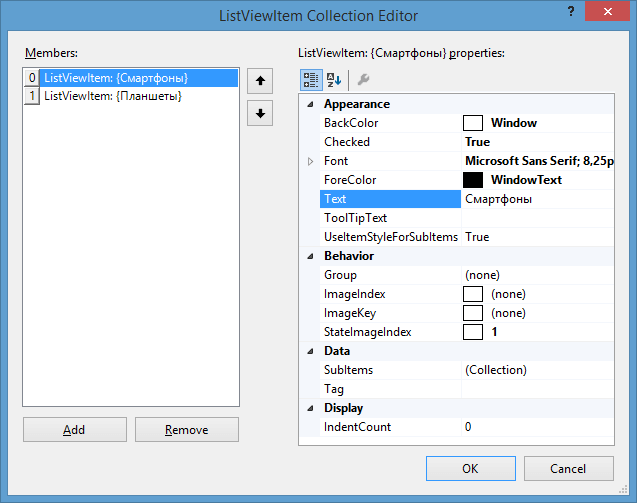
Каждый отдельный элемент в ListView представляет объект ListViewItem. В окне редактирования элементов мы также можем
добавлять и удалять элементы списка. Но кроме того, здесь также мы можем выполнить дополнительную настройку элементов с помощью следующих свойств:
-
BackColor: фоновый цвет элемента
-
Checked: если равно true, то данный элемент будет отмечен
-
Font: шрифт элемента
-
ForeColor: цвет шрифта
-
Text: текст элемента
-
ToolTipText: текст всплывающей подсказки, устанавливаемой для элемента
-
UseItemStyleForSubItems: если равно true, то стиль элемента будет также использоваться и для всех его подэлементов
-
Group: задает фоновый цвет элемента
-
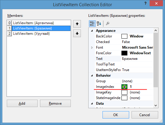
ImageIndex: получает или задает индекс изображения, выводимого для данного элемента
-
ImageKey: получает или задает индекс изображения для данного элемента
-
StateImageIndex: получает или задает индекс изображения состояния (например установленного или снятого флажка,
указывающего состояние элемента) -
SubItems: коллекция подэлементов для данного элемента ListViewItem
-
Tag: тег элемента
-
IdentCount: устанавливает отступ от границ ListViewItem до используемого им изображения
Это только те свойства, которые мы можем задать в окне редактирования элементов ListView. Но потом все добавляемые элементы мы сможем увидеть в ListView:
Чтобы добавить к элементам в ListView флажки, кроме задания свойства Checked у каждого отдельного элемента ListViewItem,
надо также у свойства CheckBoxes у самого объекта ListView установить значение true.
Изображения элементов
Для добавления элементам изображений у ListView есть несколько свойств:
-
LargeImageList: задает список ImageList, изображения которого будут использоваться для крупных значков
-
SmallImageList: задает список ImageList, изображения которого будут использоваться для мелких значков
-
StateImageList: задает список ImageList, изображения которого будут использоваться для разных состояний
Пусть у нас есть некоторый ImageList с изображениями. Зададим этот ImageList для свойств LargeImageList и SmallImageList.
Тогда при добавлении новых элементов мы можем указать индекс изображение из ImageList, которое будет использоваться элементом:
Тогда в приложении вместе с текстыми метками элементов можно будет увидеть и изображения:
Типы отображений
С помощью свойства View у элемента ListView можно задать тип отображения, который принимает следующие значения:
-
Details: отображение в виде таблицы
-
LargeIcon: набор крупных значков (применяется по умолчанию)
-
List: список
-
SmallIcon: набор мелких значков
-
Tile: плитка
При отображении в виде таблицы также надо задать набор столбцов в свойстве Columns у ListView:
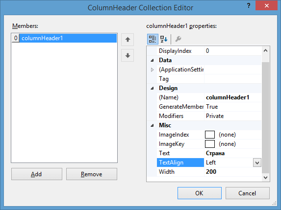
В данном случае я указал один столбец, у которого заголовок будет «Страна». Если у элементов ListViewItem были бы подэлементы, то можно было бы
также задать и столбцы для подэлементов.
Кроме рассмотренных выше свойств ListView надо еще отметить некоторые. Свойство MultiSelect при установке в true
позволяет выделять несколько строк в ListView одновременно.
Свойство Sorting позволяет задать режим сортировки в ListView. По умолчанию оно имеет значение None, но
также можно установить сортировку по возрастанию (значение Ascending) или сортировку по убыванию (значение Descending)
ListView. Практика
Выполним небольшую практическую задачу: выберем все названия файлов из какой-нибудь папки в ListView.
Во-первых добавим на форму элементы TextBox (для ввода названия папки, файлы которой надо получить), Button (для запуска получения) и
ListView.
Чтобы все файлы имели какое-нибудь изображение, добавим на форму ImageList с именем imageList1 и поместим в него какую-нибудь картинку.
У ListView для свойства View установим значение SmallIcon.
Все остальное сделаем в коде формы:
using System;
using System.ComponentModel;
using System.IO;
using System.Windows.Forms;

namespace HelloApp
{
    public partial class Form1 : Form
    {
        public Form1()
        {
            InitializeComponent();

            listView1.SmallImageList = imageList1;
        }

        private void button1_Click(object sender, EventArgs e)
        {
            string path = textBox1.Text;
			// получаем все файлы
            string[] files = Directory.GetFiles(path);
			// перебор полученных файлов
            foreach(string file in files)
            {
                ListViewItem lvi = new ListViewItem();
				// установка названия файла
                lvi.Text = file.Remove(0, file.LastIndexOf('\\') + 1);
                lvi.ImageIndex = 0; // установка картинки для файла
				// добавляем элемент в ListView
                listView1.Items.Add(lvi);
            }
        }
    }
}
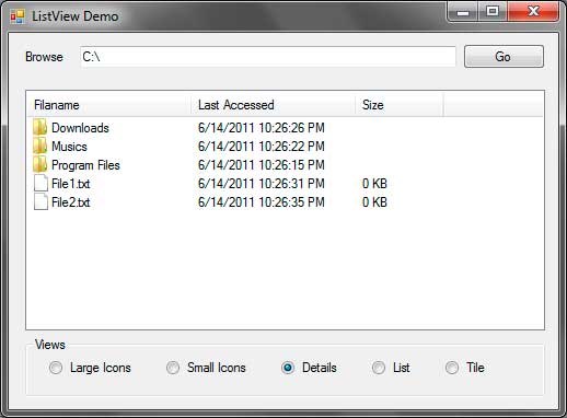
The ListView control (System.Windows.Forms.ListView) allows you to show a list of items in different views and add icons to each of them. The ListView control is composed of ListViewItems which form a grid-like structure of row and columns. Each ListViewItemhas a label and the every ListViewItem in the first column can have an icon beside them. One common use of the ListView control is to show a list of files and folders to the user. Figure 1 shows how a ListView will look like.

Figure 1 – ListView Example
You can see that the Windows Explorer uses a ListView to show files and folders. The one shown above uses the Details View, although there are more types of Views available such as Large Icons and Small Icons. The following tables shows some useful properties, methods, and events offered by the ListView control.
| Property | Description |
|---|---|
| Activation | Specifies how the user can activate an item in the ListView. Posible values are: OneClick: Activates an item using a single click. TwoClick: Activates an item using double click. Standard: Use the computer’s settings. |
| Alignment | Specifies the alignment of the items in the ListView. Possible values are: Default: Uses no alignment for the items. Left: Aligns the items to the left of the ListView. Top: Aligns the items to the top of the ListView. SnapToGrid: Creates an invisible grid where the items will snap to it. |
| AllowColumnReorder | Specifies whether the user can reorder the columns by dragging their column headers to the left or to the right. |
| AutoArrange | When set to true, items will automatically be arranged depending on the Alignment property. The effect can only be seen when using the LargeIcon or SmallIcon Views. |
| CheckBoxes | Specifies whether to show a checkbox to the left of each item when using the Details View. |
| CheckedIndices | Specifies a collection of indices of checked items. |
| CheckedItems | Specifies a collection of checked items. |
| Columns | Contains a collection of columns for the ListView and allows you to add or remove a column. |
| FocusedItem | Contains the item that is selected in the ListView. Returns null if nothing is selected. |
| FullRowSelect | Specifies whether to select the whole row when an item is clicked. |
| GridLines | Specifies whether to draw grid lines when the ListView is using the Details View. |
| HeaderStyle | Specifies the style of each column header. Possible values are: Clickable: Allows you to click the header just like a button. NonClickable: The header won’t respond to mouse clicks. None: The headers will be hidden. |
| HoverSelection | Specifies whether to select an item just by hovering your mouse pointer over it. |
| Items | Contains a collection of Items in the ListView. |
| LabelEdit | Specifies whether the user is able to edit the text of an item. |
| LabelWrap | Specifies whether the labels should wrap over multiple lines to occupy the text. |
| LargeImageList | Specifies the ImageList control that contains the icons to use when using the LargeIcon View. |
| MultiSelect | Specifies whether the user can select multiple items. |
| Scrollable | Specifies whether to show scrollbars. |
| SelectedIndices | Contians a collection of indices of selected items. |
| SelectedItems | Contains a collection of selected items. |
| ShowItemToolTips | Specifies whether to show tool tips for each item that has a ToolTip associated to it. |
| SmallImageList | Specifies the ImageList control that contains the icons to use when using the SmallIcon View. |
| Sorting | Allows the ListView to sort the items using one of these possible values: Ascending: Sorts the items in ascending order. Descending: Sorts the items in descending order. None: Do not sort the items. |
| StateImageList | Specifies the ImageList to use that determines the state of each item. When checkboxes are shown at the left or each item, the two images contained in the ImageList of this property replaces the unchecked and checked appearance of those checkboxes. |
| TopItem | Contains the item at the top of the ListView. |
| View | Specifies how the items are shown. Possible values are: LargeIcon: Items are displayed using 32×32 icons and a label. SmallIcon: Items are displayed using 16×16 icons and a label. List: Displays the items as a list with icons and labels. Details: Displays multiple columns that can contain information about the each item. Tile: Displays large icon and a label with sub-information for each of the items. |
Figure 2 – ListView Properties
| Method | Description |
|---|---|
| BeginUpdate | Tells the ListView to temporary stop drawing visual updates until EndUpdate() is called which prevents the control from flickering. |
| Clear | Removes all items in the ListView. |
| EndUpdate | Signals the ListView to draw all the updates. You can call this method after calling the BeginUpdate() method. |
| EnsureVisible | Automatically scrolls the ListView so the item with the index you specified is shown. |
| GetItemsAt | Gets the ListViewItem specified in position x, y (row, column). |
Figure 3 – ListView Methods
| Event | Description |
|---|---|
| AfterLabelEdit | Triggers after the editing of a label. |
| BeforeLabelEdit | Triggers before the user begins editing a label. |
| ColumnClick | Triggers when the user clicks a column. |
| ItemActivate | Triggers when the user activates or selects an item. |
Figure 4 – ListView Events
Now that you are familiar with the properties, methods, and events of the ListView control, let’s create a sample application that will demonstrate the capability of the ListView control. We will create a simple file browser that displays the contents of a specified directory. Each subdirectory will be represented by folders and files will be represented with a blank paper. You need to download the following .ico files that we will use in this exercise.
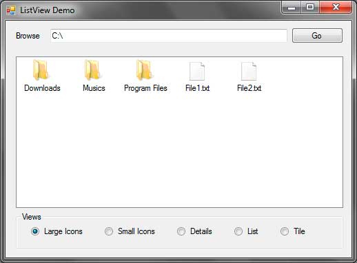
Extract the contents of the WinRAR file to a location that you can easily find. Create a new windows forms application and name it ListViewDemo. The following shows the GUI for the application that we will create.

| Label | Type | Name | Properties | |
|---|---|---|---|---|
| 1 | ListView | listViewFolderFiles | View | Details |
| SmallImageList | imageListSmallIcons | |||
| LargeImageList | imageListLargeIcons | |||
| 2 | TextBox | textBoxPath | Text | C: |
| 3 | Button | buttonGo | Text | Go |
| 4 | RadioButton | radioButtonLargeIcons | Text | Large Icons |
| 5 | RadioButton | radioButtonSmallIcons | Text | Small Icons |
| 6 | RadioButton | radioButtonDetails | Text | Details |
| Enabled | True | |||
| 7 | RadioButton | radioButtonList | Text | List |
| 8 | RadioButton | radioButtonTile | Text | Tile |
Figure 5
After constructing the GUI, we need to create two ImageList controls. An ImageList control is used to contain a collection of images to be used by other controls such as ListView or a menu. The images contained by the ImageList control should be of the same size. The ImageList control is located in the Components section of the ToolBox so drag two of them to the form. Notice that the controls are added to the component tray since they have no visual representation. Name the controls imageListSmallIcons and imageListLargeIcons.
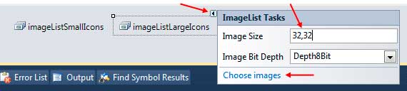
The imageListSmallIcons will contain small icons and the imageListLargeIcons contains icons that will be shown when the ListView is required to show the items with large icons. Let’s first add the images for the imageListLargeIcons. You will find a small square button with an arrow at the upper right of the control. Click it and change the image size to 32, 32 which means that we will be adding 32×32 pixel images.
Click Choose images to open the Image Collection Editor.
Click the Add button and browse for the folder where you placed the extracted images from the file you downloaded earlier. Select the folder_large.ico and files_large.ico files and click Open. The files will now show up in the Images Collection Editor. The up and down arrows in the middle allows you to change the index of each image which we will use later. Be sure that folder_large.ico is in the index 0.
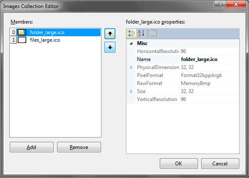
Click OK to add the images to the imageListLargeIcons. Do the same for the imageListSmallIcons. Leave the size to 16,16 and browse for the folder_small.ico and files_small.ico files. Also ensure that the folder_small.ico is at index 0.
The final step for preparing our GUI is to assign the ImageLists we created to the LargeImageList and SmallImageList properties of the ListView. In the properties window, find the LargeImageList property and click the drop down button then choose imageListLargeIcons. Do the same for the SmallImageList and use the imageListSmallIcons for it. We are now ready to add codes to our application.
Go to the code editor by pressing F7 while in the Designer. Import the System.IO namespace as we will use it later. Write the following method that will create the necessary columns for the ListView control.
private void CreateColumns()
{
    ColumnHeader filenameHeader = new ColumnHeader();
    filenameHeader.Text = "Filaname";
    filenameHeader.Width = 150;
    listViewFolderFiles.Columns.Add(filenameHeader);

    ColumnHeader lastAccessTimeHeader = new ColumnHeader("Last Accessed");
    lastAccessTimeHeader.Text = "Last Accessed";
    lastAccessTimeHeader.Width = 150;
    listViewFolderFiles.Columns.Add(lastAccessTimeHeader);

    ColumnHeader sizeHeader = new ColumnHeader("Size");
    sizeHeader.Text = "Size";
    sizeHeader.Width = 80;
    listViewFolderFiles.Columns.Add(sizeHeader);
}
Example 1 – CreateColumns() Method
We created 3 ColumnHeaders for the ListView control. The first column will show the File and Directory names. The second shows the last access time of the file or directory, and the last one shows the size of every file. We also set the sizes of each column to appropriate size to occupy the text of the headers. We then use the Add() method of the Columns property of the ListView to add the headers to the control.
Write the following method which will handle the showing of the files and directories to the ListView.
private void ShowItemsOfDirectory(string directory)
{
    DirectoryInfo currentDirectory = new DirectoryInfo(directory);
    DirectoryInfo[] subdirectories = currentDirectory.GetDirectories();
    FileInfo[] files = currentDirectory.GetFiles();

    listViewFolderFiles.Items.Clear();
    listViewFolderFiles.BeginUpdate();

    foreach (DirectoryInfo dir in subdirectories)
    {
        ListViewItem item = new ListViewItem();
        item.Text = dir.Name;
        item.ImageIndex = 0;

        ListViewItem.ListViewSubItem subitem = new ListViewItem.ListViewSubItem();
        subitem.Text = dir.LastAccessTime.ToString();
        item.SubItems.Add(subitem);

        subitem = new ListViewItem.ListViewSubItem();
        subitem.Text = String.Empty;
        item.SubItems.Add(subitem);

        listViewFolderFiles.Items.Add(item);
    }

    foreach (FileInfo file in files)
    {
        ListViewItem item = new ListViewItem();
        item.Text = file.Name;
        item.ImageIndex = 1;

        ListViewItem.ListViewSubItem subitem = new ListViewItem.ListViewSubItem();
        subitem.Text = file.LastAccessTime.ToString();
        item.SubItems.Add(subitem);

        subitem = new ListViewItem.ListViewSubItem();
        subitem.Text = (file.Length / 1000) + " KB";
        item.SubItems.Add(subitem);

        listViewFolderFiles.Items.Add(item);
    }

    listViewFolderFiles.EndUpdate();
}
Example 2 – ShowItemsOfDirectory() Method
The method has one parameter which is the path of the directory whose contents will be shown to the ListView. Line 3 creates a DirectoryInfo object based on the directory path passed to the method. We then extracted the subdirectories and files (lines 4-5) using the DirectoryInfo.GetDirectories() and DirectoryInfo.GetFiles() mehtods. Line 7 removes any existing items in the ListViewusing the Clear() method. In line 8, we used the BeginUpdate() method because we will begin the adding of rows to the ListViewcontrol.
Lines 10-25 uses a foreach loop to add every subdirectory of the given directory. Line 12 creates a ListViewItem which represents an item or row in the ListView. We used the Text property and assign the Name of the directory to show the name of the directory as the label for the item. Line 14 specifies the index of the image to use in the assigned ImageLists controls. We used the ImageIndexproperty of the ListViewItem and assigned zero because we placed the folder icon for both ImageLists at index 0. We then add the FullName which represents the full path of the directory to the Tag property because we will use it later in another method.
Every subsequent column is the ListViewItem‘s subitems. Since we have 3 columns, the last 2 columns are subitems of the first column. Line 16 creates a ListViewSubItem object. Note that ListViewSubItem is an inner class of the ListViewItem so you need to address this class as ListViewItem.ListViewSubItem. Line 17 assigns the LastAccessTime of the directory to the label of the second column. Line 18 adds the subitem to the SubItems property of the ListViewItem. A new instance of ListViewSubItem was created in line 20 for the third column. We won’t be showing the size of every subdirectory so we assigned String.Empty to the Text property of the third column. We also add it to the SubItems proeprty of the ListViewItem. Line 24 finally adds the full constructed ListViewItem to the Items property of the ListView.
Line 27-42 creates another foreach loop to enumerate the files in the given directory. The code is pretty much simillar to the first forloop except that we will now use 1 for the ImageIndex. Line 38 also assigns the size of the file to the label of the third column. Note that the size was converted to KB for a more practical look. After all the files has been added to the ListView, we called to EndUpdate() method to show the changes and the added rows to the ListView.
Modify the Form1() constructor to feature some line of code to feature codes that decision the CreateColumns() and ShowItemsOfDirectory()methods.
public Form1()
{
    InitializeComponent();

    CreateColumns();
    ShowItemsOfDirectory(textBoxPath.Text);
}
Line 6 calls the CreateColumns() method we created to create the three columns for our ListView. Line seven calls the ShowItemsOfDirectory() method and that we passed the text of textBoxPath which is initially C:.Therefore, when you run the program, the contents of C: are initially shown.
Go back to Designer and double click buttonGo and use the following event handler for its Click event.
private void buttonGo_Click(object sender, EventArgs e)
{
    ShowItemsOfDirectory(textBoxPath.Text);
}
When the user types a directory path in the text box, pressing buttonGo will show the contents of that directory.
Finally, we now need to add event handlers for the radio buttons that changes the view of the ListView control. Double click each of the radio buttons and simply assign the right View to the View property of the ListView.
private void radioButtonLargeIcons_CheckedChanged(object sender, EventArgs e)
{
    listViewFolderFiles.View = View.LargeIcon;
}

private void radioButtonSmallIcons_CheckedChanged(object sender, EventArgs e)
{
    listViewFolderFiles.View = View.SmallIcon;
}

private void radioButtonDetails_CheckedChanged(object sender, EventArgs e)
{
    listViewFolderFiles.View = View.Details;
}

private void radioButtonList_CheckedChanged(object sender, EventArgs e)
{
    listViewFolderFiles.View = View.List;
}

private void radioButtonTile_CheckedChanged(object sender, EventArgs e)
{
    listViewFolderFiles.View = View.Tile;
}
Run the program and you will see that the contents of C: are initially shown. Type another directory and press Go to check its contents. Change the view of the ListView using the radio buttons to see how each View looks.

Although Microsoft documentation for the ListView class is well written along with many code snippets on the Internet there are no well-rounded code samples to follow for populating a ListView control from start to finish reading from a data source.
The following C# code samples provide guidance to populate a ListView from both SQL-Server database table and Json files. Focus is on working with ListView control in Details view, ListView Groups and checked rows.
Framework used
This article is a port from a Microsoft TechNet article written by back when .NET Framework was current so all accept one project is .NET Framework 4.7.2.
One project was ported by first creating a NET8 Windows forms project. BasicListViewGroupsExample was ported to BasicListViewGroupsExampleCore.
Open the designer of a form in the old project, copied code to a form in the new project, deleted event handlers. Reloaded the new project and the forms match those of the old project.
Even those the old backend code to read from a database would work, the code was rewritten using Dapper. Had to add two column aliases in SQL SELECT statements and everything worked.
So if one of the older projects needs to be ported to NET Core either use the steps above or use Microsoft upgrade assistant.
Source code
Clone the following GitHub repository.
Basic setting: ListView control at design time
With a Window form selected and the Toolbox visible double click on a ListView, resize the ListView to accommodate data intended to populate the ListView. On the top right-hand corner of the ListView single click the chevron. From the view dropdown select Details. Click “Edit columns”. For each item .e.g. first name, last name click the “Add” button, name the column e.g. FirstNameColumn, set the Text property e.g. First Name, when done press OK. Don’t be concerned with column width at this time, this will be done later.
Basic detail view: Contacts Example
Create a class which represents data read from a database table. In the following example customer contacts of type owner will be the target for the first example. This class is a partial representation of several joined tables.
public class Contact
{
    public int CustomerIdentifier { get; set; }
    public string CompanyName { get; set; }
    public string FirstName { get; set; }
    public string LastName { get; set; }
    public string PhoneTypeDescription { get; set; }
    public string PhoneNumber { get; set; }
    public string CountryName { get; set; }
    public string[] ItemArray => new[]
    {
        CompanyName,
        FirstName,
        LastName,
        PhoneNumber,
        CountryName
    };
}
Enter fullscreen mode
Exit fullscreen mode
The ItemArray property will be used to add items to the ListView as the Add method accepts an array of items. The follow method is in a class solely responsible for reading data from a SQL-Server database.
Note
that the WHERE condition is hard coded, this could be rigged up to accept a int parameter to represent the contact type.
public List<Contact> GetOwnerContacts()
{
    mHasException = false;
    var ownerContacts = new List<Contact>();


    var selectStatement =
        @"
        SELECT   Cust.CustomerIdentifier ,
                 Cust.CompanyName ,
                 cont.FirstName ,
                 cont.LastName ,
                 PT.PhoneTypeDescription ,
                 CCD.PhoneNumber ,
                 Countries.CountryName
        FROM     Customers AS Cust
                 INNER JOIN dbo.Contact AS cont ON Cust.ContactIdentifier =
                    cont.ContactIdentifier
                 INNER JOIN dbo.ContactContactDevices AS CCD ON cont.ContactIdentifier =
                    CCD.ContactIdentifier
                 INNER JOIN dbo.PhoneType AS PT ON CCD.PhoneTypeIdenitfier =
                    PT.PhoneTypeIdenitfier
                 INNER JOIN dbo.Countries ON Cust.CountryIdentfier = Countries.id
        WHERE    ( Cust.ContactTypeIdentifier = 7 )
        ORDER BY Cust.CompanyName;";


    using (var cn = new SqlConnection() { ConnectionString = ConnectionString })
    {
        using (var cmd = new SqlCommand() { Connection = cn })
        {
            try
            {
                cn.Open();

                cmd.CommandText = selectStatement;

                var reader = cmd.ExecuteReader();
                while (reader.Read())
                {
                    ownerContacts.Add(new Contact()
                    {
                        CustomerIdentifier = reader.GetInt32(0),
                        CompanyName = reader.GetString(1),
                        FirstName = reader.GetString(2),
                        LastName = reader.GetString(3),
                        PhoneTypeDescription = reader.GetString(4),
                        PhoneNumber = reader.GetString(5),
                        CountryName = reader.GetString(6)
                    }) ;
                }

            }
            catch (Exception e)
            {
                mHasException = true;
                mLastException = e;
            }
        }
    }

    return ownerContacts;
}
Enter fullscreen mode
Exit fullscreen mode
In the form with the ListView, in form shown event a new instance of the data class is created followed by call the method above. To ensure that any screen updates are not shown (from adding and resizing columns) BeginUpdate is invoked before adding items to the ListView. If there is a chance of a runtime exception the code between BeginUpDate and the line above EndUpdate may be wrapped in a try-finally statement so that the ListView is partly populated is in working order although the ListView may be unstable so better to prevent any other operations to proceed as seen fit.
private void Form1_Shown(object sender, EventArgs e)
{
    var dataOperations = new SqlInformation();
    var contacts = dataOperations.GetOwnerContacts();

    ownerContactListView.BeginUpdate();
    foreach (var contact in contacts)
    {

        ownerContactListView.Items.Add(
            new ListViewItem(contact.ItemArray)
            {
                Tag = contact.CustomerIdentifier
            });

    }

    ownerContactListView.AutoResizeColumns(ColumnHeaderAutoResizeStyle.HeaderSize);
    ownerContactListView.EndUpdate();

    ownerContactListView.FocusedItem = ownerContactListView.Items[0];
    ownerContactListView.Items[0].Selected = true;
    ActiveControl = ownerContactListView;

}
Enter fullscreen mode
Exit fullscreen mode
During the iteration of contacts a new row is added to the ListView using an overload which accepts an object array which is possible using the Contact ItemArray method. Rather then create an instance of a ListViewItem as a variable and then passing the variable to the Add method it’s more efficient to simple add the item directly in the add method. The Tag property is set to the primary key of the contact which is available later to get more information from the database tables. In the following code sample the Tag property for the current item is cast to a integer which can be used to reference back to the table customers.
var id = Convert.ToInt32(ownerContactListView.SelectedItems[0]
    .Tag
    .ToString());
Enter fullscreen mode
Exit fullscreen mode
Sizing of columns is performed using the following line which sizes per data which has been added to the ListView.
ownerContactListView.AutoResizeColumns(ColumnHeaderAutoResizeStyle.HeaderSize);
Enter fullscreen mode
Exit fullscreen mode
To get details for the current ListView Item, in this case the ListView MouseDoubleClick event. The contact and phone will be displayed in a message dialog.
private void ListView1_MouseDoubleClick(object sender, MouseEventArgs e)
{
    MessageBox.Show(
        $"Call {ownerContactListView.SelectedItems[0].Text} at " +
        $"{ownerContactListView.SelectedItems[0].SubItems[3].Text}");
}
Enter fullscreen mode
Exit fullscreen mode

Basic Detail view with grouping: Products/Category example
In a conventional view for selecting products a DataGridView is used with a filtering mechanism to show one category at a time while an alternate approach would be to group products by category which a standard DataGridView is not capable of without a fair amount of custom coding or a third party grid control. A ListView is the perfect fit when multiple groups (or in this case categories) need to be displayed together.
Step 1: Obtain items which represent groups
This demonstration groups products by categories. The following class is used to create a list for working with groups.
public class Category
{
    public int CategoryId { get; set; }
    public string Name { get; set; }
    public override string ToString()
    {
        return Name;
    }
}
Enter fullscreen mode
Exit fullscreen mode
In the form shown event the data class is created and a call is made to obtain categories.
var dataOperations = new SqlInformation();
var categories = dataOperations.Categories();
Enter fullscreen mode
Exit fullscreen mode
Code to obtain categories from a database table.
public List<Category> Categories()
{
    mHasException = false;

    var categoryList = new List<Category>();
    var selectStatement = "SELECT CategoryID,CategoryName FROM dbo.Categories";

    using (var cn = new SqlConnection() {ConnectionString = ConnectionString})
    {
        using (var cmd = new SqlCommand() {Connection = cn})
        {
            cmd.CommandText = selectStatement;
            try
            {
                cn.Open();
                var reader = cmd.ExecuteReader();
                while (reader.Read())
                {
                    categoryList.Add(new Category()
                    {
                        CategoryId = reader.GetInt32(0),
                        Name = reader.GetString(1)
                    });
                }
            }
            catch (Exception e)
            {
                mHasException = true;
                mLastException = e;
            }
        }
    }

    return categoryList;
}
Enter fullscreen mode
Exit fullscreen mode
Step 2: Populate ListView
For each category products for the current category are read from the database tables using the following method in the data class.
public List<Product> Products(int pIdentifier)
{
    mHasException = false;

    var productList = new List<Product>();

    var selectStatement =
        @"
        SELECT   P.ProductID ,
                 P.ProductName ,
                 P.SupplierID ,
                 S.CompanyName AS Supplier ,
                 S.Phone ,
                 P.CategoryID ,
                 P.UnitPrice ,
                 P.UnitsInStock
        FROM     dbo.Products AS P
                 INNER JOIN dbo.Suppliers AS S ON P.SupplierID = S.SupplierID
        WHERE    P.CategoryID = @CategoryIdentifier
        ORDER BY P.ProductName;";

    using (var cn = new SqlConnection() {ConnectionString = ConnectionString})
    {
        using (var cmd = new SqlCommand() {Connection = cn})
        {
            cmd.CommandText = selectStatement;
            cmd.Parameters.AddWithValue("@CategoryIdentifier", pIdentifier);

            try
            {
                cn.Open();
                var reader = cmd.ExecuteReader();
                while (reader.Read())
                {

                    productList.Add(new Product()
                    {
                        ProductId = reader.GetInt32(0),
                        ProductName = reader.GetString(1),
                        SupplierId = reader.GetInt32(2),
                        Supplier = reader.GetString(3),
                        Phone = reader.GetString(4),
                        CategoryId = reader.GetInt32(5),
                        UnitPrice = reader.GetDecimal(6),
                        UnitsInStock = reader.GetInt16(7)
                    });

                }
            }
            catch (Exception e)
            {
                mHasException = true;
                mLastException = e;
            }
        }
    }

    return productList;
}
Enter fullscreen mode
Exit fullscreen mode
Definition of the Product class.
public class Product
{
    public int ProductId { get; set; }
    public string ProductName { get; set; }
    public int SupplierId { get; set; }
    public string Supplier { get; set; }
    public string Phone { get; set; }
    public int CategoryId { get; set; }
    public decimal? UnitPrice { get; set; }
    public int UnitsInStock { get; set; }
    /// <summary>
    /// Container for ListView item to store primary keys
    /// </summary>
    public ProductTag IdentifiersTag => new ProductTag()
    {
        CategoryId = CategoryId,
        SupplierId = SupplierId,
        ProductId = ProductId
    };

    public override string ToString()
    {
        return $"{ProductName}";
    }
}
Enter fullscreen mode
Exit fullscreen mode
Note IdentifiersTag property contains primary and foreign keys for use later if needed to query for more information of fields not obtained in the read operation above or for when edits are needed.
public class ProductTag
{
    public int ProductId { get; set; }
    public int SupplierId { get; set; }
    public int CategoryId { get; set; }
}
Enter fullscreen mode
Exit fullscreen mode
Once products have been returned from the database a name is composed for the current group which becomes the name of the group (ListViewGroup) along with a indexer to keep group names unique. Unlike the first example which used an array to populate a list item this example sets each sub-item directly in the constructor for adding a new item along with assigning the group and within the Tag property keys for referencing back to the tables in the database.
For some simple formatting if a product has nothing in stock the units in stock has a foreground color of bold red. Finally the list item is added to the ListView.
private void Form1_Shown(object sender, EventArgs e)
{
    var dataOperations = new SqlInformation();
    var categories = dataOperations.Categories();

    var categoryIndex = 1;

    // ReSharper disable once TooWideLocalVariableScope
    var groupName = "";

    foreach (var category in categories)
    {
        var products = dataOperations.Products(category.CategoryId);

        /*
         * Some category names have unwanted characters and/or whitespace, remove these chars.
         */
        groupName = category.Name.Replace("/", "").Replace(" ", "");

        var currentGroup = new ListViewGroup(category.Name, HorizontalAlignment.Left)
        {
            Header = category.Name,
            Name = $"{groupName}Group{categoryIndex}"
        };

        categoryIndex += 1;

        ProductListView.Groups.Add(currentGroup);

        foreach (var product in products)
        {
            var listViewProductItem = new ListViewItem(new[]
            {
                product.ProductName,
                product.Supplier,
                product.Phone,
                product.UnitPrice.ToString(),
                product.UnitsInStock.ToString()
            }, -1)
            {
                Group = currentGroup,
                /*
                 * Contains primary and foreign keys for current product
                 */
                Tag = product.IdentifiersTag,
                /*
                 * Required to change font and ForeColor below
                 */
                UseItemStyleForSubItems = false
            };


            /*
             * Alter user that the product is not available.
             * Could have excluded the product, that would be dependent
             * on business requirements. Also reorder information could
             * be presented.
             */
            if (product.UnitsInStock == 0)
            {
                listViewProductItem.SubItems[4].ForeColor = Color.Red;

                listViewProductItem.SubItems[4].Font = new Font(
                    listViewProductItem.SubItems[4].Font.FontFamily,
                    listViewProductItem.SubItems[4].Font.Size, FontStyle.Bold);

            }

            ProductListView.Items.Add(listViewProductItem);
        }
    }

    ProductListView.FocusedItem = ProductListView.Items[0];
    ProductListView.Items[0].Selected = true;

    ActiveControl = ProductListView;

    ProductListView.ItemSelectionChanged += ProductListView_ItemSelectionChanged;
    ProductListView.ItemCheck += ProductListView_ItemCheck;

    GroupsComboBox.DataSource = ProductListView.Groups.Cast<ListViewGroup>().Select(lvg => lvg.Name).ToList();
}
Enter fullscreen mode
Exit fullscreen mode
Once all items have been added the first item is focused.
Screenshot

Checked rows
To add check boxes, select the ListView, select properties, find CheckBoxes and set to true.
Iterate checked rows
For this example the code is in a button click which writes results to the IDE output window while in a production all there would be a list to pass to business logic for processing.
/// <summary>
/// Demonstration for iterating a single ListViewGroup
/// by group name in ComboBox
/// </summary>
/// <param name="sender"></param>
/// <param name="e"></param>
private void GetGroupProductsButton_Click(object sender, EventArgs e)
{
    var specificGroup = ProductListView.Groups.Cast<ListViewGroup>()
        .FirstOrDefault(lvg => lvg.Name == GroupsComboBox.Text);

    for (int index = 0; index < specificGroup.Items.Count; index++)
    {
        var productTag = specificGroup.Items[index].ProductTag();
        Console.WriteLine($"Id: {productTag.ProductId} Product: {specificGroup.Items[index].Text}");
    }
}
Enter fullscreen mode
Exit fullscreen mode
Take note on var productTag = specificGroup.Items[index].ProductTag(); where ProductTag is a language extension method within the current project. This keeps the cast process out of sight for cleaner code in the form.
using System.Windows.Forms;
using SqlServerOperations.Classes;

namespace BasicListViewGroupsExample.LanguageExtensions
{
    /// <summary>
    /// Contains project specific extension methods
    /// </summary>
    public static class ListViewExtensions
    {
        /// <summary>
        /// Get primary and foreign keys for a product
        /// within a ListView
        /// </summary>
        /// <param name="sender"></param>
        /// <returns></returns>
        public static ProductTag ProductTag(this ListViewItem sender)
        {
            return (ProductTag) sender.Tag;
        }
    }
}
Enter fullscreen mode
Exit fullscreen mode
Another place the extension method is useful for is when traversing rows in the ListView, here other details may be obtained using the keys stored in the current item tag property. Here keys are simply displayed in labels.
private void ProductListView_ItemSelectionChanged(object sender, ListViewItemSelectionChangedEventArgs e)
{
    if (e.IsSelected)
    {
        var primaryKeys = e.Item.ProductTag();
        SelectionChangedLabel.Text =
            $"product: {primaryKeys.ProductId} " +
            $"{ProductListView.Items[e.ItemIndex].Text}";
    }
}
Enter fullscreen mode
Exit fullscreen mode
The following code shows how to collect checked row items into a child form.
private void SelectedProductsButton_Click(object sender, EventArgs e)
{
    var checkedItems = ProductListView.CheckedItems;

    if (checkedItems.Count > 0)
    {
        var sb = new StringBuilder();

        for (int index = 0; index < checkedItems.Count; index++)
        {
            var keys = checkedItems[index].ProductTag();

            sb.AppendLine(
                $"{keys.CategoryId}," +
                $"{checkedItems[index].Group.Header}," +
                $"{keys.ProductId}," +
                $"{checkedItems[index].Text}," +
                $"{keys.SupplierId}," +
                $"{checkedItems[index].SubItems[0].Text}");
        }

        /*
         * Show selected products, in a real application this data
         * would be sent to a method to process the products
         */

        var f = new SelectedProductsForm(sb.ToString());

        try
        {
            f.ShowDialog();
        }
        finally
        {
            f.Dispose();
        }
    }
    else
    {
        MessageBox.Show("No product(s) selected");
    }
}
Enter fullscreen mode
Exit fullscreen mode
Other examples
SQL-Server table columns and related tables
In the following example which follows the same code paths as the examples shown above a ListView is setup for displaying table column definitions and related tables.

The following class is responsible for table information.
public class ServerTableItem
{
    public string Table { get; set; }
    public string Field { get; set; }
    public Int16? FieldOrder { get; set; }
    public string DataType { get; set; }
    public Int16? Length { get; set; }
    public string Precision { get; set; }
    public Int32 Scale { get; set; }
    public string AllowNulls { get; set; }
    public string Identity { get; set; } = String.Empty;
    public string PrimaryKey { get; set; }
    public string ForeignKey { get; set; } = String.Empty;
    public string RelatedTable { get; set; }
    public string Description { get; set; }
    public override string ToString()
    {
        return Field;
    }
}
Enter fullscreen mode
Exit fullscreen mode
Warning for novice coders: Reading information is rather complicated!!!
- Using the SQL statement below, data is read into a DataTable
- Using Lambda group statement tables columns are grouped together by table name into an anonymous type.
- The result set above is iterated over and items are placed into a Dictionary of Dictionary<string, List<ServerTableItem>>
Method which returns table information explained above.
public Dictionary<string, List<ServerTableItem>> TableDependencies()
{
    mHasException = false;

    var informationTable = new DataTable();

    var selectStatement = @"
        SELECT  syso.name [Table],
                sysc.name [Field],
                sysc.colorder [FieldOrder],
                syst.name [DataType],
                sysc.[length] [Length],
                CASE WHEN sysc.prec IS NULL THEN 'NULL' ELSE CAST(sysc.prec AS VARCHAR) END [Precision],
        CASE WHEN sysc.scale IS null THEN '-' ELSE sysc.scale END [Scale],
        CASE WHEN sysc.isnullable = 1 THEN 'True' ELSE 'False' END [AllowNulls],
        CASE WHEN sysc.[status] = 128 THEN 'True' ELSE 'False' END [Identity],
        CASE WHEN sysc.colstat = 1 THEN 'True' ELSE 'False' END [PrimaryKey],
        CASE WHEN fkc.parent_object_id is NULL THEN 'False' ELSE 'True' END [ForeignKey],
        CASE WHEN fkc.parent_object_id is null THEN '(none)' ELSE obj.name  END [RelatedTable],
        CASE WHEN ep.value is NULL THEN '(none)' ELSE CAST(ep.value as NVARCHAR(500)) END [Description]
        FROM [sys].[sysobjects] AS syso
        JOIN [sys].[syscolumns] AS sysc on syso.id = sysc.id
        LEFT JOIN [sys].[systypes] AS syst ON sysc.xtype = syst.xtype and syst.name != 'sysname'
        LEFT JOIN [sys].[foreign_key_columns] AS fkc on syso.id = fkc.parent_object_id and
            sysc.colid = fkc.parent_column_id
        LEFT JOIN [sys].[objects] AS obj ON fkc.referenced_object_id = obj.[object_id]
        LEFT JOIN [sys].[extended_properties] AS ep ON syso.id = ep.major_id and sysc.colid =
            ep.minor_id and ep.name = 'MS_Description'
        WHERE syso.type = 'U' AND  syso.name != 'sysdiagrams'
        ORDER BY [Table], FieldOrder, Field;";

    using (var cn = new SqlConnection() {ConnectionString = ConnectionString})
    {
        using (var cmd = new SqlCommand() {Connection = cn})
        {
            cmd.CommandText = selectStatement;

            try
            {

                cn.Open();

                informationTable.Load(cmd.ExecuteReader());
            }
            catch (Exception e)
            {
                mHasException = true;
                mLastException = e;
            }

        }
    }

    var result = from row in informationTable.AsEnumerable()
        group row by row.Field<string>("Table") into grp
        select new
        {
            TableName = grp.Key,
            Rows = grp,
            Count = grp.Count()
        };

    var tableDictionary = new Dictionary<string, List<ServerTableItem>>();

    foreach (var topItem in result)
    {

        if (!tableDictionary.ContainsKey(topItem.TableName))
        {
            tableDictionary[topItem.TableName] = new List<ServerTableItem>();
        }

        foreach (var row in topItem.Rows)
        {
            tableDictionary[topItem.TableName].Add(new ServerTableItem()
            {
                Table = topItem.TableName,
                Field = row.Field<string>("Field"),
                FieldOrder = row.Field<short>("FieldOrder"),
                DataType = row.Field<string>("DataType"),
                Length = row.Field<short>("Length"),
                Precision = row.Field<string>("Precision"),
                Scale = row.Field<int>("Scale"),
                AllowNulls = row.Field<string>("AllowNulls"),
                Identity = row.Field<string>("Identity"),
                PrimaryKey = row.Field<string>("PrimaryKey"),
                ForeignKey = row.Field<string>("ForeignKey"),
                RelatedTable = row.Field<string>("RelatedTable"),
                Description = row.Field<string>("Description")
            });
        }
    }

    return tableDictionary;
}
Enter fullscreen mode
Exit fullscreen mode
The Dictionary returned above is set to a ComboBox data source where a BindingSource is required as a ComboBox.DataSource does not handle dictionaries.
private void Form1_Shown(object sender, EventArgs e)
{
    var items = _tableInformation.TableDependencies();
    tableInformationComboBox.DataSource = new BindingSource(items, null);
    tableInformationComboBox.DisplayMember = "Key";
}
Enter fullscreen mode
Exit fullscreen mode
When a selection is made from the ComboBox, clicking the associated button populates the ListView using a more drawn out method by adding SubItems rather than using an array to setup a ListViewItem.
Once the load process has completed the first item is selected followed by painting alternate rows in a light grey.
private void GetInformationButton_Click(object sender, EventArgs e)
{
    listView1.Items.Clear();

    var detailItems = ((KeyValuePair<string, List<ServerTableItem> >)
        tableInformationComboBox.SelectedItem);

    foreach (var serverTableItem in detailItems.Value)
    {
        var item = listView1.Items.Add(serverTableItem.FieldOrder.ToString());
        item.SubItems.Add(serverTableItem.Field);
        item.SubItems.Add(serverTableItem.DataType);
        item.SubItems.Add(serverTableItem.Length.ToString());
        item.SubItems.Add(serverTableItem.Precision);
        item.SubItems.Add(serverTableItem.Scale.ToString());
        item.SubItems.Add(serverTableItem.AllowNulls);
        item.SubItems.Add(serverTableItem.Identity);
        item.SubItems.Add(serverTableItem.PrimaryKey);
        item.SubItems.Add(serverTableItem.ForeignKey);
        item.SubItems.Add(serverTableItem.RelatedTable);

        item.Tag = serverTableItem.Description;
    }

    listView1.AutoResizeColumns(ColumnHeaderAutoResizeStyle.HeaderSize);
    listView1.FocusedItem = listView1.Items[0];
    listView1.Items[0].Selected = true;
    ActiveControl = listView1;

    /*
     * Shade alternate rows
     */
    var index = 0;
    var shadedBackgroundColor = Color.FromArgb(240, 240, 240);

    foreach (ListViewItem item in listView1.Items)
    {
        if (index++ % 2 != 1) continue;
        item.BackColor = shadedBackgroundColor;
        item.UseItemStyleForSubItems = true;
    }
}
Enter fullscreen mode
Exit fullscreen mode
Working with moving rows up/down
DEV article Windows form move items up/down in ListView and more
Summary
This article has presented the basics for adding items to a ListView from database tables and Json for detail view using groups and check boxes for learning how to do this in Windows Forms projects.
All projects were written with Framework 4.7 and to show how well code was written the author of this article duplicated BasicListViewGroupsExample project and ported to BasicListViewGroupsExampleCore.
Steps
- Open each form one by one in BasicListViewGroupsExample, copied designer code.
- Commented out event handlers when pasting code into BasicListViewGroupsExampleCore forms.
- Took SQL from the old project, placed them into the new projects
- Replaced connection and command objects with Dapper
- All code worked in the forms but made minor changes to enhance your learning expereince.
You currently have JavaScript disabled on your web browser.
This website uses JavaScript, and This web page needs JavaScript activated to work correctly.
Please active JavaScript on your web browser and then refresh this web page.
ListView
By Tim-Bo Tolbert, posted on Jan 07, 2022
The ListView control is found in the System.Windows.Forms namespace within the System.Windows.Forms.dll. In this blog post I am referring to the ListView control that is available in C# .NET-Core (.NET 6.0) with Visual Studio 2022 (although this code example might still work OK with older .NET versions).
The ListView control can be used to display a collection of items to the user, which the user can then view and select items from. The ListView control has five different view modes which can be set using the ListView control object’s View property: LargeIcon, Details, SmallIcon, List, and Tile (default is LargeIcon).
The ListViewItem class represents an Item within a ListView control. Each Item is displayed in the ListView control with Item text, along with optional image icons. Items can be displayed as large icons, as small icons, or as small icons in a vertical list.
Each Item can also have multiple SubItems, which contain additional information that is related to the parent Item. The Details view allows you to display the Item and its SubItems in a grid with column headers that identify the information of a SubItem. The Tile view can also display information about an Items SubItems, can can display the Item and its SubItems as a tile that contains a large icon next to the SubItems textual information.
Each Item and SubItem can be selected as one whole, so that if you select an Item’s SubItem then that Item will be selected. They can also be selected individually, allowing you to program some task to be performed when selected. Alternatively, setting the FullRowSelect property to True will the entire Item and its SubItems to be selected whenever one of an Items SubItems are selected.
Tip: When View mode is set to Design, set each Columns Width value to -2 to have that column immediately auto-size itself. The columns width value will immediately change to the new columns size value, therefore to auto-size the column again after adding new values to column cells then you will need to reapply the -2 value to the columns width property value again to again have it auto-size itself.
Example Source Code
This example uses a ListView control, along with a GroupBox control, three Label controls, a ComboBox control, two TextBox controls, and three Button controls.
To add the ListView control to your form, you can double click on its name (i.e. ListView) as listed in the Toolbox window panel within the Form editor window. Alternatively, you can single click on it and then drag and drop it onto your form, to position it more closer to where you want it to be positioned at. Once it is added to the form then it will appear on the forms surface area having default control values.
After you have added the ListView control to your form, then once you select it then you can view and edit that objects property values in the Properties window within the Forms editor window, where you can then change the controls Name, Items, and other properties as you desire.
In the following example, I added a ListView control to my form, and then resized it so that it fits the Form area as shown below. While it was still selected, I modified its properties in the following way. First, I changed the View property to Details. Then I set MultiSelect property to False. I then set GridLines property and FullRowSelect property to True. I then clicked on three dots in the Columns property field to open up the Columns editor window, and added three Columns («Title», «First Name», and «Last Name»). In the Events section of the Properties window, I double clicked on the ColumnClick and SelectedIndexChanged events to automatically cerate and link callback methods to those events. Afterwards, I added a GroupBox control and positioned it below the ListView control object on the form, and changed its Text property to have a string value of «Record». Inside it, I added a ComboBox control (having some items in its items collection), and two TextBox controls (one for First Name and one for Last Name), along with some Label controls to help identify them to the user. At the bottom of the Form I added three Button controls (for «New», «Update», and «Delete») and then double clicked each Button control to automatically create and link a callback method to their Click events:
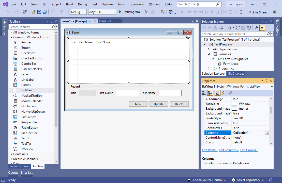
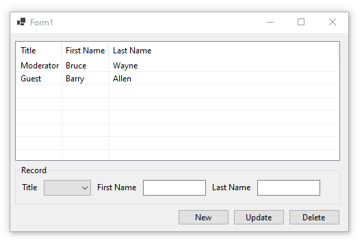
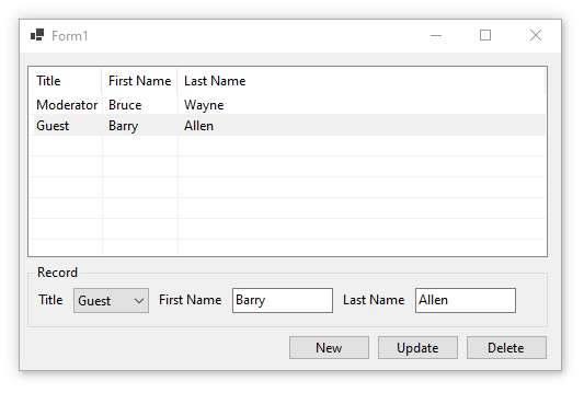
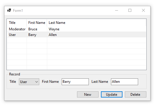
I then altered the Forms source code with the following code. I initialized the forms ListView object with a custom Column Sorter class, and then added two ListViewItems during the Form Load event. I added code to the ListView’s ColumnClick events callback method so that whenever the user clicks on one of the Column header’s then the custom Sorter class will sort the ListView control object by that Column. I added code to the ListView’s SelectedIndexChanged events callback method that whenever the user selects an item then that items values will be displayed in the Form. I then added source code to each of the three Button control objects Click even callback methods, one to create a new record and add it to the ListView, one to update the ListView’s selected record, and one to delete the ListView’s selected record. I then added a custom method to automatically resize the column widths whenever a record is created, edited, or deleted, and then added a call to it in all of the necessary places throughout the Forms source code. I then added the source code for the custom Sorter class itself and added it to the projects Namespace in the same file as and just below the Forms class:
// Copyright 2025 T&J Divisions, LLC
// All Rights Reserved
using System.Collections;
using System.Windows.Forms;
namespace TestProgram
{
public partial class Form1 : Form
{
private ListViewColumnSorter lvwColumnSorter;
public Form1()
{
InitializeComponent();
// Create an instance of a ListView column sorter and assign it to the ListView control.
lvwColumnSorter = new ListViewColumnSorter();
this.listView1.ListViewItemSorter = lvwColumnSorter;
}
void Form1_Load(object sender, EventArgs e)
{
// add item #1 to the listview
ListViewItem newItem1 = new ListViewItem();
newItem1.Text = "Moderator";
newItem1.SubItems.Add("Bruce");
newItem1.SubItems.Add("Wayne");
listView1.Items.Add(newItem1);
// add item #2 to the listview
ListViewItem newItem2 = new ListViewItem();
newItem2.Text = "Guest";
newItem2.SubItems.Add("Barry");
newItem2.SubItems.Add("Allen");
listView1.Items.Add(newItem2);
// resize the columns
resizeColumns();
}
private void resizeColumns()
{
// Loop through and set each column header width to -2 so that the column will auto-size itself to fit the cell contents.
foreach (ColumnHeader ch in this.listView1.Columns)
{
ch.Width = -2;
}
}
private void listView1_ColumnClick(object sender, ColumnClickEventArgs e)
{
// precheck to ensure it has more than 1 item to sort
if(listView1.Items.Count <= 1) { return; }
// Determine if clicked column is already the column that is being sorted.
if (e.Column == lvwColumnSorter.SortColumn)
{
// Reverse the current sort direction for this column.
if (lvwColumnSorter.Order == SortOrder.Ascending)
{
lvwColumnSorter.Order = SortOrder.Descending;
}
else
{
lvwColumnSorter.Order = SortOrder.Ascending;
}
}
else
{
// Set the column number that is to be sorted; default to ascending.
lvwColumnSorter.SortColumn = e.Column;
lvwColumnSorter.Order = SortOrder.Ascending;
}
// Perform the sort with these new sort options.
this.listView1.Sort();
}
private void listView1_SelectedIndexChanged(object sender, EventArgs e)
{
// init default values
string title = "";
string firstName = "";
string lastName = "";
// get the values of the selected record
if(listView1.SelectedItems != null && listView1.SelectedItems.Count > 0)
{
title = listView1.SelectedItems[0].SubItems[0].Text;
firstName = listView1.SelectedItems[0].SubItems[1].Text;
lastName = listView1.SelectedItems[0].SubItems[2].Text;
}
// display them in the Records group box controls
int itemIndex = cbTitle.Items.IndexOf(title);
cbTitle.SelectedIndex = itemIndex;
tbFirstName.Text = firstName;
tbLastName.Text = lastName;
}
private void buttonNew_Click(object sender, EventArgs e)
{
// precheck for values
if(tbFirstName.Text.Trim() == "" && tbLastName.Text.Trim() == "")
{
MessageBox.Show(this, "Blank or empty name is not allowed", "Error", MessageBoxButtons.OK, MessageBoxIcon.Error);
return;
}
// instantiate an instance of a new ListViewItem
ListViewItem newItem = new ListViewItem();
// set item the values
newItem.Text = cbTitle.Text;
newItem.SubItems.Add(tbFirstName.Text);
newItem.SubItems.Add(tbLastName.Text);
// add the item to the listview
listView1.Items.Add(newItem);
// select just this item in the listview
listView1.SelectedItems.Clear();
newItem.Selected = true;
// resize the columns to auto-fit
resizeColumns();
}
private void buttonUpdate_Click(object sender, EventArgs e)
{
// precheck to ensure something is selected
if (listView1.SelectedItems == null || listView1.SelectedItems.Count == 0)
{
MessageBox.Show(this, "You must first select an item to edit", "Error", MessageBoxButtons.OK, MessageBoxIcon.Error);
return;
}
// precheck for values
if (tbFirstName.Text.Trim() == "" && tbLastName.Text.Trim() == "")
{
MessageBox.Show(this, "Blank or empty name is not allowed", "Error", MessageBoxButtons.OK, MessageBoxIcon.Error);
return;
}
// get index of selected item
int itemIndex = listView1.SelectedItems[0].Index;
// update the selected item
listView1.Items[itemIndex].SubItems[0].Text = cbTitle.Text;
listView1.Items[itemIndex].SubItems[1].Text = tbFirstName.Text;
listView1.Items[itemIndex].SubItems[2].Text = tbLastName.Text;
// resize the columns to auto-fit
resizeColumns();
}
private void buttonDelete_Click(object sender, EventArgs e)
{
// precheck to ensure something is selected
if (listView1.SelectedItems == null || listView1.SelectedItems.Count == 0)
{
MessageBox.Show(this, "You must first select an item to delete", "Error", MessageBoxButtons.OK, MessageBoxIcon.Error);
return;
}
// get index of selected item
int itemIndex = listView1.SelectedItems[0].Index;
// remove the item at the specified index
listView1.Items.RemoveAt(itemIndex);
// resize the columns to auto-fit
resizeColumns();
}
}
/// <summary>
/// This class is an implementation of the 'IComparer' interface,
/// which we are using to sort the ListView by column.
/// </summary>
public class ListViewColumnSorter : IComparer
{
// Specifies the column to be sorted
private int ColumnToSort;
// Specifies the order in which to sort (i.e. 'Ascending').
private SortOrder OrderOfSort;
// Case insensitive comparer object
private CaseInsensitiveComparer ObjectCompare;
// Class constructor. Initializes various elements
public ListViewColumnSorter()
{
// Initialize the column to '0'
ColumnToSort = 0;
// Initialize the sort order to 'none'
OrderOfSort = SortOrder.None;
// Initialize the CaseInsensitiveComparer object
ObjectCompare = new CaseInsensitiveComparer();
}
/// <summary>
/// This method is inherited from the IComparer interface. It compares the two objects passed using a case insensitive comparison.
/// </summary>
/// <param name="x">First object to be compared</param>
/// <param name="y">Second object to be compared</param>
/// <returns>The result of the comparison. "0" if equal, negative if 'x' is less than 'y' and positive if 'x' is greater than 'y'</returns>
public int Compare(object x, object y)
{
int compareResult;
ListViewItem listviewX, listviewY;
// Cast the objects to be compared to ListViewItem objects
listviewX = (ListViewItem)x;
listviewY = (ListViewItem)y;
// Compare the two items
compareResult = ObjectCompare.Compare(listviewX.SubItems[ColumnToSort].Text, listviewY.SubItems[ColumnToSort].Text);
// Calculate correct return value based on object comparison
if (OrderOfSort == SortOrder.Ascending)
{
// Ascending sort is selected, return normal result of compare operation
return compareResult;
}
else if (OrderOfSort == SortOrder.Descending)
{
// Descending sort is selected, return negative result of compare operation
return (-compareResult);
}
else
{
// Return '0' to indicate they are equal
return 0;
}
}
/// <summary>
/// Gets or sets the number of the column to which to apply the sorting operation (Defaults to '0').
/// </summary>
public int SortColumn
{
set
{
ColumnToSort = value;
}
get
{
return ColumnToSort;
}
}
/// <summary>
/// Gets or sets the order of sorting to apply (for example, 'Ascending' or 'Descending').
/// </summary>
public SortOrder Order
{
set
{
OrderOfSort = value;
}
get
{
return OrderOfSort;
}
}
}
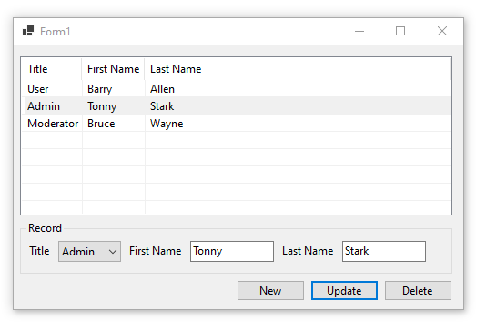
}When you run the above example then you should see something similar to the following:
Initial screen:
Select a record:
Update selected record:
Add new record:
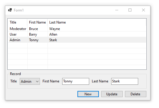
Sort by Title:
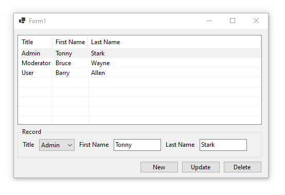
Sort by Last Name:
Final Thoughts
Thank you for reading, I hope you found this blog post (tutorial) educational and helpful.
- Details
- Written by David Corrales
- Last Updated: 23 January 2017
- Created: 04 April 2012
- Hits: 61436
ListView [System.Windows.Forms.ListView]
Represents a Windows list view control, which displays a collection of items that can be displayed using one of four different views.
Default Event: SelectedIndexChanged
Why use a ListView control?
The ListView is a hybrid display. It is more complex then a ListBox, but also can display data similar to a grid. A ListView control allows you to display a list of items with item text and, optionally, an icon to identify the type of item. For example, you could use the ListView to display icons in a similar fashion to the Window’s File Explorer.
See also: How to add icons to a ListView.
Important Properties:
View
This property indicates how items are displayed in the control. Use this property to set the style or view of the ListView control.
Select from the following views:
LargeIcon
Each item appears as a full-sized icon with a label below it.Details
Each item appears on a separate line with further information about each item arranged in columns. The left-most column contains a small icon and label, and subsequent columns contain sub items as specified by the application. A column displays a header which can display a caption for the column. The user can resize each column at run time.SmallIcon
Each item appears as a small icon with a label to its right.List
Each item appears as a small icon with a label to its right. Items are arranged in columns with no column headers.Tile
Each item appears as a full-sized icon with the item label and subitem information to the right of it. The subitem information that appears is specified by the application. This view is available only on Windows XP and the Windows Server 2003 family. On earlier operating systems, this value is ignored and the ListView control displays in the LargeIcon view.
Note: Some properties only pertain to particular views. The compatible views will be listed in each property’s description.
Alignment
This property indicates how items are aligned within the ListView.
Compatible Views: SmallIcon, LargeIcon
Default Value: Top
Default
When the user moves an item, it remains where it is dropped.Top
Items are aligned to the top of the ListView control.Left
Items are aligned to the left of the ListView control.SnapToGrid
Items are aligned to an invisible grid in the control. When the user moves an item, it moves to the closest juncture in the grid.
AllowColumnReorder
This property indicates whether the user can reorder column headers in the Details view. Set this property to True, the users the order of the column header, by dragging the header to the desired location.
Compatible Views: Details
Default Value: False
CheckBoxes
This property indicates whether a check box appears next to each item in the control.
Compatible Views: All except Tile
Default Value: False
When CheckBoxes is set to True, use the ItemChecked event to respond to an item’s checked state changes.
Columns
This property contains a collection of column headers that are displayed in the Details view.
Compatible Views: Details
You can access the ColumnHeader Collection Editor via the designer:
Or you can access the ColumnHeader Collection Editor via the Property Pane:
The ColumnHeader Collection Editor allows you to add / remove Columns as well as modify their properties:
The Columns collection is made up of the following object:
ColumnHeader [System.Windows.Forms.ColumnHeader ]
Property Description DisplayIndex This property indicates the display order of the column relative to the currently displayed columns ImageIndex This property indicates the index of the image displayed in the ColumnHeader. Text This property contains the text displayed in the column header. TextAlign This property determines the horizontal alignment of the text displayed in the ColumnHeader.
Values (Default: Left):
Left
The object or text is aligned on the left of the control element.Right
The object or text is aligned on the right of the control element.Center
The object or text is aligned in the center of the control element.Width This property determines the width of the column.
Set Width = -1, to adjust the width of the longest item in the column.
Set Width = -2, to auto size to the width of the column heading.
Note: When setting these special values, the control will automatically replace the Width with the calculated value.
You can use the Column’s Add method to add Columns via the script editor:
Add Methods:
[int] Add ([ColumnHeader] value)
Adds an existing ColumnHeader to the collection.
[ColumnHeader] Add ([String] text)
Creates and adds a column with the specified text to the collection.
[ColumnHeader] Add ([String] text, [int] width)
Creates and adds a column with the specified text and width to the collection.
[ColumnHeader] Add ([String] key, [String] text)
Creates and adds a column with the specified text and key to the collection.
[ColumnHeader] Add ([String] text, [int] width, [HorizontalAlignment] textAlign)
Adds a column header to the collection with specified text, width, and alignment settings.
[ColumnHeader] Add ([String] key, [String] text, [int] width)
Creates and adds a column with the specified text, key, and width to the collection.
[ColumnHeader] Add ([String] key, [String] text, [int] width, [HorizontalAlignment] textAlign, [int] imageIndex)
Creates and adds a column with the specified key, aligned text, width, and image index to the collection.
[ColumnHeader] Add ([String] key, [String] text, [int] width, [HorizontalAlignment] textAlign, [String] imageKey)
Creates and add s a column with the specified key, aligned text, width, and image key to the collection.
Example Use:
$columnApplication = $listview1.Columns.Add("Application")
$columnInstalled = $listview1.Columns.Add("Installed")
FullRowSelect
This property indicates whether all sub items are highlighted along with the item when selected.
Compatible Views: Details
Default Value: False
Selection without FullRowSelect:
Selection with FullRowSelect:
GridLines
This property indicates whether grid lines appear between the rows and columns containing the items and sub items in the control. The grid lines are only shown when in Details view.
Compatible Views: Details
Groups
This property contains a collection of ListViewGroup objects that are used by the control. Groups are very useful to display items in categories within the ListView.
Note: If there are groups defined and a item has no group set, it will go into the “Default” group.
Compatible Views: All except the List
You can access the Group Collection Editor via the Designer:
Or via the Property Pane:
The ListViewGroup Collection Editor allows you to add / remove groups:
The Group collection is made up of the following object:
ListViewGroup [System.Windows.Forms.ListViewGroup]
Property Description Header This property sets the header text for the group. HeaderAlignment This property sets the alignment of the group header text.
Values (Default: Left):
Left
The object or text is aligned on the left of the control element.Right
The object or text is aligned on the right of the control element.Center
The object or text is aligned in the center of the control element.
Adding groups via the Script Editor:
[int] Add ([ListViewGroup] group)
Adds the specified ListViewGroup to the collection.
[ListViewGroup] Add ([String] key, [String] headerText)
Adds a new ListViewGroup to the collection using the specified values to initialize the Name and Header properties
Example Use:
$listview1.Groups.Add("InstallGroup", "Installed")
ShowGroups
This property indicates whether items are displayed in groups.
Compatible Views: Details, LargeIcon, SmallIcon, Tile
Default Value: True
HeaderStyle
This property indicated the style of the column headers in the Details view. Use this property when you want to prevent the users from having the option to click on the headers. Typically you would want to sort the items when a user clicks on the header. You can respond to a header click by using the ListView’s ColumnClick event.
Compatible Views: Details
Values (Default: Clickable):
None
The column header is not displayed in report view.Nonclickable
The column headers do not respond to the click of a mouse.Clickable
The column headers function like buttons and can carry out an action, such as sorting, when clicked.
HideSelection
This property indicates whether the selected item in the control remains highlighted when the control loses focus.
Compatible Views: All
HotTracking
This property indicates whether the text of an item or subitem has the appearance of a hyperlink when the mouse pointer passes over it.
Enabling hot tracking will cause the Activation property to be set to OneClick and the HoverSelection property to be set to true. In addition, run-time label editing is not allowed when hot tracking is enabled.
Compatible Views: All
Default Value: False
LabelEdit
This property indicates whether the user can edit the labels of items in the control. Use the BeforeEditLabel and AfterEditLabel events in order react to when a user changes a label.
Compatible Views: All
Default Value: False
LargeImageList
This property contains the ImageList control used by the ListView for images in Large Icon view. For more information about the ImageList control, see See the Spotlight on the ImageList Control and How to add icons to a ListView.
Note: The index of the corresponding SmallImageList should be the same as the LargeImageList.
Compatible Views: LargeIcon
SmallImageList
This property contains the ImageList control used by the ListView for images in all views except for the Large Icon view. For more information about the ImageList control, see See the Spotlight on the ImageList Control and How to add icons to a ListView.
Compatible Views: SmallIcon, Detail, List, Tile
StateImageList
This property contains the ImageList control used by the ListView for custom states.
Note: If an ImageList is specified in the StateImageList property and the CheckBoxes property is set to true, the images at index positions 0 and 1 in the ImageList are displayed instead of the check box. The image at index position 0 is displayed instead of the unchecked check box, and the image at index position 1 is displayed instead of the checked check box.
Compatible Views: All
MultiSelect
This property indicating whether multiple items can be selected. If this property is set to true, use the SelectedItems property to determine which items are selected.
Compatible Views: All
Default Value: True
ShowItemToolTips
This property indicates whether ToolTips are shown for the ListViewItem objects contained in the ListView.
Compatible Views: All
Default Value: False
Sorting
This property indicates the manner in which items are to be sorted.
Default Value: None
None
The items are not sorted.Ascending
The items are sorted in ascending order.Descending
The items are sorted in descending order.
Compatible Views: All
SelectedItems
This property contains all the items that are selected in the ListView. Note: Each item is a ListViewItem object, so you will have to use the Text property to display the name. The ListViewItem will be addressed in Part 2.
#Display Selected Items
foreach($itemin$listview1.SelectedItems)
{
   Write-Host $item.Text
}
Items
This property contains a collection of all the items in the ListView. All items in a ListView are represented by a ListViewItem object:
ListViewItem [System.Windows.Forms.ListViewItem]
Property Description Checked This property indicates whether the item is checked. Text This property contains the displayed text of the item. ToolTipText This property contains the text shown when the mouse pointer rests on the ListViewItem. Group This property points to the group to which the item is assigned.
Set this property to any existing Group. All items with an unsigned Group will be show in the “Default” Group.ImageIndex This property indicates the index of the image that is displayed for the item. StateImageIndex This property indicates the index of the state image (an image such as a selected or cleared check box that indicates the state of the item) that is displayed for the item. SubItems This property is a collection containing all subitems of the item.
Compatible Views: Details, Tile
In the Details view the Subitems will be displayed only if Columns are defined.In the Tile view only the first SubItem will be displayed (below the Item’s text).
Adding Items to the ListView:
You can access the Items Collection Editor via the Designer:
Or via the Property Pane:
The ListViewItem Collection Editor allows you to add / remove Item as well set their properties:
Via the Script Editor:
[ListViewItem] Add ([ListViewItem] value)
Adds an existing ListViewItem to the collection.
[ListViewItem] Add ([String] text)
Creates an item with the specified text and adds it to the collection.
[ListViewItem] Add ([String] text, [Int] imageIndex)
Creates an item with the specified text and image and adds it to the collection.
[ListViewItem] Add ([String] text, [String] imageKey)
Creates an item with the specified text and image and adds it to the collection.
[ListViewItem] Add ([String] key, [String] text, [Int] imageIndex)
Creates an item with the specified key, text, and image and adds an item to the collection.
[ListViewItem] Add ([String] key, [String] text, [String] imageKey)
Creates an item with the specified key, text, and image and adds an item to the collection.
Example Use:
$listitem = $listview1.Items.Add(‘PowerShell Studio’ , 2)
Adding SubItems:
In the cases where you wish to add SubItems to the ListView you can add them using:
Via the ListViewItem Collection Editor:
By clicking on the SubItems property in the ListViewItem Collection Editor, you will be presented with a ListViewSubItem Collection Editor.
The only important property you need to set for a ListViewSubItemis the Text property.
Via the Script Editor:
The SubItems property has the following methods to add ListViewSubItems:
[ListViewSubItem] Add ([ListViewSubItem] item)
Adds an existing ListViewItem.ListViewSubItem to the collection.
[ListViewSubItem] Add ([String] text)
Adds a subitem to the collection with specified text.
[ListViewSubItem] Add ([String] text, [Color] foreColor, [Color] backColor, [Font] font)
Adds a subitem to the collection with specified text, foreground color, background color, and font settings.
Example Use:
$subItem = $listitem.SubItems.Add('Installed')
Important Methods:
Clear
This method removes all items and columns from the ListView.
$listview1.Clear()
BeginUpdate
This method prevents the control from drawing until the EndUpdate method is called. Use this method when you are updating or adding a large amount of items.
$listview1.BeginUpdate()
EndUpdate
This method resumes drawing of the list view control after drawing is suspended by the BeginUpdate method.
$listview1.EndUpdate()
Example use of the BeginUpdate and EndUpdate:
$listview1.BeginUpdate()
$listview1.Items.Clear();
foreach($itemin$array)
{
    [void]$listview1.Items.Add($item.Text)
}
$listview1.EndUpdate();
Important Events:
AfterLabelEdit
This event occurs when the label for an item has been edited by the user. Label editing must be enabled for this event to be called (See LabelEdit property).
AfterLabelEdit event uses the following argument, which is accessible via the $_ variable:
[System.Windows.Forms.LabelEditEventHandler]
Properties Description CancelEdit Gets or sets a value indicating whether the edit has been canceled. Label Gets the new text assigned to the label of the ListViewItem. Item Gets the zero-based index of the ListViewItem containing the label to edit.
Use this event to react to name changes. For example if the represents a file, you can use this event as a trigger for renaming the file. You should also perform any validation and reject the name change if there is a failure.
$listview1_AfterLabelEdit=[System.Windows.Forms.LabelEditEventHandler]{
    #Event Argument: $_ = [System.Windows.Forms.LabelEditEventArgs]
    if(-not (Validate-FileName$_.Label))
    {
        $_.CancelEdit =$true
    }
    else
    {
        #Rename the file
    }
}
BeforeLabelEdit
This event occurs when the user starts editing the label of an item.
This event uses the [System.Windows.Forms.LabelEditEventHandler] argument. See AfterLabelEdit for more information about this argument.
Use this event to prevent users from renaming specific items.
$listview1_BeforeLabelEdit=[System.Windows.Forms.LabelEditEventHandler]{
    #Event Argument: $_ = [System.Windows.Forms.LabelEditEventArgs]
    if(-not$listview1.Items[$_.Item].Checked)
    {
        $_.CancelEdit =$true
    }
}
ColumnClick
This event occurs when the user clicks a column header within the list view control. Typically you will use this event to sort the list by the selected column.
ColumnClick event uses the following argument, which is accessible via the $_ variable:
[System.Windows.Forms.ColumnClickEventArgs]
Properties Description Column Gets the zero-based index of the column that is clicked.
$listview1_ColumnClick=[System.Windows.Forms.ColumnClickEventHandler]{
    #Event Argument: $_ = [System.Windows.Forms.ColumnClickEventArgs]
    Write-Host ("Column '{0}' was clicked" -f $this.Columns[$_.Column].Text)
}
See Sorting ListViewItems for how to sort columns.
ItemActivate
This event occurs when an item is activated. One or more items can be activated by the user, depending on the Activate property. Note: Activating an item is not the same as selecting an item. For example, you may want to display a webpage when the user activates an item in the ListView. Use the SelectedItems or SelectedIndices property to referenced the activated item.
$listview1_ItemActivate={
    #TODO: Place custom script here
    Write-Host "Activate Item" $listview1.SelectedItems[0].Text
}
ItemChecked
This event occurs when the checked property of a ListView item changes.
ItemChecked event uses the following argument, which is accessible via the $_ variable:
[System.Windows.Forms.ItemCheckedEventArgs]
Properties Description Item Gets the ListViewItem whose checked state is changing.
$listview1_ItemChecked=[System.Windows.Forms.ItemCheckedEventHandler]{
    #Event Argument: $_ = [System.Windows.Forms.ItemCheckedEventArgs]
    if($_.Item.Checked)
    {
        Write-Host "Checked Item: $($_.Item.Text)"
    }
    else
    {
        Write-Host"Unchecked Item: $($_.Item.Text)"
    }
}
SelectedIndexChanged
This event occurs when the SelectedIndices collection changes. Use the event when you want to react to a change in the selection.
$listview1_SelectedIndexChanged={
    Write-Host "Selection Changed"
}
ItemSelectionChanged
This event occurs when the selection state of an item changes. Use this event instead of the SelectedIndexChanged when you want to know the which item was selected or unselected.
ItemSelectionChanged event uses the following argument, which is accessible via the $_ variable:
[System.Windows.Forms.ListViewItemSelectionChangedEventArgs]
Properties Description Item Gets the item whose selection state has changed. IsSelected Gets a value indicating whether the item’s state has changed to selected. ItemIndex Gets the index of the item whose selection state has changed.
$listview1_ItemSelectionChanged=[System.Windows.Forms.ListViewItemSelectionChangedEventHandler]{
    #Event Argument: $_ = [System.Windows.Forms.ListViewItemSelectionChangedEventArgs]
    if($_.IsSelected)
    {
        Write-Host"Selected: $($_.Item.Text)"
    }
    else
    {
        Write-Host"UnSelected: $($_.Item.Text)"
    }
}
Sorting ListViewItems
The ListView supports basic sorting, but it only handles sorting by the first column. In case you want to sort using the content of other columns, you need to write some additional code. Typically you want to sort when a user clicks on a column header, so we will be using the ColumnClick event to trigger sorting.
Simple Solution:
The simplest way to change the sort items is to toggle the Sort property:
$listview1_ColumnClick=[System.Windows.Forms.ColumnClickEventHandler]{
    #Event Argument: $_ = [System.Windows.Forms.ColumnClickEventArgs]
    if($this.Sorting -eq'Ascending')
    {
        $this.Sorting ='Descending'
    }
}
The problem with this simplistic approach is that it doesn’t take into account which column was clicked. In this case, the Sorting property just doesn’t cut it, unless you only have one column.
Possible Alternative Solution:
Next you can try to create your own sort procedure in PowerShell depending on the column clicked.
You can manually sort the items by doing the following:
$listview1_ColumnClick=[System.Windows.Forms.ColumnClickEventHandler]{
#Event Argument: $_ = [System.Windows.Forms.ColumnClickEventArgs]

    $array = New-Object System.Collections.ArrayList

    foreach($item in $listview1.Items)
    {
        $psobject = New-Object PSObject
        $psobject | Add-Member -type 'NoteProperty' -Name 'Text'`
        -value $item.SubItems[$_.Column].Text
        $psobject | Add-Member -type 'NoteProperty' -Name 'ListItem'`
        -value $item
        $array.Add($psobject)
    }

    $array = ($array | Sort-Object -Property Text)

    $listview1.BeginUpdate()

    $listview1.Items.Clear();

    foreach($item in $array)
    {
        $listview1.Items.Add($item.ListItem)
    }

    $listview1.EndUpdate();
}
Note: When you manually sorting the List, you will want to set the Sorting property to None.
In this sample, we are creating custom objects and adding them to a list. We use the custom property to sort our list and after we add the sorted Items back into the ListView. The down side to this method is that you lose any group associations, therefore you need to reassign them. Plus this method isn’t the most efficient way of sorting your items. You are probably better off sorting the original data and rebuilding the ListView again.
Final Solution:
The best solution is to use a ListViewItemSorter class. Unfortunately it requires you to create a custom C# class that will handle the item comparisons. Fortunately for you, we wrote our own custom class to handle the sorting for you. The get around creating a class in PowerShell (something it doesn’t support), we have to use Add-Type cmdlet. The Add-Type cmdlet dynamically compiles C# code and allows you to use the new class directly in PowerShell.
    Add-Type -ReferencedAssemblies ('System.Windows.Forms') -TypeDefinition  @"
    using System;
    using System.Windows.Forms;
    using System.Collections;
    public class ListViewItemComparer : IComparer
    {
        public int column;
        public SortOrder sortOrder;
        public ListViewItemComparer()
        {
            column = 0;
            sortOrder = SortOrder.Ascending;
        }
        public ListViewItemComparer(int column, SortOrder sort)
        {
            this.column = column;
            sortOrder = sort;
        }
        public int Compare(object x, object y)
        {
            if(column >= ((ListViewItem)x).ListView.Columns.Count ||
                column >= ((ListViewItem)x).SubItems.Count ||
                column >= ((ListViewItem)y).SubItems.Count)
                column = 0;

            if(sortOrder == SortOrder.Ascending)
                return String.Compare(((ListViewItem)x).SubItems[column].Text,`
 ((ListViewItem)y).SubItems[column].Text);
            else
                return String.Compare(((ListViewItem)y).SubItems[column].Text,`
 ((ListViewItem)x).SubItems[column].Text);
        }
    }
"@  | Out-Null
Our custom ListViewItemComparer class will act as a generic sorting class that will allow you to compare any column and choose in which direction to sort.
Next we created a PowerShell function that will allow you to sort the ListView by Column Index:
function Sort-ListViewColumn
{
    <#
    .SYNOPSIS
        Sort the ListView's item using the specified column.

    .DESCRIPTION
        Sort the ListView's item using the specified column.
        This function uses Add-Type to define a class that sort the items.
        The ListView's Tag property is used to keep track of the sorting.

    .PARAMETER ListView
        The ListView control to sort.

    .PARAMETER ColumnIndex
        The index of the column to use for sorting.

    .PARAMETER  SortOrder
        The direction to sort the items. If not specified or set to None, it will toggle.

    .EXAMPLE
        Sort-ListViewColumn -ListView $listview1 -ColumnIndex 0
#>
    param(
            [ValidateNotNull()]
            [Parameter(Mandatory=$true)]
            [System.Windows.Forms.ListView]$ListView,
            [Parameter(Mandatory=$true)]
            [int]$ColumnIndex,
            [System.Windows.Forms.SortOrder]$SortOrder = 'None')

    if(($ListView.Items.Count -eq 0) -or ($ColumnIndex -lt 0) -or ($ColumnIndex -ge $ListView.Columns.Count))
    {
        return;
    }

    #region Define ListViewItemComparer
        try{
        $local:type = [ListViewItemComparer]
    }
    catch{
    Add-Type -ReferencedAssemblies ('System.Windows.Forms') -TypeDefinition  @"
    using System;
    using System.Windows.Forms;
    using System.Collections;
    public class ListViewItemComparer : IComparer
    {
        public int column;
        public SortOrder sortOrder;
        public ListViewItemComparer()
        {
            column = 0;
            sortOrder = SortOrder.Ascending;
        }
        public ListViewItemComparer(int column, SortOrder sort)
        {
            this.column = column;
            sortOrder = sort;
        }
        public int Compare(object x, object y)
        {
            if(column >= ((ListViewItem)x).ListView.Columns.Count ||
                column >= ((ListViewItem)x).SubItems.Count ||
                column >= ((ListViewItem)y).SubItems.Count)
                column = 0;

            if(sortOrder == SortOrder.Ascending)
                return String.Compare(((ListViewItem)x).SubItems[column].Text,`
 ((ListViewItem)y).SubItems[column].Text);
            else
                return String.Compare(((ListViewItem)y).SubItems[column].Text,`
 ((ListViewItem)x).SubItems[column].Text);
        }
    }
"@  | Out-Null
    }
    #endregion

    if($ListView.Tag -is [ListViewItemComparer])
    {
        #Toggle the Sort Order
        if($SortOrder -eq [System.Windows.Forms.SortOrder]::None)
        {
            if($ListView.Tag.column -eq $ColumnIndex -and $ListView.Tag.sortOrder -eq 'Ascending')
            {
                $ListView.Tag.sortOrder = 'Descending'
            }
            else
            {
                $ListView.Tag.sortOrder = 'Ascending'
            }
        }
        else
        {
            $ListView.Tag.sortOrder = $SortOrder
        }

        $ListView.Tag.column = $ColumnIndex
        $ListView.Sort()#Sort the items
    }
    else
    {
        if($Sort -eq [System.Windows.Forms.SortOrder]::None)
        {
            $Sort = [System.Windows.Forms.SortOrder]::Ascending
        }

        #Set to Tag because for some reason in PowerShell ListViewItemSorter prop returns null
        $ListView.Tag = New-Object ListViewItemComparer ($ColumnIndex, $SortOrder)
        $ListView.ListViewItemSorter = $ListView.Tag #Automatically sorts
    }
}
The first part checks if the ListViewItemComparer types exists. If it doesn’t then it will use the Add-Type cmdlets to add the custom class. Next the functions stores new sorter class in the ListView’s Tag property, so it can track which direction and column it was lasted sorted. This way it can easily toggle between Ascending and Descending when you click the same column.
The last step is to simply call the Sort-ListViewColumn function from ColumnClick event:
$listviewApplications_ColumnClick=[System.Windows.Forms.ColumnClickEventHandler]{
#Event Argument: $_ = [System.Windows.Forms.ColumnClickEventArgs]
    Sort-ListViewColumn $this $_.Column
}
Now you need not worry about creating your own custom sorting script. Just call Sort-ListViewColumn and you’re done.
Sorted Columns:
ListView Help Function:
Here is a help function to add items to the ListView. It will handle the creation of ListViewItems for you.
function Add-ListViewItem
{

    Param(
    [ValidateNotNull()]
    [Parameter(Mandatory=$true)]
    [System.Windows.Forms.ListView]$ListView,
    [ValidateNotNull()]
    [Parameter(Mandatory=$true)]
    $Items,
    [int]$ImageIndex = -1,
    [string[]]$SubItems,
    [System.Windows.Forms.ListViewGroup]$Group,
    [switch]$Clear)

    if($Clear)
    {
        $ListView.Items.Clear();
    }

    if($Items -is [Array])
    {
        foreach ($item in $Items)
        {
            $listitem  = $ListView.Items.Add($item.ToString(), $ImageIndex)
            #Store the object in the Tag
            $listitem.Tag = $item

            if($SubItems -ne $null)
            {
                $listitem.SubItems.AddRange($SubItems)
            }

            if($Group -ne $null)
            {
                $listitem.Group = $Group
            }
        }
    }
    else
    {
        #Add a new item to the ListView
        $listitem  = $ListView.Items.Add($Items.ToString(), $ImageIndex)
        #Store the object in the Tag
        $listitem.Tag = $Items

        if($SubItems -ne $null)
        {
            $listitem.SubItems.AddRange($SubItems)
        }

        if($Group -ne $null)
        {
            $listitem.Group = $Group
        }
    }
}
Note: These helper functions are already included in PowerShell Studio.
We also created a sample form which demonstrates the ListView and column sorting. You can download the ListView sample.