
The ‘ListView’ control provides you the base to display a set of data items in a WPF (Windows Presentation Foundation) application in different layouts or views. In case you are working to show a dataset in your WPF app, this post will help you to get started with it.
In this blog post, we will learn about the ListView control with a basic layout followed by advance layout with a GridView. Continue reading further.
")
The ‘ListView‘ control part of the ‘System.Windows.Controls‘ namespace, represents a control that displays a list of data items. It is basically inherited from the basic ‘ListBox‘ control and as a result the basic ListView control actually looks just like a ListBox.
When you start adding specialized views to it, the List View starts adding more details and customization options to it.
A simple basic ListView control contains ListViewItem, where you can either display a simple string or can add complex items/elements in the view. As the ListViewItem derives from the ContentControl class, we can specify a WPF control as its content. A basic XAML code for ListView is as below:
When you go for an advance ListView, you can specify different layout/view as per your business need. You can also insert a GridView control as a view of the ListView control and display data items in a table and/or sort its columns.
To specify a view mode for the content of a ListView control, you have to set the View property. The GridView can have multiple GridViewColumn binded to your properties. The ‘Header’ property of the GridViewColumn sets the header text of the column. By using DisplayMemberBinding, you can data bind the column with your properties.
Here’s a simple GridView in a ListView control with few columns binded to the backend:
When you populate the data and run the above code example, you will see the app running with the data in a tabular form. This will just look like a data table or data grid. Here’s a screenshot of the sample code:
")
You can further customize it by tuning the template and exploring various properties that the control exposes.
Some points to remember:
- On the ListView control, you can use the ItemTemplate, ItemTemplateSelector and ItemContainerStyle properties.
- To avoid alignment issues between cells in a GridView, do not use the ItemContainerStyle to set properties or add content that affects the width of an item in a ListView.
- Do not use the HorizontalContentAlignment and VerticalContentAlignment properties for ListView content that is displayed by using a GridView.
- To specify the alignment of content in a column of a GridView, define a CellTemplate.
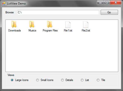
The ListView control (System.Windows.Forms.ListView) allows you to show a list of items in different views and add icons to each of them. The ListView control is composed of ListViewItems which form a grid-like structure of row and columns. Each ListViewItemhas a label and the every ListViewItem in the first column can have an icon beside them. One common use of the ListView control is to show a list of files and folders to the user. Figure 1 shows how a ListView will look like.

Figure 1 – ListView Example
You can see that the Windows Explorer uses a ListView to show files and folders. The one shown above uses the Details View, although there are more types of Views available such as Large Icons and Small Icons. The following tables shows some useful properties, methods, and events offered by the ListView control.
| Property | Description |
|---|---|
| Activation | Specifies how the user can activate an item in the ListView. Posible values are: OneClick: Activates an item using a single click. TwoClick: Activates an item using double click. Standard: Use the computer’s settings. |
| Alignment | Specifies the alignment of the items in the ListView. Possible values are: Default: Uses no alignment for the items. Left: Aligns the items to the left of the ListView. Top: Aligns the items to the top of the ListView. SnapToGrid: Creates an invisible grid where the items will snap to it. |
| AllowColumnReorder | Specifies whether the user can reorder the columns by dragging their column headers to the left or to the right. |
| AutoArrange | When set to true, items will automatically be arranged depending on the Alignment property. The effect can only be seen when using the LargeIcon or SmallIcon Views. |
| CheckBoxes | Specifies whether to show a checkbox to the left of each item when using the Details View. |
| CheckedIndices | Specifies a collection of indices of checked items. |
| CheckedItems | Specifies a collection of checked items. |
| Columns | Contains a collection of columns for the ListView and allows you to add or remove a column. |
| FocusedItem | Contains the item that is selected in the ListView. Returns null if nothing is selected. |
| FullRowSelect | Specifies whether to select the whole row when an item is clicked. |
| GridLines | Specifies whether to draw grid lines when the ListView is using the Details View. |
| HeaderStyle | Specifies the style of each column header. Possible values are: Clickable: Allows you to click the header just like a button. NonClickable: The header won’t respond to mouse clicks. None: The headers will be hidden. |
| HoverSelection | Specifies whether to select an item just by hovering your mouse pointer over it. |
| Items | Contains a collection of Items in the ListView. |
| LabelEdit | Specifies whether the user is able to edit the text of an item. |
| LabelWrap | Specifies whether the labels should wrap over multiple lines to occupy the text. |
| LargeImageList | Specifies the ImageList control that contains the icons to use when using the LargeIcon View. |
| MultiSelect | Specifies whether the user can select multiple items. |
| Scrollable | Specifies whether to show scrollbars. |
| SelectedIndices | Contians a collection of indices of selected items. |
| SelectedItems | Contains a collection of selected items. |
| ShowItemToolTips | Specifies whether to show tool tips for each item that has a ToolTip associated to it. |
| SmallImageList | Specifies the ImageList control that contains the icons to use when using the SmallIcon View. |
| Sorting | Allows the ListView to sort the items using one of these possible values: Ascending: Sorts the items in ascending order. Descending: Sorts the items in descending order. None: Do not sort the items. |
| StateImageList | Specifies the ImageList to use that determines the state of each item. When checkboxes are shown at the left or each item, the two images contained in the ImageList of this property replaces the unchecked and checked appearance of those checkboxes. |
| TopItem | Contains the item at the top of the ListView. |
| View | Specifies how the items are shown. Possible values are: LargeIcon: Items are displayed using 32×32 icons and a label. SmallIcon: Items are displayed using 16×16 icons and a label. List: Displays the items as a list with icons and labels. Details: Displays multiple columns that can contain information about the each item. Tile: Displays large icon and a label with sub-information for each of the items. |
Figure 2 – ListView Properties
| Method | Description |
|---|---|
| BeginUpdate | Tells the ListView to temporary stop drawing visual updates until EndUpdate() is called which prevents the control from flickering. |
| Clear | Removes all items in the ListView. |
| EndUpdate | Signals the ListView to draw all the updates. You can call this method after calling the BeginUpdate() method. |
| EnsureVisible | Automatically scrolls the ListView so the item with the index you specified is shown. |
| GetItemsAt | Gets the ListViewItem specified in position x, y (row, column). |
Figure 3 – ListView Methods
| Event | Description |
|---|---|
| AfterLabelEdit | Triggers after the editing of a label. |
| BeforeLabelEdit | Triggers before the user begins editing a label. |
| ColumnClick | Triggers when the user clicks a column. |
| ItemActivate | Triggers when the user activates or selects an item. |
Figure 4 – ListView Events
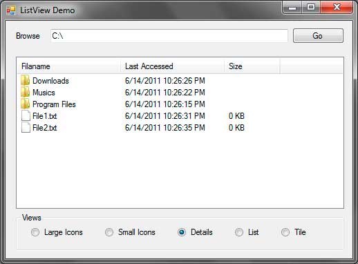
Now that you are familiar with the properties, methods, and events of the ListView control, let’s create a sample application that will demonstrate the capability of the ListView control. We will create a simple file browser that displays the contents of a specified directory. Each subdirectory will be represented by folders and files will be represented with a blank paper. You need to download the following .ico files that we will use in this exercise.
Extract the contents of the WinRAR file to a location that you can easily find. Create a new windows forms application and name it ListViewDemo. The following shows the GUI for the application that we will create.

| Label | Type | Name | Properties | |
|---|---|---|---|---|
| 1 | ListView | listViewFolderFiles | View | Details |
| SmallImageList | imageListSmallIcons | |||
| LargeImageList | imageListLargeIcons | |||
| 2 | TextBox | textBoxPath | Text | C: |
| 3 | Button | buttonGo | Text | Go |
| 4 | RadioButton | radioButtonLargeIcons | Text | Large Icons |
| 5 | RadioButton | radioButtonSmallIcons | Text | Small Icons |
| 6 | RadioButton | radioButtonDetails | Text | Details |
| Enabled | True | |||
| 7 | RadioButton | radioButtonList | Text | List |
| 8 | RadioButton | radioButtonTile | Text | Tile |
Figure 5
After constructing the GUI, we need to create two ImageList controls. An ImageList control is used to contain a collection of images to be used by other controls such as ListView or a menu. The images contained by the ImageList control should be of the same size. The ImageList control is located in the Components section of the ToolBox so drag two of them to the form. Notice that the controls are added to the component tray since they have no visual representation. Name the controls imageListSmallIcons and imageListLargeIcons.
The imageListSmallIcons will contain small icons and the imageListLargeIcons contains icons that will be shown when the ListView is required to show the items with large icons. Let’s first add the images for the imageListLargeIcons. You will find a small square button with an arrow at the upper right of the control. Click it and change the image size to 32, 32 which means that we will be adding 32×32 pixel images.
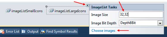
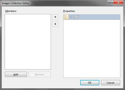
Click Choose images to open the Image Collection Editor.
Click the Add button and browse for the folder where you placed the extracted images from the file you downloaded earlier. Select the folder_large.ico and files_large.ico files and click Open. The files will now show up in the Images Collection Editor. The up and down arrows in the middle allows you to change the index of each image which we will use later. Be sure that folder_large.ico is in the index 0.
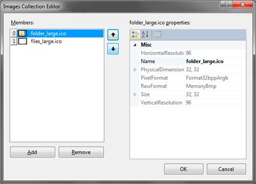
Click OK to add the images to the imageListLargeIcons. Do the same for the imageListSmallIcons. Leave the size to 16,16 and browse for the folder_small.ico and files_small.ico files. Also ensure that the folder_small.ico is at index 0.
The final step for preparing our GUI is to assign the ImageLists we created to the LargeImageList and SmallImageList properties of the ListView. In the properties window, find the LargeImageList property and click the drop down button then choose imageListLargeIcons. Do the same for the SmallImageList and use the imageListSmallIcons for it. We are now ready to add codes to our application.
Go to the code editor by pressing F7 while in the Designer. Import the System.IO namespace as we will use it later. Write the following method that will create the necessary columns for the ListView control.
private void CreateColumns()
{
    ColumnHeader filenameHeader = new ColumnHeader();
    filenameHeader.Text = "Filaname";
    filenameHeader.Width = 150;
    listViewFolderFiles.Columns.Add(filenameHeader);

    ColumnHeader lastAccessTimeHeader = new ColumnHeader("Last Accessed");
    lastAccessTimeHeader.Text = "Last Accessed";
    lastAccessTimeHeader.Width = 150;
    listViewFolderFiles.Columns.Add(lastAccessTimeHeader);

    ColumnHeader sizeHeader = new ColumnHeader("Size");
    sizeHeader.Text = "Size";
    sizeHeader.Width = 80;
    listViewFolderFiles.Columns.Add(sizeHeader);
}
Example 1 – CreateColumns() Method
We created 3 ColumnHeaders for the ListView control. The first column will show the File and Directory names. The second shows the last access time of the file or directory, and the last one shows the size of every file. We also set the sizes of each column to appropriate size to occupy the text of the headers. We then use the Add() method of the Columns property of the ListView to add the headers to the control.
Write the following method which will handle the showing of the files and directories to the ListView.
private void ShowItemsOfDirectory(string directory)
{
    DirectoryInfo currentDirectory = new DirectoryInfo(directory);
    DirectoryInfo[] subdirectories = currentDirectory.GetDirectories();
    FileInfo[] files = currentDirectory.GetFiles();

    listViewFolderFiles.Items.Clear();
    listViewFolderFiles.BeginUpdate();

    foreach (DirectoryInfo dir in subdirectories)
    {
        ListViewItem item = new ListViewItem();
        item.Text = dir.Name;
        item.ImageIndex = 0;

        ListViewItem.ListViewSubItem subitem = new ListViewItem.ListViewSubItem();
        subitem.Text = dir.LastAccessTime.ToString();
        item.SubItems.Add(subitem);

        subitem = new ListViewItem.ListViewSubItem();
        subitem.Text = String.Empty;
        item.SubItems.Add(subitem);

        listViewFolderFiles.Items.Add(item);
    }

    foreach (FileInfo file in files)
    {
        ListViewItem item = new ListViewItem();
        item.Text = file.Name;
        item.ImageIndex = 1;

        ListViewItem.ListViewSubItem subitem = new ListViewItem.ListViewSubItem();
        subitem.Text = file.LastAccessTime.ToString();
        item.SubItems.Add(subitem);

        subitem = new ListViewItem.ListViewSubItem();
        subitem.Text = (file.Length / 1000) + " KB";
        item.SubItems.Add(subitem);

        listViewFolderFiles.Items.Add(item);
    }

    listViewFolderFiles.EndUpdate();
}
Example 2 – ShowItemsOfDirectory() Method
The method has one parameter which is the path of the directory whose contents will be shown to the ListView. Line 3 creates a DirectoryInfo object based on the directory path passed to the method. We then extracted the subdirectories and files (lines 4-5) using the DirectoryInfo.GetDirectories() and DirectoryInfo.GetFiles() mehtods. Line 7 removes any existing items in the ListViewusing the Clear() method. In line 8, we used the BeginUpdate() method because we will begin the adding of rows to the ListViewcontrol.
Lines 10-25 uses a foreach loop to add every subdirectory of the given directory. Line 12 creates a ListViewItem which represents an item or row in the ListView. We used the Text property and assign the Name of the directory to show the name of the directory as the label for the item. Line 14 specifies the index of the image to use in the assigned ImageLists controls. We used the ImageIndexproperty of the ListViewItem and assigned zero because we placed the folder icon for both ImageLists at index 0. We then add the FullName which represents the full path of the directory to the Tag property because we will use it later in another method.
Every subsequent column is the ListViewItem‘s subitems. Since we have 3 columns, the last 2 columns are subitems of the first column. Line 16 creates a ListViewSubItem object. Note that ListViewSubItem is an inner class of the ListViewItem so you need to address this class as ListViewItem.ListViewSubItem. Line 17 assigns the LastAccessTime of the directory to the label of the second column. Line 18 adds the subitem to the SubItems property of the ListViewItem. A new instance of ListViewSubItem was created in line 20 for the third column. We won’t be showing the size of every subdirectory so we assigned String.Empty to the Text property of the third column. We also add it to the SubItems proeprty of the ListViewItem. Line 24 finally adds the full constructed ListViewItem to the Items property of the ListView.
Line 27-42 creates another foreach loop to enumerate the files in the given directory. The code is pretty much simillar to the first forloop except that we will now use 1 for the ImageIndex. Line 38 also assigns the size of the file to the label of the third column. Note that the size was converted to KB for a more practical look. After all the files has been added to the ListView, we called to EndUpdate() method to show the changes and the added rows to the ListView.
Modify the Form1() constructor to feature some line of code to feature codes that decision the CreateColumns() and ShowItemsOfDirectory()methods.
public Form1()
{
    InitializeComponent();

    CreateColumns();
    ShowItemsOfDirectory(textBoxPath.Text);
}
Line 6 calls the CreateColumns() method we created to create the three columns for our ListView. Line seven calls the ShowItemsOfDirectory() method and that we passed the text of textBoxPath which is initially C:.Therefore, when you run the program, the contents of C: are initially shown.
Go back to Designer and double click buttonGo and use the following event handler for its Click event.
private void buttonGo_Click(object sender, EventArgs e)
{
    ShowItemsOfDirectory(textBoxPath.Text);
}
When the user types a directory path in the text box, pressing buttonGo will show the contents of that directory.
Finally, we now need to add event handlers for the radio buttons that changes the view of the ListView control. Double click each of the radio buttons and simply assign the right View to the View property of the ListView.
private void radioButtonLargeIcons_CheckedChanged(object sender, EventArgs e)
{
    listViewFolderFiles.View = View.LargeIcon;
}

private void radioButtonSmallIcons_CheckedChanged(object sender, EventArgs e)
{
    listViewFolderFiles.View = View.SmallIcon;
}

private void radioButtonDetails_CheckedChanged(object sender, EventArgs e)
{
    listViewFolderFiles.View = View.Details;
}

private void radioButtonList_CheckedChanged(object sender, EventArgs e)
{
    listViewFolderFiles.View = View.List;
}

private void radioButtonTile_CheckedChanged(object sender, EventArgs e)
{
    listViewFolderFiles.View = View.Tile;
}
Run the program and you will see that the contents of C: are initially shown. Type another directory and press Go to check its contents. Change the view of the ListView using the radio buttons to see how each View looks.
I wanted to highlight some of the similarities and some of the differences of ListBox vs ItemsControl.
Similarites of ItemsControl, ListBox, and ListView
These two controls are similar in a few ways.
- All three are lists
- All three support binding ItemsSource to a list
- All three are ItemsControl objects as ListBox and ListView are descendants
Differences between ItemsControl, ListBox, and ListView
Inheritence
ItemsControl
ItemsControl uses an ItemsPresenter to present its children.
System.Object
System.Windows.Threading.DispatcherObject
System.Windows.DependencyObject
System.Windows.Media.Visual
System.Windows.UIElement
System.Windows.FrameworkElement
System.Windows.Controls.Control
System.Windows.Controls.ItemsControl
ListBox
A ListBox is an ItemsControl but an ItemsControl is not a list box. Notice a list box is a descendant of ItemsControl but has a Selector object, which is abstract, that it specifically derives from. Inheriting from Selector provides ListBox with selection events and selection features that are missing from ItemsControl. ListBox adds a SelectionMode Dependency Property that allows for selection types of Single, Multiple, or Extended, which are defined in a SelectionMode enum. It uses ListBoxItem as its default child.
…
System.Windows.Controls.ItemsControl
System.Windows.Controls.Primitives.Selector
System.Windows.Controls.ListBox
ListView
ListView inherits from ListBox, so it is everything a ListBox is plus it has a View Dependency Property and some functions supporting the View Dependency Property. It uses ListViewItem as its default child.
…
System.Windows.Controls.ItemsControl
System.Windows.Controls.Primitives.Selector
System.Windows.Controls.ListBox
System.Windows.Controls.ListView
Sizing and Scrolling
- ItemsControl takes as much space as it needs for its child elements, which can cause it to be larger than the screen. Because its size is based on its child controls, ItemsControl does not resize when re-sizing the screen.
- ListBox and ListView take up all the space available to them from the parent and no more. Because the size is based on the parent control size, ListBox and ListView resize with the screen.
- ItemsControl does not have a ScrollBar.
- ListBox has both a vertical and horizontal ScrollBar.
Note: I learned that if you want to have an ItemsControl, but you want to have the scrolling. Simply make a copy of the ListBox style and change its TargetType to ItemsControl and use that style.
Styles and Templates
Note: These default styles are obtained using Expresion Blend by right-clicking a Control and choosing Edit Template | Edit a copy.
ItemsControl Default Style
This style is short and simple.
<ResourceDictionary
	xmlns="http://schemas.microsoft.com/winfx/2006/xaml/presentation"
	xmlns:x="http://schemas.microsoft.com/winfx/2006/xaml">
	<Style x:Key="ItemsControlDefaultStyle" TargetType="{x:Type ItemsControl}">
		<Setter Property="Template">
			<Setter.Value>
				<ControlTemplate TargetType="{x:Type ItemsControl}">
					<Border BorderBrush="{TemplateBinding BorderBrush}" BorderThickness="{TemplateBinding BorderThickness}" Background="{TemplateBinding Background}" Padding="{TemplateBinding Padding}" SnapsToDevicePixels="true">
						<ItemsPresenter SnapsToDevicePixels="{TemplateBinding SnapsToDevicePixels}"/>
					</Border>
				</ControlTemplate>
			</Setter.Value>
		</Setter>
	</Style>
	<!-- Resource dictionary entries should be defined here. -->
</ResourceDictionary>
ListBox and ListView Default Style
ListBox and ListView have the same default style, with the only exception being the the TargetType, which is of course ListBox or ListView repectively.
Both have all the elements ItemsControl has, but also there are more Setters as Setters exist for the ScrollViewer and for the Border. ListBox and ListView styles also include a ScrollViewer in the ControlTemplate between the Border and the ItemsPresenter. ListBox and ListView also have a ControlTemplate.Triggers section.
<ResourceDictionary
	xmlns="http://schemas.microsoft.com/winfx/2006/xaml/presentation"
	xmlns:x="http://schemas.microsoft.com/winfx/2006/xaml">
	<SolidColorBrush x:Key="ListBorder" Color="#828790"/>
	<Style x:Key="ListBoxDefaultStyle" TargetType="{x:Type ListBox}">
		<Setter Property="Background" Value="{DynamicResource {x:Static SystemColors.WindowBrushKey}}"/>
		<Setter Property="BorderBrush" Value="{StaticResource ListBorder}"/>
		<Setter Property="BorderThickness" Value="1"/>
		<Setter Property="Foreground" Value="{DynamicResource {x:Static SystemColors.ControlTextBrushKey}}"/>
		<Setter Property="ScrollViewer.HorizontalScrollBarVisibility" Value="Auto"/>
		<Setter Property="ScrollViewer.VerticalScrollBarVisibility" Value="Auto"/>
		<Setter Property="ScrollViewer.CanContentScroll" Value="true"/>
		<Setter Property="ScrollViewer.PanningMode" Value="Both"/>
		<Setter Property="Stylus.IsFlicksEnabled" Value="False"/>
		<Setter Property="VerticalContentAlignment" Value="Center"/>
		<Setter Property="Template">
			<Setter.Value>
				<ControlTemplate TargetType="{x:Type ListBox}">
					<Border x:Name="Bd" BorderBrush="{TemplateBinding BorderBrush}" BorderThickness="{TemplateBinding BorderThickness}" Background="{TemplateBinding Background}" Padding="1" SnapsToDevicePixels="true">
						<ScrollViewer Focusable="false" Padding="{TemplateBinding Padding}">
							<ItemsPresenter SnapsToDevicePixels="{TemplateBinding SnapsToDevicePixels}"/>
						</ScrollViewer>
					</Border>
					<ControlTemplate.Triggers>
						<Trigger Property="IsEnabled" Value="false">
							<Setter Property="Background" TargetName="Bd" Value="{DynamicResource {x:Static SystemColors.ControlBrushKey}}"/>
						</Trigger>
						<Trigger Property="IsGrouping" Value="true">
							<Setter Property="ScrollViewer.CanContentScroll" Value="false"/>
						</Trigger>
					</ControlTemplate.Triggers>
				</ControlTemplate>
			</Setter.Value>
		</Setter>
	</Style>
	<!-- Resource dictionary entries should be defined here. -->
</ResourceDictionary>
Note: If you accidentally put ListBoxItems under ListView, the items are wrapped in a ListViewItem control which has its own margin, which will make the items move 5 pixels further to the right.
Choosing betweeen ItemsControl, ListBox, and ListView
Choosing an ItemsControl
It is pretty easy to choose between ItemsControl and either ListBox or ListView. If you do not want the ability to select a row or switch the View, use ItemsControl. Otherwise, use ListBox or ListView.
Choosing an ListBox
Also, if you need the select feature but you do not need to be able to switch the View, use ListBox.
Choosing an ListView
If you need to be able to switch the View, then choose ListView. It doesn’t matter if you need the ability to select or not.
You currently have JavaScript disabled on your web browser.
This website uses JavaScript, and This web page needs JavaScript activated to work correctly.
Please active JavaScript on your web browser and then refresh this web page.
ListView
By Tim-Bo Tolbert, posted on Jan 07, 2022
The ListView control is found in the System.Windows.Forms namespace within the System.Windows.Forms.dll. In this blog post I am referring to the ListView control that is available in C# .NET-Core (.NET 6.0) with Visual Studio 2022 (although this code example might still work OK with older .NET versions).
The ListView control can be used to display a collection of items to the user, which the user can then view and select items from. The ListView control has five different view modes which can be set using the ListView control object’s View property: LargeIcon, Details, SmallIcon, List, and Tile (default is LargeIcon).
The ListViewItem class represents an Item within a ListView control. Each Item is displayed in the ListView control with Item text, along with optional image icons. Items can be displayed as large icons, as small icons, or as small icons in a vertical list.
Each Item can also have multiple SubItems, which contain additional information that is related to the parent Item. The Details view allows you to display the Item and its SubItems in a grid with column headers that identify the information of a SubItem. The Tile view can also display information about an Items SubItems, can can display the Item and its SubItems as a tile that contains a large icon next to the SubItems textual information.
Each Item and SubItem can be selected as one whole, so that if you select an Item’s SubItem then that Item will be selected. They can also be selected individually, allowing you to program some task to be performed when selected. Alternatively, setting the FullRowSelect property to True will the entire Item and its SubItems to be selected whenever one of an Items SubItems are selected.
Tip: When View mode is set to Design, set each Columns Width value to -2 to have that column immediately auto-size itself. The columns width value will immediately change to the new columns size value, therefore to auto-size the column again after adding new values to column cells then you will need to reapply the -2 value to the columns width property value again to again have it auto-size itself.
Example Source Code
This example uses a ListView control, along with a GroupBox control, three Label controls, a ComboBox control, two TextBox controls, and three Button controls.
To add the ListView control to your form, you can double click on its name (i.e. ListView) as listed in the Toolbox window panel within the Form editor window. Alternatively, you can single click on it and then drag and drop it onto your form, to position it more closer to where you want it to be positioned at. Once it is added to the form then it will appear on the forms surface area having default control values.
After you have added the ListView control to your form, then once you select it then you can view and edit that objects property values in the Properties window within the Forms editor window, where you can then change the controls Name, Items, and other properties as you desire.
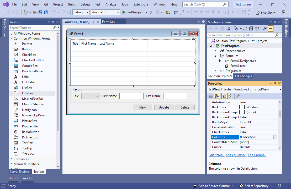
In the following example, I added a ListView control to my form, and then resized it so that it fits the Form area as shown below. While it was still selected, I modified its properties in the following way. First, I changed the View property to Details. Then I set MultiSelect property to False. I then set GridLines property and FullRowSelect property to True. I then clicked on three dots in the Columns property field to open up the Columns editor window, and added three Columns («Title», «First Name», and «Last Name»). In the Events section of the Properties window, I double clicked on the ColumnClick and SelectedIndexChanged events to automatically cerate and link callback methods to those events. Afterwards, I added a GroupBox control and positioned it below the ListView control object on the form, and changed its Text property to have a string value of «Record». Inside it, I added a ComboBox control (having some items in its items collection), and two TextBox controls (one for First Name and one for Last Name), along with some Label controls to help identify them to the user. At the bottom of the Form I added three Button controls (for «New», «Update», and «Delete») and then double clicked each Button control to automatically create and link a callback method to their Click events:
I then altered the Forms source code with the following code. I initialized the forms ListView object with a custom Column Sorter class, and then added two ListViewItems during the Form Load event. I added code to the ListView’s ColumnClick events callback method so that whenever the user clicks on one of the Column header’s then the custom Sorter class will sort the ListView control object by that Column. I added code to the ListView’s SelectedIndexChanged events callback method that whenever the user selects an item then that items values will be displayed in the Form. I then added source code to each of the three Button control objects Click even callback methods, one to create a new record and add it to the ListView, one to update the ListView’s selected record, and one to delete the ListView’s selected record. I then added a custom method to automatically resize the column widths whenever a record is created, edited, or deleted, and then added a call to it in all of the necessary places throughout the Forms source code. I then added the source code for the custom Sorter class itself and added it to the projects Namespace in the same file as and just below the Forms class:
// Copyright 2025 T&J Divisions, LLC
// All Rights Reserved
using System.Collections;
using System.Windows.Forms;
namespace TestProgram
{
public partial class Form1 : Form
{
private ListViewColumnSorter lvwColumnSorter;
public Form1()
{
InitializeComponent();
// Create an instance of a ListView column sorter and assign it to the ListView control.
lvwColumnSorter = new ListViewColumnSorter();
this.listView1.ListViewItemSorter = lvwColumnSorter;
}
void Form1_Load(object sender, EventArgs e)
{
// add item #1 to the listview
ListViewItem newItem1 = new ListViewItem();
newItem1.Text = "Moderator";
newItem1.SubItems.Add("Bruce");
newItem1.SubItems.Add("Wayne");
listView1.Items.Add(newItem1);
// add item #2 to the listview
ListViewItem newItem2 = new ListViewItem();
newItem2.Text = "Guest";
newItem2.SubItems.Add("Barry");
newItem2.SubItems.Add("Allen");
listView1.Items.Add(newItem2);
// resize the columns
resizeColumns();
}
private void resizeColumns()
{
// Loop through and set each column header width to -2 so that the column will auto-size itself to fit the cell contents.
foreach (ColumnHeader ch in this.listView1.Columns)
{
ch.Width = -2;
}
}
private void listView1_ColumnClick(object sender, ColumnClickEventArgs e)
{
// precheck to ensure it has more than 1 item to sort
if(listView1.Items.Count <= 1) { return; }
// Determine if clicked column is already the column that is being sorted.
if (e.Column == lvwColumnSorter.SortColumn)
{
// Reverse the current sort direction for this column.
if (lvwColumnSorter.Order == SortOrder.Ascending)
{
lvwColumnSorter.Order = SortOrder.Descending;
}
else
{
lvwColumnSorter.Order = SortOrder.Ascending;
}
}
else
{
// Set the column number that is to be sorted; default to ascending.
lvwColumnSorter.SortColumn = e.Column;
lvwColumnSorter.Order = SortOrder.Ascending;
}
// Perform the sort with these new sort options.
this.listView1.Sort();
}
private void listView1_SelectedIndexChanged(object sender, EventArgs e)
{
// init default values
string title = "";
string firstName = "";
string lastName = "";
// get the values of the selected record
if(listView1.SelectedItems != null && listView1.SelectedItems.Count > 0)
{
title = listView1.SelectedItems[0].SubItems[0].Text;
firstName = listView1.SelectedItems[0].SubItems[1].Text;
lastName = listView1.SelectedItems[0].SubItems[2].Text;
}
// display them in the Records group box controls
int itemIndex = cbTitle.Items.IndexOf(title);
cbTitle.SelectedIndex = itemIndex;
tbFirstName.Text = firstName;
tbLastName.Text = lastName;
}
private void buttonNew_Click(object sender, EventArgs e)
{
// precheck for values
if(tbFirstName.Text.Trim() == "" && tbLastName.Text.Trim() == "")
{
MessageBox.Show(this, "Blank or empty name is not allowed", "Error", MessageBoxButtons.OK, MessageBoxIcon.Error);
return;
}
// instantiate an instance of a new ListViewItem
ListViewItem newItem = new ListViewItem();
// set item the values
newItem.Text = cbTitle.Text;
newItem.SubItems.Add(tbFirstName.Text);
newItem.SubItems.Add(tbLastName.Text);
// add the item to the listview
listView1.Items.Add(newItem);
// select just this item in the listview
listView1.SelectedItems.Clear();
newItem.Selected = true;
// resize the columns to auto-fit
resizeColumns();
}
private void buttonUpdate_Click(object sender, EventArgs e)
{
// precheck to ensure something is selected
if (listView1.SelectedItems == null || listView1.SelectedItems.Count == 0)
{
MessageBox.Show(this, "You must first select an item to edit", "Error", MessageBoxButtons.OK, MessageBoxIcon.Error);
return;
}
// precheck for values
if (tbFirstName.Text.Trim() == "" && tbLastName.Text.Trim() == "")
{
MessageBox.Show(this, "Blank or empty name is not allowed", "Error", MessageBoxButtons.OK, MessageBoxIcon.Error);
return;
}
// get index of selected item
int itemIndex = listView1.SelectedItems[0].Index;
// update the selected item
listView1.Items[itemIndex].SubItems[0].Text = cbTitle.Text;
listView1.Items[itemIndex].SubItems[1].Text = tbFirstName.Text;
listView1.Items[itemIndex].SubItems[2].Text = tbLastName.Text;
// resize the columns to auto-fit
resizeColumns();
}
private void buttonDelete_Click(object sender, EventArgs e)
{
// precheck to ensure something is selected
if (listView1.SelectedItems == null || listView1.SelectedItems.Count == 0)
{
MessageBox.Show(this, "You must first select an item to delete", "Error", MessageBoxButtons.OK, MessageBoxIcon.Error);
return;
}
// get index of selected item
int itemIndex = listView1.SelectedItems[0].Index;
// remove the item at the specified index
listView1.Items.RemoveAt(itemIndex);
// resize the columns to auto-fit
resizeColumns();
}
}
/// <summary>
/// This class is an implementation of the 'IComparer' interface,
/// which we are using to sort the ListView by column.
/// </summary>
public class ListViewColumnSorter : IComparer
{
// Specifies the column to be sorted
private int ColumnToSort;
// Specifies the order in which to sort (i.e. 'Ascending').
private SortOrder OrderOfSort;
// Case insensitive comparer object
private CaseInsensitiveComparer ObjectCompare;
// Class constructor. Initializes various elements
public ListViewColumnSorter()
{
// Initialize the column to '0'
ColumnToSort = 0;
// Initialize the sort order to 'none'
OrderOfSort = SortOrder.None;
// Initialize the CaseInsensitiveComparer object
ObjectCompare = new CaseInsensitiveComparer();
}
/// <summary>
/// This method is inherited from the IComparer interface. It compares the two objects passed using a case insensitive comparison.
/// </summary>
/// <param name="x">First object to be compared</param>
/// <param name="y">Second object to be compared</param>
/// <returns>The result of the comparison. "0" if equal, negative if 'x' is less than 'y' and positive if 'x' is greater than 'y'</returns>
public int Compare(object x, object y)
{
int compareResult;
ListViewItem listviewX, listviewY;
// Cast the objects to be compared to ListViewItem objects
listviewX = (ListViewItem)x;
listviewY = (ListViewItem)y;
// Compare the two items
compareResult = ObjectCompare.Compare(listviewX.SubItems[ColumnToSort].Text, listviewY.SubItems[ColumnToSort].Text);
// Calculate correct return value based on object comparison
if (OrderOfSort == SortOrder.Ascending)
{
// Ascending sort is selected, return normal result of compare operation
return compareResult;
}
else if (OrderOfSort == SortOrder.Descending)
{
// Descending sort is selected, return negative result of compare operation
return (-compareResult);
}
else
{
// Return '0' to indicate they are equal
return 0;
}
}
/// <summary>
/// Gets or sets the number of the column to which to apply the sorting operation (Defaults to '0').
/// </summary>
public int SortColumn
{
set
{
ColumnToSort = value;
}
get
{
return ColumnToSort;
}
}
/// <summary>
/// Gets or sets the order of sorting to apply (for example, 'Ascending' or 'Descending').
/// </summary>
public SortOrder Order
{
set
{
OrderOfSort = value;
}
get
{
return OrderOfSort;
}
}
}
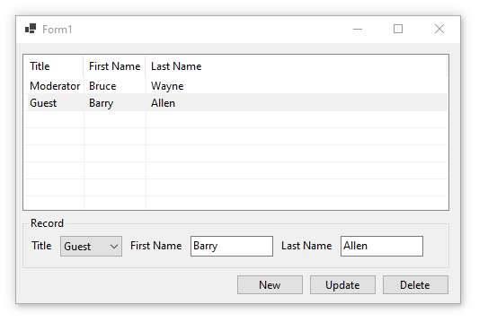
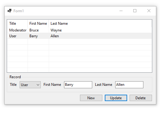
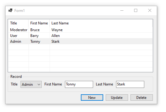
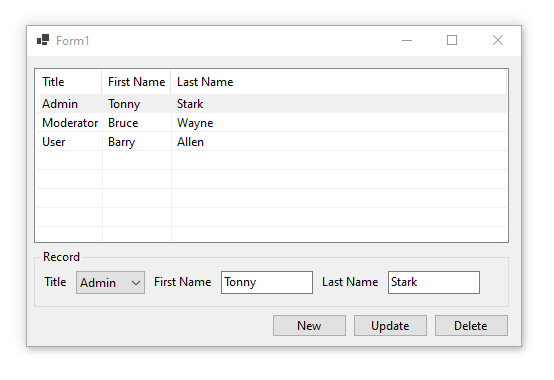
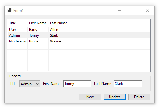
}When you run the above example then you should see something similar to the following:
Initial screen:
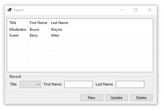
Select a record:
Update selected record:
Add new record:
Sort by Title:
Sort by Last Name:
Final Thoughts
Thank you for reading, I hope you found this blog post (tutorial) educational and helpful.

Inhaltsverzeichnis
- 1 The WPF ListView – listing items / things
- 2 What is a WPF ListView?
- 2.1 The definition, I guess?
- 2.2 Examining the ListView
- 2.3 Inheritance tree
- 3 A first example – with XAML & code behind
- 3.1 How to add items to the WPF ListView?
- 3.2 How to remove items from the ListView again?
- 3.3 How to delete the selected item in the ListView?
- 3.4 Okay, but not flexible, nor practical – imo
- 4 Working with „real data“ – MVVM approach
- 4.1 The „MusicArtist“ model class
- 5 Displaying bound data inside the WPF ListView
- 5.1 Preventing a known error
- 5.2 Giving the ListView its datasource
- 5.3 Creating a bindable property
- 5.4 Filling up some data
- 5.5 But it’s displaying rubbish now?
- 5.6 Overriding that „default-rubbish“
- 6 Using the ListViews „View“ Property creating columns
- 6.1 But why a ListView, why no DataGrid instead?
- 6.2 Specifying a „View“-template
- 6.3 Adding, removing, etc. the MVVM way – preparations
- 6.4 A DelegateCommand base class
- 6.5 A PropertyChangedBase class
- 6.6 Corresponding buttons
- 6.7 The MainViewModel
- 6.8 Assign a ViewModel to the MainWindow
- 6.9 How to add WPF ListView items with MVVM
- 6.10 Removing the selected item MVVM style
- 6.11 Deleting an item by index, MVVM like
- 7 Summing up
- 8 Downloads
The WPF ListView – listing items / things
In today’s post, we are going to talk about one of the most basic controls: The WPF ListView. We will take a look at the different use cases of the ListView and we will try out some of the architectural styles. As MVVM is like the „way to go“ in WPF, I will definitely examine this, but we won’t forget the „old way“. Like always, I will provide different source code examples in the two most used .NET languages, being C# and VB.NET.
What is a WPF ListView?
When stumbling upon this control, the first question coming to your mind could be: „Well, what is a ListView – in the Windows Presentation Foundation – in the first place?“. I mean, by the name, you could just assume, that it’s something for displaying like a „list“ of something, right? I mean, you are pretty much on the right side, but what makes it different from like a DataGrid, or even a ListBox? Don’t worry, we will cover this is a few minutes, further down below.
The definition, I guess?
Let’s first define, what a ListView really is by like definition:
A WPF ListView provides the basic tools needed, to help you displaying a set of data items. This can be easily done in like different views or layouts, depending on your usecase. Each item of those ListViews are displayed, using something called ListViewItem. A ListViewItem iteself is – more or less – just another template-ish element, being a ContentControl.
Examining the ListView
Let’s take a quick sneak peek into the inheritance-tree, of the WPF ListView Control, by pressing F12, while being on one of those with your mouse cursor. There you can see, that it actually inherits from the class ListBox.

Inheritance tree
Going further down, there are some other classes in the inheritance tree as well, like the Selector & the ItemsControl class. I think, for most persons, it’s actually a surprise / a „good to know“-thing, that the ListView actually inherits from the ListBox class.

At this point, you can see, that there’s pretty much going on in the background. The ListView itself is actually derived from a few levels of control hierarchy and is therefore bringing a lot „to the table“. For sure, we can’t go to every level in detail, but I think the most important ones for you are beginning at the ItemsControl.
I mean, in a real application scenario, you would most likely fetch some data like the „charts“ or something like that. Those could then be displayed inside your ListView by specifying what should actually appear. The chart object could be composed from many different objects and therefore you would need to specify a bit further.
A first example – with XAML & code behind

Let’s now focus on creating an actual first example of the ListView Control. To do so, we usually need to first have some kind of data to display. At this point, we will just create some hardcoded items, to see, how the ListView and its ListViewItems are created in the first place. Keep in mind, that we will do this and more in an MVVM manner, later – which is the preferred way for me personally.
We will surround the ListView by a GroupBox Control, to have some kind of labelling, etc. So go ahead and create a GroupBox XAML markup inside your MainWindow.xaml (inside the root Grid). You can write something like „Music stars“, etc. inside the Header Property of that GroupBox, like this, we have some kind of heading for our list.
After that, we can add some sort of styling like padding, a width and alignments to that GroupBox, to make it look less bruised. The final, but first testing XAML code could therefore look like this:
    <Grid>
        <GroupBox Header="Some items" Padding="8" Width="200" VerticalAlignment="Center" HorizontalAlignment="Center">
            <ListView>
                <ListView.Items>
                    <ListViewItem Content="Jimmy Hendrix" />
                    <ListViewItem Content="Michael Jackson" />
                    <ListViewItem Content="The Beatles" />
                </ListView.Items>
            </ListView>
        </GroupBox>
    </Grid>
The visual representation of that XAML code from above, will just look as simple as this.

How to add items to the WPF ListView?
To add some items to the ListView in a „code behind“-manner, we need to specify a usual handler for like the click event, of for example a button. We can then react to that click inside of the handler and actually add a new item to the ListView. Go ahead and add a button inside of your MainWindow (Grid) and specify the „Click“-Property.
<Button Click="Button_Click" />
It will suggest, to create an actual handler, you can confirm this and press F12 while being on the „Button_Click“ text. After that, it will automatically jump to the corresponding part in your code – the code behind file. Feel free to rename that handler (in XAML & code) to pick a better name, like „btnAddItem_Click“.
Inside of the click handler, we need to somehow say: „Hey, ListView, please remove an item!“. And we are only able to do so, if we have something to talk to. Currently, the ListView doesn’t have a name, so you should go back and specify a name for it:
<ListView x:Name="MusicArtistList" ....>
    <!-- .... -->
</ListView>
The button click handler itself could just look like the following. We are just telling the property of the „MusicArtistList“, called „Items“: „Hey, please add another entry to yourself, thanks!“.
    private void Button_Click(object sender, RoutedEventArgs e)
    {
        MusicArtistList.Items.Add("Sam Smith");
    }
    Private Sub Button_Click(sender As Object, e As RoutedEventArgs)
        MusicArtistList.Items.Add("Sam Smith")
    End Sub
How to remove items from the ListView again?
If you have followed the above steps to actually add an item inside of our ListView, then you could be ready to remove it again. Keep in mind, that you should have like the click handler ready (by specifying the Buttons click property with like „btnRemove_Click“) and that the ListView needs a name. Otherwise, we wouldn’t be able to target it from the code behind file.
    private void btnRemove_Click(object sender, RoutedEventArgs e)
    {
        // this only works that easy due to our current "strings" example
        MusicArtistList.Items.Remove("Sam Smith");
    }
    Private Sub btnRemove_Click(sender As Object, e As RoutedEventArgs)
        ' this only works that easy due to our current "strings" example
        MusicArtistList.Items.Remove("Sam Smith")
    End Sub
How to delete the selected item in the ListView?
This one here is a bit different, because we can’t know at compile time, which one of the items, the user will select. We can’t therefore hardcode like a specific string thing, to be deleted later. We need a possibility, to get the currently selected item and delete it somehow.
This is actually pretty easy, as we get everything we need to know, from the ListView itself. We will first check, if there’s an actual selection and if so, we will delete that item by providing its index.
    private void btnRemoveSelectedItem_Click(object sender, RoutedEventArgs e)
    {
        bool noItemSelected = MusicArtistList.SelectedIndex == -1;
        if (noItemSelected)
            return;
        MusicArtistList.Items.RemoveAt(MusicArtistList.SelectedIndex);
    }
Private Sub btnRemoveSelectedItem_Click(sender As Object, e As RoutedEventArgs)
    Dim noItemSelected As Boolean = MusicArtistList.SelectedIndex = -1
    If noItemSelected Then
        Return
    End If
    MusicArtistList.Items.RemoveAt(MusicArtistList.SelectedIndex)
End Sub
Okay, but not flexible, nor practical – imo
So in the end, we just created a small ListView representation with like 3 entries for our music stars / artists. Currently, this isn’t really good, as it’s not dynamic or based on „real data“. We just hardcoded those ListViewItems inside the ListView and this isn’t pretty much practical.
The other problem with our current example is, that it’s not pretty flexible, currently we are having only like „1 Column“. With that, we can only display one „thing“ per item and we are not really different from a ListBox. What if we wanted to publish some sort of „year of birth“ information? I mean sure, we could just pump it into one string, but nah, that doesn’t feel right.
What we really need are some sort of columns and guess what, the ListView supports this out of the box, by just specifying the View property.
Working with „real data“ – MVVM approach

Moving away from that unpractical non-databased „stringish“ approach from above, we will now start a newer, clean version of our ListView Control. But first, we need to actually define „what“ to display, I mean, we need some sort of a so called „Model“ (or even a ViewModel – but I’ll leave it at that for now). As we wanted to display some sort of „music star“-overview, we could think of a better term in the first place. I will call it list of artists, so let’s now create a new class called „MusicArtist“ inside a matching folder.
Go ahead and create the corresponding folder inside your WPF project, first. We will call that folder like „Models“ – remember, I don’t want to go too deep into the MVVM cosmos. I would encourage you to refer to my C# MVVM post for that and don’t be confused, it will for work VB.NET as well. I mean the characteristics of Model-View-ViewModel are in the focus, not the language itself :).
The „MusicArtist“ model class
Thinking about the class itself and keeping our example from above in mind, we could say, that a music artist has the following properties. For sure, it’s just for our example and I’m trying to stay as easy as possible, so feel free to change anything you would like to.
using System;

namespace WpfListViewExampleCs.Models;

public class MusicArtist
{

    public string FirstName { get; set; }

    public string LastName { get; set; }

    public DateTime Birthday { get; set; }

    public MusicArtist(string firstName, string lastName, DateTime birthday)
    {
        FirstName = firstName;
        LastName = lastName;
        Birthday = birthday;
    }
}
Imports System

Namespace WpfListViewExampleCs.Models

    Public Class MusicArtist

        Public Property FirstName As String

        Public Property LastName As String

        Public Property Birthday As DateTime

        Public Sub New(firstName As String, lastName As String, birthday As DateTime)
            Me.FirstName = firstName
            Me.LastName = lastName
            Me.Birthday = birthday
        End Sub

    End Class

End Namespace
In my example here, the music artist has two properties for the name, meaning a first- and a lastname. I don’t like the „name“ only approach, as you can’t easily separate the names in some situations. Well, I mean yeah, before you mention it: „The Beatles“ isn’t really nicely separatable in this manner, but, welcome to the world of software development. I would say, this isn’t the right moment to argue about this, so feel free – again – to change that as you wish. Additionally I thought about using the birthday property, to show some sort of formatting in the XAML as well.
Displaying bound data inside the WPF ListView

After specifying some kind of model to actually display inside the ListView, we now go ahead and tell the ListView about its datasource. The ListView will then know: „Where can I fetch my data from? What is my data?“.
Preventing a known error
But before, we need to clean up the old code, otherwise we could run into an error like this:
System.InvalidOperationException: „The items collection must be empty before using itemssource“
To avoid this error, you need to remove the manually added items inside our XAML code. You can’t like say: „Hey, fetch the items from this datasource here“ AND put them in manually by XAML. Please go ahead and remove this marked area from the XAML code:

Giving the ListView its datasource
In the next step, we will actually care for some items being displayed. For this, we will use the DataSource property of the ListView and bind to some property from our ViewModel. Don’t be scared, if you don’t know what a ViewModel is! Maybe this is another chance, to refer to my blog post considering the MVVM pattern.
<ListView ItemsSource="{Binding MusicArtists}">
<!-- rest of the listview.. -->
</ListView>
We won’t create a separate ViewModel right now, for this simple example, we will use the MainWindow itself. This is pretty much easier at this point and it won’T push you too far away from the actual topic. Never the less, we still need a bindable property inside our MainWindow, which we are going to create, now.
Creating a bindable property
To create the announced property, just build some normal property inside your MainWindow (for example) called „MusicArtists“. This could look like the following code, keep in mind, that we should use something which implements the „INotifyCollectionChanged“ interface. But yes, I hear you, this should be a topic for another blog post, so just take it like that for now.
Next, create that property called „MusicArtists“ of type of „ObservableCollection“, with the generic type argument „MusicArtist“. We could also just make it like readonly, but those are fine tuning things, which aren’t necessary right now.
The last important step is, to say: „Hey, MainWindow, your DataContext is actually.. you!“. Then the MainWindow will know where to find the corresponding „MusicArtists“, which we are going to bind very soon from the XAML side. Take a look at the following example XAML code:
using System;
using System.Collections.ObjectModel;
using System.Windows;
using WpfListViewExampleCs.Models;

namespace WpfListViewExampleCs;

/// <summary>
/// Interaction logic for MainWindow.xaml
/// </summary>
public partial class MainWindow : Window
{

    public ObservableCollection<MusicArtist> MusicArtists { get; set; }

    public MainWindow()
    {
        InitializeComponent();
        MusicArtists = new ObservableCollection<MusicArtist>();
        DataContext = this;
    }
}
Imports System
Imports System.Collections.ObjectModel
Imports System.Windows
Imports WpfListViewExampleCs.Models

Namespace WpfListViewExampleCs

    Public Partial Class MainWindow
        Inherits Window

        Public Property MusicArtists As ObservableCollection(Of MusicArtist)

        Public Sub New()
            InitializeComponent()
            MusicArtists = New ObservableCollection(Of MusicArtist)()
            DataContext = Me
        End Sub

    End Class

End Namespace
Filling up some data
Currently, the ListView wouldn’t be able to display much, because there just aren’t no items inside the „MusicArtists“, yet. So in the next step we are going to fill up some items, to make the ListView be able to display those. This is the reason, why we added a quick constructor inside the „MusicArtist“ class: Creating quick example artists.
Let’s re-create the MainWindow constructor for this:
// rest of the MainWindow code behind file

    public MainWindow()
    {
        InitializeComponent();
        MusicArtists = new ObservableCollection<MusicArtist>();
        MusicArtists.Add(new MusicArtist("Jimmy", "Hendrix", new DateTime(1942, 11, 27)));
        MusicArtists.Add(new MusicArtist("Michael", "Jackson", new DateTime(1958, 8, 29)));
        MusicArtists.Add(new MusicArtist("The", "Beatles", new DateTime(1960, 1, 1)));
        DataContext = this;
    }

// rest of the MainWindow code behind file
' rest of the MainWindow code behind file

Public Sub New()
    InitializeComponent()
    MusicArtists = New ObservableCollection(Of MusicArtist)()
    MusicArtists.Add(New MusicArtist("Jimmy", "Hendrix", New DateTime(1942, 11, 27)))
    MusicArtists.Add(New MusicArtist("Michael", "Jackson", New DateTime(1958, 8, 29)))
    MusicArtists.Add(New MusicArtist("The", "Beatles", New DateTime(1960, 1, 1)))
    DataContext = Me
End Sub

' rest of the MainWindow code behind file
But it’s displaying rubbish now?
If you are looking at the current results, you would pretty much only see rubbish. If you didn’t look until now, please watch the following screenshot, then you probably will. The items are more or less being displayed, but there’s only something like „Blabla.Bla.MusicArtist“ written.

The reason for that is, that the corresponding ListViewItem actually knows: „Hey, there is something called MusicArtist“. But it’s also asking itself: „well, how am I supposed to display this? Property A, B, C, WHAT!?“. In the end it thinks: „You know what, dev? I’m just going to display THAT over here“.
By „that“ I’m meaning the complete path to the corresponding class instance type. We are having a class called „MusicArtist“ inside our project called „WpfListViewExampleCs“ AND inside the „Models“ namespace. So this is basically why that „rubbish“ comes out of it, it displays the complete namespace to class path!
Overriding that „default-rubbish“
Before we are going to use the final solution for this, I first want to explain and show you, how you could potentially solve it at this point. Please keep in mind, that this solution depends on your usecase! Usually, if you want to display like „multiple columns“, you would actually need – well – multiple columns.
In the image from above, you are seeing the default object class „ToString“ output. To change it, you can just override it in your derived class – being the „MusicArtist“-class like in a second. Hint: I’m using the newer, shorter version of the overriding functionality. This means, no body parantheses and an arrow (for C#), as well as string interpolation (for both languages).
You could add this to the „MusicArtist“ class:
// rest of the MusicArtist class

public override string ToString()
    => $"{FirstName} {LastName}";

// rest of the MusicArtist class
' rest of the MusicArtist class

Public Overrides Function ToString() As String
    Return $"{FirstName} {LastName}"
End Function

' rest of the MusicArtist class
So the current / new output would look like this:
Using the ListViews „View“ Property creating columns

After cleaning up that „namespace and class“-mess we saw in the last section, we now can go the last step (I think). Currently, our ListView is only displaying some kind of single dimensioned data, which is not thaaaat bad, but I guess bad for multi-dimensioned data? What if I wanted to have some sort of separated columns for first and last name? This is exactly, where the so called „View“-property of the WPF ListView comes into play!
But why a ListView, why no DataGrid instead?
Sure, you could ask yourself: „Why would I use a ListView, when I could use a DataGrid instead?“. The answer is: „It depends“, yeah, I hate those answers as well.. Usually there’s one rule floating around in the internet: Use a DataGrid, if you need editing, use a ListView otherwise – bang. I would pretty much love going deeper into this topic, but well, I think this post is already too big, isn’t it?
Specifying a „View“-template
To start creating those columns we talked about, we need to specify some sort of template for the View property. But it’s not a usual „DataTemplate“, it’s something more special, lemme give you an example. The basic view provided from WPF itself, is something called a „GridView“. I mean, the name pretty much suggests what it is. If needed, you could create something similiar for your own needs, but again, I think this would blow up this post even more..
So let’s stick with the basic GridView for now. Back into your MVVM prepared ListView, we can now provide a GridView template for our ListView. Watch out for that nice string format functionality, where I specified a custom format for that birthday binding. Basically all you have to do is, providing the columns you want, with a header of your choice. Then you need to tell the ListViewItem, where it should pull the data from (being the DisplayMemberPath-Binding).
            <ListView ItemsSource="{Binding MusicArtists}">
                <ListView.View>
                    <GridView>
                        <GridView.Columns>
                            <GridViewColumn Header="FirstName" DisplayMemberBinding="{Binding FirstName}" />
                            <GridViewColumn Header="LastName" DisplayMemberBinding="{Binding LastName}" />
                            <GridViewColumn Header="Birthday" DisplayMemberBinding="{Binding Birthday, StringFormat={}{0:dd.MM.yyyy}}" />
                        </GridView.Columns>
                    </GridView>
                </ListView.View>
            </ListView>
And finally, you end up having this nice thing here:

Adding, removing, etc. the MVVM way – preparations
Because it’s a bit harder, I saved this topic (and other) for the end of this blog post. You actually need some sort of „ICommand“ implementation, which we won’t cover here, but I will give you the example code needed. There will be another blog post about those commands in english, currently, it’s only available in german, sorry.
A DelegateCommand base class
Please go ahead and create another folder inside your project, called „Utils„. We will deposit a small class over there, which helps us with the buttons in MVVM style. The class I’m talking about looks like this, it’s a basic implementation of a delegated action (with check) for the ICommand-interface:
using System.Windows.Input;
using System;

namespace Utils
{
    public class DelegateCommand : ICommand
    {
        private Action<object?> _action;

        private Func<object?, bool>? _canExecute;

        public DelegateCommand(Action<object?> action)
        {
            _action = action;
        }

        public DelegateCommand(Action<object?> action, Func<object?, bool> canExecute)
        {
            _action = action;
            _canExecute = canExecute;
        }

        public void Execute(object? parameter)
        {
            _action(parameter);
        }

        public bool CanExecute(object? parameter)
        {
            if (_canExecute == null)
                return true;
            return _canExecute(parameter);
        }

        public void RaiseCanExecuteChanged()
        {
            CanExecuteChanged?.Invoke(this, EventArgs.Empty);
        }

        public event EventHandler? CanExecuteChanged;
    }
}
Namespace Utils
    Public Class DelegateCommand
        Implements ICommand
        Private _action As Action(Of Object)
        Private _canExecute As Func(Of Object, Boolean)
        Sub New(action As Action(Of Object))
            _action = action
        End Sub
        Sub New(action As Action(Of Object), canExecute As Func(Of Object, Boolean))
            _action = action
            _canExecute = canExecute
        End Sub
        Public Sub Execute(parameter As Object) Implements ICommand.Execute
            ' führt unsere von außen mitgegebene Aktion aus und übergibt auch den Parameter
            _action(parameter)
        End Sub
        Public Function CanExecute(parameter As Object) As Boolean Implements ICommand.CanExecute
            If _canExecute Is Nothing Then
                Return True
            End If
            Return _canExecute(parameter)
        End Function
        Public Event CanExecuteChanged As EventHandler Implements ICommand.CanExecuteChanged
    End Class
End Namespace
A PropertyChangedBase class
Without going into too much detail, please copy this class and put it into the „Utils“ folder as well. There is a blog post for the INotifyPropertyChanged-interface, but currently it’s only in german. Maybe you could use a browser-translator for now, but I will add the english version soon. So now, please take this class:
using System.Runtime.CompilerServices;
using System.ComponentModel;

namespace Utils;

public abstract class PropertyChangedBase : INotifyPropertyChanged
{
    protected void NotifyOfPropertyChange([CallerMemberName] string? propertyName = null)
    {
        PropertyChanged?.Invoke(this, new PropertyChangedEventArgs(propertyName));
    }
    public event PropertyChangedEventHandler? PropertyChanged;
}
Imports System.ComponentModel
Imports System.Runtime.CompilerServices

Namespace Utils

    Public Class PropertyChangedBase
        Implements INotifyPropertyChanged

        Protected Sub NotifyOfPropertyChange(<CallerMemberName> Optional propertyName As String = Nothing)
            RaiseEvent PropertyChanged(Me, New PropertyChangedEventArgs(propertyName))
        End Sub

        Public Event PropertyChanged As PropertyChangedEventHandler Implements INotifyPropertyChanged.PropertyChanged

    End Class

End Namespace
Corresponding buttons
Please add something like a StackPanel and 3 Buttons inside of it. There will be one button for adding and one for removing an item at a specific position. The third button will be for removing the selected item. At this point, we will also those commands, please have a look at the following XAML. Please pardon me for not making this visually appealing, it’s only for its functional purpose.
Keep in mind, that you also need to create 3 new properties of type of „DelegateCommand“, 1 for each command, being:
- AddItemCommand
- RemoveItemCommand
- RemoveItemAtIndexCommand
        <GroupBox Header="Music stars" Padding="8" Width="400" VerticalAlignment="Center" HorizontalAlignment="Center">
            <StackPanel>
                <ListView SelectedItem="{Binding SelectedMusicArtist}" ItemsSource="{Binding MusicArtists}">
                    <ListView.View>
                        <GridView>
                            <GridView.Columns>
                                <GridViewColumn Header="FirstName" DisplayMemberBinding="{Binding FirstName}" />
                                <GridViewColumn Header="LastName" DisplayMemberBinding="{Binding LastName}" />
                                <GridViewColumn Header="Birthday" DisplayMemberBinding="{Binding Birthday, StringFormat={}{0:dd.MM.yyyy}}" />
                            </GridView.Columns>
                        </GridView>
                    </ListView.View>
                </ListView>
                <StackPanel Orientation="Horizontal" Margin="0 12 0 0" HorizontalAlignment="Right">
                    <Button Command="{Binding AddItemCommand}" Content="Add item" Margin="0 0 8 0" />
                    <Button Command="{Binding RemoveItemCommand}" Content="Remove item" Margin="0 0 8 0" />
                    <Button Command="{Binding RemoveItemAtIndexCommand}" Content="Remove item at index" />
                </StackPanel>
            </StackPanel>
        </GroupBox>
The „new“ UI now looks like this:

The MainViewModel
Now create a new folder called „ViewModels“ and a „MainViewModel“ class inside. Let the „MainViewModel“ class inherit from the „PropertyChangedBase“ you copied from the previous paragraph. The view (code behind) file should now be abandoned as it’s getting too much otherwise.
Over here we fully implemented the „SelectedMusicArtist“-property to actually tell the „RemoveItemCommand“: „Hey, here was something selected, check if you can be executed now“. We’re subscribing to the „CollectionChanged“ event of the ObservableCollection as well. This way, we can also refresh the commands state, when the collection is changed.
In the next steps, we are going to instantiate the commands and therefore telling them, what to do and when.
using System;
using System.Collections.ObjectModel;
using System.Collections.Specialized;
using Utils;
using WpfListViewExampleCs.Models;

namespace WpfListViewExampleCs.ViewModels;

public class MainViewModel : PropertyChangedBase
{

    public ObservableCollection<MusicArtist> MusicArtists { get; set; }

    private MusicArtist? _selectedMusicArtist;

    public MusicArtist? SelectedMusicArtist
    {
        get => _selectedMusicArtist;
        set
        {
            if (_selectedMusicArtist == value)
                return;
            _selectedMusicArtist = value;
            RemoveItemCommand.RaiseCanExecuteChanged();
        }
    }

    public DelegateCommand AddItemCommand { get; set; }

    public DelegateCommand RemoveItemCommand { get; set; }

    public DelegateCommand RemoveItemAtIndexCommand { get; set; }

    public MainViewModel()
    {
        MusicArtists = new ObservableCollection<MusicArtist>();
        MusicArtists.CollectionChanged += MusicArtists_CollectionChanged;
        MusicArtists.Add(new MusicArtist("Jimmy", "Hendrix", new DateTime(1942, 11, 27)));
        MusicArtists.Add(new MusicArtist("Michael", "Jackson", new DateTime(1958, 8, 29)));
        MusicArtists.Add(new MusicArtist("The", "Beatles", new DateTime(1960, 1, 1)));
    }

    private void MusicArtists_CollectionChanged(object? sender, NotifyCollectionChangedEventArgs e)
    {
        RemoveItemCommand.RaiseCanExecuteChanged();
        RemoveItemAtIndexCommand.RaiseCanExecuteChanged();
    }

}
Imports System
Imports System.Collections.ObjectModel
Imports System.Collections.Specialized
Imports Utils
Imports WpfListViewExampleCs.Models

Namespace WpfListViewExampleCs.ViewModels

    Public Class MainViewModel
        Inherits PropertyChangedBase

        Public Property MusicArtists As ObservableCollection(Of MusicArtist)

        Private _selectedMusicArtist As MusicArtist?

        Public Property SelectedMusicArtist As MusicArtist?
            Get
                Return _selectedMusicArtist
            End Get
            Set(ByVal value As MusicArtist?)
                If _selectedMusicArtist = value Then Return
                _selectedMusicArtist = value
                RemoveItemCommand.RaiseCanExecuteChanged()
            End Set
        End Property

        Public Property AddItemCommand As DelegateCommand

        Public Property RemoveItemCommand As DelegateCommand

        Public Property RemoveItemAtIndexCommand As DelegateCommand

        Public Sub New()
            MusicArtists = New ObservableCollection(Of MusicArtist)()
            AddHandler MusicArtists.CollectionChanged, AddressOf MusicArtists_CollectionChanged
            MusicArtists.Add(New MusicArtist("Jimmy", "Hendrix", New DateTime(1942, 11, 27)))
            MusicArtists.Add(New MusicArtist("Michael", "Jackson", New DateTime(1958, 8, 29)))
            MusicArtists.Add(New MusicArtist("The", "Beatles", New DateTime(1960, 1, 1)))
        End Sub

        Private Sub MusicArtists_CollectionChanged(ByVal sender As Object?, ByVal e As NotifyCollectionChangedEventArgs)
            RemoveItemCommand.RaiseCanExecuteChanged()
            RemoveItemAtIndexCommand.RaiseCanExecuteChanged()
        End Sub

    End Class

End Namespace
Assign a ViewModel to the MainWindow
To be able to this all work, make sure, you set an appropriate ViewModel for your MainWindow. Otherwise, the binding system wouldn’t know, where to search for your bindings. This is done by adding this code to your MainWindow XAML file:
<!-- create a namespace mapping at the top of your file -->
xmlns:vm="clr-namespace:WpfListViewExampleCs.ViewModels"

<!-- Set the DataContext MainViewModel instance by XAML -->
<Window.DataContext>
    <vm:MainViewModel />
</Window.DataContext>
How to add WPF ListView items with MVVM
After you got our little helper class from above inside your „Utils“ folder and everything else ready, we can now continue. Adding items is now kinda different, because our items are actually bound and not just simple strings. Our commands wants at least to know, what it should do, when executed. We can pass a function, to let the command determine, if it can be executed. I mean, we don’t want a „remove selected item“ to happen, when there’s no item, right?
The following code is needed for the actual functionality: Instantiate the command inside the constructor (don’t forget to take the command property from above!).
    // other properties

    public DelegateCommand AddItemCommand { get; set; }

    public MainViewModel()
    {
        AddItemCommand = new DelegateCommand(AddItem);

        // list instantiation etc..
    }

    // the delegate function to be executed on click
    private void AddItem(object? parameter)
    {
        // adding miley cyrus, as we have no dynamic dialog, as it's not a part of this here..
        MusicArtists.Add(new MusicArtist("Miley", "Cyrus", new DateTime(1992, 11, 23)));
    }
    ' other properties

    Public Property AddItemCommand As DelegateCommand

    Sub New()
        AddItemCommand = new DelegateCommand(AddItem);

        ' list instantiation etc..
    End Sub

    Private Sub AddItem(parameter As Object)
        MusicArtists.Add(New MusicArtist("Miley", "Cyrus", New DateTime(1992, 11, 23)))
    End Sub
Removing the selected item MVVM style
The important thing here is, that we can only remove a selected item, if there is actually one selected. Please check the „SelectedMusicArtist“-property from the above MainViewModel for this. If the selected item (therefore the SelectedMusicArtist) changes, we tell the command to refresh.
    // other properties

    public DelegateCommand RemoveItemCommand { get; set; }

    public MainViewModel()
    {
        RemoveItemCommand = new DelegateCommand(RemoveItem, CanRemoveItem);

        // list instantiation etc..
    }

    private void RemoveItem(object? parameter)
    {
        // we should know that SelectedMusicArtist isn't null, therefore the !
        MusicArtists.Remove(SelectedMusicArtist!);
    }

    private bool CanRemoveItem(object? parameter)
    {
        return SelectedMusicArtist != null;
    }
    ' other properties

    Public Property RemoveItemCommand As DelegateCommand

    Sub New()
        RemoveItemCommand = new DelegateCommand(RemoveItem, CanRemoveItem);

        ' list instantiation etc..
    End Sub

    Private Sub RemoveItem(parameter As Object)
        MusicArtists.Remove(SelectedMusicArtist)
    End Sub

    Private Function CanRemoveItem(parameter As Object) As Boolean
        Return SelectedMusicArtist IsNot Nothing
    End Function
Deleting an item by index, MVVM like
In the last example, we do pretty much the same, but with some hardcoded index, just as an example!
    // other properties

    public DelegateCommand RemoveItemAtIndexCommand { get; set; }

    public MainViewModel()
    {
        RemoveItemAtIndexCommand = new DelegateCommand(RemoveItemAtIndex, CanRemoveItemAtIndex);

        // list instantiation etc..
    }

    private void RemoveItemAtIndex(object? parameter)
    {
        // we need at least one item inside
        MusicArtists.RemoveAt(0);
    }

    private bool CanRemoveItemAtIndex(object? parameter)
    {
        return MusicArtists.Count > 0;
    }
    ' other properties

    Public Property RemoveItemAtIndexCommand As DelegateCommand

    Sub New()
        RemoveItemAtIndexCommand = new DelegateCommand(RemoveItemAtIndex, CanRemoveItemAtIndex);

        ' list instantiation etc..
    End Sub

    Private Sub RemoveItemAtIndex(parameter As Object)
        MusicArtists.RemoveAt(0)
    End Sub

    Private Function CanRemoveItemAtIndex(parameter As Object) As Boolean
        MusicArtists.Count > 0
    End Function
Summing up
If you want to have a control, which is able to display things in like a list, being able to select one or more items out of it, the ListView is possibly your choice. When thinking about: „Should I use a ListView or a DataGrid“, you should choose the ListView, if editing is not a concern. As mostly always, you have the option to go for the code behind, or the MVVM approach, I would personally always choose the MVVM one. It seems much cleaner for my personal preferences and doesn’t mix up UI with business code. Feel free to leave any comment on how to improve this article, or if I may explained something wrong.
Downloads
If you need quick and ready to use examples, just go ahead and download the ones you need. Maybe I’ll add some more later.