
Displays a caption, required field indicator, and validation error indicator for a control.
Inheritance
System.Object
Label
Inherited Members
System.Object.Equals(System.Object)
System.Object.Equals(System.Object, System.Object)
System.Object.GetHashCode()
System.Object.GetType()
System.Object.MemberwiseClone()
System.Object.ReferenceEquals(System.Object, System.Object)
System.Object.ToString()
Namespace: System.Windows.Controls
Assembly: OpenSilver.Controls.Data.Input.dll
Syntax
public class Label : ContentControl, IControl, IFrameworkElement, IUIElement, IDependencyObjectConstructors
|
Improve this Doc
View Source
Label()
Initializes a new instance of the Label class.
Declaration
Fields
|
Improve this Doc
View Source
IsRequiredProperty
Identifies the IsRequired dependency property.
Declaration
public static readonly DependencyProperty IsRequiredPropertyField Value
| Type | Description |
|---|---|
| DependencyProperty |
|
Improve this Doc
View Source
IsValidProperty
Identifies the IsValid dependency property
Declaration
public static readonly DependencyProperty IsValidPropertyField Value
| Type | Description |
|---|---|
| DependencyProperty |
|
Improve this Doc
View Source
PropertyPathProperty
Identifies the PropertyPath dependency property
Declaration
public static readonly DependencyProperty PropertyPathPropertyField Value
| Type | Description |
|---|---|
| DependencyProperty |
|
Improve this Doc
View Source
TargetProperty
Identifies the Target dependency property.
Declaration
public static readonly DependencyProperty TargetPropertyField Value
| Type | Description |
|---|---|
| DependencyProperty |
Properties
|
Improve this Doc
View Source
IsRequired
Gets or sets a value that indicates whether
the Target field is required.
Declaration
public bool IsRequired { get; set; }Property Value
| Type | Description |
|---|---|
| System.Boolean |
|
Improve this Doc
View Source
IsValid
Gets a value that indicates whether
the Target field data is valid.
Declaration
public bool IsValid { get; }Property Value
| Type | Description |
|---|---|
| System.Boolean |
|
Improve this Doc
View Source
PropertyPath
Gets or sets the path to the dependency property on the
DataContext of the
Target control that this
Label is associated with.
Declaration
public string PropertyPath { get; set; }Property Value
| Type | Description |
|---|---|
| System.String |
|
Improve this Doc
View Source
Target
Gets or sets the control that this Label is associated with.
Declaration
public FrameworkElement Target { get; set; }Property Value
| Type | Description |
|---|---|
| FrameworkElement |
Methods
|
Improve this Doc
View Source
OnApplyTemplate()
When the template is applied, this loads all the template parts
Declaration
public override void OnApplyTemplate()Overrides
|
Improve this Doc
View Source
OnContentChanged(Object, Object)
Called when the value of the System.Windows.Controls.Label.Content property changes.
Declaration
protected override void OnContentChanged(object oldContent, object newContent)Parameters
| Type | Name | Description |
|---|---|---|
| System.Object | oldContent |
The old value of the System.Windows.Controls.Label.Content property. |
| System.Object | newContent |
The new value of the System.Windows.Controls.Label.Content property. |
Overrides
|
Improve this Doc
View Source
Refresh()
Reload the metadata from the source target or DataContext
Declaration
public virtual void Refresh()Extension Methods
Основные элементы управления:
Элемент Label в своей самой простой форме выглядит практически также, как TextBlock, о котором речь шла в другой главе. Вы быстро заметите, что вместо свойства Text, Label имеет свойство Content. Смысл этого заключается в том, что Label может содержать в себе любой другой элемент, а не только текст. «Контент», как известно, может быть строкой. Рассмотрим базовый и очень простой пример:
<Window x:Class="WpfTutorialSamples.Basic_controls.LabelControlSample"
        xmlns="http://schemas.microsoft.com/winfx/2006/xaml/presentation"
        xmlns:x="http://schemas.microsoft.com/winfx/2006/xaml"
        Title="LabelControlSample" Height="100" Width="200">
    <Grid>
		<Label Content="This is a Label control." />
	</Grid>
</Window>
Другое отличие, которое вы наверняка заметили, – это то, что Label по умолчанию содержит небольшие отступы, позволяющие отобразить текст на несколько пикселей дальше от левого верхнего угла. В случае с TextBlock ситуация выглядит немного иначе, ведь там эти отступы вы должны определить самостоятельно.
В простом случае, таком как рассмотренный выше, где контент это простая строка, Label фактически создаст TextBlock, для того, чтобы отобразить строку.
Label vs. TextBlock
Так для чего же нам нужен Label? Существует несколько важных различий между Label и TextBlock. TextBlock позволяет отображать только текстовые строки, в то время как Label позволяет Вам:
- Стилизировать границы
- Отображать другие элементы, например: изображения
- Использовать шаблонный контент, с помощью свойства ContentTemplate
- Использовать клавиши доступа для фокусирования на связанных элементах управления
Именно последний пункт является главной причиной для того, чтобы выбрать Label вместо TextBlock. Всякий раз, когда Вы хотите отобразить обыкновенный текст, следует использовать TextBlock, так как в большинстве случаев он будет менее ресурсоемким, чем Label.
Label и клавиши доступа
В Windows, как и в других операционных системах, распространен механизм, в котором Вы получаете доступ к элементу управления в даилоговом окне путем удержания клавиши [Alt] и нажатия на символ, соответствующий элементу управления, к которому Вы хотите получить доступ.
При этом, фокус будет перенесен на элемент, символ которого был нажат при удержании [Alt]. TextBlock не поддерживает этот функционал, но Label — поддерживает. Поэтому для этикет элемент Label является обычно отличным выбором. Давайте взглянем на пример работы этого механизма:
<Window x:Class="WpfTutorialSamples.Basic_controls.LabelControlSample"
        xmlns="http://schemas.microsoft.com/winfx/2006/xaml/presentation"
        xmlns:x="http://schemas.microsoft.com/winfx/2006/xaml"
        Title="LabelControlSample" Height="180" Width="250">
	<StackPanel Margin="10">
		<Label Content="_Name:" Target="{Binding ElementName=txtName}" />
		<TextBox Name="txtName" />
		<Label Content="_Mail:" Target="{Binding ElementName=txtMail}" />
		<TextBox Name="txtMail" />
	</StackPanel>
</Window>
На скриншоте показан наш пример диалогового окна при нажатой клавише [Alt]. Запустите этот пример, и, удерживая [Alt], нажмите N либо M. Вы увидите, как перемещается фокус между двумя текстовыми полями.
Итак, здесь мы можем наблюдать несколько новых концептов. Во-первых, мы определяем клавишу доступа с помощью символа подчеркивания ‘_’ перед символом. Это не обязательно должен быть первый символ, а может быть любой в свойстве Content. Наиболее распространенным решением считается использование первого символа, который не использован в качестве клавиши доступа в другом элементе управления.
Мы использовали свойство Target для подключения Label к выбранному элементу, с помощью стандартного механизма связывания в WPF, (свойство ElementName). Эти свойства мы позже еще опишем в рамках руководства. Связывание осуществляется на основании названия элемента, так что, при его изменении Вы должны помнить о том, что необходимо модифицировать связывание для этого элемента
Использование элементов управления в качестве содержимого Label
Как было уже упомянуто, элемент Label может содержать в себе другие элементы, сохраняя свои преимущества. Давайте рассмотрим пример, в котором внутри Label у нас будут находится изображение и некоторый текст, и, при этом, будут доступны клавиши доступа для каждого Label:
<Window x:Class="WpfTutorialSamples.Basic_controls.LabelControlAdvancedSample"
        xmlns="http://schemas.microsoft.com/winfx/2006/xaml/presentation"
        xmlns:x="http://schemas.microsoft.com/winfx/2006/xaml"
        Title="LabelControlAdvancedSample" Height="180" Width="250">
	<StackPanel Margin="10">
		<Label Target="{Binding ElementName=txtName}">
			<StackPanel Orientation="Horizontal">
				<Image Source="http://cdn1.iconfinder.com/data/icons/fatcow/16/bullet_green.png" />
				<AccessText Text="_Name:" />
			</StackPanel>
		</Label>
		<TextBox Name="txtName" />
		<Label Target="{Binding ElementName=txtMail}">
			<StackPanel Orientation="Horizontal">
				<Image Source="http://cdn1.iconfinder.com/data/icons/fatcow/16/bullet_blue.png" />
				<AccessText Text="_Mail:" />
			</StackPanel>
		</Label>
		<TextBox Name="txtMail" />
	</StackPanel>
</Window>
Это была лишь расширенная версия предыдущего примера — вместо простой текстовой строки, Label теперь содержит в себе изображение с текстом (внутри элемента AccessText, который позволяет использовать клавиши доступа для Label). Оба этих элемента находятся внутри горизонального контейнера StackPanel, так как Label, будучи наследником элемента ContentControl, может содержать внутри себя лишь один дочерний элемент.
Элемент Image, который будет подробно описан позже, использует изображение из Интернета — такой подход не является наилучшим для реальных приложений и использован здесь лишь в целях демонстрации.
Итог
В большинстве ситуаций, элемент Label реализует именно то, о чем говорит его название — является ни чем иным, как подписью для другого элемента управления. Это его главная цель. В других случаях, вероятно, Вам стоит использовать TextBlock или любой другой из существующих в WPF контейнеров.
This article has been fully translated into the following languages:
-
Catalan
-
Chinese
-
Czech
-
Danish
-
Dutch
-
French
-
German
-
Hindi
-
Hungarian
-
Italian
-
Japanese
-
Korean
-
Persian
-
Polish
-
Portuguese
-
Romanian
-
Russian
-
Slovak
-
Spanish
-
Turkish
-
Ukrainian
-
Vietnamese
Is your preferred language not on the list? Click here to help us translate this article into your language!
- Details
- Written by June Blender
- Last Updated: 01 September 2016
- Created: 16 December 2015
- Hits: 31490
Label Control [System.Windows.Forms.Label]
Creates a clickable text box in a GUI application. Use a label to display text strings.
- MSDN Page: System.Windows.Forms.Label
- Default Event: Click
Tip: To display multiple lines of text, use a Textbox or RichTextBox control.
Important properties of the Label object
- Text
- Font
- ForeColor
- BackColor
- BorderStyle
- Image
- TextAlign
- Enabled
- AutoSize
Important Events:
- Click
Important properties of the Label object
Text property: Determines the text in the label
Use the Text property to set, get, or change the text that is displayed on the label.
Value type: System.String
Default value: (None)
To set the initial value of Text property, that is, the value that appears when the GUI app starts, use the Properties pane. On the Text row, type the text that appears on the Label.
NOTE: When you change the value of the Text property of a Label in the Properties pane, PowerShell Studio changes the name of the variable that stores the Label object in your script. For example, if you change the Text property value to ‘Close’, PowerShell Studio changes all references of the Label variable to $LabelClose.
To get or change the label text while the GUI app is running, use the Text property in the event handlers in your script.
To get the text in the label:
To set the text in the label use an assignment statement. You can include variables and expressions in the assigned string value.
$Name = 'PowerShell'
$LabelMain.Text = "Hello, $Name"
To change the text in the label:
$LabelMain_click = {

    # Get the text currently in the label and evaluate it.
    If ($LabelMain.Text -eq 'Click')
    {
        $LabelMain.Text = 'Clicked' # Change the text in the label.
    }
    Else
    {
        $LabelMain.Text = 'Click'
    }
}
Tip: To direct Windows PowerShell to evaluate an expression before inserting the result in a string, use a subexpression. The syntax is $( <expression ).
For example:
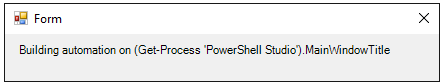
Without subexpression:
$LabelMain.Text = "Building automation on (Get-Process 'PowerShell Studio').MainWindowTitle"
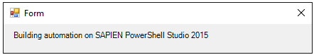
With subexpression:
$LabelMain.Text = "Building automation on $((Get-Process 'PowerShell Studio').MainWindowTitle)"
Font property: Determines the style and size of the label text
Use the Font property to get, set, or change the font of the label text.
Value Type: System.Drawing.Font
Default: Microsoft Sans Serif 8.25.
To set the font easily, in the Properties pane for the Label, in the Font row, click the ellipsis (…) and then use the Font selector.
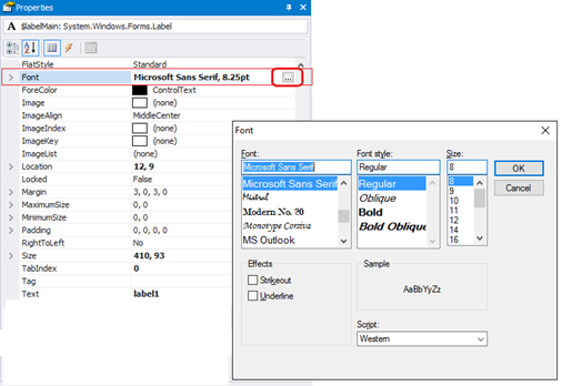
To display the properties of the Font object, in the Properties pane, click the Font group arrow.
To script a font change, set the Font property to a string with the Font name, size, and style.
$labelMain.Font = 'Segoe UI, 15.75pt, style=Bold, Italic'
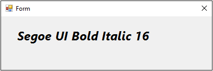
To determine other properties of the font, create a System.Drawing.Font object.
$ClickFont = [System.Drawing.Font]::new('Microsoft Sans Serif', 8.25, [System.Drawing.FontStyle]::Regular)
$ClickedFont = [System.Drawing.Font]::new('Segoe UI', 16, [System.Drawing.FontStyle]::Italic)

$labelMain_Click={
    if ($labelMain.Text -eq 'Click')
    {
        $labelMain.Text = 'Clicked'
        $labelMain.Font = $ClickedFont
    }
    else
    {
        $labelMain.Text = 'Click'
        $labelMain.Font = $ClickFont
    }
}
Tips:
- To enlarge the label automatically to fit its contents, set the AutoSize property of the Label to $True.
- When scripting a font, be sure to set the Font property of the Label. The Text property of the Label does not have a Font property.
ForeColor property: Determines the color of the label text.
Use the ForeColor property to get, set, and change the color of the text in the label.
Values: Any [System.Drawing.Color] type
Default: ControlText (Black)
To set the ForeColor property in the Properties pane.
To set ForeColor property in a script:
$Label1.ForeColor = [System.Drawing.Color]::Red
-or-
$Label1.ForeColor = "Red"
BackColor property: Determines the color of the background in the label
Use the BackColor property to get, set, and change the color of the label background.
Value Type: [System.Drawing.Color]
Default: (Determined by the operating system. Typically ‘Control’)
To set the BackColor property in a script:
If ($Label1.BackColor -eq 'Control')
{
    $Label1.BackColor = [System.Drawing.Color]::ControlDark
}
-or-
$Label1.BackColor = "ControlDark"
TextAlign property: Determines the position of the text in the label
Use the TextAlign property to get, set, or change the alignment of the text relative to the label border.
Value Type: [System.Drawing.ContentAlignment] enumeration
Values: TopLeft, TopCenter, TopRight, MiddleLeft, MiddleCenter, MiddleRight, BottomLeft, BottomCenter, BottomRight
Default: MiddleCenter
To set the TextAlign property in the Property pane:
To set the TextAlign property in a script:
$label1.TextAlign = 'TopRight'
BorderStyle property: Determines the style and thickness of the label border.
Use the BorderStyle property to get, set, or change the label border. Label borders are fixed. The end-user cannot resize any label border style.
Value Type: [System.Windows.Forms.BorderStyle] enumerator.
Values: None, FixedSingle, Fixed3D
Default: None
$label1.BorderStyle = 'None'
-or-
$label1.BorderStyle = [System.Windows.Forms.BorderStyle]'None'
$label1.BorderStyle = 'FixedSingle'
$label1.BorderStyle = 'Fixed3D'
Image property: Determines that image that appears on the label
Use this property to display an icon, bitmap, or image of any type on the label.
Value Type: [System.Drawing.Image]
Default: (None; Same as Form.BackgroundImage)
To add an image from a file to a label, use Image property in the Property pane. Click the ellipsis and, in File Explorer, select a file. PowerShell Studio converts the file into a bitmap string (64-bit byte array) so it is independent of the local system.
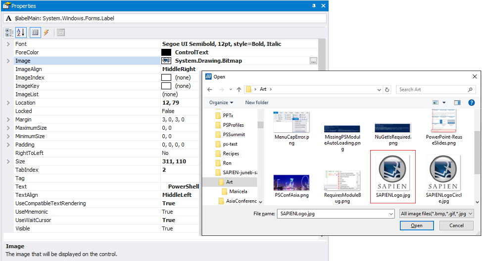
On the label:
Tip: If you are using a label to display an image without text, consider using a PictureBox object.
Note: To add an image to a label, PowerShell Studio converts the image to a 64-bit string and then uses the FromBase64String static method to pass a byte array as the System.Drawing.Image type. It does not pass a path or use any local system values.
Enabled property: Determines whether the label can be clicked
Use the Enabled property to temporarily enable or disable the click feature of the label. For example, use Enabled = $false to disable the click feature after the label has been clicked or while a function is running.
Value Type: [System.Boolean] ($True, $False).
Default: $True
To completely disable the click feature of the label, omit the Click event handler or enter an empty script block.
To set the Enabled property in the script:
For example:
If ($Label1.Text -eq 'Click')
{
    $Label1.Text -eq 'Clicked'
    $Label1.Enabled = $false
}
AutoSize property: Adjusts the label length to enclose its contents
The AutoSize property automatically adjusts the length of the label (horizontally) to enclose the string in the value of its Text property.
Use an AutoSize value of $True when the contents of the label are not predetermined, such as when the label displays a value that is returned at runtime or the label can display text in multiple languages. To resize the label or set a fixed size, use $False.
Value Type: [System.Boolean] ($True, $False).
Default: $True (PowerShell Studio 5.2.124 and later. Otherwise, $False)
When the value of AutoSize is $True, Windows automatically resizes the label at runtime to display the text within the label borders.
The size of the label in the designer might not indicate its actual size when the form is displayed.
When the value of AutoSize is $False, you determine the label size, which is fixed, regardless of its content. To resize the label, the value of AutoSize must be $False.
AutoSize extends only the length of the label (horizontally) and the Label control does not have a MultiLine property. If the text exceeds the length of the form, the label and its text are truncated.
To use an ellipsis to prevent truncated text, set the value of AutoEllipsis to $True and AutoSize to $False.
To wrap the text in a Label to the next line, set AutoSize to $False and then increase the height of the label (vertically).
Important Events:
Click event: Determines how the label responds when a user clicks it.
The event handler for the Click event is called when the label is clicked.
IMPORTANT: The Click event is included because it’s the default event for the Label control. However, because the Label is static, not obviously clickable, and provides no user feedback when clicked, best practice guidelines recommend using a Button or LinkLabel control for most clicking actions.
$label1_Click={
    $label1.Enabled = $false
    $label1.Text = "Disabled"
}
Before Click event:
After Click event:
Note about events:
To discover which control called the event script block, use the $this automatic variable. The $this variable is particularly useful when you have multiple controls calling the same event script block. The $this variable tells which control triggered the event, so you can respond in a control-specific way.
For example, this Click event script block disables the control that called it:
$Disable_Click={
    $this.Enabled = $false
}
Looking for more Spotlight articles? In PowerShell Studio, in the Toolbox or in the Properties pane, right-click a control and then click ‘View Spotlight Article’.
June Blender is a technology evangelist at SAPIEN Technologies, Inc. You can reach her at This email address is being protected from spambots. You need JavaScript enabled to view it. or follow her on Twitter at @juneb_get_help.
Also, we create the Label_Loaded event. Please type «Label» into the XAML file and then have Visual Studio auto-generate the C# event handler. This is the easiest way to modify a label in a dynamic way.
Example markup: XAML
<Window x:Class=»WpfApplication4.MainWindow»
xmlns=»http://schemas.microsoft.com/winfx/2006/xaml/presentation»
xmlns:x=»http://schemas.microsoft.com/winfx/2006/xaml»
Title=»MainWindow» Height=»350″ Width=»525″>
<Grid>
<Label
Content=»Label»
HorizontalAlignment=»Stretch»
Margin=»10,10,10,10″
VerticalAlignment=»Center»
Background=»Beige»
Padding=»5″
FontSize=»30″
Loaded=»Label_Loaded»
/>
</Grid>
</Window>
Example code: C#
using System;
using System.Windows;
using System.Windows.Controls;
namespace WpfApplication4
{
/// <summary>
/// Interaction logic for MainWindow.xaml
/// </summary>
public partial class MainWindow : Window
{
public MainWindow()
{
InitializeComponent();
}
private void Label_Loaded(object sender, RoutedEventArgs e)
{
// … Get label.
var label = sender as
Label
;
// … Set date in content.
label.Content = DateTime.Now.ToShortDateString();
}
}
}
Last Updated :
20 Mar, 2025
In Windows Forms, Label control is used to display text on the form. It does not interact with user input or handle mouse or keyboard events. Labels are used to provide information to the user within the form such as description, message, or details. These are the key points about labels.
- Display Text or Image: It is mainly used to show the text or image in form.
- Non-Interactive: It is non-interactive and just shows the text not like buttons and textbox.
- Positioning: Labels can be placed anywhere on the form we can use drag and drop and also specify their coordinates using code.
- Auto-Size: Labels can automatically adjust their size and fit according to the content when we set the AutoSize property as true.
Ways To Create Labels in Windows Forms
There are mainly two ways to create labels in the Windows Forms:
- Design Time (Drag and drop)
- Run Time (Custom code)
Design Time ( Drag and drop)
This is the easiest way to create labels in Windows Forms using Visual Studio we just have to open the toolbox and drag and drop the label on the form in the designer and further we can change the appearance of the label using the properties. Follow these steps to create a label.
Step 1: Now locate the project with the name here we are using the default name which is Form1 and it will open a form in the editor that we can further modify.
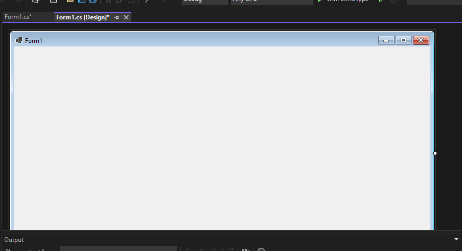
In the image, we have two files that are open one Design and there is Form1.cs these two play a major role. We use the Form 1.cs file for the custom logic.
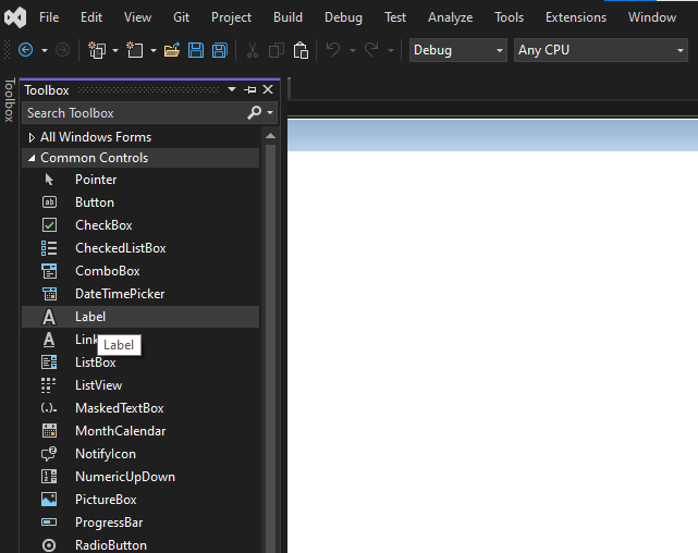
Step 2: Now open a Toolbox go to the view > Toolbox or ctrl + alt + x.
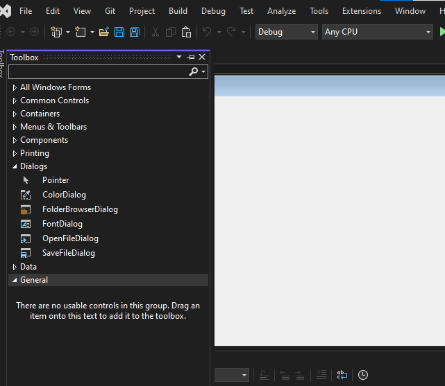
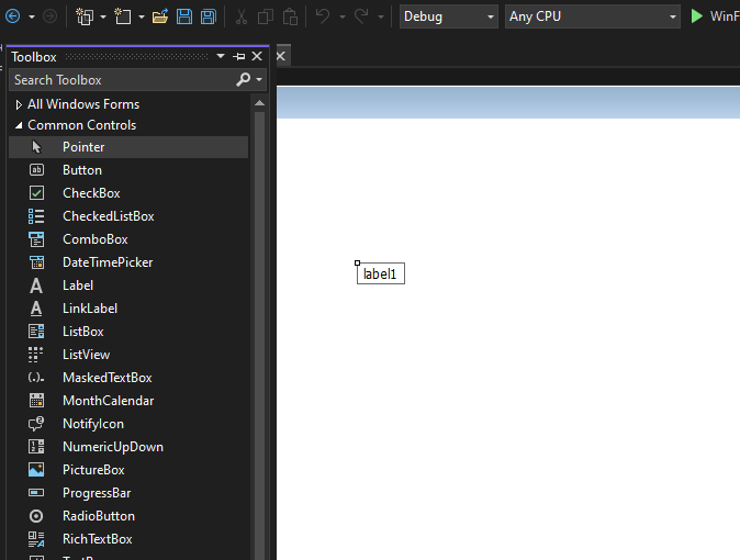
Step 3: Choose labels from the common controls in Toolbox as shown below:
And then drag-and-drop in the form:
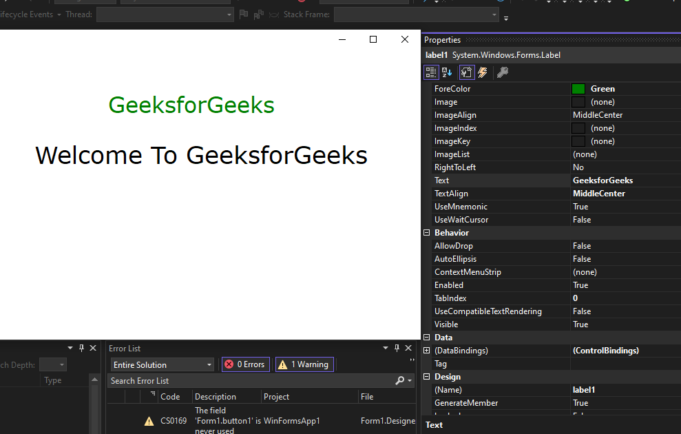
Step 4. Now open the properties of the label, press right-click on the label and go to properties it will open Solution Explorer now we can change the appearance and behaviour of the label in properties.
Now we can change the appearance and behaviour of the label such as background and text color or font size. These are the changes we made to the label
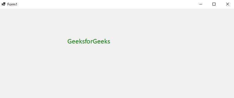
Similarly, we can create different labels here is the output
Output:
Run Time (Custom Code)
In this method, we are going to modify the Form1.cs file and add custom code modification in C# to change the appearance of the button according to our requirements. Follow these step-by-step processes.
Step 1: Create a label using the Label() constructor provided by the Label class.
// Creating label using Label class
Label mylab = new Label();
Step 2: After creating the Label, set the properties of the Label provided by the Label class.
// Set the text in Label
mylab.Text = “GeeksforGeeks”;
// Set the location of the Label
mylab.Location = new Point(222, 90);
// Set the AutoSize property of the Label control
mylab.AutoSize = true;
// Set the font of the content present in the Label Control
mylab.Font = new Font(“Calibri”, 18);
// Set the foreground color of the Label control
mylab.ForeColor = Color.Green;
// Set the padding in the Label control
mylab.Padding = new Padding(6);
Step 3: And last add this Label control to form using the Add() method.
// Add this label to the form
this.Controls.Add(mylab);
Step 4: Now double-click on the form in Design and it will open the Form.cs file where code is written in C#. Here the program file is Form 1.cs Now write this code in Form1.cs file
Form1.cs file:
C#
namespace WinFormsApp1
{
    public partial class Form1 : Form
    {
        public Form1()
        {
            InitializeComponent();
        }

        private void Form1_Load(object sender, EventArgs e)
        {
            // Creating and setting the label
            Label mylab = new Label();
            mylab.Text = "GeeksforGeeks";
            mylab.Location = new Point(222, 90);
            mylab.AutoSize = true;
            mylab.Font = new Font("Calibri", 18);
            mylab.ForeColor = Color.Green;
            mylab.Padding = new Padding(6);

            // Adding this control to the form
            this.Controls.Add(mylab);
        }
    }
}
Output:
Properties of Label Control
| Property | Description |
|---|---|
| AutoSize | This property is used to set a value indicating whether the Label control is automatically resized to display its entire contents. |
| BackColor | This property is used to set the background colour for the Label control. |
| BackgroundImage | This property is used to set the background image for the Label control. |
| BorderStyle | This property is used to set the border style for the Label control. |
| FlatStyle | This property is used to set the flat style appearance of the label control. |
| Font | This property is used to set the font of the text displayed by the Label control. |
| FontHeight | This property is used to set the height of the font of the Label control. |
| ForeColor | This property is used to set the foreground colour of the Label control. |
| Height | This property is used to set the height of the Label control. |
| Image | This property is used to set the image that is displayed on a Label. |
| Location | This property is used to set the coordinates of the upper-left corner of the Label control relative to the upper-left corner of its form. |
| Name | This property is used to set the name of the Label control. |
| Padding | This property is used to set padding within the Label control. |
| Size | This property is used to set the height and width of the Label control. |
| Text | This property is used to set the text associated with this Label control. |
| TextAlign | This property is used to set the alignment of text in the label. |
| Visible | This property is used to set a value indicating whether the control and all its child controls are displayed. |
| Width | This property is used to set the width of the Label control. |