
Stop using the default Windows controls and learn how to use controls with Material Design in your WinForms application in C#.
Everybody loves Material Design, the comprehensive design used as a guide for visual, motion, and interaction design across platforms and devices. Although the Material Design is specifically used by the Android OS and other Google Products, you can still use the design as you want and wherever you want.
To use material design in your WinForms applications, you can use the MaterialSkin library for adding a theming to .NET WinForms, C# or VB.Net with Google’s Material Design Principles. This library follows the guidelines defined in the material design specification and use the same components and functionalities.
1. Install MaterialSkin via NuGet
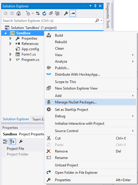
The preferred way of installation is via NuGet. Install the package with Visual Studio, by accessing the NuGET package manager. Do right click in your project in the Solution Explorer at the right top of Visual Studio and select Manage NuGet packages in the dropdown menu:
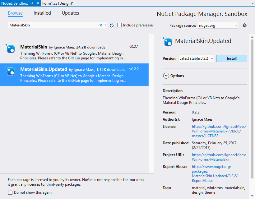
In the emergent Window, go to the Browse tab and search for MaterialSkin, select the package (with the latest version namely MaterialSkin updated) in the list and install it in your project:
Note
According to the version of .NET Framework that you’re using, you will need to download a specific version of the plugin. For example, the MaterialSking.Updated package requires at least .NET Framework 4.6.2.
Once the installation of the package finishes, you will be able to work with the Material Design in your project. Visit the official repository at Github for more information about this library.
2. Add Material Controls to the Controls Toolbox
With MaterialSking you will be able to drag and drop controls into your forms in the same way you do with the traditional controls. To be organized, we recommend you to create a custom Toolbox Tab to store inside the exclusive controls of this library. Do right click on an empty space of the Toolbox and from the Dropdown menu select Add Tab, this will allow you to create an empty Tab and to give a custom name, in this case we’ll name it Material Controls:
Then do right click on the custom tab that you’ve created (Metro Controls) and select Choose Items from the menu:
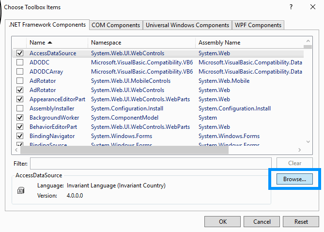
In the new window, go to the .NET Framework Components tab and click on Browse:
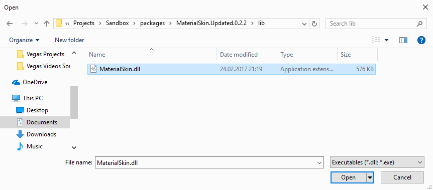
Once the filebrowser appears, you will need to navigate to the folder of your WinForms project, then inside the packages folder search for the MaterialSking folder, then on lib. Inside the lib folder there should be a dll file, select it an click on open:
Then a loading bar will appear and the controls will appear on the list of .NET components, finally click on OK:
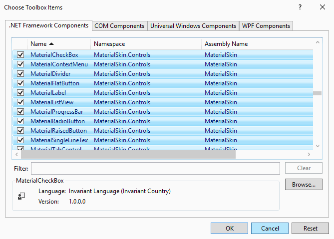
By default all components will be selected, however you can unselect the one you don’t want. Finally the controls will appear in the previously created tab of Controls:
And you will be able to simply drag and drop the controls you need in your form in the same way you do with the default components of Windows.
3. Set Material Style
Till the previous step, you can now drag and drop elements into your form easily as you do with the tipical controls of .NET. However, if you want to provide a Material Style to your entire form (not only the elements inside of the form), then you will need to modify the code of your Form.
Start by importing the MaterialSkin namespaces at the top of your class:
using MaterialSkin;
using MaterialSkin.Controls;
Then you’ll be able to change the type of your form. Usually, the declaration of your form is of the Form type e.g class Form1 : Form, but if you want it with Material Style, then you need to change the type Form to MaterialForm:
namespace Sandbox
{
    public partial class Form1 : MaterialForm
    {

  // ... //

  // ... //

  // ... //
Now in the constructor function of your class, in this case Form1, under the InitializeComponent function , add some code to use the Material Skin instead of the default and change the color palette of the form:
public Form1()
{
    InitializeComponent();

    // Create a material theme manager and add the form to manage (this)
    MaterialSkinManager materialSkinManager = MaterialSkinManager.Instance;
    materialSkinManager.AddFormToManage(this);
    materialSkinManager.Theme = MaterialSkinManager.Themes.LIGHT;

    // Configure color schema
    materialSkinManager.ColorScheme = new ColorScheme(
        Primary.Blue400, Primary.Blue500,
        Primary.Blue500, Accent.LightBlue200,
        TextShade.WHITE
    );
}
As you can see, the implementation of custom controls for WinForms is pretty easy. Save the changes and run your form to see what happens !
4. Example
The following example shows how to create a Material Styled form on your main form on a simple WinForms project:
using System;
using System.Collections.Generic;
using System.ComponentModel;
using System.Data;
using System.Drawing;
using System.Linq;
using System.Text;
using System.Threading.Tasks;
using System.Windows.Forms;

// Import the Material Skin
using MaterialSkin;
using MaterialSkin.Controls;

namespace Sandbox
{
    public partial class Form1 : MaterialForm
    {
        public Form1()
        {
            InitializeComponent();

            // Create a material theme manager and add the form to manage (this)
            MaterialSkinManager materialSkinManager = MaterialSkinManager.Instance;
            materialSkinManager.AddFormToManage(this);
            materialSkinManager.Theme = MaterialSkinManager.Themes.LIGHT;

            // Configure color schema
            materialSkinManager.ColorScheme = new ColorScheme(
                Primary.Blue400, Primary.Blue500,
                Primary.Blue500, Accent.LightBlue200,
                TextShade.WHITE
            );
        }

        private void Form1_Load(object sender, EventArgs e)
        {

        }
    }
}
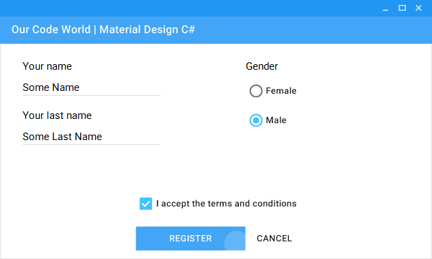
The previous code would generate the following form:

Then you can simply drag and drop some controls from the toolbox created in the step 2 and create awesome forms:
For more information or to read the docs of the library, we recommend you to visit the official repository at Github here. Although this project is no longer under active development, it’s well made and has a lot of useful components and contributions are still welcome. Besides the community will likely still help if you open an issue.
Happy coding !
Material Design is a popular UI style defined by Google and used by many modern applications. With ComponentOne WinForms Edition, we’ve made Material Design easy to achieve in your classic, .NET Windows Forms applications. In this blog, we will show how to style your entire desktop application with a material-inspired theme. We will explore:
- Adding Material Themes to WinForms Apps
- How to Customize the WinForms Material Theme
- Advanced Customization of the Material Theme
Adding Material Themes to WinForms Apps
ComponentOne WinForms Edition includes Material and Material Dark themes. ComponentOne Themes for WinForms makes it easy to theme your WinForms controls with many built-in themes and an easy-to-use Theme designer to create your own themes or modify existing ones.
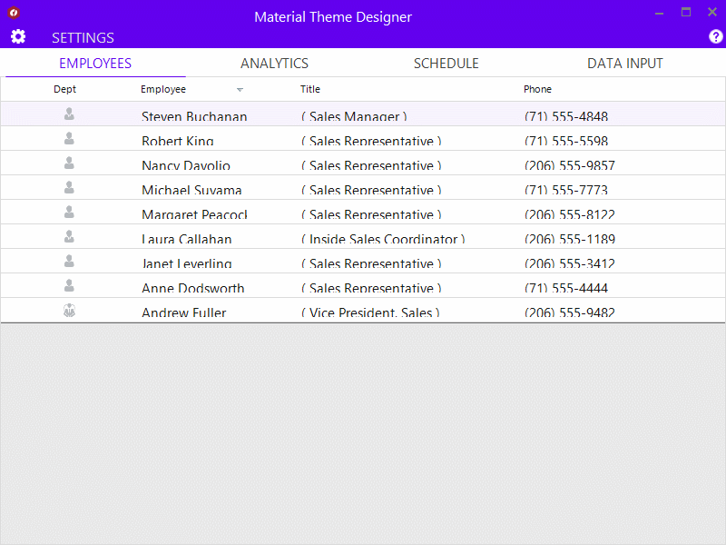
Below are some examples of what the Material themes look like applied to some ComponentOne WinForms controls:
Material themes can be applied at design time as well as at runtime. You can apply a theme at design time with the Theme Controller dialog or by modifying the App.config file. Let’s look at the different ways to set the theme.
Ready to Get Started? Download ComponentOne Today!
Setting the Material Theme at Design-Time
The easiest way to set a theme is to use the C1ThemeController component at design-time. It requires that you first download and install ComponentOne WinForms Edition for the version of .NET you are using.
-
Open a form in your application in the Visual Studio’s forms designer.
-
From the designer’s toolbox, locate and drag a C1ThemeController and drop it on your form. A dialog box appears, enabling you to select:
-
Application-wide default theme
-
Current controller’s default theme
-
Themes for all supporting controls already on the form.
-
In the dialog that pops up, the theme is initially specified as «(none)» for all supporting controls already on the form. This prevents unintentional loss of property settings on those controls.
-
Click the All to (default) button in the dialog so that the default theme is set on all controls. Note: If you’ve customized some of the controls already, this will be ignored, and the default theme will not be restored.
-
Select Material from the list of available built-in themes. (or if you already created a custom material theme you can select it here).
-
Click the All to (default) button as mentioned above, to set the default theme on all supporting controls on the form.
-
Click the OK button to close the dialog and apply the specified theme to the controls on the form.
Setting the Material Theme using App.config
You can also specify the theme at the application level using the app.config file. Add the C1.Win.C1Themes package to your application, and add the following setting to your App.Config. This will apply the built-in Material theme to your entire application.
<configuration>
  <appSettings>
      <add key="C1ApplicationTheme" value="Material"/>
  </appSettings>
</configuration>
Setting the Material Theme using Code
The third approach is to set a theme in the code. This is helpful if you need to apply or change the theme at runtime. Here, we use the C1ThemeController static class to apply themes. Just add the C1.Win.C1Themes. package to your application and add the following code to your application before it loads.
C1Theme theme = C1.Win.C1Themes.C1ThemeController.GetThemeByName(“Material”, false);
C1ThemeController.ApplyThemeToControlTree(control, theme);
How to Customize the WinForms Material Theme
The Material Design color system consists of primary and secondary colors. These colors reflect your application’s branding and styling. By default, we use a green color scheme. We include a sample named MaterialDesign that lets you customize the primary and secondary accent colors for your Material theme. You can save the theme and apply it to your WinForms application later.
To change the color scheme for your theme, follow these easy steps:
-
Run the Material Theme Designer sample.
-
It’s named MaterialDesign installed under \Documents\ComponentOne Samples\WinForms\v4.8\Themes.
-
Or download it from GitHub.
-
-
Click on the “SETTINGS” tab and select template and accent colors based on your brand/theme.
-
Preview how the theme looks with C1 controls.
-
Click on the cog icon to open the application menu.
-
Click on “Save Theme” to save the theme at your preferred location.
-
Follow the steps from the previous section to apply the theme, but now select your saved theme in step #4.
Advanced Customization of the Material Theme
The ComponentOne Theme Designer Application allows easy designing of new themes for any controls in WinForms Edition. It also lets you edit/modify an existing theme to achieve the appearance of your choice, or match with the application theme. You can further use this application to tweak the Material theme to the most granular level allowed by the control.
A theme is an XML file with .c1theme extension that consists of a set of properties and their values (which determines the look and feel of a control). Themes are divided internally into different sections corresponding to different controls. A section, Base Theme Properties, is accessible to all other controls. This section contains a sub-section, Material, which stores the Material properties that can be altered to create different material themes.
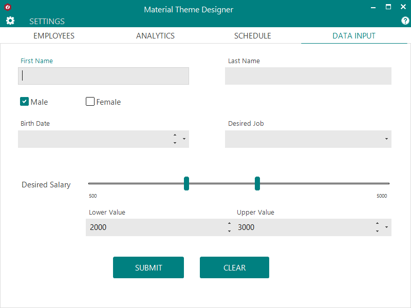
For example, let’s start changing our material theme for FlexGrid, where the headers are the primary color.
How to use the WinForms Material Theme Designer
-
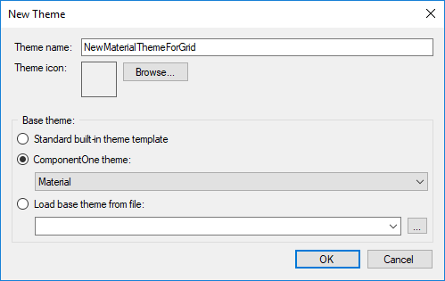
Open the ComponentOne Theme Designer from the ComponentOne Start Menu. Press Ctrl + N or File > New. Select Material as the base theme for your new theme.

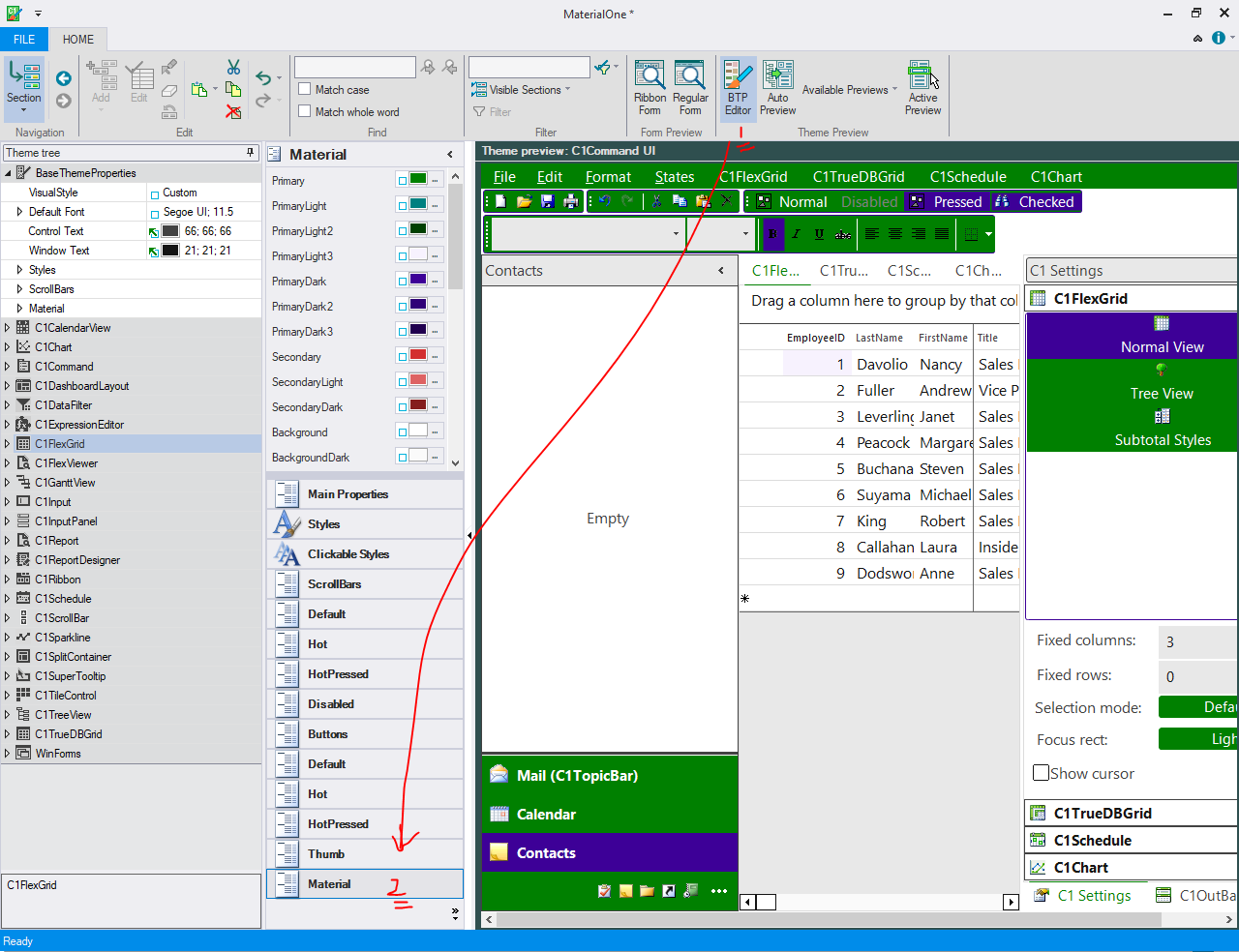
-
Click on the BTP Editor button (1). This opens a new Base Theme Property Editor. Select “Material” properties (2). Here, you can see the different colors used in Material:

-
Go to the theme tree and expand the C1FlexGrid node.
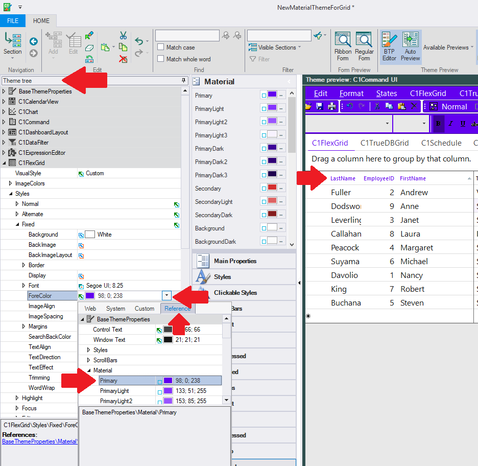
-
Expand C1FlexGrid > Styles > Fixed node. This node would hold the styles for a fixed (header) cell.
-
Select the ForeColor dropdown to open the color picker.
-
You can select the Reference tab in the picker dropdown to select the primary color.
-
You can save this theme and use it as mentioned in the «Applying Material Themes in your application» section. Your FlexGrid should now have a header color based on your primary color settings.
Share with us how you’re designing your desktop applications and how Material theme works with your application.
Ready to Get Started? Download ComponentOne Today!
Стиль Material Design в Windows Forms
admin
23.02.2019
Видеоуроки
Нет комментариев
В видеоуроке рассказывается, как заменить стандартную тему оформления Windows Forms на стиль Material Design от Google. Проект создается на языке программирования C#.
3.9/5 — (22 голоса)
c#, Windows Forms, Видео, Видеоурок, Урок
Поделиться в соц. сетях:
- ← Является ли число простым — Проверяем на языке Си
- Потоки в Visual C++ — Пример реализации и использования →
Добавить комментарий
Ваш адрес email не будет опубликован.
Комментарий
Имя
Сайт
Сохранить моё имя, email и адрес сайта в этом браузере для последующих моих комментариев.
Уведомить меня о новых комментариях по email.
Уведомлять меня о новых записях почтой.
C# Material Design/Lollipop WinForms UI
Today i introduce to you Google’s Material Design Controls for WinForms projects rather than the default ones that come packed with .NET Framework.
Here is a screenshot:
Current state of the Controls
| Support color | Disabled mode | Animated
— | — | — | — | —
Button | Yes | Yes | Yes
Flat Button | Yes | Yes | Yes
Check Box | Yes | Yes | Yes
Toggle Button | Yes | Yes | Yes
Radio Button | Yes | Yes | Yes
Card | Yes | No | Yes
Small Card | Yes | Yes | No
TextBox | Yes | Yes | Yes
File Input | Yes | Yes | Yes
Folder InPut | Yes | Yes | Yes
Progress Bar | Yes | No | No
Label | No | No | No
To implement LollipopUI in your application
1. Add the resources to your project
- Add Roboto-Medium and Roboto-Regular fonts to resources.
- Open solution explorer and Right-click on Roboto-Medium => Properties => Change Build Action from «None» to «Embedded Resource»…..Do the same to Roboto-Regular .
2. Add the references
- add
System.Design.dllreference to your project. To do that click on Project tab => Choose Add Reference => SelectSystem.Designand press ok.
Contact
If you need any help or anything else, don’t hesitate =D
- My Facebook acc: https://www.facebook.com/profile.php?id=100006635474719
- v.i.k.i Facebook: https://www.facebook.com/VikiTechnology
- v.i.k.i Google+: https://plus.google.com/u/0/b/113510021162458322468/113510021162458322468
Introduction
In this article, I am going to explain how to use Material Skin in Windows. Forms applications. Here, I have designed a login form using Material Skin in Visual Studio 2017.
Material Skin
Material Skin is an open-source library bringing material design to .NET Windows. Forms Applications.
Step 1. Start the Project
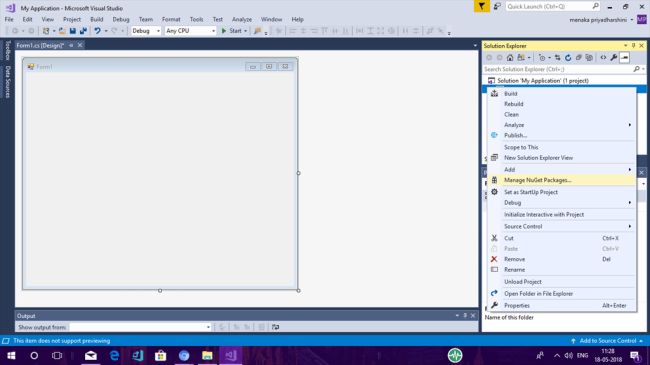
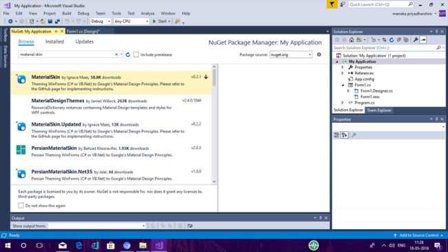
Open Visual Studio and start New Project—->Windows.Forms Application and name it as my application. The Form Designer page will be loaded by default. Now, right-click the project file and choose «Manage NuGet Packages».
Step 2. Download and Install Material skin.
From the NuGet Packages, browse Material Skin and download it. After downloading, install the Material Skin NuGet. Once the installation of the NuGet package is done, you can work with Material design in your project.
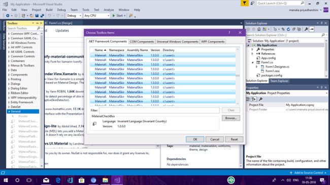
Step 3. Add Material control to the Controls Toolbox
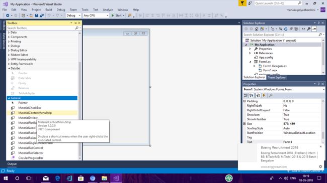
After successful installation, you are able to drag and drop Controls into your form in the same way you did with the traditional method.
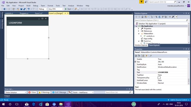
Step 4. Material Form
The following example shows how to create a Material-styled login form on your main form in a simple Windows. Forms project. Do follow this code and your output will appear as in the screenshot below.
public partial class Form1 : MaterialSkin.Controls.MaterialForm
Step 5. Drag and Drop Controls
Now, drag and drop controls from the toolbox onto the form in Visual Studio 2017. For creating a login form, drag and drop the Material SingleLine Text Field and change its text as username and password.
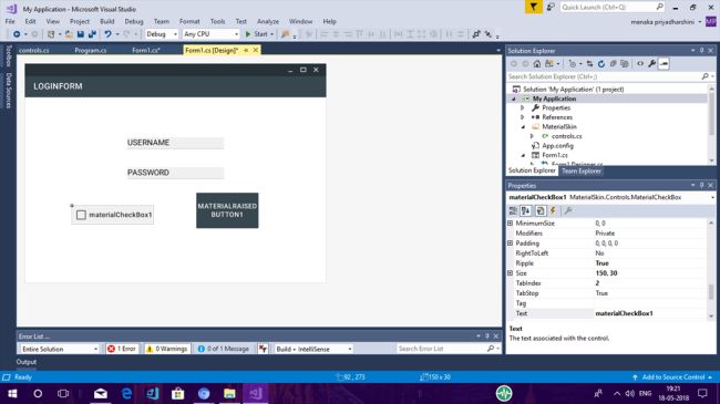
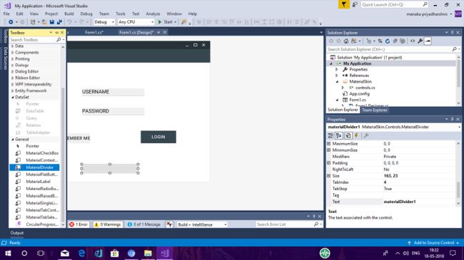
Drag and drop the Material raised button and Material checkbox, changing their texts to log in and Remember Me. Now, drag and drop a Material Divider onto the form.
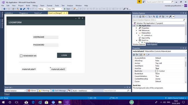
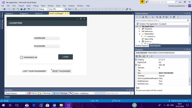
Drag and drop Material Label and change the text to «Lost your Password?» and «Reset Password».
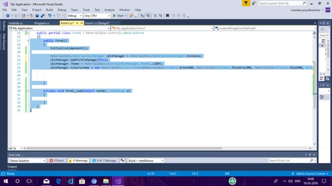
Step 6. Coding
Now, it’s time to code. Follow the code given below which shows how to create a Material Styled Login Form on your main form.
public Form1()
{
    InitializeComponent();
    MaterialSkin.MaterialSkinManager skinManager = MaterialSkin.MaterialSkinManager.Instance;
    skinManager.AddFormToManage(this);
    skinManager.Theme = MaterialSkin.MaterialSkinManager.Themes.LIGHT;
    skinManager.ColorScheme = new MaterialSkin.ColorScheme(
        MaterialSkin.Primary.LightBlue400,
        MaterialSkin.Primary.BlueGrey900,
        MaterialSkin.Primary.Blue500,
        Accent.Orange700,
        MaterialSkin.TextShade.WHITE
    );
}
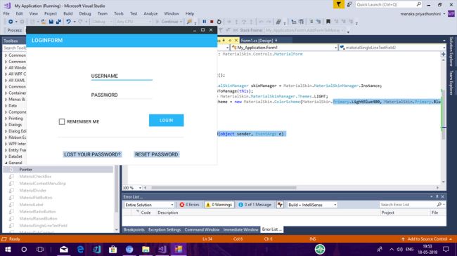
Step 7. Output
Compile and run the code. The following output will be achieved.

Step 8. Add Design
You can add an additional design to the Login Form by dragging and dropping some more controls from the Toolbox into the Form. The following output will be obtained.
Summary
Hope this article is interesting for you. In my next article, I will explain how to install NuGet Packages. For any problem or error in the code, please feel free to comment. Again, thanks for reading!