
Время на прочтение3 мин
Количество просмотров7.5K
Введение
После размещения первой статьи о своем приложении FAQ.Net (программа заметок под Windows), появились первые пользователи, для которых хочется дальше развивать свою программу для заметок.
Чтобы повысить интерес у пользователей, возникла идея повысить его привлекательность за счет настройки цвета и шрифта.
Требования к настройке внешнего вида приложения
- хранить и загружать свойства отдельных компонентов в XML-файле
- пользователь должен иметь простой инструмент по настройке внешнего вида
- список настраиваемых компонентов должен очень просто расширяться (одной строкой кода)
- при изменении значения свойства пользователь должен сразу видеть изменения на форме
- должна быть кнопка отмены, которая позволит вернуть все изменения назад
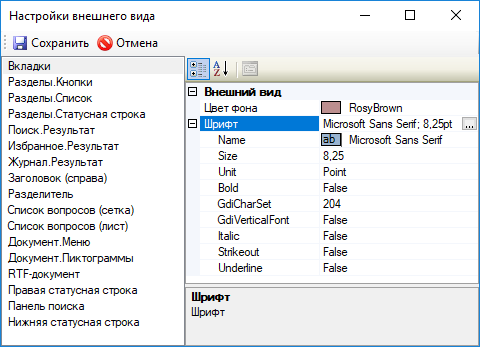
Результат работы
Окно настройки внешнего вида:
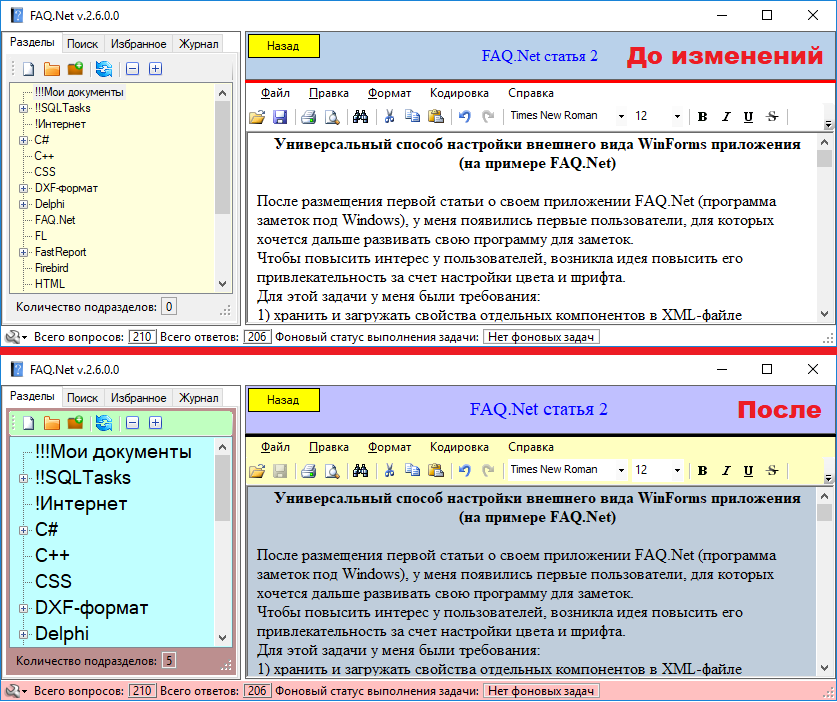
До и после настроек внешнего вида:
Для решения задачи необходимо
- использовать компонент PropertyGridEx, для отображения и изменения свойств компонентов
- создать класс CustomDesignControl для удобства хранения свойств в XML
- создать форму MainForm, на которой будем изменять внешний вид
- создать форму AppSettingsForm, на которой будем настраивать внешний вид MainForm
- создать класс SettingsXml для удобства работы с XML
Функция отмены изменений внешнего вида
Чтобы реализовать отмену изменений внешнего вида (пункт 5 из требований), решил найти универсальный способ клонирования свойств компонентов которые будут создаваться в памяти и заменять отображаемые компоненты.
Клонирование объектов:
public static class ControlExtensions
  {
    public static T Clone<T>(T controlToClone)
        where T : Control
    {
      PropertyInfo[] controlProperties = typeof(T).GetProperties(BindingFlags.Public | BindingFlags.Instance);

      T instance = Activator.CreateInstance<T>();

      RichTextBox rtb = new RichTextBox();
      foreach (PropertyInfo propInfo in controlProperties)
      {
        if (propInfo.Name == "Parent")
          continue;
        if (propInfo.CanWrite)
        {
          if (propInfo.Name != "WindowTarget")
          {
              propInfo.SetValue(instance, propInfo.GetValue(controlToClone, null), null);
          }
        }
      }
      return instance;
    }
Скопировал код, убрал лишние свойства, которые не нужно сохранять, оставив цвета и шрифт.
После проверки работы кода, сразу выяснились недостатки данного способа:
- используется приведение любого контрола к классу Control, а это означает, что половину свойств можно потерять (например, компонент DataGridView унаследован от класса Control, но имеет свой дополнительный набор свойств)
- при клонировании компонента некоторые свойства (например: цвет шрифта внутри ячейки DataGridView) не клонируются, а создают ссылки на клонируемый компонент (возможно, это потому, что используется свойство со своими внутренними свойствами и их нужно как-то по-другому обрабатывать).
Начал экспериментировать над вторым пунктом, чтобы добиться именно клонирования свойства.
Для этого создавал объект нужного типа оператором new.
DataGridView dgvClone = new DataGridView();Безрезультатно, компонент не смог вернуть изменения обратно.
Попробовал тогда само свойство создать оператором new и задать ему значение методом SetValue:
propInfo.SetValue(_controls[i], propInfo.GetValue(_controlsBeforeChange[i], null), null);
И этот способ не дал результата. При изменении значения свойства в одном компоненте, оно автоматически обновляется и в клонируемом компоненте.
Другие способы я больше не искал и сделал возврат изменений обычным перезапуском приложения с возможностью сохранения рабочего документа или отмены перезапуска. Это позволило значительно съэкономить память приложения, так как не нужно создавать клоны объектов.
Пример приложения с настройкой внешнего вида
На всякий случай, подготовил готовый код, на котором желающие смогут проверить и возможно доработать функцию отмены изменений внешнего вида без перезагрузки приложения и рассказать нам о проблеме в комментариях.
Нужно добиться, чтобы при нажатии на кнопку «Автотест» на компоненте DataGridView был серый фон и шрифт ячеек был мелкий.
Скачать Windows приложение FAQ.Net (бесплатно):
(x64) yadi.sk/d/sq3g4NOD3Zt7ZY
(x86) yadi.sk/d/NKXeyUWH3Zt8PQ
Группа ВКонтакте
Исходный код FAQ.Net
Вывод
Надеюсь, что во многих WinForms приложениях, благодаря этой статье, у конечного пользователя появится возможность настраивать интерфейс на свой вкус и цвет.
Если эта публикация вас вдохновила и вы хотите поддержать автора — не стесняйтесь нажать на кнопку
Стиль Material Design в Windows Forms
admin
23.02.2019
Видеоуроки
Нет комментариев
В видеоуроке рассказывается, как заменить стандартную тему оформления Windows Forms на стиль Material Design от Google. Проект создается на языке программирования C#.
3.9/5 — (22 голоса)
c#, Windows Forms, Видео, Видеоурок, Урок
Поделиться в соц. сетях:
- ← Является ли число простым — Проверяем на языке Си
- Потоки в Visual C++ — Пример реализации и использования →
Добавить комментарий
Ваш адрес email не будет опубликован.
Комментарий
Имя
Сайт
Сохранить моё имя, email и адрес сайта в этом браузере для последующих моих комментариев.
Уведомить меня о новых комментариях по email.
Уведомлять меня о новых записях почтой.
Skip to content
How to create beautiful animated material user interface design using C# Winforms
-
View Larger Image

This is our very first article where we take you step by step with an example of animated Material User Interface created with Bunifu UI Winforms. You will need it to use some of the controls and components mentioned.
Let’s dive into it!
First of all, please create a new Windows Forms Application and add a Bunifu Ellipse on the main form. It will look simple, without borders.
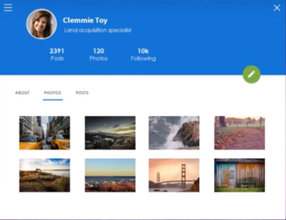
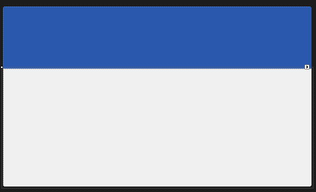
Now please add 2 panels on the form, the first one with dock to the top and the second one with dock to fill. Set the BackColor of the first panel (the top one) to 42, 88, 173 and you should get the following effect:
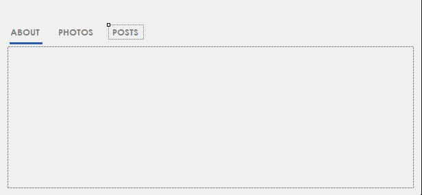
Now we’ll work on the panel on the bottom (the second one). First let’s add another panel inside this one and then above that new panel let’s add 3 labels named About, Photos and Posts (with the font Century Gothic) and above the first one let’s add a Bunifu Separator colored Blue with a Thickness of 3.
This should be the effect:
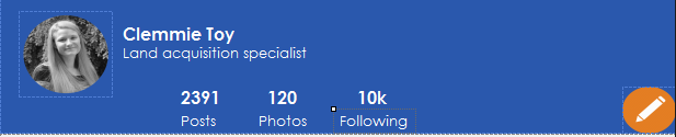
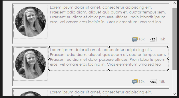
Now we move in the panel on the top, where we’ll add 2 picture boxes to maintain the profile picture and the edit picture. Also we’ll add some labels with the name, position and different statistics. This is an example of designing:
Now we’ll do something very interesting: we’ll make the form move when we drag the panel above (this one that contains the profile picture).
In order to do that, make sure that the name of your panel is Panel1 and type that code in the Form1 class:
[code lang=”csharp”]
Bunifu.Framework.UI.Drag drag = new Bunifu.Framework.UI.Drag();
public Form1()
{
InitializeComponent();
}
private void panel1_MouseDown(object sender, MouseEventArgs e)
{
drag.Grab(this);
}
private void panel1_MouseUp(object sender, MouseEventArgs e)
{
drag.Release();
}
private void panel1_MouseMove(object sender, MouseEventArgs e)
{
drag.MoveObject();
}
[/code]
Now you can easily move your entire form by just dragging the top panel!
Let’s move now the separator (that blue line below the About label) to each label, when we click on it.
We just need to implement the Click event on each label:
[code lang=”csharp”]
private void label1_Click(object sender, EventArgs e)
{
bunifuSeparator1.Width = label1.Width;
bunifuSeparator1.Left = label1.Left;
}
private void label3_Click(object sender, EventArgs e)
{
bunifuSeparator1.Width = label3.Width;
bunifuSeparator1.Left = label3.Left;
}
private void label2_Click(object sender, EventArgs e)
{
bunifuSeparator1.Width = label2.Width;
bunifuSeparator1.Left = label2.Left;
}
[/code]
You can simply test it and see it working:
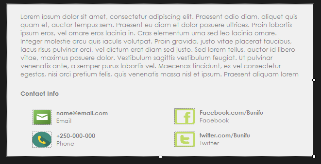
Now we’ll complete each tab. We’ll create each tab as a new User Control component. So let’s work on the “About” tab. Add a new User Control and name it About. Then, place some labels and some pictures in it to fit the following layout:
This is a new user control (defined by you) so you can simply find it in the toolbox and you can basically drop it to the form (as you do with all the other controls).
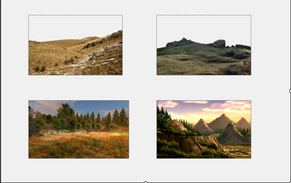
Now let’s add the Photos User Control:
In order to animate the transition between the newly created controls (About, Photos, etc.), let’s add a Bunifu Transition Component and set it’s animation type to HorizSlide. Then add this code in the label1_click method:
[code lang=”csharp”]
about1.Visible = false;
about1.BringToFront();
bunifuTransition1.ShowSync(about1);
[/code]
You need to add a similar structure in the same label_click method that we implement. This way when we click on “Photos” we’ll get a horizontal transition of all the controls of the previous control.
The last control, Posts, can be easily done by adding another panel inside our user control and designing it like that (as an example):
It’s just a simple styling of labels and finding the right image. Just rebuild the solution and you’ll find the control in the toolbox. Add it on the form, complete the label3_click method to use the animation (as I mentioned above) and that’s it.
Finally, we created an amazing User Interface that we can use to interact with our backend. We can see again how much we can get from Bunifu UI Winforms.
You can watch a detailed video of the same below.
Please let us know in the comments what you think…More posts coming, stay tuned 🙂
Enjoy!
Share This Story, Choose Your Platform!
Related Posts
This site uses Akismet to reduce spam. Learn how your comment data is processed.
Page load link
Go to Top
In this article we will customize basic windows forms using only Panels in diffrerent colors for different UI designs such as Microsoft Office 2013 in Visual Studio using C#
- Download CustomWindowsForm.zip — 418.2 KB
- Download Office_Word_PP_Excel.zip


Introduction
I wanted to create Custom windows forms in C#. Before working on this code, I started to find any code that could help me to create custom windows forms in C# on the internet. But unfortunately, I couldn’t find any simple and useful code. I found some code but they all are complicated. When I started working on solving this problem, I thought to:
- Use Custom Panel/Panel as a border of a Frame for change the size of Form such as Width, Height etc and use Custom Buttons as a Control Box of a Frame.
- Use Custom Panel as a Top layered Title border of a frame and use label to display text of a frame.
- To display icon on a frame we will set background image to added panel.
- Applying Mouse Events to panels and change properties of Form.
And it works perfectly.
You require Visual Studio Professional 2013 or higher version and .NET framework 4.5 or higher to open the project.

Perform following all Steps correctly to create custom windows forms.
We can also create extended advanced forms using only panels.(see above images,image 1 & 2)
Download the source code to view code for those forms.
See above image for better understanding of resizing our customized form and BlackForm.cs in file.
In this article we will create Blue colored resizable custom windows form, change colors of panels and buttons as you wish. You can use Custom Controls to design a form. Dont have Custom Controls?
- http://customcontrolsincs.blogspot.in/
Using following procedure you can also design Microsoft Office 2013 UI for any of your winform application such as Word, PowerPoint, Excel etc. Like following word screenshots.
Download the Download Office_Word_PP_Excel.zip file to view the UI code for Word, PowerPoint, Excel, DarkWord.


Start
Step 1
- Start Visual Studio and Create new Windows Forms Application project in C#. I have created CustomWindowsForm project.
- Download the source code and view the code for BlueForm.cs.
- Now set following Properties to created Form (Form1).
| ControlBox | false |
| BackColor | 30,60,150 |
| FormBorderStyle | None |
| Size | 684,461 |
To Add icon you can add again a panel/picturebox/toolstrip and set background image to it used as a window icon.
Step 2
- Now, Go to Project -> Add Class
- Enter Name
ButtonZand click Add. - Now Copy and Paste following
ButtonZcode into your created classButtonZcode. This button code is our Close & Minimize buttons of the form.
using System;
using System.Collections.Generic;
using System.Text;
using System.Drawing;
using System.Data;
using System.Windows.Forms;
namespace CustomWindowsForm
{
    public class ButtonZ : System.Windows.Forms.Button
    {
        Color clr1;
        private Color color = Color.Teal;
        private Color m_hovercolor = Color.FromArgb(0, 0, 140);
        private Color clickcolor = Color.FromArgb(160, 180, 200);
        private int textX = 6;
        private int textY = -20;
        private String text = "_";

        public String DisplayText
        {
            get { return text; }
            set { text = value; Invalidate(); }
        }
        public Color BZBackColor
        {
            get { return color; }
            set { color = value; Invalidate(); }
        }

        public Color MouseHoverColor
        {
            get { return m_hovercolor; }
            set { m_hovercolor = value; Invalidate(); }
        }

        public Color MouseClickColor1
        {
            get { return clickcolor; }
            set { clickcolor = value; Invalidate(); }
        }


        public int TextLocation_X
        {
            get { return textX; }
            set { textX = value; Invalidate(); }
        }
        public int TextLocation_Y
        {
            get { return textY; }
            set { textY = value; Invalidate(); }
        }
        public ButtonZ()
        {
            this.Size = new System.Drawing.Size(31, 24);
            this.ForeColor = Color.White;
            this.FlatStyle = System.Windows.Forms.FlatStyle.Flat;
            this.Font = new System.Drawing.Font("Microsoft YaHei UI", 20.25F, System.Drawing.FontStyle.Bold, System.Drawing.GraphicsUnit.Point, ((byte)(0)));
            this.Text = "_";
            text = this.Text;
        }
        //method mouse enter
        protected override void OnMouseEnter(EventArgs e)
        {
            base.OnMouseEnter(e);
            clr1 = color;
            color = m_hovercolor;
        }
        //method mouse leave
        protected override void OnMouseLeave(EventArgs e)
        {
            base.OnMouseLeave(e);
            color = clr1;
        }

        protected override void OnMouseDown(MouseEventArgs mevent)
        {
            base.OnMouseDown(mevent);
            color = clickcolor;
        }

        protected override void OnMouseUp(MouseEventArgs mevent)
        {
            base.OnMouseUp(mevent);
            color = clr1;
        }

        protected override void OnPaint(PaintEventArgs pe)
        {
            base.OnPaint(pe);
            text = this.Text;
            if (textX == 100 && textY == 25)
            {
                textX = ((this.Width) / 3) + 10;
                textY = (this.Height / 2) - 1;
            }

            Point p = new Point(textX, textY);
            pe.Graphics.FillRectangle(new SolidBrush(color), ClientRectangle);
            pe.Graphics.DrawString(text, this.Font, new SolidBrush(this.ForeColor), p);
        }

    }
}
Step 3
- Now, Go to Project -> Add Class
- Enter Name
MinMaxButtonand click Add. - Now Copy and Paste following
MinMaxButtoncode into your created classMinMaxButtoncode.
This code is for to create our maximize & restore down button when form is maximized.
using System;
using System.Collections.Generic;
using System.Text;
using System.Drawing;
using System.Data;
using System.Windows.Forms;
namespace CustomWindowsForm
{
    public class MinMaxButton : System.Windows.Forms.Button
    {
        Color clr1;
        private Color color = Color.Gray;
        private Color m_hovercolor = Color.FromArgb(180, 200, 240);
        private Color clickcolor = Color.FromArgb(160, 180, 200);
        private int textX = 6;
        private int textY = -20;
        private String text = "_";

        public enum CustomFormState
        {
            Normal,
            Maximize
        }

        CustomFormState _customFormState;

        public CustomFormState CFormState
        {
            get { return _customFormState; }
            set { _customFormState = value; Invalidate(); }
        }


        public String DisplayText
        {
            get { return text; }
            set { text = value; Invalidate(); }
        }
        public Color BZBackColor
        {
            get { return color; }
            set { color = value; Invalidate(); }
        }

        public Color MouseHoverColor
        {
            get { return m_hovercolor; }
            set { m_hovercolor = value; Invalidate(); }
        }

        public Color MouseClickColor1
        {
            get { return clickcolor; }
            set { clickcolor = value; Invalidate(); }
        }


        public int TextLocation_X
        {
            get { return textX; }
            set { textX = value; Invalidate(); }
        }
        public int TextLocation_Y
        {
            get { return textY; }
            set { textY = value; Invalidate(); }
        }

        public MinMaxButton()
        {
            this.Size = new System.Drawing.Size(31, 24);
            this.ForeColor = Color.White;
            this.FlatStyle = System.Windows.Forms.FlatStyle.Flat;
            this.Text = "_";
            text = this.Text;
        }

        //method mouse enter
        protected override void OnMouseEnter(EventArgs e)
        {
            base.OnMouseEnter(e);
            clr1 = color;
            color = m_hovercolor;
        }
        //method mouse leave
        protected override void OnMouseLeave(EventArgs e)
        {
            base.OnMouseLeave(e);
            color = clr1;
        }

        protected override void OnMouseDown(MouseEventArgs mevent)
        {
            base.OnMouseDown(mevent);
            color = clickcolor;
        }

        protected override void OnMouseUp(MouseEventArgs mevent)
        {
            base.OnMouseUp(mevent);
            color = clr1;
        }


        protected override void OnPaint(PaintEventArgs pe)
        {
            base.OnPaint(pe);

            switch (_customFormState)
            {
                case CustomFormState.Normal:
                    pe.Graphics.FillRectangle(new SolidBrush(color), ClientRectangle);

                    //draw and fill thw rectangles of maximized window
                    for (int i = 0; i < 2; i++)
                    {
                        pe.Graphics.DrawRectangle(new Pen(this.ForeColor), textX + i + 1, textY, 10, 10);
                        pe.Graphics.FillRectangle(new SolidBrush(this.ForeColor), textX + 1, textY - 1, 12, 4);
                    }
                    break;

                case CustomFormState.Maximize:
                    pe.Graphics.FillRectangle(new SolidBrush(color), ClientRectangle);

                    //draw and fill thw rectangles of maximized window
                    for (int i = 0; i < 2; i++)
                    {
                        pe.Graphics.DrawRectangle(new Pen(this.ForeColor), textX + 5, textY, 8, 8);
                        pe.Graphics.FillRectangle(new SolidBrush(this.ForeColor), textX + 5, textY - 1, 9, 4);

                        pe.Graphics.DrawRectangle(new Pen(this.ForeColor), textX + 2, textY + 5, 8, 8);
                        pe.Graphics.FillRectangle(new SolidBrush(this.ForeColor), textX + 2, textY + 4, 9, 4);

                    }
                    break;
            }

        }


    }
}
Step 4
Run your Form and exit it. For to create controls of above code for drag & drop components.
Step 5
- Drag & Drop Panel onto your Form (
TopBorderPanel) - Set following Properties to dropped panel.
| Name | TopBorderPanel |
| BackColor | 10,20,50 |
| Cursor | SizeNS |
| Dock | Top |
| Size | 684,2 |
Step 6
- Drag & Drop Panel onto your Form (
TopPanel) - Set following Properties to dropped panel.
| Name | TopPanel |
| BackColor | 20,40,80 |
| Cursor | Default |
| Dock | Top |
| Size | 680,35 |
Step 7
- Drag & Drop Panel onto your Form (
LeftPanel) - Set following Properties to dropped panel.
| Name | LeftPanel |
| BackColor | 10,20,50 |
| Cursor | SizeWE |
| Dock | Left |
| Size | 2,459 |
Step 8
- Drag & Drop Panel onto your Form (
RightPanel) - Set following Properties to dropped panel.
| Name | RightPanel |
| BackColor | 10,20,50 |
| Cursor | SizeWE |
| Dock | Right |
| Size | 2,459 |
Step 9
- Drag & Drop Panel onto your Form (
BottomPanel) - Set following Properties to dropped panel.
| Name | BottomPanel |
| BackColor | 10,20,50 |
| Cursor | SizeNS |
| Dock | Bottom |
| Size | 680,2 |
Step 10
- Drag & Drop ToolTip onto your form
Step 11
- Drag & Drop
ButtonZontoTopPanel(_CloseButton) - Set following Properties to dropped button.
| Name | _CloseButton |
| Anchor | Top,Right |
| BZBackColor | 20,40,80 |
| DisplayText | X |
| Font | Microsoft YaHei UI, 11.25pt, style=Bold |
| ForeColor | White |
| Location | 639,3 |
| MouseClickColor1 | 150,0,0 |
| MouseHoverColor | 40,80,180 |
| Size | 35,25 |
| Text | X |
| TextLocation_X | 10 |
| TextLocation_Y | 4 |
| ToolTip on toolTip1 | Close |
Adjust button location as you wish.
Step 12
- Drag & Drop
ButtonZontoTopPanel(_MinButton) - Set following Properties to dropped button.
| Name | _MinButton |
| Anchor | Top,Right |
| BZBackColor | 20,40,80 |
| DisplayText | _ |
| Font | Microsoft YaHei UI, 18pt, style=Bold |
| ForeColor | White |
| Location | 569,3 |
| MouseClickColor1 | 10,20,60 |
| MouseHoverColor | 40,80,180 |
| Size | 35,25 |
| Text | _ |
| TextLocation_X | 8 |
| TextLocation_Y | -14 |
| ToolTip on toolTip1 | Minimize |
Step 13
- Drag & Drop
MinMaxButtonontoTopPanel(_MaxButton) - Set following Properties to dropped button.
| Name | _MaxButton |
| Anchor | Top,Right |
| BZBackColor | 20,40,80 |
| CFormState | Normal |
| ForeColor | White |
| Location | 604,3 |
| MouseClickColor1 | 10,20,60 |
| MouseHoverColor | 40,80,180 |
| Size | 35,25 |
| TextLocation_X | 11 |
| TextLocation_Y | 8 |
| ToolTip on toolTip1 | Maximize |
For text of our custom for, you can add Label and use it as a text of a form.
Step 14
Add following variables to code of Form1 globally:
        bool isTopPanelDragged = false;
        bool isLeftPanelDragged = false;
        bool isRightPanelDragged = false;
        bool isBottomPanelDragged = false;
        bool isTopBorderPanelDragged = false;
        bool isWindowMaximized = false;
        Point offset;
        Size _normalWindowSize;
        Point _normalWindowLocation = Point.Empty;
isTopPanelDraggedis to check that mouse down event triggered by top panel or not. Same for Left, Right, Bottom, TopBorder panels.isWindowMaximizedis to check whether_MaxButtonclick event occured or not.- offset is temporary variable to store location of our form.
_normalWindowSizeis to hold normal window size after clicking on_MaxButtonfor go to normal window size Same as for_normalWindowLocationonly just to store form location.
Step 15
Now add Events to Panels and Buttons in Events Box. MouseDown, MouseMove & MouseUp events to Panels.
TopBorderPanel
TopBorderPanel_MouseDownTopBorderPanel_MouseMoveTopBorderPanel_MouseUp
TopPanel
TopPanel_MouseDownTopPanel_MouseMoveTopPanel_MouseUp
LeftPanel
LeftPanel_MouseDownLeftPanel_MouseMoveLeftPanel_MouseUp
RightPanel
RightPanel_MouseDownRightPanel_MouseMoveRightPanel_MouseUp
BottomPanel
BottomPanel_MouseDownBottomPanel_MouseMoveBottomPanel_MouseUp
_MinButton
_MinButton_Click
_MaxButton
_MaxButton_Click
_CloseButton
_CloseButton_Click
Step 16
Once you added all above events to all components then replace your Form1.cs code with following code. Just make changes in classes, namespaces etc. Download the source code for view simple blue colored custom form.
using System;
using System.Collections.Generic;
using System.ComponentModel;
using System.Data;
using System.Drawing;
using System.Linq;
using System.Text;
using System.Threading.Tasks;
using System.Windows.Forms;

namespace CustomWindowsForm
{
    public partial class Form1 : Form
    {
        public Form1()
        {
            InitializeComponent();
        }

        bool isTopPanelDragged = false;
        bool isLeftPanelDragged = false;
        bool isRightPanelDragged = false;
        bool isBottomPanelDragged = false;
        bool isTopBorderPanelDragged = false;
        bool isWindowMaximized = false;
        Point offset;
        Size _normalWindowSize;
        Point _normalWindowLocation = Point.Empty;

        //**********************************************************************
        //top border panel
        private void TopBorderPanel_MouseDown(object sender, MouseEventArgs e)
        {
            if (e.Button == MouseButtons.Left)
            {
                isTopBorderPanelDragged = true;
            }
            else
            {
                isTopBorderPanelDragged = false;
            }
        }

        private void TopBorderPanel_MouseMove(object sender, MouseEventArgs e)
        {
            if (e.Y < this.Location.Y)
            {
                if (isTopBorderPanelDragged)
                {
                    if (this.Height < 50)
                    {
                        this.Height = 50;
                        isTopBorderPanelDragged = false;
                    }
                    else
                    {
                        this.Location = new Point(this.Location.X, this.Location.Y + e.Y);
                        this.Height = this.Height - e.Y;
                    }
                }
            }
        }

        private void TopBorderPanel_MouseUp(object sender, MouseEventArgs e)
        {
            isTopBorderPanelDragged = false;
        }

        //**********************************************************************
        //top panel
        private void TopPanel_MouseDown(object sender, MouseEventArgs e)
        {
            if (e.Button == MouseButtons.Left)
            {
                isTopPanelDragged = true;
                Point pointStartPosition = this.PointToScreen(new Point(e.X, e.Y));
                offset = new Point();
                offset.X = this.Location.X - pointStartPosition.X;
                offset.Y = this.Location.Y - pointStartPosition.Y;
            }
            else
            {
                isTopPanelDragged = false;
            }
            if (e.Clicks == 2)
            {
                isTopPanelDragged = false;
                _MaxButton_Click(sender, e);
            }
        }

        private void TopPanel_MouseMove(object sender, MouseEventArgs e)
        {
            if (isTopPanelDragged)
            {
                Point newPoint = TopPanel.PointToScreen(new Point(e.X, e.Y));
                newPoint.Offset(offset);
                this.Location = newPoint;

                if (this.Location.X > 2 || this.Location.Y > 2)
                {
                    if (this.WindowState == FormWindowState.Maximized)
                    {
                        this.Location = _normalWindowLocation;
                        this.Size = _normalWindowSize;
                        toolTip1.SetToolTip(_MaxButton, "Maximize");
                        _MaxButton.CFormState = MinMaxButton.CustomFormState.Normal;
                        isWindowMaximized = false;
                    }
                }
            }
        }

        private void TopPanel_MouseUp(object sender, MouseEventArgs e)
        {
            isTopPanelDragged = false;
            if (this.Location.Y <= 5)
            {
                if (!isWindowMaximized)
                {
                    _normalWindowSize = this.Size;
                    _normalWindowLocation = this.Location;

                    Rectangle rect = Screen.PrimaryScreen.WorkingArea;
                    this.Location = new Point(0, 0);
                    this.Size = new System.Drawing.Size(rect.Width, rect.Height);
                    toolTip1.SetToolTip(_MaxButton, "Restore Down");
                    _MaxButton.CFormState = MinMaxButton.CustomFormState.Maximize;
                    isWindowMaximized = true;
                }
            }
        }

        //**********************************************************************
        //left panel
        private void LeftPanel_MouseDown(object sender, MouseEventArgs e)
        {
            if (this.Location.X <= 0 || e.X < 0)
            {
                isLeftPanelDragged = false;
                this.Location = new Point(10, this.Location.Y);
            }
            else
            {
                if (e.Button == MouseButtons.Left)
                {
                    isLeftPanelDragged = true;
                }
                else
                {
                    isLeftPanelDragged = false;
                }
            }
        }

        private void LeftPanel_MouseMove(object sender, MouseEventArgs e)
        {
            if (e.X < this.Location.X)
            {
                if (isLeftPanelDragged)
                {
                    if (this.Width < 100)
                    {
                        this.Width = 100;
                        isLeftPanelDragged = false;
                    }
                    else
                    {
                        this.Location = new Point(this.Location.X + e.X, this.Location.Y);
                        this.Width = this.Width - e.X;
                    }
                }
            }
        }

        private void LeftPanel_MouseUp(object sender, MouseEventArgs e)
        {
            isLeftPanelDragged = false;
        }

        //**********************************************************************
        //right panel
        private void RightPanel_MouseDown(object sender, MouseEventArgs e)
        {
            if (e.Button == MouseButtons.Left)
            {
                isRightPanelDragged = true;
            }
            else
            {
                isRightPanelDragged = false;
            }
        }

        private void RightPanel_MouseMove(object sender, MouseEventArgs e)
        {
            if (isRightPanelDragged)
            {
                if (this.Width < 100)
                {
                    this.Width = 100;
                    isRightPanelDragged = false;
                }
                else
                {
                    this.Width = this.Width + e.X;
                }
            }
        }

        private void RightPanel_MouseUp(object sender, MouseEventArgs e)
        {
            isRightPanelDragged = false;
        }

        //**********************************************************************
        //bottom panel
        private void BottomPanel_MouseDown(object sender, MouseEventArgs e)
        {
            if (e.Button == MouseButtons.Left)
            {
                isBottomPanelDragged = true;
            }
            else
            {
                isBottomPanelDragged = false;
            }
        }

        private void BottomPanel_MouseMove(object sender, MouseEventArgs e)
        {
            if (isBottomPanelDragged)
            {
                if (this.Height < 50)
                {
                    this.Height = 50;
                    isBottomPanelDragged = false;
                }
                else
                {
                    this.Height = this.Height + e.Y;
                }
            }
        }

        private void BottomPanel_MouseUp(object sender, MouseEventArgs e)
        {
            isBottomPanelDragged = false;
        }

        //**********************************************************************
        //actions for close,min,max buttons
        private void _CloseButton_Click(object sender, EventArgs e)
        {
            this.Close();
        }

        private void _MaxButton_Click(object sender, EventArgs e)
        {
            if (isWindowMaximized)
            {
                this.Location = _normalWindowLocation;
                this.Size = _normalWindowSize;
                toolTip1.SetToolTip(_MaxButton, "Maximize");
                _MaxButton.CFormState = MinMaxButton.CustomFormState.Normal;
                isWindowMaximized = false;
            }
            else
            {
                _normalWindowSize = this.Size;
                _normalWindowLocation = this.Location;

                Rectangle rect = Screen.PrimaryScreen.WorkingArea;
                this.Location = new Point(0, 0);
                this.Size = new System.Drawing.Size(rect.Width, rect.Height);
                toolTip1.SetToolTip(_MaxButton, "Restore Down");
                _MaxButton.CFormState = MinMaxButton.CustomFormState.Maximize;
                isWindowMaximized = true;
            }
        }

        private void _MinButton_Click(object sender, EventArgs e)
        {
            this.WindowState = FormWindowState.Minimized;
        }
    }
}
Here is the output of above all procedures:

Well we have created a custom forms, so you directly cannot add some controls to a form like MenuStrip, SplitContainer etc. To add these controls first you need to add panels and add them onto that panel so that our customize form will not be changed.
[WinForms] Theme Pack (26 themes + base)
~26 custom Windows Forms themes and controls in 1 folder.
Changelog
*+Dec 2020: Added jSkin
+May 2020: Added NetSeal Themes
Examples:
jSkin

NetSeal Original

NetSeal Amethyst

NetSeal BrightGreen

NetSeal Clouds

NetSeal Emerald

NetSeal Pr Blue

Aevion Theme

Positron Theme

Base files:
+ Theme Base 1.5.2
+ Theme Base 1.5.3
+ Theme Base 1.5.4
Theme files:
+ Aeonhack1-Positron [x]
+ Aeonhack2-Ghost    [x]
+ Aevion             [x]
+ Purityx
+ CC Theme
+ Darksky            [x]
+ Drone
+ EasyColour
+ Flow
+ Fox/Firefox        [x]
+ Future
+ Ghosts
+ Google Chrome      [x]
+ iTalk              [x]
+ Mephobia-Perplex   [x]
+ Modern
+ Prime
+ Tweety             [x]
+ VTheme             [x]
NetSEAL Themes
+ NetSeal Original [x]
+ NetSeal Amethyst [x]
+ NetSeal Bright Green [x]
+ NetSeal Clouds [x]
+ NetSeal Emerald [x]
+ NetSeal Pr Blue [x]
x = tested and working
Usage:
Varies. Select your theme, import the .cs file to your project, build and check if there are any missing references or errors. You may need to include Theme Base 1.5.2, 1.5.3 or 1.5.4 (included) in your project as well.
Selected Theme/controls should appear in the toolbox after building or doing a rebuild. If not, remember to reference the theme file in your main form (ex:Form1) and restart Visual Studio.
NetSeal requires Theme Base 1.5.4.
No guarantees; themes are collected from multiple sources and some may not work correctly. Original file names kept unchanged
Credits:
aeonhack/aeon
Mavamaarten
PatPositron
Slurms Makenzi
Ethernal Five
Euras
DoggyCollin
Ecco
HazelDev
Mephobia
UnReLaTeDScript