
The WinForms Data Grid (GridControl class) is a data-aware control that can display data in various formats (Views).
This topic describes how to work with the Grid control, its Views and columns (data fields).
Tutorial Video
This video walks you through basic Data Grid customization. It begins with an empty Data Grid control with an applied GridView format, which displays records as rows and columns. Then, it shows the main Grid control features: data binding, column creation, sorting, grouping, and filtering data, summaries, access to grid options, in-place editors, etc. Finally, the GridView is converted to the LayoutView format, which displays underlying data as cards instead of rows and columns.
Grid Control’s Views
The WinForms Grid control ships with a flexible View-based architecture. Views — visual components that can be embedded in the Data Grid. Assign an appropriate View to the Grid control to display data in a specific manner.
The Grid control supports the following data views:
- Standard Table View
- Banded Column Views
- Card View
- Windows Tile View
- Windows Explorer View
- Layout / Carousel View
- Items View
Grid View
The GridView displays data in a tabular form. It is represented by the GridView class.
GridView — Standard Table View
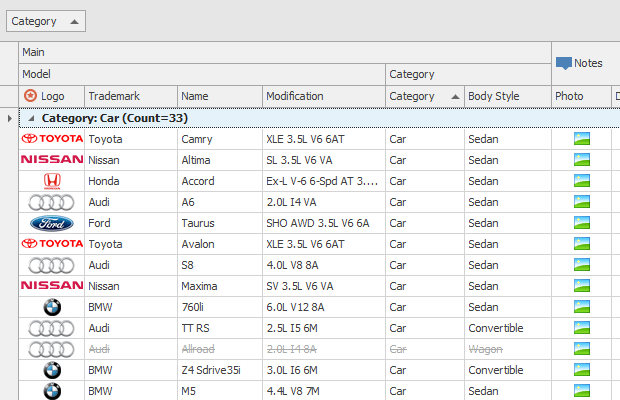
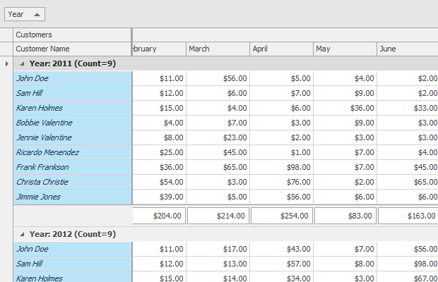
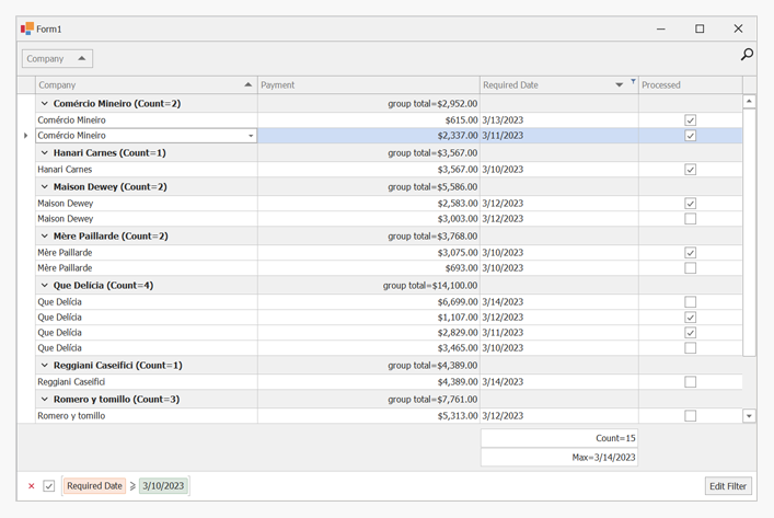
GridView — Data Grouping
GridView — Conditional Formatting
GridView — Cell Merging
GridView — Row Auto Height
Features include:
- Custom and automatic row height
- Sort and group data
- Filter data
- Calculate summaries
- Master-detail mode
- Select rows and cells
- Split presentation mode
- Fixed columns
- Edit cells in-place with various data editors
- Merge cells
- Customize layout at runtime
Learn more about GridView
Banded Grid View
The Banded GridView displays data in a tabular form and organizes columns into bands. It is represented by the BandedGridView class.
One Band Level — Row Auto Height
Nested Bands
Fixed Bands and Data Grouping
Features include:
- Custom and automatic row height
- Sort and group data
- Filter data
- Calculate summaries
- Master-detail mode
- Select rows and cells
- Split presentation mode
- Fixed columns
- Edit cells in-place with various data editors
- Merge cells
- Customize layout at runtime
Learn more about Banded GridView
Advanced Banded Grid View
The Advanced Banded GridView displays data in a tabular form, organizes columns into bands, and supports complex data cell arrangement. It is represented by the AdvBandedGridView class.
Multi-Row Cell Layout
Data Grouping
Customization Form
The main features of the Advanced Banded Grid View match those of the Grid View (except for Cell Merging). Features include:
- Custom and automatic row height
- Sort and group data
- Filter data
- Calculate summaries
- Master-detail mode
- Select rows and cells
- Split presentation mode
- Fixed columns
- Edit cells in-place with various data editors
- Customize layout at runtime
Learn more about Advanced Banded GridView
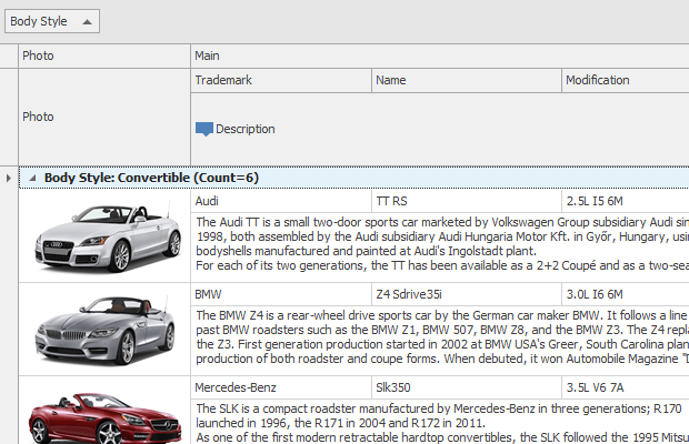
Layout View
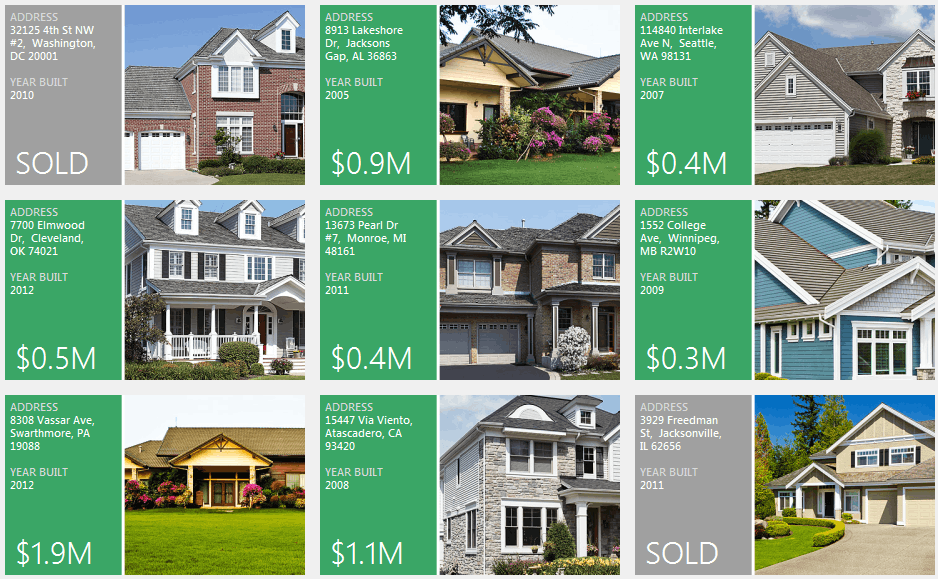
The Layout View displays records as cards in one or more columns, in one or more rows, in an ellipse (carousel mode), or as a single card at a time. The view supports complex card field layouts, built-in groups, tabbed groups, and labels. It is represented by the LayoutView class.
LayoutView
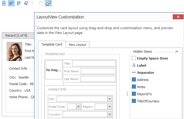
LayoutView — Runtime Customization
LayoutView — Carousel Mode
Features include:
- Simple and complex arrangement of fields within cards
- Several card arrangement rules (in one or multiple columns, in one or multiple rows, in an ellipse (carousel mode), or a single card at a time)
- Stretching cards to View width/height
- Sorting and filtering cards
- Multiple card selection
- Split presentation mode
- In-place cell editing using various data editors
- Runtime card field layout customization
Learn more about LayoutView
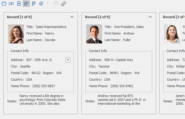
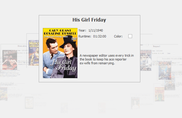
Card View
The Card View displays data records as cards, arranged down and then across. Card fields are always arranged in a single column. The Card View is represented by the CardView class.
CardView
CardView — Runtime Customization
Features include:
- Basic card field arrangement (in a single column)
- Arrangement of cards down and then across
- Card sort and filter
- Multiple card selection
- Split presentation mode
- In-place cell editing using various data editors
- Runtime card field layout customization (toggle card field visibility)
Learn more about CardView
WinExplorer View
The WinExplorer View displays records using one of seven styles supported by Microsoft Windows Explorer — Small, Medium, Large, Extra Large, List, Tiles, and Content. The view supports HTML-CSS templates that allow you to create fully custom UIs. The view is represented by the WinExplorerView class.
WinExplorerView — Tiles Style
WinExplorerView — Small Style
WinExplorerView — Medium Style

WinExplorerView — Large Style

WinExplorerView — ExtraLarge Style

WinExplorerView — Content Style
WinExplorerView — List Style
Features include:
- Seven data presentation formats — Small, Medium, Large, Extra Large, List, Tiles, and Content
- Context buttons
- Card sort and filter (in code)
- Data grouping (by one column)
- Disable items based on data from a data source
- Select items with built-in item check boxes
- Load images asynchronously
- Select multiple cards
- Split presentation mode
Learn more about WinExplorerView
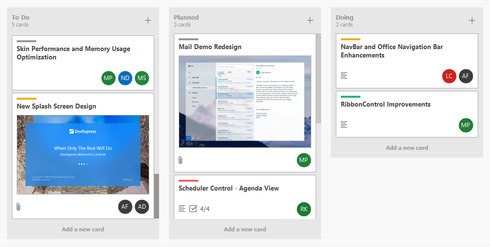
Tile View & Kanban Board
The Tile View displays records as tiles using one of the following layout modes: default (standard table layout), list (tiles have no space between them), or Kanban. The Tile View includes the Tile Template feature that allows you to arrange fields relative to other fields, specify absolute or relative field display bounds, etc. In-place editors are supported when you use HTML-based templates.
The Tile View is represented by the TileView class.
Features include:
- Arrange tile elements (columns) relative to tile corners and other tile elements
- Context buttons
- Sort and filter tiles (in code)
- Group data (by one column)
- Disable tiles based on data from a data source
- Tile check marks
- Edit data in a modal edit form
- Kanban tile presentation mode
- Load images asynchronously
- Split presentation mode
Learn more about TileView
Items View
The Items View renders items (records) using an HTML-CSS template that you can specify with a property, or dynamically with an event. It is represented by the ItemsView class.
Learn more about ItemsView
Select a View
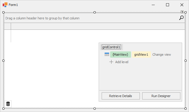
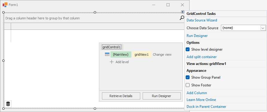
When you drop a GridControl onto the form at design time (or when you create this control in code), it is created with an embedded GridView — a View that presents underlying data as a two-dimensional table.
At design time:
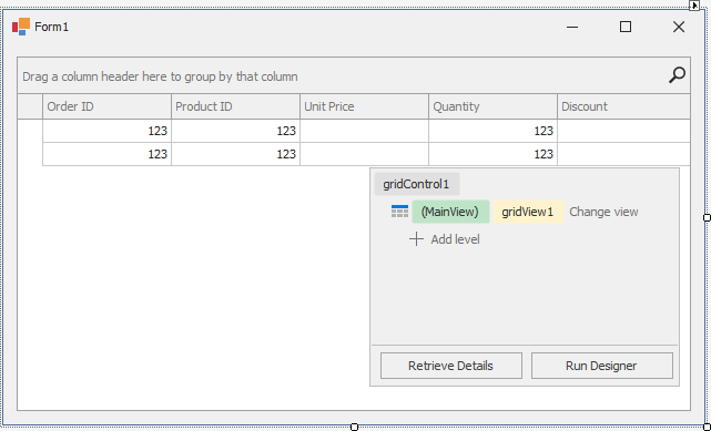
At runtime (after you bind the grid to data and add columns to the GridView):
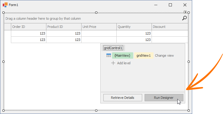
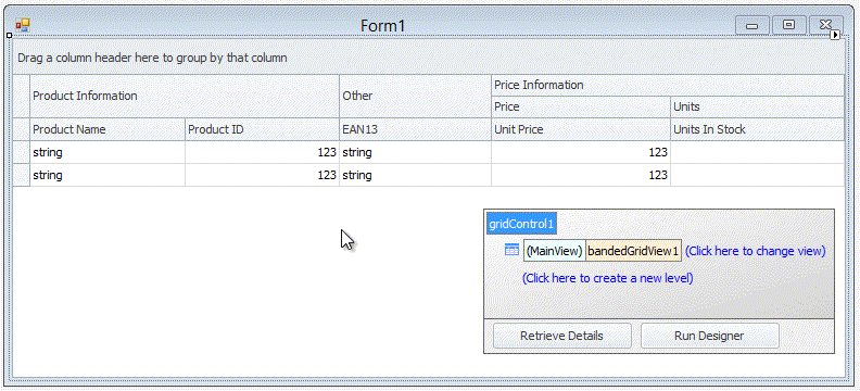
At design time, the data grid displays the Level Designer at the bottom right corner. The Level Designer allows you to access and manipulate (create, delete, and convert) data Views, and run the Grid Designer.
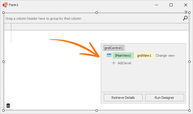
The box in the Level Designer identifies the current View. Click Change view to change the data View.
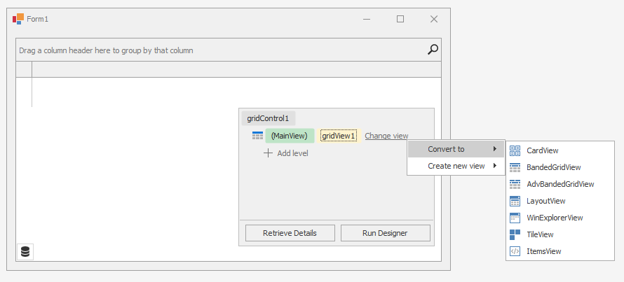
Select one of the following options:
- Convert to — Allows you to convert the View to another type. The conversion transfers columns (if they exist) and appropriate settings from this View to a new View. The “old” View is removed (destroyed).
- Create new view — Allows you to create a new View (the “old” View is not removed). You can access new and old Views in the Level Designer, the grid control’s Designer, and the GridControl.ViewCollection property in code.
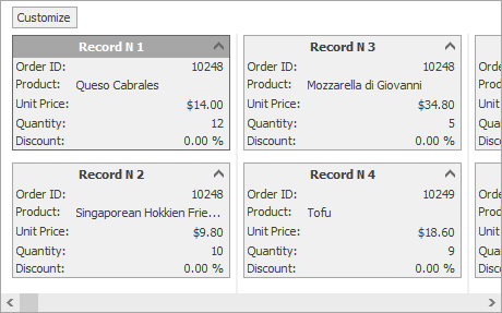
For instance, if you convert the GridView to CardView, the Level Designer will display .
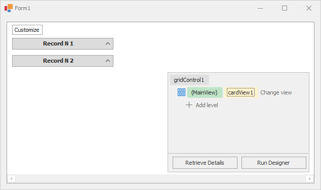
At runtime, you will see the following card UI:
Note
The Grid Control can also display data from hierarchical data sources (with two or more tables (data lists) linked by master-detail relationships). These relationships are also called one-to-many relationships: each record in a master table corresponds to one or more records in a child (detail) table. With the Level Designer, you can specify the data Views that display master and detail tables.
Read the following topic for detailed information: Master-Detail Relationships.
Supply Data for Views and Populate Column Collection
A View’s data is supplied by the grid control’s bound data source that is specified by the GridControl.DataSource and GridControl.DataMember properties.
At design time, you can use the Grid’s smart tag menu to bind the grid control to data.
You can do one of the following:
- Open the drop-down menu next to Choose Data Source to run the Visual Studio Data Source Configuration Wizard.
- Select Data Source Wizard to run the DevExpress Data Source Configuration Wizard that simplifies binding to various data source types (ADO.NET, SQL data, Entity Framework, etc.).
Important
The DevExpress Data Source Wizard calls the standard Visual Studio Data Source Configuration Wizard that is not available in .NET projects. You should create datasets, binding sources, and table adapters manually (or you can generate them in a .NET Framework project and add to the .NET project).
Important Notes Related to Design-Time Customization in .NET Apps
Refer to the following topic for more information: Data Binding.
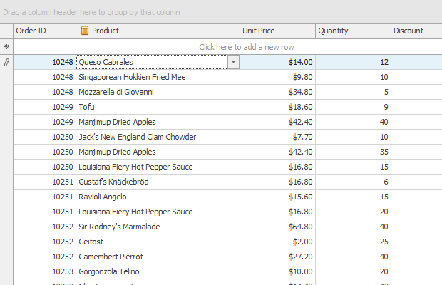
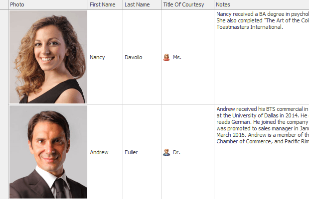
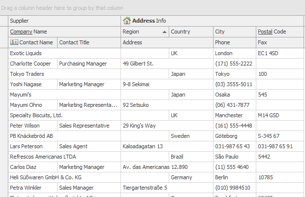
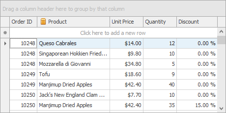
Once you bind the grid control to data, the View automatically creates columns for all fields in the bound data source (if the grid’s column collection was empty before binding). The following image shows the GridView populated with data from a sample data table that has five data fields.
You can use the View’s OptionsBehavior.AutoPopulateColumns setting to disable automatic column population.
Unlike other Views, the WinExplorerView and TileView do not automatically show added columns. For these Views, additional customization is required to set up a layout within items/cards. Read the following topics for more information:
- WinExplorer View
- Tile View
Access and Customize Views and Columns at Design Time
Views and their columns have multiple options and events to customize the way underlying data is presented on-screen. You can access and customize their settings in a number of ways.
On-Form Selection and Properties Window
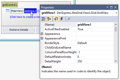
Since View and column objects are visual components, they are accessible from the Visual Studio Properties window.
The data grid supports design-time on-form selection of Views and columns. To select a View and list its settings in the Properties window, click the View in the Level Designer.
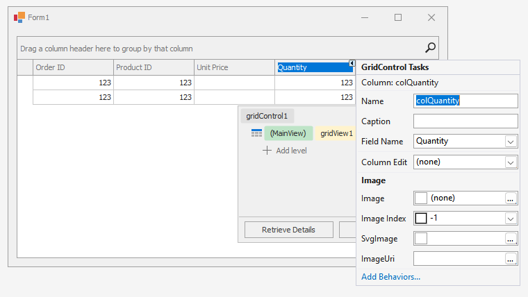
To select a column, click its header directly on the form:
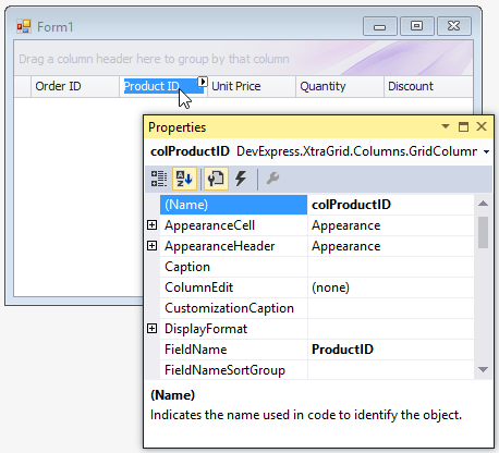
Column Smart Tags
Column smart tags display main column settings in GridViews, Banded GridViews, and Advanced Banded GridViews:
Grid Designer
The Grid Designer allows you to manage Views, columns, in-place editors, group summaries, appearance settings, and layout options. It contains the “Feature Browser” page to quickly locate settings related to a specific functionality. To invoke the Grid Designer, click the Run Designer button in the Level Designer:
The Grid Designer has a navigation bar on the left that allows you to select various pages. For instance, the Views page is equivalent to the Level Designer. This page allows you to access the current top level View and nested Views (if any).
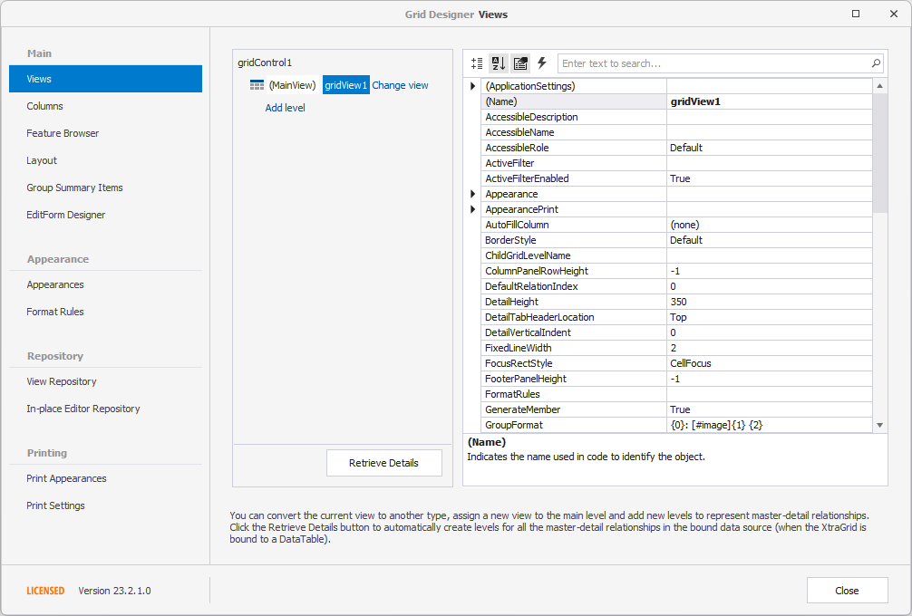
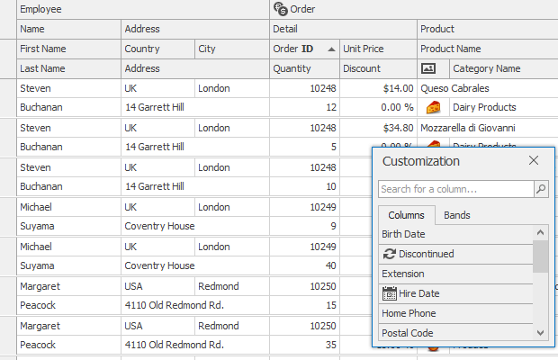
The Columns page shows available data source fields and columns (visible and hidden) that are bound to these fields. You can customize individual columns, clear the column collection, add new columns manually, or populate the View with columns from the bound data source with a single button click.
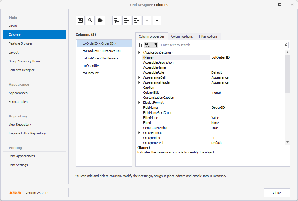
The Feature Browser page categorizes options and events based on specific features:
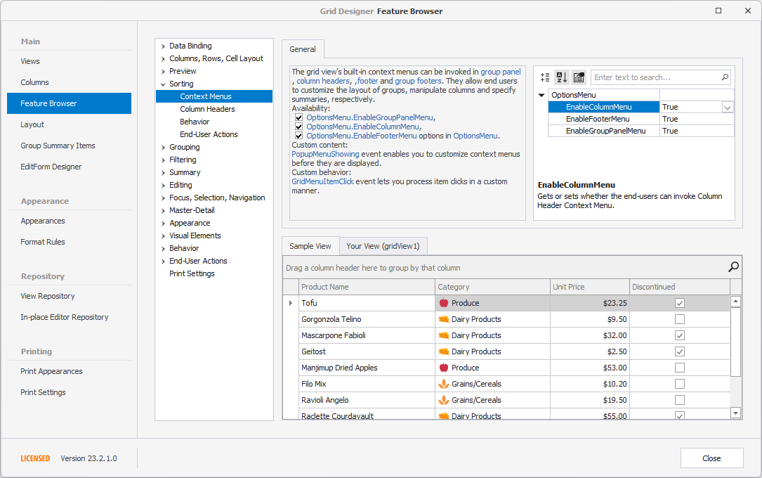
Read the following topic for more information: Grid Designer.
Access and Customize Views and Columns in Code
View and column objects are components. When created at design time, you can access them in code by their names:
- C#
- VB.NET
gridView1.OptionsBehavior.AutoPopulateColumns = false;
gridColumn1.VisibleIndex = -1;
Use the GridControl.MainView property to access the grid control’s top level View (you should cast this property value to the corresponding View type):
- C#
- VB.NET
GridView view = gridControl1.MainView as GridView;
if (view != null)
    view.OptionsView.RowAutoHeight = true;
The following example changes the main View:
- C#
- VB.NET
LayoutView lv = new LayoutView(gridControl1);
gridControl1.MainView = lv;
You can obtain grid columns from the View’s ColumnView.Columns collection by the index or field name:
- C#
- VB.NET
gridView1.Columns["ID"].Caption = "№";
In master-detail mode, the data grid displays multiple Views. Use the following properties and methods to get displayed detail Views:
- GridControl.FocusedView
- GridView.ExpandMasterRow
- GridView.GetDetailView.
Refer to the following help topics for more information: Master-Detail Relationships — Pattern and Clone Views and Access Master and Clone Views.
Example: How to Change the View
The following example replaces the existing top level View with a BandedGridView, and adds a band and column to the View:
- C#
- VB.NET
using DevExpress.XtraGrid.Views.BandedGrid;

// Dispose of the old view
gridControl1.MainView.Dispose();
// Create a Banded Grid View
BandedGridView bandedView = new BandedGridView(gridControl1);
gridControl1.MainView = bandedView;
// Add one band and one column to the view
GridBand band = bandedView.Bands.AddBand("General");
BandedGridColumn column = (BandedGridColumn)bandedView.Columns.AddField("CustomerID");
column.OwnerBand = band;
column.Visible = true;
Layout of Columns and Bands (in Grid Views and Banded Grid Views)
The GridView, BandedGridView, and AdvBandedGridView support on-form design-time layout customization via drag-and-drop. You can re-order, resize and hide columns and bands:
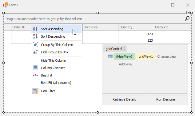
The context menu, invoked on a column header click, allows you to sort and group data against a column, calculate the best column width and show the Column Chooser (Column/Band Chooser in Banded Views) — a floating panel that provides access to hidden columns (and bands in Banded Views). Hidden columns (and bands) can be restored from the Column/Band Chooser back to the View using drag-and-drop:
You can also customize column and band settings in the Visual Studio Properties window (GridColumn.VisibleIndex, GridBand.VisibleIndex, GridColumn.Width, GridColumn.SortOrder, GridColumn.SortIndex, etc.).
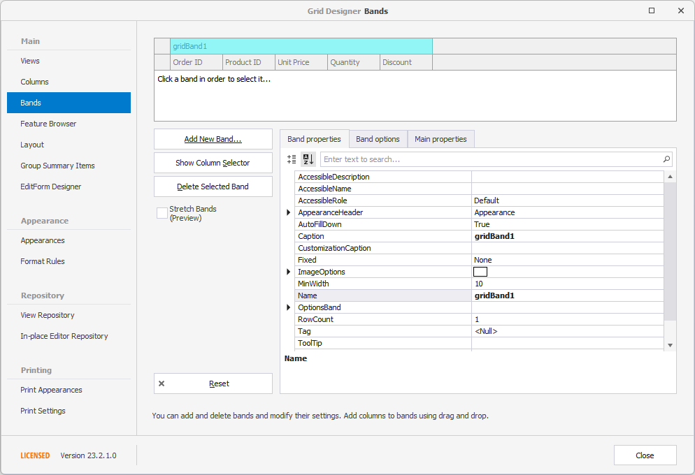
For Banded Views (BandedGridView and AdvBandedGridView), use the Bands page of the Grid Designer to add new bands and rearrange bands and columns. You can also re-arrange bands and columns on the form:
Examples
Create GridView
The following example creates a GridControl at runtime and shows how to perform basic customization tasks:
- Bind the grid to a data source
- Access the View that displays the underlying data
- Access columns
- Assign an in-place editor (a combo box editor) to a column
- Sort and group data
- Calculate total and group summaries
- Create a filter
- Hide columns and calculate column “best” widths
- Expand group rows
- Focus a specific cell
- Specify DataAnnotation attributes (column display names and data formats) at the data source level
- C#
- VB.NET
using System;
using DevExpress.ClipboardSource.SpreadsheetML;
using DevExpress.Data;
using DevExpress.XtraEditors;
using DevExpress.XtraEditors.Repository;
using DevExpress.XtraGrid;
using DevExpress.XtraGrid.Columns;
using DevExpress.XtraGrid.Views.Grid;
using System.ComponentModel;
using System.ComponentModel.DataAnnotations;
using System.Runtime.CompilerServices;
using System.Windows.Forms;

namespace DXApplication {
    public partial class Form1 : XtraForm {
        public Form1() {
            InitializeComponent();
            this.Load += Form1_Load;
        }
        private void Form1_Load(object sender, EventArgs e) {
            GridControl gridControl1 = new GridControl() {
                Name = "gridControl1",
                Parent = this,
                Dock = DockStyle.Fill
            };
            gridControl1.DataSource = DataHelper.GetData(30);
            // The grid automatically creates columns for the public fields found in the data source.
            // Calling the gridView1.PopulateColumns method is not required unless gridView1.OptionsBehavior.AutoPopulateColumns is disabled.

            // The grid automatically creates a GridView that displays the underlying data as a two-dimensional table.
            GridView gridView1 = gridControl1.MainView as GridView;

            // Obtain created columns.
            GridColumn colCompany = gridView1.Columns["CompanyName"];
            GridColumn colID = gridView1.Columns["ID"];
            GridColumn colDate = gridView1.Columns["RequiredDate"];
            GridColumn colPayment = gridView1.Columns["Value"];
            GridColumn colProcessed = gridView1.Columns["Processed"];

            // The Company column uses a ComboBox in-place editor that shows a list of available companies.
            RepositoryItemComboBox riComboBox = new RepositoryItemComboBox();
            riComboBox.Items.AddRange(DataHelper.companies);
            gridControl1.RepositoryItems.Add(riComboBox);
            colCompany.ColumnEdit = riComboBox;

            // Hide a column.
            colID.Visible = false;

            // Group and sort data.
            colCompany.GroupIndex = 0;
            colDate.SortIndex = 0;
            colDate.SortOrder = DevExpress.Data.ColumnSortOrder.Descending;

            // Show group columns in the table.
            gridView1.OptionsView.ShowGroupedColumns = true;

            // Expand group rows.
            gridView1.ExpandAllGroups();

            // Apply a filter.
            gridView1.ActiveFilterString = "[RequiredDate]>= #" + DateTime.Today.ToString() + "#";

            // Calculate two total summaries.
            colDate.Summary.Add(SummaryItemType.Count, colDate.FieldName, "Count={0}");
            colDate.Summary.Add(SummaryItemType.Max, colDate.FieldName, "Max={0:d}");
            gridView1.OptionsView.ShowFooter = true;

            // Calculate group summaries.
            GridGroupSummaryItem item = new GridGroupSummaryItem();
            item.FieldName = colCompany.FieldName;
            item.SummaryType = DevExpress.Data.SummaryItemType.Count;
            gridView1.GroupSummary.Add(item);

            GridGroupSummaryItem item1 = new GridGroupSummaryItem();
            item1.FieldName = colPayment.FieldName;
            item1.SummaryType = SummaryItemType.Sum;
            item1.DisplayFormat = "group total={0:c2}";
            item1.ShowInGroupColumnFooter = colPayment;
            gridView1.GroupSummary.Add(item1);

            // Forcibly move group footer summaries to positions in group rows under corresponding column headers.
            gridView1.OptionsBehavior.AlignGroupSummaryInGroupRow = DevExpress.Utils.DefaultBoolean.True;

            // Focus a specific cell.
            gridView1.FocusedRowHandle = 1;
            gridView1.FocusedColumn = colCompany;

            // Optimize column widths.
            colDate.BestFit();
            colProcessed.BestFit();
        }
    }

    public class Record : INotifyPropertyChanged {
        public Record() {
        }
        int id;
        public int ID {
            get { return id; }
            set {
                if(id != value) {
                    id = value;
                    OnPropertyChanged();
                }
            }
        }

        string text;
        [DisplayName("Company")]
        public string CompanyName {
            get { return text; }
            set {
                if(text != value) {
                    if(string.IsNullOrEmpty(value))
                        throw new Exception();
                    text = value;
                    OnPropertyChanged();
                }
            }
        }
        Nullable<decimal> val;
        [DataType(System.ComponentModel.DataAnnotations.DataType.Currency)]
        [DisplayName("Payment")]
        public Nullable<decimal> Value {
            get { return val; }
            set {
                if(val != value) {
                    val = value;
                    OnPropertyChanged();
                }
            }
        }
        DateTime dt;
        [DisplayFormat(DataFormatString = "d")]
        public DateTime RequiredDate {
            get { return dt; }
            set {
                if(dt != value) {
                    dt = value;
                    OnPropertyChanged();
                }
            }
        }
        bool state;
        public bool Processed {
            get { return state; }
            set {
                if(state != value) {
                    state = value;
                    OnPropertyChanged();
                }
            }
        }

        public override string ToString() {
            return string.Format("ID = {0}, Text = {1}", ID, CompanyName);
        }

        public event PropertyChangedEventHandler PropertyChanged;
        protected void OnPropertyChanged([CallerMemberName] string propertyName = "") {
            if(PropertyChanged != null)
                PropertyChanged(this, new PropertyChangedEventArgs(propertyName));
        }
    }

    public class DataHelper {

        public static string[] companies = new string[] { "Hanari Carnes", "Que Delícia", "Romero y tomillo", "Mère Paillarde",
            "Comércio Mineiro", "Reggiani Caseifici", "Maison Dewey" };
        public static BindingList<Record> GetData(int count) {
            BindingList<Record> records = new BindingList<Record>();
            Random rnd = new Random();
            for(int i = 0; i < count; i++) {
                int n = rnd.Next(10);
                records.Add(new Record() {
                    ID = i + 100,
                    CompanyName = companies[i % companies.Length],
                    RequiredDate = DateTime.Today.AddDays(n - 5),
                    Value = i % 2 == 0 ? (i + 1) * 123 : i * 231,
                    Processed = i % 2 == 0,
                });
            };
            return records;
        }
    }

}
Create BandedGridView
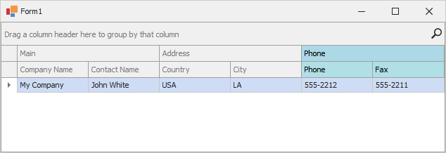
This example shows how to create a GridControl, while presenting its underlying data using a banded grid format (BandedGridView). The example creates three bands (Main, Address and Phone), adds columns to the bands and customizes the background color for the third band and its columns.
- C#
- VB.NET
using System;
using System.Collections.Generic;
using System.Windows.Forms;
using DevExpress.XtraEditors;
using DevExpress.XtraGrid;
using DevExpress.XtraGrid.Views.BandedGrid;

namespace DXApplication {
    public partial class Form1 : XtraForm {
        public Form1() {
            InitializeComponent();
            this.Load += Form1_Load;
        }
        private void Form1_Load(object sender, EventArgs e) {
            GridControl gridControl1 = new GridControl() { Parent = this, Dock = DockStyle.Fill };

            BandedGridView bandedGridView1 = new BandedGridView(gridControl1);
            GridBand gridBandMain = new GridBand() { Caption = "Main", VisibleIndex = 0 };
            GridBand gridBandAddress = new GridBand() { Caption = "Address", VisibleIndex = 1 };
            GridBand gridBandPhone = new GridBand() { Caption = "Phone", VisibleIndex = 2 };
            BandedGridColumn colCity = new BandedGridColumn() { FieldName = "City", Visible = true };
            BandedGridColumn colCompanyName = new BandedGridColumn() { FieldName = "CompanyName", Visible = true };
            BandedGridColumn colContactName = new BandedGridColumn() { FieldName = "ContactName", Visible = true };
            BandedGridColumn colCountry = new BandedGridColumn() { FieldName = "Country", Visible = true };
            BandedGridColumn colPhone = new BandedGridColumn() { FieldName = "Phone", Visible = true };
            BandedGridColumn colFax = new BandedGridColumn() { FieldName = "Fax", Visible = true };

            gridControl1.DataSource = new List<DataRecord>() {
                new DataRecord(){ City = "LA", CompanyName = "My Company", ContactName = "John White",
                   Country = "USA",  Fax = "555-2211", Phone = "555-2212" }
            };
            gridControl1.ViewCollection.Add(bandedGridView1);
            gridControl1.MainView = bandedGridView1;

            bandedGridView1.Bands.AddRange(new GridBand[] { gridBandMain, gridBandAddress, gridBandPhone });
            bandedGridView1.Columns.AddRange(new BandedGridColumn[] { colCompanyName, colContactName, colCity, colCountry, colPhone, colFax });

            colPhone.AppearanceCell.BackColor = System.Drawing.Color.PowderBlue;
            colPhone.AppearanceCell.Options.UseBackColor = true;
            colPhone.AppearanceHeader.BackColor = System.Drawing.Color.PowderBlue;
            colPhone.AppearanceHeader.Options.UseBackColor = true;

            colFax.AppearanceCell.BackColor = System.Drawing.Color.PowderBlue;
            colFax.AppearanceCell.Options.UseBackColor = true;
            colFax.AppearanceHeader.BackColor = System.Drawing.Color.PowderBlue;
            colFax.AppearanceHeader.Options.UseBackColor = true;

            gridBandMain.Columns.Add(colCompanyName);
            gridBandMain.Columns.Add(colContactName);

            gridBandAddress.Columns.Add(colCountry);
            gridBandAddress.Columns.Add(colCity);

            gridBandPhone.AppearanceHeader.BackColor = System.Drawing.Color.LightBlue;
            gridBandPhone.AppearanceHeader.Options.UseBackColor = true;
            gridBandPhone.Columns.Add(colPhone);
            gridBandPhone.Columns.Add(colFax);

            bandedGridView1.OptionsCustomization.AllowChangeColumnParent = false;
        }
    }

    public class DataRecord {
        public string CompanyName{ get; set; }
        public string ContactName { get; set; }
        public string City { get; set; }
        public string Country { get; set; }
        public string Phone { get; set; }
        public string Fax { get; set; }
    }
}
Create LayoutView
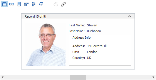
The following example shows how to create and customize a Layout View in code. In the example, a template card is created, consisting of six fields arranged as in the image below:
Before arranging layout fields in code, ensure that corresponding columns are visible (see LayoutViewColumn.Visible and GridColumnCollection.AddVisible).
- C#
- VB.NET
using DevExpress.XtraGrid;
using DevExpress.XtraGrid.Views.Layout;
using DevExpress.XtraGrid.Columns;
using DevExpress.XtraLayout;
using DevExpress.XtraLayout.Customization;
using DevExpress.XtraLayout.Utils;
using DevExpress.XtraEditors.Repository;
using DevExpress.XtraEditors.Controls;

GridControl grid = new GridControl();
LayoutView lView = new LayoutView(grid);
grid.MainView = lView;
lView.OptionsBehavior.AutoPopulateColumns = false;

grid.DataSource = employeesBindingSource;
this.Controls.Add(grid);
grid.Dock = DockStyle.Fill;

// Create columns.
LayoutViewColumn colFirstName = lView.Columns.AddVisible("FirstName") as LayoutViewColumn;
LayoutViewColumn colLastName = lView.Columns.AddVisible("LastName") as LayoutViewColumn;
LayoutViewColumn colAddress = lView.Columns.AddVisible("Address") as LayoutViewColumn;
LayoutViewColumn colCity = lView.Columns.AddVisible("City") as LayoutViewColumn;
LayoutViewColumn colCountry = lView.Columns.AddVisible("Country") as LayoutViewColumn;
LayoutViewColumn colPhoto = lView.Columns.AddVisible("Photo") as LayoutViewColumn;

// Access corresponding card fields.
LayoutViewField fieldFirstName = colFirstName.LayoutViewField;
LayoutViewField fieldLastName = colLastName.LayoutViewField;
LayoutViewField fieldAddress = colAddress.LayoutViewField;
LayoutViewField fieldCity = colCity.LayoutViewField;
LayoutViewField fieldCountry = colCountry.LayoutViewField;
LayoutViewField fieldPhoto = colPhoto.LayoutViewField;

// Position the FirstName field to the right of the Photo field.
fieldFirstName.Move(new LayoutItemDragController(fieldFirstName, fieldPhoto,
    InsertLocation.After, LayoutType.Horizontal));

// Position the LastName field below the FirstName field.
fieldLastName.Move(new LayoutItemDragController(fieldLastName, fieldFirstName,
    InsertLocation.After, LayoutType.Vertical));

// Create an Address Info group.
LayoutControlGroup groupAddress = new LayoutControlGroup();
groupAddress.Text = "Address Info";
groupAddress.Name = "addressInfoGroup";

// Move the Address, City and Country fields to this group.
groupAddress.AddItem(fieldAddress);
fieldCity.Move(fieldAddress, InsertType.Bottom);
fieldCountry.Move(fieldCity, InsertType.Bottom);

lView.TemplateCard.AddGroup(groupAddress, fieldLastName, InsertType.Bottom);

// Assign editors to card fields.
RepositoryItemPictureEdit riPictureEdit = grid.RepositoryItems.Add("PictureEdit") as RepositoryItemPictureEdit;
riPictureEdit.SizeMode = PictureSizeMode.Squeeze;
colPhoto.ColumnEdit = riPictureEdit;

// Customize card field options.
colFirstName.Caption = "First Name";
colLastName.Caption = "Last Name";
// Set the card's minimum size.
lView.CardMinSize = new Size(250, 180);

fieldPhoto.TextVisible = false;
fieldPhoto.SizeConstraintsType = SizeConstraintsType.Custom;
fieldPhoto.MaxSize = fieldPhoto.MinSize = new Size(150, 150);
See Also
- Grid View
- Banded Grid View
- Advanced Banded Grid View
- Layout View
- Card View
- WinExplorer View
- Tile View
- Items View
Introduction
When it comes to creating complex user interfaces in C# WinForms applications, a grid control can be a powerful tool to organize and display data in a structured and visually appealing manner. However, not all grid controls are created equal, and some may not meet the specific requirements of your project. In this article, we will explore the concept of a C# WinForms grid control that supports the layout of rows of controls, and discuss the key features and considerations to keep in mind when selecting the right control for your needs.
What is a C# WinForms Grid Control?
A C# WinForms grid control is a type of user interface component that allows you to display data in a table-like structure, with rows and columns. Unlike traditional grid controls, which often have a fixed layout and may not support the addition or removal of rows or columns at runtime, a C# WinForms grid control is designed to be highly flexible and customizable. This means that you can create a grid control that meets the specific needs of your application, including the ability to add or remove rows and columns dynamically, and to customize the layout and appearance of each row and column.
Key Features of a C# WinForms Grid Control
When selecting a C# WinForms grid control, there are several key features to consider. Some of the most important features to look for include:
- Dynamic row and column layout: The ability to add or remove rows and columns at runtime, and to customize the layout and appearance of each row and column.
- Support for different types of controls: The ability to add different types of controls to each row, such as text boxes, buttons, and labels.
- Customizable appearance: The ability to customize the appearance of the grid control, including the background color, font, and other visual elements.
- Event handling: The ability to handle events such as row selection, column resizing, and cell editing.
- Data binding: The ability to bind the grid control to a data source, such as a database or a collection of objects.
Popular C# WinForms Grid Controls
There are several popular C# WinForms grid controls available, each with its own strengths and weaknesses. Some of the most popular options include:
- DevExpress Grid Control: A highly customizable grid control that supports dynamic row and column layout, and a wide range of features and options.
- Infragistics UltraGrid: A powerful grid control that supports dynamic row and column layout, and a wide range of features and options.
- Telerik RadGrid: A highly customizable grid control that supports dynamic row and column layout, and a wide range of features and options.
- GridControl: A simple and lightweight grid control that supports dynamic row and column layout, and a basic set of features and options.
Creating a Custom C# WinForms Grid Control
If you are unable to find a C# WinForms grid control that meets your specific needs, you may need to create a custom control from scratch. This can be a complex and time-consuming process, but it can also provide you with a high degree of flexibility and customization.
To create a custom C WinForms grid control, you will need to:
- Design the control’s layout: Decide on the layout and appearance of the control, including the number and arrangement of rows and columns.
- Create the control’s user interface: Use a tool such as Visual Studio to create the control’s user interface, including the rows and columns, and any other visual elements.
- Implement the control’s logic: Write code to implement the control’s logic, including the ability to add or remove rows and columns, and to handle events such as row selection and cell editing.
- Test and debug the control: Test and debug the control to ensure that it works as expected, and to identify and fix any bugs or issues.
Conclusion
In conclusion, a C# WinForms grid control is a powerful tool for creating complex user interfaces in C# WinForms applications. By selecting the right control for your needs, and customizing its layout and appearance to meet the specific requirements of your project, you can create a grid control that is both functional and visually appealing. Whether you choose to use a pre-built control or create a custom control from scratch, the key to success lies in understanding the key features and considerations to keep in mind when selecting and implementing a C# WinForms grid control.
Example Code
Here is an example of how you might create a custom C# WinForms grid control using the GridControl class:
using System; using System.Windows.Forms;public class CustomGridControl : UserControl { private GridControl grid;
public CustomGridControl() { grid = new GridControl(); grid.Dock = DockStyle.Fill; this.Controls.Add(grid); } public void AddRow() { grid.Rows.Add(); } public void RemoveRow() { grid.Rows.RemoveAt(grid.Rows.Count - 1); } public void AddColumn() { grid.Columns.Add(); } public void RemoveColumn() { grid.Columns.RemoveAt(grid.Columns.Count - 1); }
}
This code creates a custom grid control that supports the addition and removal of rows and columns, and provides methods for adding and removing rows and columns. You can customize the control’s layout and appearance by modifying the GridControl class and its properties.
Best Practices
When creating a custom C# WinForms grid control, there are several best practices to keep in mind:
- Use a consistent naming convention: Use a consistent naming convention for your control’s properties and methods, to make it easier to understand and use.
- Document your code: Document your code thoroughly, to make it easier for others to understand and use.
- Test and debug your control: Test and debug your control thoroughly, to ensure that it works as expected and to identify and fix any bugs or issues.
- Use a version control system: Use a version control system such as Git to track changes to your code and to collaborate with others.
Q: What is a C# WinForms grid control?
A: A C# WinForms grid control is a type of user interface component that allows you to display data in a table-like structure, with rows and columns. Unlike traditional grid controls, which often have a fixed layout and may not support the addition or removal of rows or columns at runtime, a C# WinForms grid control is designed to be highly flexible and customizable.
Q: What are the key features of a C# WinForms grid control?
A: Some of the key features of a C# WinForms grid control include:
- Dynamic row and column layout: The ability to add or remove rows and columns at runtime, and to customize the layout and appearance of each row and column.
- Support for different types of controls: The ability to add different types of controls to each row, such as text boxes, buttons, and labels.
- Customizable appearance: The ability to customize the appearance of the grid control, including the background color, font, and other visual elements.
- Event handling: The ability to handle events such as row selection, column resizing, and cell editing.
- Data binding: The ability to bind the grid control to a data source, such as a database or a collection of objects.
Q: What are some popular C# WinForms grid controls?
A: Some popular C# WinForms grid controls include:
- DevExpress Grid Control: A highly customizable grid control that supports dynamic row and column layout, and a wide range of features and options.
- Infragistics UltraGrid: A powerful grid control that supports dynamic row and column layout, and a wide range of features and options.
- Telerik RadGrid: A highly customizable grid control that supports dynamic row and column layout, and a wide range of features and options.
- GridControl: A simple and lightweight grid control that supports dynamic row and column layout, and a basic set of features and options.
Q: How do I create a custom C# WinForms grid control?
A: To create a custom C# WinForms grid control, you will need to:
- Design the control’s layout: Decide on the layout and appearance of the control, including the number and arrangement of rows and columns.
- Create the control’s user interface: Use a tool such as Visual Studio to create the control’s user interface, including the rows and columns, and any other visual elements.
- Implement the control’s logic: Write code to implement the control’s logic, including the ability to add or remove rows and columns, and to handle events such as row selection and cell editing.
- Test and debug the control: Test and debug the control to ensure that it works as expected, and to identify and fix any bugs or issues.
Q: What are some best practices for creating a custom C# WinForms grid control?
A: Some best practices for creating a custom C# WinForms grid control include:
- Use a consistent naming convention: Use a consistent naming convention for your control’s properties and methods, to make it easier to understand and use.
- Document your code: Document your thoroughly, to make it easier for others to understand and use.
- Test and debug your control: Test and debug your control thoroughly, to ensure that it works as expected and to identify and fix any bugs or issues.
- Use a version control system: Use a version control system such as Git to track changes to your code and to collaborate with others.
Q: How do I bind data to a C# WinForms grid control?
A: To bind data to a C# WinForms grid control, you will need to:
- Create a data source: Create a data source, such as a database or a collection of objects.
- Create a data binding: Create a data binding between the grid control and the data source.
- Configure the data binding: Configure the data binding to specify the fields to display and the data types to use.
Q: How do I handle events in a C# WinForms grid control?
A: To handle events in a C# WinForms grid control, you will need to:
- Create an event handler: Create an event handler to handle the event, such as a row selection or column resizing event.
- Attach the event handler: Attach the event handler to the grid control, using a method such as
gridControl.RowSelected += new EventHandler(gridControl_RowSelected);. - Implement the event handler: Implement the event handler to perform the desired action, such as displaying a message box or updating a database.
Q: How do I customize the appearance of a C# WinForms grid control?
A: To customize the appearance of a C# WinForms grid control, you will need to:
- Use a theme: Use a theme to customize the appearance of the grid control, including the background color, font, and other visual elements.
- Use a skin: Use a skin to customize the appearance of the grid control, including the background color, font, and other visual elements.
- Customize the grid control’s properties: Customize the grid control’s properties, such as the row height, column width, and cell padding.
Q: How do I add or remove rows and columns in a C# WinForms grid control?
A: To add or remove rows and columns in a C# WinForms grid control, you will need to:
- Use the grid control’s methods: Use the grid control’s methods, such as
gridControl.Rows.Add()orgridControl.Columns.Add(), to add or remove rows and columns. - Use the grid control’s properties: Use the grid control’s properties, such as
gridControl.Rows.CountorgridControl.Columns.Count, to access the rows and columns.
Q: How do I handle data validation in a C# WinForms grid control?
A: To handle data validation in a C# WinForms grid control, you will need to:
- Implement a data validation rule: Implement a data validation rule to validate the data entered by the user.
- Attach the data validation rule: Attach the data validation rule to the grid control, using a method such as
gridControl.DataValidation += new EventHandler(gridControl_DataValidation);. - Implement the data validation rule: Implement the data validation rule to perform the desired action, as displaying an error message or updating a database.
(iGrid.NET Control Tour, Step 1 of 9)
The main goal of iGrid is to give you a handy tool to implement tabular interfaces with the ability to highly adjust them. This is possible due to the array of iGrid cells. This functionality is available out-of-the-box without a need to define an array in your code and bind it to the 10Tec WinForms grid. Its cells are already organized into a 2-dimensional array, and iGrid provides you with a convenient way to use this array.
The simplest code sample
All what we need to use iGrid’s cell array is to specify the required number of columns and rows, for example:
iGrid1.Cols.Count = 3;
iGrid1.Rows.Count = 5;
After that we can access the iGrid cells and set their values using the Cells array-like property:
iGrid1.Cells[2, 0].Value = "Test value";
iGrid1.Cells[3, 0].Value = 12345;
The two code snippets above create the following grid with 3 columns and 5 rows:
Notice that you can specify values of different data types in the cells of the same column. This allows you to easily build PropertyGrid-like interfaces like this one:

Column and row string keys
Every column and row in iGrid can have a string key. The string key can be used instead of the numeric index to access a column, row, or cell. To demonstrate this, let’s create another grid in which we define columns with the Add() method of the Cols collection. The overloaded version we will use accepts column string key as its first parameter and column caption as the second one:
for(int i = 0; i <= 2; i++)
  iGrid1.Cols.Add($"Col {i}", $"Column {i}");

iGrid1.Rows.Count = 5;

for(int i = 0; i < iGrid1.Rows.Count; i++)
  for(int j = 0; j < iGrid1.Cols.Count; j++)
    iGrid1.Cells[i, j].Value = (i + 1) * 10000 + j;
Having column keys, we can retrieve a cell value using the string key of its column in the same Cells array (column and row keys are case-insensitive):
var value = iGrid1.Cells[3, "Col 2"].Value;String keys make your code more understandable. They also save your time when you modify grid structure because you will not worry about changing numeric column/row indices you would use otherwise.
Intrinsic unbound mode and excellent performance
iGrid works in unbound mode, but this does not mean you cannot create data-bound grids. You can upload data from ADO.NET data sources with the FillWithData() method in one call and optionally, if you need data binding, implement it exactly the way you need with iGrid’s rich object and event model.
Operations with the iGrid cell array are extremely effective due to internal page organization and other optimizations like .NET native pointer arithmetic. Tasks like adding/inserting many rows into the grid, especially when the number of rows to add is not known beforehand, are performed very quickly. Your work is just to put data into iGrid cells and format them; iGrid does the rest to provide your users with excellent performance!
iGrid.NET cell formatting options »
Используя возможности макета элемента Visual Studio, можно точно указать расположение элементов управления в форме. Элементы управления добавить в форму или переместить в форме автоматически выравниваются в строки и столбцы сетки в конструкторе Windows Forms, или можно выравнивать элементы управления с помощью линий привязки.
Note
Отображаемые диалоговые окна и команды меню могут отличаться от описанных в справке в зависимости от текущих параметров или выпуска. Чтобы изменить параметры, выберите в меню Сервис пункт Импорт и экспорт параметров . Дополнительные сведения см. в разделе Персонализация интегрированной среды разработки Visual Studio.
Чтобы привязать все элементы управления к сетке
-
Выберите SnapToGrid режим макета в конструкторе Windows Forms параметры диалоговое окно.
Дополнительные сведения см. в разделе Общие, конструктор Windows Forms, диалоговое окно параметров. Все элементы управления теперь выравниваются по точкам сетки.
Отдельные элементы управления в сетку можно привязывать, блокировки их на месте. Тем не менее хотя они заблокированы, их нельзя переместить или изменить размер. Дополнительные сведения о блокировке элементов управления, см. в разделе как: Блокирование элементов управления в Windows Forms.
Для выравнивания элементов управления с помощью линий привязки
-
Выберите линии привязки режим макета в конструкторе Windows Forms параметры диалоговое окно.
Дополнительные сведения см. в разделе Пошаговое руководство: Упорядочение элементов управления в Windows Forms с помощью линий привязки. Теперь можно использовать линии привязки для выравнивания и упорядочения элементов управления в форме.
См. также
- Без ограничений, конструктор Windows Forms, диалоговое окно параметров
- Пошаговое руководство. Упорядочение элементов управления в формах Windows Forms с помощью линий привязки
- Элементы управления Windows Forms
- Практическое руководство. Добавление элементов управления в формы Windows Forms
- Расположение элементов управления в формах Windows Forms
- Создание меток и назначение сочетаний клавиш для элементов управления Windows Forms
- Элементы управления для использования в формах Windows Forms
- Функциональная классификация элементов управления Windows Forms
Provide feedback
Saved searches
Use saved searches to filter your results more quickly
Sign up
Appearance settings