
Вступление: Часто встречаются приложения которые не блестят особым дизайном UI, так же в них нет вкуса и все в сером цвете. С помощью не хитрых действий можно сделать современное приложение которая не будет уступать монстру WPF, к которому очень не легко сразу научится писать ПО, эта статья скорей для тех кто пишет под WinForms и боится начать WPF, так как они вроде бы похожи но все же отличаются сложностью и крутостью.
Итак. Для простого примера создадим наш собственный браузер на движке webkit с помощью платформы .Net Framework на языке программировании c#
Глава 1: Цвет залог успешной дружелюбности, чем он приятней тем лучше, и кстати белый цвета тоже не плохо смотрятся
Свойства формы: FrameBorder=none, BackColor=white
Глава 2: Кнопки играют не маловажную роль в интерфейсе любой ПО, главное их правильное расположение, размер, текст и цвет,
Для этого создадим UserControl
using System;
using System.Drawing;
using System.Linq;
using System.Text;
using System.Windows.Forms;

namespace habr
{
    public partial class btn : Button//UserControl
    {
        public enum ButtonType
        {
            GoBack,
            Home,
            GoForward,
            Refresh,
            Search,
            Close,
            Minimize
        }
        public btn()
        {
            InitializeComponent();
        }
        private Color _OnMouseEnterColor = Color.Blue;
        private Color _OnMouseClickColor = Color.BlueViolet;
        private Color _MixedColor = Color.CadetBlue;
        private byte _Transparency1 = 64;
        private byte _Transparency2 = 64;
        private byte _AngleOfTransparency = 90;
        private float _Resizer = 1.05f;
        private ButtonType _ButtonType;

        private bool IsOver;
        private bool IsDown;
        private Point _initLocation;
        private Font _initFontSize;
        private Point _tempLocation;
        private Size _tempSize;

        public Color OnMouseEnterColor { get { return _OnMouseEnterColor; } set { _OnMouseEnterColor = value; Invalidate(); } }
        public Color OnMouseClickColor { get { return _OnMouseClickColor; } set { _OnMouseClickColor = value; Invalidate(); } }
        public Color MixedColor { get { return _MixedColor; } set { _MixedColor = value; Invalidate(); } }
        public byte Transparency1 { get { return _Transparency1; } set { _Transparency1 = value; Invalidate(); } }
        public byte Transparency2 { get { return _Transparency2; } set { _Transparency2 = value; Invalidate(); } }
        public byte AngleOfTransparency { get { return _AngleOfTransparency; } set { _AngleOfTransparency = value; Invalidate(); } }
        public float Resizer { get { return _Resizer; } set { _Resizer = value; Invalidate(); } }
        public ButtonType ButtonTypeThumb { get { return _ButtonType; } set { _ButtonType = value; Invalidate(); } }


        protected override void OnMouseEnter(EventArgs e)
        {
            base.OnMouseEnter(e);
            IsOver = true;
        }
        protected override void OnMouseLeave(EventArgs e)
        {
            base.OnMouseLeave(e);
            IsOver = false;
        }
        protected override void OnMouseDown(MouseEventArgs mevent) //Эффект увеличивания / уменьшения
        {
            base.OnMouseDown(mevent);
            _initLocation = Location;
            _tempLocation = new Point(Location.X + Width / 2, Location.Y + Height / 2);
            _tempSize = Size;
            Size = new Size((int)(Width / _Resizer), (int)(Height / _Resizer));
            Location = new Point(_tempLocation.X - Size.Width / 2, _tempLocation.Y - Size.Height / 2);
            _initFontSize = Font;
            Font = new Font(Font.FontFamily, Font.Size / _Resizer);
            IsDown = true;

        }
        protected override void OnMouseUp(MouseEventArgs mevent)
        {
            base.OnMouseUp(mevent);
            Location = _initLocation;
            Size = _tempSize;
            Font = _initFontSize;
            IsDown = false;
        }
        protected override void OnPaint(PaintEventArgs pevent) //отрисовка иконки ИСПОЛЬЗОВАТЬ ШРИФТ SEGOE UI SYMBOL. Который позволяет отрисовывать такие жамечательные картинки
        {
            base.OnPaint(pevent);
            if (_ButtonType == ButtonType.GoBack) Text = "\ue096";
            if (_ButtonType == ButtonType.GoForward) Text = "\ue097";
            if (_ButtonType == ButtonType.Home) Text = "\ue10f";
            if (_ButtonType == ButtonType.Refresh) Text = "\ue149";
            if (_ButtonType == ButtonType.Search) Text = "\ue11a";
            if (_ButtonType == ButtonType.Close) Text = "\ue10a";
            if (_ButtonType == ButtonType.Minimize) Text = "\ue108";

            if (IsOver)
            {
                if (IsDown)
                {
                    Color c1 = Color.FromArgb
                    (_Transparency1, _OnMouseClickColor);
                    Color c2 = Color.FromArgb
                        (_Transparency2, _MixedColor);
                    Brush b = new System.Drawing.Drawing2D.LinearGradientBrush
                        (ClientRectangle, c1, c2, _AngleOfTransparency);
                    pevent.Graphics.FillRectangle(b, ClientRectangle);
                    b.Dispose();
                }
                else
                {
                    Color c1 = Color.FromArgb
                   (_Transparency1, _OnMouseEnterColor);
                    Color c2 = Color.FromArgb
                        (_Transparency2, _MixedColor);
                    Brush b = new System.Drawing.Drawing2D.LinearGradientBrush
                        (ClientRectangle, c1, c2, _AngleOfTransparency);
                    pevent.Graphics.FillRectangle(b, ClientRectangle);
                    b.Dispose();
                }

            }
        }

    }
}
Глава 3: Не много функциональности для формы
public partial class Form1 : Form
    {
        public Form1()
        {
            InitializeComponent();
        }
        private bool IsDown;
        private Point Origin;
        private void btn6_Click(object sender, EventArgs e)
        {
            Application.Exit();
        }

        private void btn7_Click(object sender, EventArgs e)
        {
            WindowState = FormWindowState.Minimized;
        }

        private void panel4_MouseDown(object sender, MouseEventArgs e)
        {
            IsDown = true;
            Origin = new Point(e.X, e.Y);
        }

        private void panel4_MouseUp(object sender, MouseEventArgs e)
        {
            IsDown = false;
            Location = new Point(Location.X - Origin.X + e.X, Location.Y - Origin.Y + e.Y);
        }

        private void panel4_MouseMove(object sender, MouseEventArgs e)
        {
            if (IsDown) Location = new Point(Location.X - Origin.X + e.X, Location.Y - Origin.Y + e.Y);
        }

        private void panel1_DoubleClick(object sender, EventArgs e)
        {
            if (WindowState == FormWindowState.Maximized) WindowState = FormWindowState.Normal;
            else WindowState = FormWindowState.Maximized;
        }
    }
Заключение: Не смотря на многообещающий WPF, Winforms еще жив, пока и не мере в Казахстане и России, и во многих странах, да и вообще везде, не мало людей кто пишут. Путем не многих модернизации можно добиться схожих результатов как и в WPF.
Еще один пример
Welcome, fellow developers! Today, we’re diving deep into the world of WinForms advanced UI design. If you’re looking to take your Windows Forms applications from bland to brilliant, you’re in the right place. We’ll cover everything from custom controls to styling techniques, and even touch on performance optimization. By the end of this tutorial, you’ll have a solid grasp on how to create visually appealing and user-friendly interfaces in WinForms. So, let’s get started!
1. Introduction to WinForms and UI Design
WinForms, or Windows Forms, is a UI framework for building desktop applications on the .NET platform. While it’s not the newest kid on the block, it’s still widely used and loved for its simplicity and flexibility. But let’s face it, the default WinForms controls can look a bit dated. That’s where advanced UI design comes in. It’s all about making your applications not just functional, but also visually appealing and intuitive to use.
2. Why Bother with Advanced UI Design?
You might be thinking, ‘Why should I bother with advanced UI design? My app works fine as it is.’ Well, sure, functionality is king. But consider this: a well-designed UI can enhance user experience, improve usability, and even make your app more memorable. It’s like giving your app a personality, a unique identity. Plus, it’s just more fun to build (and use) apps that look amazing!
Before we dive into the fun stuff, let’s make sure you’re familiar with the tools of the trade. You’ll need:
- Visual Studio: This will be your IDE for designing and coding your WinForms app.
- The .NET Framework: WinForms is built on this, so make sure you have it installed.
- A good eye for design: This one’s a bit harder to quantify, but don’t worry. Even if you’re not Picasso, I’ve got some tips and tricks to help you along.
4. Custom Controls: Building Blocks of Advanced UI Design
Alright, let’s get our hands dirty with some custom controls. WinForms comes with a set of default controls, but they can be a bit bland. That’s why we’re going to create our own!
4.1 Creating a Custom Button
Let’s start simple with a custom button. We’ll override the default button class to create something a bit more stylish.
public class CustomButton : Button { protected override void OnPaint(PaintEventArgs pevent) { base.OnPaint(pevent); Graphics g = pevent.Graphics; g.FillRectangle(Brushes.DodgerBlue, this.ClientRectangle); TextRenderer.DrawText(g, this.Text, this.Font, this.ClientRectangle, Color.White, Color.Empty, TextFormatFlags.HorizontalCenter | TextFormatFlags.VerticalCenter); } } In this example, we’re creating a button that’s filled with a nice dodger blue color, and has white text centered in the middle. It’s a small change, but it already looks so much better than the default grey buttons!
4.2 Adding Properties to Your Custom Control
Now, let’s say we want to make our button’s color customizable. We can do this by adding a new property to our custom control.
public class CustomButton : Button { private Color _buttonColor = Color.DodgerBlue; public Color ButtonColor { get { return _buttonColor; } set { _buttonColor = value; this.Invalidate(); } } protected override void OnPaint(PaintEventArgs pevent) { base.OnPaint(pevent); Graphics g = pevent.Graphics; g.FillRectangle(new SolidBrush(_buttonColor), this.ClientRectangle); TextRenderer.DrawText(g, this.Text, this.Font, this.ClientRectangle, Color.White, Color.Empty, TextFormatFlags.HorizontalCenter | TextFormatFlags.VerticalCenter); } } Now, we can set our button’s color to whatever we like! Just set the ButtonColor property like so:
customButton1.ButtonColor = Color.HotPink;5. Styling Techniques: Making Your UI Pop
Now that we’ve got our custom controls, let’s talk about styling techniques. There’s a lot you can do to make your UI stand out, from color schemes to font choices. Let’s dive in.
5.1 Choosing a Color Scheme
Color is one of the most powerful tools in your design arsenal. It can set the mood, guide the user’s attention, and even convey meaning. So, how do you choose a good color scheme?
Well, there’s a whole field of study dedicated to color theory, but here are some basic tips:
- Use a color wheel to help you pick harmonious colors.
- Consider the psychology of color. Different colors can evoke different emotions.
- Think about contrast. You want your text to be easily readable against its background.
Personally, I like to use a tool like Coolors to generate color schemes. It’s fast, it’s easy, and it’s fun!
5.2 Typography Matters
Font choices can make or break your design. A good font should be easy to read and should complement your overall design aesthetic. Here are some tips:
- Stick to 2-3 fonts max. Any more than that and your design can start to look cluttered.
- Consider font size and weight. These can help establish a visual hierarchy in your UI.
- Don’t be afraid to use custom fonts. Just make sure they’re readable!
5.3 Consistency is Key
Consistency is one of the most important principles in UI design. It helps users understand and navigate your application. Here’s how you can apply it:
- Use the same color for the same type of element throughout your app.
- Keep font choices consistent.
- Maintain consistent spacing between elements.
So, you might have a primary color that you use for all your buttons, a secondary color for accents, and a neutral color for backgrounds. Stick to these throughout your app, and you’ll have a cohesive, professional look.
6. Advanced UI Design Techniques
Alright, we’ve covered the basics. Now let’s dive into some more advanced techniques. These can really take your UI design to the next level.
6.1 Animations and Transitions
Subtle animations and transitions can make your UI feel more dynamic and responsive. They can also guide the user’s attention and provide visual feedback. WinForms doesn’t have built-in support for animations like, say, WPF, but we can still create them with a bit of code.
private void FadeIn(Control c, int interval = 80) { while (c.Opacity < 1.0) { c.Opacity += 0.05; await Task.Delay(interval); } c.Opacity = 1; } In this example, we’re creating a simple fade-in animation. You can use this to make controls appear gradually, rather than just popping into existence.
6.2 Gradients and Shadows
Gradients and shadows can add depth and dimension to your UI. They’re a bit tricky to implement in WinForms, but the results are worth it.
private void ApplyGradient(Control c, Color color1, Color color2) { using (LinearGradientBrush brush = new LinearGradientBrush(c.ClientRectangle, color1, color2, 90F)) { using (Graphics g = c.CreateGraphics()) { g.FillRectangle(brush, c.ClientRectangle); } } } This code will fill a control with a linear gradient. You can play around with the colors and direction to get different effects.
6.3 Custom Drawing
For truly unique UIs, you might need to dive into custom drawing. This involves overriding the OnPaint method of a control and using GDI+ to draw whatever you like. It’s a big topic, but let’s look at a simple example.
protected override void OnPaint(PaintEventArgs e) { base.OnPaint(e); Graphics g = e.Graphics; Pen pen = new Pen(Color.HotPink, 10); g.DrawRectangle(pen, this.DisplayRectangle); } Here, we’re drawing a hot pink rectangle around the edge of a control. It’s simple, but it gives you an idea of what’s possible.
7. Performance Optimization: Keeping Your UI Smooth
A beautiful UI is great, but it’s not much use if it’s laggy or unresponsive. Performance optimization is a crucial part of UI design. Here are some tips to keep your WinForms UI running smoothly:
- Avoid blocking the UI thread. This is the thread that handles all the UI work, so if you block it, your UI will freeze.
- Use async and await for long-running tasks. This allows you to run tasks in the background without blocking the UI thread.
- Only invalidate what you need to. When you call Invalidate on a control, it triggers a repaint. If you’re only changing a small part of a control, only invalidate that part.
- Be mindful of resource usage. Things like bitmaps and graphics objects can consume a lot of memory if you’re not careful.
8. Responsive Design: Making Your UI Adaptable
In today’s world, users expect applications to work on a variety of devices and screen sizes. That’s where responsive design comes in. It’s all about making your UI adapt to different screen sizes and orientations.
8.1 Anchoring and Docking
WinForms has built-in support for anchoring and docking controls. This makes it easy to create simple responsive layouts.
- Anchoring allows you to make a control stick to one or more edges of its parent. This is great for things like buttons that you want to stay in the corner of the window.
- Docking allows you to make a control fill all or part of its parent. This is useful for things like panels that you want to resize with the window.
8.2 TableLayoutPanel
For more complex layouts, you might want to use a TableLayoutPanel. This allows you to arrange controls in a grid, with each control occupying one or more cells.
You can set the row and column sizes to be absolute, percentage-based, or auto-sized. This makes it easy to create layouts that adapt to different screen sizes.
8.3 FlowLayoutPanel
A FlowLayoutPanel arranges its controls in a horizontal or vertical ‘flow’. This means that when the panel is resized, the controls will wrap onto the next line (or column).
This is great for things like toolbars or lists of items.
9. Accessibility: Designing for Everyone
It’s important to remember that not all users will interact with your application in the same way. Some may use screen readers, or have difficulty seeing certain colors, or be unable to use a mouse. That’s why accessibility is such a crucial part of UI design.
9.1 Keyboard Navigation
Not all users can (or want to) use a mouse. That’s why it’s important to ensure that your application can be navigated using just the keyboard.
- Use the TabIndex property to set the tab order of controls.
- Provide keyboard shortcuts for common tasks.
- Make sure interactive controls have a clear focus indication.
9.2 Screen Reader Support
Screen readers are software programs that read out the UI of an application to visually impaired users. WinForms has some built-in support for screen readers, but there are things you can do to improve it:
- Use the AccessibleName and AccessibleDescription properties to provide textual descriptions of controls.
- Use the AccessibleRole property to indicate the type of a control (e.g. button, checkbox, etc.).
- Make sure to notify screen readers of dynamic content changes.
9.3 High Contrast and High DPI Support
Some users may use high contrast themes or high DPI settings to make their computer easier to see. It’s important to test your application under these conditions to ensure it’s still usable.
WinForms has some built-in support for high contrast and high DPI, but you may need to do some additional work to fully support them.
10. Real-World Examples: Putting It All Together
Alright, we’ve covered a lot of ground. Let’s put it all together with some real-world examples. These will give you an idea of how you can apply what you’ve learned to create some truly stunning UIs in WinForms.
10.1 Modern Dashboard
Dashboards are a great way to display a lot of information in a compact, easily digestible format. Let’s create a modern dashboard with a dark theme, custom controls, and some subtle animations.
Imagine we’re building a dashboard for a music player application. We might have things like a list of currently playing songs, some controls for playback, and maybe some charts showing listening statistics.
First, let’s set up our form. We’ll use a dark color scheme, and set the form’s background image to a subtle gradient.
this.BackColor = Color.FromArgb(30, 30, 30); this.BackgroundImage = Resources.dark_gradient; this.BackgroundImageLayout = ImageLayout.Stretch; Next, let’s add our controls. We’ll use a TableLayoutPanel to arrange them in a grid.
TableLayoutPanel tableLayoutPanel = new TableLayoutPanel(); tableLayoutPanel.ColumnCount = 2; tableLayoutPanel.RowCount = 3; tableLayoutPanel.Dock = DockStyle.Fill; // Add controls to the panel here this.Controls.Add(tableLayoutPanel); For the song list, we can use a ListView with custom drawing to create a modern, flat look.
ListView songListView = new ListView(); songListView.OwnerDraw = true; songListView.DrawItem += (sender, e) => { e.DrawBackground(); e.DrawFocusRectangle(); TextRenderer.DrawText(e.Graphics, ((ListView)sender).Items[e.ItemIndex].Text, ((ListView)sender).Font, e.Bounds, Color.White, TextFormatFlags.Left); }; songListView.Dock = DockStyle.Fill; tableLayoutPanel.Controls.Add(songListView, 0, 0); tableLayoutPanel.SetColumnSpan(songListView, 2); For the playback controls, we can use our custom button class from earlier.
CustomButton playButton = new CustomButton(); playButton.ButtonColor = Color.HotPink; playButton.Text = 'Play'; playButton.Dock = DockStyle.Fill; tableLayoutPanel.Controls.Add(playButton, 0, 1); // Add other playback controls here Finally, let’s add some charts. We can use a library like LiveCharts for this.
CartesianChart chart = new CartesianChart(); chart.Dock = DockStyle.Fill; // Add series to the chart here tableLayoutPanel.Controls.Add(chart, 0, 2); tableLayoutPanel.SetColumnSpan(chart, 2); And there you have it! A modern dashboard for our music player application. Of course, this is just a starting point. You can customize this to your heart’s content, adding animations, gradients, and whatever else takes your fancy.
10.2 Custom Login Screen
Login screens are a great place to make a good first impression. Let’s create a custom login screen with a sleek, modern look.
We’ll use a simple layout with a logo at the top, text boxes for the username and password, and a login button. We’ll also add some subtle animations to make the UI feel more dynamic.
First, let’s set up our form. We’ll use a light color scheme this time, with a radial gradient background.
this.BackColor = Color.White; this.BackgroundImage = Resources.light_radial_gradient; this.BackgroundImageLayout = ImageLayout.Stretch; Next, let’s add our controls. We’ll use a TableLayoutPanel to arrange them.
TableLayoutPanel tableLayoutPanel = new TableLayoutPanel(); tableLayoutPanel.ColumnCount = 1; tableLayoutPanel.RowCount = 4; tableLayoutPanel.Dock = DockStyle.Fill; // Add controls to the panel here this.Controls.Add(tableLayoutPanel); For the logo, we can use a PictureBox. We’ll add a fade-in animation to make it appear gradually when the form loads.
PictureBox logoPictureBox = new PictureBox(); logoPictureBox.Image = Resources.logo; logoPictureBox.SizeMode = PictureBoxSizeMode.AutoSize; logoPictureBox.Opacity = 0; tableLayoutPanel.Controls.Add(logoPictureBox, 0, 0); async void Form_Load(object sender, EventArgs e) { await FadeIn(logoPictureBox); } For the text boxes, we can use custom drawing to create a modern, flat look. We’ll also add a subtle color change animation when the user focuses on a text box.
class CustomTextBox : TextBox { private Color _borderColor = Color.LightGray; public Color BorderColor { get { return _borderColor; } set { _borderColor = value; this.Invalidate(); } } protected override void OnPaint(PaintEventArgs e) { base.OnPaint(e); Pen pen = new Pen(_borderColor); e.Graphics.DrawRectangle(pen, this.ClientRectangle); } protected override void OnEnter(EventArgs e) { base.OnEnter(e); this.BorderColor = Color.HotPink; } protected override void OnLeave(EventArgs e) { base.OnLeave(e); this.BorderColor = Color.LightGray; } } CustomTextBox usernameTextBox = new CustomTextBox(); usernameTextBox.BorderStyle = BorderStyle.None; tableLayoutPanel.Controls.Add(usernameTextBox, 0, 1); CustomTextBox passwordTextBox = new CustomTextBox(); passwordTextBox.BorderStyle = BorderStyle.None; passwordTextBox.UseSystemPasswordChar = true; tableLayoutPanel.Controls.Add(passwordTextBox, 0, 2); Finally, let’s add our login button. We can use our custom button class from earlier, and add a simple scaling animation when the user hovers over it.
CustomButton loginButton = new CustomButton(); loginButton.ButtonColor = Color.HotPink; loginButton.Text = 'Login'; loginButton.MouseEnter += (sender, e) => { loginButton.Scale(new SizeF(1.1f, 1.1f)); }; loginButton.MouseLeave += (sender, e) => { loginButton.Scale(new SizeF(1f, 1f)); }; tableLayoutPanel.Controls.Add(loginButton, 0, 3); And there you have it! A sleek, modern login screen. Again, this is just a starting point. You can customize this as much as you like, adding animations, gradients, and whatever else takes your fancy.
Conclusion
And that’s a wrap, folks! We’ve covered a lot of ground in this tutorial, from custom controls to styling techniques, advanced design techniques to performance optimization, responsive design to accessibility. You should now have a solid foundation in advanced UI design with WinForms.
Remember, UI design is an iterative process. Don’t be afraid to experiment, to try new things, to fail. That’s how we learn and grow. And always, always keep the user at the heart of your design. After all, they’re the ones who’ll be using your application.
So, go forth and create beautiful, intuitive, user-friendly UIs. The world of WinForms awaits!
FAQ
Q: I’m new to WinForms. Can I still use this tutorial?
A: Absolutely! While this tutorial is aimed at more advanced users, I’ve tried to explain things in a way that’s accessible to beginners too. If you’re new to WinForms, you might just need to take things a bit slower.
Q: Can I use these techniques in a commercial application?
A: Of course! Everything we’ve covered in this tutorial is just standard WinForms stuff. There’s no reason why you couldn’t use these techniques in a commercial application.
Q: How can I learn more about UI design?
A: There are loads of great resources out there for learning UI design. I’d recommend starting with some books or online courses. Websites like Dribbble and Behance can also be a great source of inspiration.
Q: I’m having trouble with a specific technique. Where can I get help?
A: If you’re stuck, don’t hesitate to reach out to the community. Websites like StackOverflow and the /r/csharp subreddit can be a great place to ask for help. And of course, you can always leave a comment below!
Skip to content
How to create beautiful animated material user interface design using C# Winforms
-
View Larger Image

This is our very first article where we take you step by step with an example of animated Material User Interface created with Bunifu UI Winforms. You will need it to use some of the controls and components mentioned.
Let’s dive into it!
First of all, please create a new Windows Forms Application and add a Bunifu Ellipse on the main form. It will look simple, without borders.
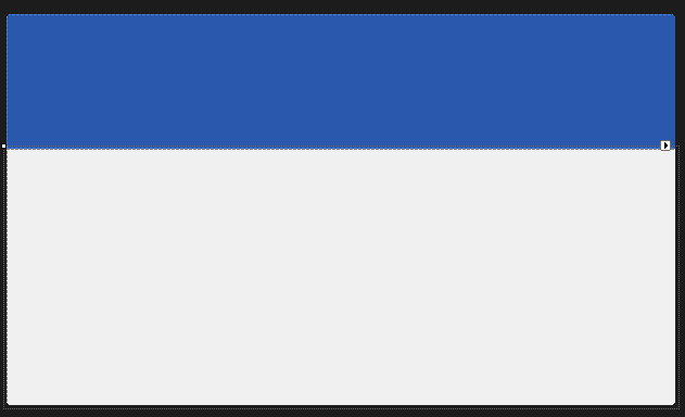
Now please add 2 panels on the form, the first one with dock to the top and the second one with dock to fill. Set the BackColor of the first panel (the top one) to 42, 88, 173 and you should get the following effect:
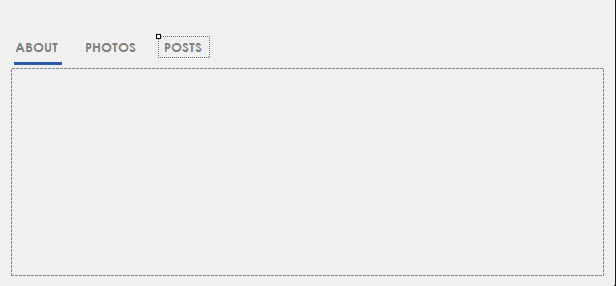
Now we’ll work on the panel on the bottom (the second one). First let’s add another panel inside this one and then above that new panel let’s add 3 labels named About, Photos and Posts (with the font Century Gothic) and above the first one let’s add a Bunifu Separator colored Blue with a Thickness of 3.
This should be the effect:
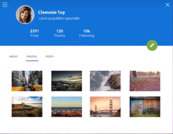
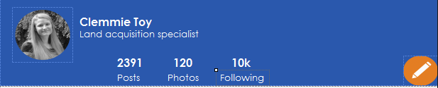
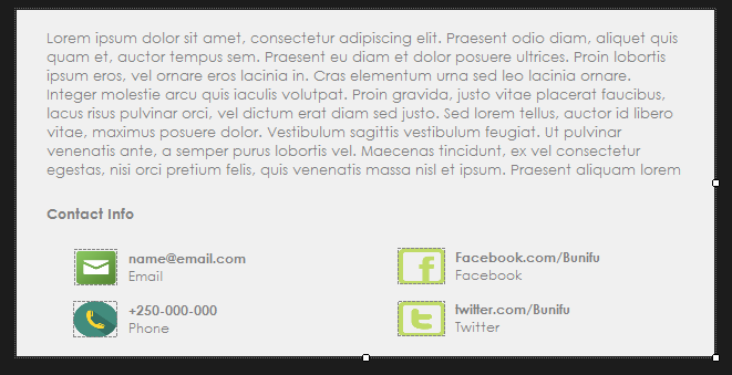
Now we move in the panel on the top, where we’ll add 2 picture boxes to maintain the profile picture and the edit picture. Also we’ll add some labels with the name, position and different statistics. This is an example of designing:
Now we’ll do something very interesting: we’ll make the form move when we drag the panel above (this one that contains the profile picture).
In order to do that, make sure that the name of your panel is Panel1 and type that code in the Form1 class:
[code lang=”csharp”]
Bunifu.Framework.UI.Drag drag = new Bunifu.Framework.UI.Drag();
public Form1()
{
InitializeComponent();
}
private void panel1_MouseDown(object sender, MouseEventArgs e)
{
drag.Grab(this);
}
private void panel1_MouseUp(object sender, MouseEventArgs e)
{
drag.Release();
}
private void panel1_MouseMove(object sender, MouseEventArgs e)
{
drag.MoveObject();
}
[/code]
Now you can easily move your entire form by just dragging the top panel!
Let’s move now the separator (that blue line below the About label) to each label, when we click on it.
We just need to implement the Click event on each label:
[code lang=”csharp”]
private void label1_Click(object sender, EventArgs e)
{
bunifuSeparator1.Width = label1.Width;
bunifuSeparator1.Left = label1.Left;
}
private void label3_Click(object sender, EventArgs e)
{
bunifuSeparator1.Width = label3.Width;
bunifuSeparator1.Left = label3.Left;
}
private void label2_Click(object sender, EventArgs e)
{
bunifuSeparator1.Width = label2.Width;
bunifuSeparator1.Left = label2.Left;
}
[/code]
You can simply test it and see it working:
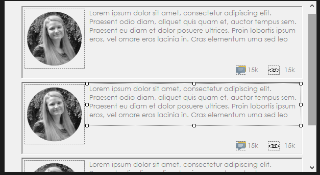
Now we’ll complete each tab. We’ll create each tab as a new User Control component. So let’s work on the “About” tab. Add a new User Control and name it About. Then, place some labels and some pictures in it to fit the following layout:
This is a new user control (defined by you) so you can simply find it in the toolbox and you can basically drop it to the form (as you do with all the other controls).
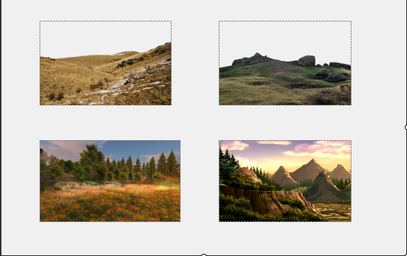
Now let’s add the Photos User Control:
In order to animate the transition between the newly created controls (About, Photos, etc.), let’s add a Bunifu Transition Component and set it’s animation type to HorizSlide. Then add this code in the label1_click method:
[code lang=”csharp”]
about1.Visible = false;
about1.BringToFront();
bunifuTransition1.ShowSync(about1);
[/code]
You need to add a similar structure in the same label_click method that we implement. This way when we click on “Photos” we’ll get a horizontal transition of all the controls of the previous control.
The last control, Posts, can be easily done by adding another panel inside our user control and designing it like that (as an example):
It’s just a simple styling of labels and finding the right image. Just rebuild the solution and you’ll find the control in the toolbox. Add it on the form, complete the label3_click method to use the animation (as I mentioned above) and that’s it.
Finally, we created an amazing User Interface that we can use to interact with our backend. We can see again how much we can get from Bunifu UI Winforms.
You can watch a detailed video of the same below.
Please let us know in the comments what you think…More posts coming, stay tuned 🙂
Enjoy!
Share This Story, Choose Your Platform!
Related Posts
This site uses Akismet to reduce spam. Learn how your comment data is processed.
Page load link
Go to Top
In this article we will customize basic windows forms using only Panels in diffrerent colors for different UI designs such as Microsoft Office 2013 in Visual Studio using C#
- Download CustomWindowsForm.zip — 418.2 KB
- Download Office_Word_PP_Excel.zip


Introduction
I wanted to create Custom windows forms in C#. Before working on this code, I started to find any code that could help me to create custom windows forms in C# on the internet. But unfortunately, I couldn’t find any simple and useful code. I found some code but they all are complicated. When I started working on solving this problem, I thought to:
- Use Custom Panel/Panel as a border of a Frame for change the size of Form such as Width, Height etc and use Custom Buttons as a Control Box of a Frame.
- Use Custom Panel as a Top layered Title border of a frame and use label to display text of a frame.
- To display icon on a frame we will set background image to added panel.
- Applying Mouse Events to panels and change properties of Form.
And it works perfectly.
You require Visual Studio Professional 2013 or higher version and .NET framework 4.5 or higher to open the project.

Perform following all Steps correctly to create custom windows forms.
We can also create extended advanced forms using only panels.(see above images,image 1 & 2)
Download the source code to view code for those forms.
See above image for better understanding of resizing our customized form and BlackForm.cs in file.
In this article we will create Blue colored resizable custom windows form, change colors of panels and buttons as you wish. You can use Custom Controls to design a form. Dont have Custom Controls?
- http://customcontrolsincs.blogspot.in/
Using following procedure you can also design Microsoft Office 2013 UI for any of your winform application such as Word, PowerPoint, Excel etc. Like following word screenshots.
Download the Download Office_Word_PP_Excel.zip file to view the UI code for Word, PowerPoint, Excel, DarkWord.


Start
Step 1
- Start Visual Studio and Create new Windows Forms Application project in C#. I have created CustomWindowsForm project.
- Download the source code and view the code for BlueForm.cs.
- Now set following Properties to created Form (Form1).
| ControlBox | false |
| BackColor | 30,60,150 |
| FormBorderStyle | None |
| Size | 684,461 |
To Add icon you can add again a panel/picturebox/toolstrip and set background image to it used as a window icon.
Step 2
- Now, Go to Project -> Add Class
- Enter Name
ButtonZand click Add. - Now Copy and Paste following
ButtonZcode into your created classButtonZcode. This button code is our Close & Minimize buttons of the form.
using System;
using System.Collections.Generic;
using System.Text;
using System.Drawing;
using System.Data;
using System.Windows.Forms;
namespace CustomWindowsForm
{
    public class ButtonZ : System.Windows.Forms.Button
    {
        Color clr1;
        private Color color = Color.Teal;
        private Color m_hovercolor = Color.FromArgb(0, 0, 140);
        private Color clickcolor = Color.FromArgb(160, 180, 200);
        private int textX = 6;
        private int textY = -20;
        private String text = "_";

        public String DisplayText
        {
            get { return text; }
            set { text = value; Invalidate(); }
        }
        public Color BZBackColor
        {
            get { return color; }
            set { color = value; Invalidate(); }
        }

        public Color MouseHoverColor
        {
            get { return m_hovercolor; }
            set { m_hovercolor = value; Invalidate(); }
        }

        public Color MouseClickColor1
        {
            get { return clickcolor; }
            set { clickcolor = value; Invalidate(); }
        }


        public int TextLocation_X
        {
            get { return textX; }
            set { textX = value; Invalidate(); }
        }
        public int TextLocation_Y
        {
            get { return textY; }
            set { textY = value; Invalidate(); }
        }
        public ButtonZ()
        {
            this.Size = new System.Drawing.Size(31, 24);
            this.ForeColor = Color.White;
            this.FlatStyle = System.Windows.Forms.FlatStyle.Flat;
            this.Font = new System.Drawing.Font("Microsoft YaHei UI", 20.25F, System.Drawing.FontStyle.Bold, System.Drawing.GraphicsUnit.Point, ((byte)(0)));
            this.Text = "_";
            text = this.Text;
        }
        //method mouse enter
        protected override void OnMouseEnter(EventArgs e)
        {
            base.OnMouseEnter(e);
            clr1 = color;
            color = m_hovercolor;
        }
        //method mouse leave
        protected override void OnMouseLeave(EventArgs e)
        {
            base.OnMouseLeave(e);
            color = clr1;
        }

        protected override void OnMouseDown(MouseEventArgs mevent)
        {
            base.OnMouseDown(mevent);
            color = clickcolor;
        }

        protected override void OnMouseUp(MouseEventArgs mevent)
        {
            base.OnMouseUp(mevent);
            color = clr1;
        }

        protected override void OnPaint(PaintEventArgs pe)
        {
            base.OnPaint(pe);
            text = this.Text;
            if (textX == 100 && textY == 25)
            {
                textX = ((this.Width) / 3) + 10;
                textY = (this.Height / 2) - 1;
            }

            Point p = new Point(textX, textY);
            pe.Graphics.FillRectangle(new SolidBrush(color), ClientRectangle);
            pe.Graphics.DrawString(text, this.Font, new SolidBrush(this.ForeColor), p);
        }

    }
}
Step 3
- Now, Go to Project -> Add Class
- Enter Name
MinMaxButtonand click Add. - Now Copy and Paste following
MinMaxButtoncode into your created classMinMaxButtoncode.
This code is for to create our maximize & restore down button when form is maximized.
using System;
using System.Collections.Generic;
using System.Text;
using System.Drawing;
using System.Data;
using System.Windows.Forms;
namespace CustomWindowsForm
{
    public class MinMaxButton : System.Windows.Forms.Button
    {
        Color clr1;
        private Color color = Color.Gray;
        private Color m_hovercolor = Color.FromArgb(180, 200, 240);
        private Color clickcolor = Color.FromArgb(160, 180, 200);
        private int textX = 6;
        private int textY = -20;
        private String text = "_";

        public enum CustomFormState
        {
            Normal,
            Maximize
        }

        CustomFormState _customFormState;

        public CustomFormState CFormState
        {
            get { return _customFormState; }
            set { _customFormState = value; Invalidate(); }
        }


        public String DisplayText
        {
            get { return text; }
            set { text = value; Invalidate(); }
        }
        public Color BZBackColor
        {
            get { return color; }
            set { color = value; Invalidate(); }
        }

        public Color MouseHoverColor
        {
            get { return m_hovercolor; }
            set { m_hovercolor = value; Invalidate(); }
        }

        public Color MouseClickColor1
        {
            get { return clickcolor; }
            set { clickcolor = value; Invalidate(); }
        }


        public int TextLocation_X
        {
            get { return textX; }
            set { textX = value; Invalidate(); }
        }
        public int TextLocation_Y
        {
            get { return textY; }
            set { textY = value; Invalidate(); }
        }

        public MinMaxButton()
        {
            this.Size = new System.Drawing.Size(31, 24);
            this.ForeColor = Color.White;
            this.FlatStyle = System.Windows.Forms.FlatStyle.Flat;
            this.Text = "_";
            text = this.Text;
        }

        //method mouse enter
        protected override void OnMouseEnter(EventArgs e)
        {
            base.OnMouseEnter(e);
            clr1 = color;
            color = m_hovercolor;
        }
        //method mouse leave
        protected override void OnMouseLeave(EventArgs e)
        {
            base.OnMouseLeave(e);
            color = clr1;
        }

        protected override void OnMouseDown(MouseEventArgs mevent)
        {
            base.OnMouseDown(mevent);
            color = clickcolor;
        }

        protected override void OnMouseUp(MouseEventArgs mevent)
        {
            base.OnMouseUp(mevent);
            color = clr1;
        }


        protected override void OnPaint(PaintEventArgs pe)
        {
            base.OnPaint(pe);

            switch (_customFormState)
            {
                case CustomFormState.Normal:
                    pe.Graphics.FillRectangle(new SolidBrush(color), ClientRectangle);

                    //draw and fill thw rectangles of maximized window
                    for (int i = 0; i < 2; i++)
                    {
                        pe.Graphics.DrawRectangle(new Pen(this.ForeColor), textX + i + 1, textY, 10, 10);
                        pe.Graphics.FillRectangle(new SolidBrush(this.ForeColor), textX + 1, textY - 1, 12, 4);
                    }
                    break;

                case CustomFormState.Maximize:
                    pe.Graphics.FillRectangle(new SolidBrush(color), ClientRectangle);

                    //draw and fill thw rectangles of maximized window
                    for (int i = 0; i < 2; i++)
                    {
                        pe.Graphics.DrawRectangle(new Pen(this.ForeColor), textX + 5, textY, 8, 8);
                        pe.Graphics.FillRectangle(new SolidBrush(this.ForeColor), textX + 5, textY - 1, 9, 4);

                        pe.Graphics.DrawRectangle(new Pen(this.ForeColor), textX + 2, textY + 5, 8, 8);
                        pe.Graphics.FillRectangle(new SolidBrush(this.ForeColor), textX + 2, textY + 4, 9, 4);

                    }
                    break;
            }

        }


    }
}
Step 4
Run your Form and exit it. For to create controls of above code for drag & drop components.
Step 5
- Drag & Drop Panel onto your Form (
TopBorderPanel) - Set following Properties to dropped panel.
| Name | TopBorderPanel |
| BackColor | 10,20,50 |
| Cursor | SizeNS |
| Dock | Top |
| Size | 684,2 |
Step 6
- Drag & Drop Panel onto your Form (
TopPanel) - Set following Properties to dropped panel.
| Name | TopPanel |
| BackColor | 20,40,80 |
| Cursor | Default |
| Dock | Top |
| Size | 680,35 |
Step 7
- Drag & Drop Panel onto your Form (
LeftPanel) - Set following Properties to dropped panel.
| Name | LeftPanel |
| BackColor | 10,20,50 |
| Cursor | SizeWE |
| Dock | Left |
| Size | 2,459 |
Step 8
- Drag & Drop Panel onto your Form (
RightPanel) - Set following Properties to dropped panel.
| Name | RightPanel |
| BackColor | 10,20,50 |
| Cursor | SizeWE |
| Dock | Right |
| Size | 2,459 |
Step 9
- Drag & Drop Panel onto your Form (
BottomPanel) - Set following Properties to dropped panel.
| Name | BottomPanel |
| BackColor | 10,20,50 |
| Cursor | SizeNS |
| Dock | Bottom |
| Size | 680,2 |
Step 10
- Drag & Drop ToolTip onto your form
Step 11
- Drag & Drop
ButtonZontoTopPanel(_CloseButton) - Set following Properties to dropped button.
| Name | _CloseButton |
| Anchor | Top,Right |
| BZBackColor | 20,40,80 |
| DisplayText | X |
| Font | Microsoft YaHei UI, 11.25pt, style=Bold |
| ForeColor | White |
| Location | 639,3 |
| MouseClickColor1 | 150,0,0 |
| MouseHoverColor | 40,80,180 |
| Size | 35,25 |
| Text | X |
| TextLocation_X | 10 |
| TextLocation_Y | 4 |
| ToolTip on toolTip1 | Close |
Adjust button location as you wish.
Step 12
- Drag & Drop
ButtonZontoTopPanel(_MinButton) - Set following Properties to dropped button.
| Name | _MinButton |
| Anchor | Top,Right |
| BZBackColor | 20,40,80 |
| DisplayText | _ |
| Font | Microsoft YaHei UI, 18pt, style=Bold |
| ForeColor | White |
| Location | 569,3 |
| MouseClickColor1 | 10,20,60 |
| MouseHoverColor | 40,80,180 |
| Size | 35,25 |
| Text | _ |
| TextLocation_X | 8 |
| TextLocation_Y | -14 |
| ToolTip on toolTip1 | Minimize |
Step 13
- Drag & Drop
MinMaxButtonontoTopPanel(_MaxButton) - Set following Properties to dropped button.
| Name | _MaxButton |
| Anchor | Top,Right |
| BZBackColor | 20,40,80 |
| CFormState | Normal |
| ForeColor | White |
| Location | 604,3 |
| MouseClickColor1 | 10,20,60 |
| MouseHoverColor | 40,80,180 |
| Size | 35,25 |
| TextLocation_X | 11 |
| TextLocation_Y | 8 |
| ToolTip on toolTip1 | Maximize |
For text of our custom for, you can add Label and use it as a text of a form.
Step 14
Add following variables to code of Form1 globally:
        bool isTopPanelDragged = false;
        bool isLeftPanelDragged = false;
        bool isRightPanelDragged = false;
        bool isBottomPanelDragged = false;
        bool isTopBorderPanelDragged = false;
        bool isWindowMaximized = false;
        Point offset;
        Size _normalWindowSize;
        Point _normalWindowLocation = Point.Empty;
isTopPanelDraggedis to check that mouse down event triggered by top panel or not. Same for Left, Right, Bottom, TopBorder panels.isWindowMaximizedis to check whether_MaxButtonclick event occured or not.- offset is temporary variable to store location of our form.
_normalWindowSizeis to hold normal window size after clicking on_MaxButtonfor go to normal window size Same as for_normalWindowLocationonly just to store form location.
Step 15
Now add Events to Panels and Buttons in Events Box. MouseDown, MouseMove & MouseUp events to Panels.
TopBorderPanel
TopBorderPanel_MouseDownTopBorderPanel_MouseMoveTopBorderPanel_MouseUp
TopPanel
TopPanel_MouseDownTopPanel_MouseMoveTopPanel_MouseUp
LeftPanel
LeftPanel_MouseDownLeftPanel_MouseMoveLeftPanel_MouseUp
RightPanel
RightPanel_MouseDownRightPanel_MouseMoveRightPanel_MouseUp
BottomPanel
BottomPanel_MouseDownBottomPanel_MouseMoveBottomPanel_MouseUp
_MinButton
_MinButton_Click
_MaxButton
_MaxButton_Click
_CloseButton
_CloseButton_Click
Step 16
Once you added all above events to all components then replace your Form1.cs code with following code. Just make changes in classes, namespaces etc. Download the source code for view simple blue colored custom form.
using System;
using System.Collections.Generic;
using System.ComponentModel;
using System.Data;
using System.Drawing;
using System.Linq;
using System.Text;
using System.Threading.Tasks;
using System.Windows.Forms;

namespace CustomWindowsForm
{
    public partial class Form1 : Form
    {
        public Form1()
        {
            InitializeComponent();
        }

        bool isTopPanelDragged = false;
        bool isLeftPanelDragged = false;
        bool isRightPanelDragged = false;
        bool isBottomPanelDragged = false;
        bool isTopBorderPanelDragged = false;
        bool isWindowMaximized = false;
        Point offset;
        Size _normalWindowSize;
        Point _normalWindowLocation = Point.Empty;

        //**********************************************************************
        //top border panel
        private void TopBorderPanel_MouseDown(object sender, MouseEventArgs e)
        {
            if (e.Button == MouseButtons.Left)
            {
                isTopBorderPanelDragged = true;
            }
            else
            {
                isTopBorderPanelDragged = false;
            }
        }

        private void TopBorderPanel_MouseMove(object sender, MouseEventArgs e)
        {
            if (e.Y < this.Location.Y)
            {
                if (isTopBorderPanelDragged)
                {
                    if (this.Height < 50)
                    {
                        this.Height = 50;
                        isTopBorderPanelDragged = false;
                    }
                    else
                    {
                        this.Location = new Point(this.Location.X, this.Location.Y + e.Y);
                        this.Height = this.Height - e.Y;
                    }
                }
            }
        }

        private void TopBorderPanel_MouseUp(object sender, MouseEventArgs e)
        {
            isTopBorderPanelDragged = false;
        }

        //**********************************************************************
        //top panel
        private void TopPanel_MouseDown(object sender, MouseEventArgs e)
        {
            if (e.Button == MouseButtons.Left)
            {
                isTopPanelDragged = true;
                Point pointStartPosition = this.PointToScreen(new Point(e.X, e.Y));
                offset = new Point();
                offset.X = this.Location.X - pointStartPosition.X;
                offset.Y = this.Location.Y - pointStartPosition.Y;
            }
            else
            {
                isTopPanelDragged = false;
            }
            if (e.Clicks == 2)
            {
                isTopPanelDragged = false;
                _MaxButton_Click(sender, e);
            }
        }

        private void TopPanel_MouseMove(object sender, MouseEventArgs e)
        {
            if (isTopPanelDragged)
            {
                Point newPoint = TopPanel.PointToScreen(new Point(e.X, e.Y));
                newPoint.Offset(offset);
                this.Location = newPoint;

                if (this.Location.X > 2 || this.Location.Y > 2)
                {
                    if (this.WindowState == FormWindowState.Maximized)
                    {
                        this.Location = _normalWindowLocation;
                        this.Size = _normalWindowSize;
                        toolTip1.SetToolTip(_MaxButton, "Maximize");
                        _MaxButton.CFormState = MinMaxButton.CustomFormState.Normal;
                        isWindowMaximized = false;
                    }
                }
            }
        }

        private void TopPanel_MouseUp(object sender, MouseEventArgs e)
        {
            isTopPanelDragged = false;
            if (this.Location.Y <= 5)
            {
                if (!isWindowMaximized)
                {
                    _normalWindowSize = this.Size;
                    _normalWindowLocation = this.Location;

                    Rectangle rect = Screen.PrimaryScreen.WorkingArea;
                    this.Location = new Point(0, 0);
                    this.Size = new System.Drawing.Size(rect.Width, rect.Height);
                    toolTip1.SetToolTip(_MaxButton, "Restore Down");
                    _MaxButton.CFormState = MinMaxButton.CustomFormState.Maximize;
                    isWindowMaximized = true;
                }
            }
        }

        //**********************************************************************
        //left panel
        private void LeftPanel_MouseDown(object sender, MouseEventArgs e)
        {
            if (this.Location.X <= 0 || e.X < 0)
            {
                isLeftPanelDragged = false;
                this.Location = new Point(10, this.Location.Y);
            }
            else
            {
                if (e.Button == MouseButtons.Left)
                {
                    isLeftPanelDragged = true;
                }
                else
                {
                    isLeftPanelDragged = false;
                }
            }
        }

        private void LeftPanel_MouseMove(object sender, MouseEventArgs e)
        {
            if (e.X < this.Location.X)
            {
                if (isLeftPanelDragged)
                {
                    if (this.Width < 100)
                    {
                        this.Width = 100;
                        isLeftPanelDragged = false;
                    }
                    else
                    {
                        this.Location = new Point(this.Location.X + e.X, this.Location.Y);
                        this.Width = this.Width - e.X;
                    }
                }
            }
        }

        private void LeftPanel_MouseUp(object sender, MouseEventArgs e)
        {
            isLeftPanelDragged = false;
        }

        //**********************************************************************
        //right panel
        private void RightPanel_MouseDown(object sender, MouseEventArgs e)
        {
            if (e.Button == MouseButtons.Left)
            {
                isRightPanelDragged = true;
            }
            else
            {
                isRightPanelDragged = false;
            }
        }

        private void RightPanel_MouseMove(object sender, MouseEventArgs e)
        {
            if (isRightPanelDragged)
            {
                if (this.Width < 100)
                {
                    this.Width = 100;
                    isRightPanelDragged = false;
                }
                else
                {
                    this.Width = this.Width + e.X;
                }
            }
        }

        private void RightPanel_MouseUp(object sender, MouseEventArgs e)
        {
            isRightPanelDragged = false;
        }

        //**********************************************************************
        //bottom panel
        private void BottomPanel_MouseDown(object sender, MouseEventArgs e)
        {
            if (e.Button == MouseButtons.Left)
            {
                isBottomPanelDragged = true;
            }
            else
            {
                isBottomPanelDragged = false;
            }
        }

        private void BottomPanel_MouseMove(object sender, MouseEventArgs e)
        {
            if (isBottomPanelDragged)
            {
                if (this.Height < 50)
                {
                    this.Height = 50;
                    isBottomPanelDragged = false;
                }
                else
                {
                    this.Height = this.Height + e.Y;
                }
            }
        }

        private void BottomPanel_MouseUp(object sender, MouseEventArgs e)
        {
            isBottomPanelDragged = false;
        }

        //**********************************************************************
        //actions for close,min,max buttons
        private void _CloseButton_Click(object sender, EventArgs e)
        {
            this.Close();
        }

        private void _MaxButton_Click(object sender, EventArgs e)
        {
            if (isWindowMaximized)
            {
                this.Location = _normalWindowLocation;
                this.Size = _normalWindowSize;
                toolTip1.SetToolTip(_MaxButton, "Maximize");
                _MaxButton.CFormState = MinMaxButton.CustomFormState.Normal;
                isWindowMaximized = false;
            }
            else
            {
                _normalWindowSize = this.Size;
                _normalWindowLocation = this.Location;

                Rectangle rect = Screen.PrimaryScreen.WorkingArea;
                this.Location = new Point(0, 0);
                this.Size = new System.Drawing.Size(rect.Width, rect.Height);
                toolTip1.SetToolTip(_MaxButton, "Restore Down");
                _MaxButton.CFormState = MinMaxButton.CustomFormState.Maximize;
                isWindowMaximized = true;
            }
        }

        private void _MinButton_Click(object sender, EventArgs e)
        {
            this.WindowState = FormWindowState.Minimized;
        }
    }
}
Here is the output of above all procedures:

Well we have created a custom forms, so you directly cannot add some controls to a form like MenuStrip, SplitContainer etc. To add these controls first you need to add panels and add them onto that panel so that our customize form will not be changed.
Стиль Material Design в Windows Forms
admin
23.02.2019
Видеоуроки
Нет комментариев
В видеоуроке рассказывается, как заменить стандартную тему оформления Windows Forms на стиль Material Design от Google. Проект создается на языке программирования C#.
3.9/5 — (22 голоса)
c#, Windows Forms, Видео, Видеоурок, Урок
Поделиться в соц. сетях:
- ← Является ли число простым — Проверяем на языке Си
- Потоки в Visual C++ — Пример реализации и использования →
Добавить комментарий
Ваш адрес email не будет опубликован.
Комментарий
Имя
Сайт
Сохранить моё имя, email и адрес сайта в этом браузере для последующих моих комментариев.
Уведомить меня о новых комментариях по email.
Уведомлять меня о новых записях почтой.