
Microsoft Windows — компания, специализирующаяся на разработке и поддержании функционирования коммерческих операционных систем, управляемых посредством графического интерфейса. Кроме этого, фирма занимается выпуском игровых консолей, компьютерных манипуляторов и аудиоплееров.
В настоящее время операционные системы семейства Windows установлены на 88% всех персональных компьютеров.

История Microsoft Windows берёт начало в 1975 году. Друзья-студенты Гарварда Билл Гейтс и Пол Аллен узнают о создании персонального компьютера Altair 8800 и решают написать для него интерпретатор языка Basic. В это время товарищи задумываются о том, чтобы открыть собственный бизнес по составлению универсальных языков программирования. Они дают бренду название «Аллен и Гейтс». Однако вскоре, посчитав, что подобное наименование больше подходит для юридической конторы, переименовывают его в «Micro-Soft» (слияние слов «microcomputer» и «software»).
Позже, разрабатывая простую и интуитивно понятную систему управления, где каждая функция работает в отдельном «окне», друзья оставляют рабочее название «Windows». Под этим именем операционная система известна уже несколько десятков лет.
Первый логотип Microsoft Windows
Начальный символ Microsoft Windows появился в 1985 году. Он был небесно-голубого цвета. Справа от изображения прямоугольника располагалось название компании. В первой строке было вписано слово «Microsoft», а во второй — «Windows» (оно в 3 раза больше по размеру). Надпись выполнена необычным тонким шрифтом с небольшими засечками.
Кто создал логотип Microsoft Windows
Первый логотип Виндовс создан Биллом Гейтсом и Полом Алленом. Он представляет собой скруглённый прямоугольник, разделённый белыми линиями на четыре неравных по размеру прямоугольника. Считается, что эмблема отражает суть функционирования электронного продукта.
История изменения логотипа Microsoft Windows
Рассмотрим, как менялись логотипы Microsoft Windows за время существования компании.
1992
В 1992 году логотип Windows становится разноцветным. На нем изображен чёрный прямоугольник, изогнутый как развевающийся на ветру флаг. Он в свою очереди делится на четыре равных квадрата: красный, зелёный, синий и жёлтый. Левый край будто «рассыпается» на много небольших квадратов. Ниже также расположилось наименование компании. Шрифт становится толще, однако общий стиль сохраняется.
1995
1995 год — символ остаётся прежним, однако теперь он изображён под наклоном и цвета становятся тусклее. Надписи также меняют положения на логотипе. Слово «Windows» находится прямо под иконкой, а «Microsoft» — слева, вертикально, мелким шрифтом. Стиль надписи становится иным: буквы значительно вытягиваются кверху и сливаются друг с другом. Кроме этого, у буквы N два слоя на крайних границах.
2001
2001 год — появляется логотип известной версии Microsoft Windows XP. Графическая составляющая также представлена четырьмя квадратами. Однако теперь они помещены на белый фон и имеют более выраженный изгиб. Квадраты изображены с небольшим объемом. Под ним расположено название компании: большое слово «Windows» и маленькое (слева, сверху) — «Microsoft». Также справа надпись дополнена обозначением версии операционной системы.
2007
2007 год — появляется логотип Windows Vista. Эмблема теперь выглядит более объёмной. Появляется синий градиентный круг, в который помещён «флаг». Ниже помещена надпись «Windows Vista» (исчезло слово «Microsoft»), выполненная рубленным шрифтом без засечек. Первое слово названия выделено жирным.
2009
2009 год — компания представляет логотип Windows 7. От предыдущего он отличается прозрачной подложкой вместо синего круга. Под графическим компонентом написано название — «Windows 7» (цифра по размеру чуть больше слова).
2012
2012 год — логотип Виндовс 8 плоский, полностью светло-голубой. Квадраты, которые использовались во всех версиях лого, стали одного цвета. Они расположены немного по-другому: увеличиваются слево-направо. В целом иконка теперь напоминает окно. Название версии находится справа от символа. Шрифтовой стиль остался такой же, как в эмблеме 2009 года, но расстояние между буквами уменьшилось.
2015
2015 год — логотип Windows 10 меняет цвет на более насыщенный синий. В целом, композиция сохраняется та же. Единственные изменения — шрифт становится тоньше, и меняется цифра, обозначающая версию.
Заключение
Все логотипы Windows (в том числе Виндовс 7 и 10) — отличный пример простой, стильной, качественной эмблемы, которая прекрасно презентует продукт.
Часто задаваемые вопросы
Когда появился первый логотип Windows?
Первый фирменный знак Windows был разработан в 1985 году.
Кто сделал логотип Microsoft Windows?
Логотип Windows создали Билл Гейтс и Пол Аллен.
Когда Windows обновили логотип?
Новая версия фирменного знака была принята в 2015 году.
Сколько раз менялся логотип Microsoft Windows?
Лого Microsoft Windows менялся 7 раз: в 1992, 1995, 2001, 2006, 2009, 2012, 2015 годах.
Продуктовый и графический дизайнер с опытом работы более 10 лет. Пишу о брендинге, дизайне логотипов и бизнесе.
Microsoft — компания, которая создала легендарный Windows, популярный XBOX-360 и инновационный XBOX One. Ей уже 38 лет. И за эти годы она несколько раз меняла логотипы. Один логотип даже похож на «лого» группы Metallica. Давайте узнаем, какие же логотипы были у Microsoft…
Как я уже сказал, Microsoft уже 38 лет. И за эти 38 лет она 5 раз сменила логотип. Для начала просмотрим все 5 логотипов:
Развитие логотипов Microsoft
К каждому «лого» Microsoft подходила ответственно. Давайте узнаем о каждом логотипе побольше.
1975-1979 — «Джиги-Джиги, Ача-Ача»
Первый логотип Microsoft
Не знаю почему, но первая ассоциация с логотипом была песня из какого-то знакомого мне Индийского фильма. Видимо и сотрудники под эту песню делали логотип.
Сам он похож на Диско-Style, ну середина 70-х годов, что сказать теперь. В это время штаб Microsoft’a был Альбукерке.
1980-1981 — «С Диско в Хардкор»

Второй логотип Microsoft
Начало восьмидесятых. Microsoft переезжает из Альбукерка а Северо-Запад Вашингтона. А тем временем, начинается жизнь рок-группы Metallica. Если сравнивать с «лого» Металлики, то можно увидеть некое сходство.
Первый логотип группы Metallica
Кто у кого украл дизайн, не поймешь. Но логотип «МелкоМягким» быстро надоел.
1982-1986 — «Зеленый — успокаивает…»
Третий логотип Microsoft
Сотрудникам Microsoft’a уже надоело танцевать и петь под Хардкорную музыку. Они быстро придумали новый логотип.
Теперь Microsoft зеленый, в шрифте «Blibbet» и с необычной буквой «О».
И в это же время появились IBM-PC, на 16-рязрядной версии MS-DOS Microsoft.
1987-2012 — «Waka-Waka-Waka © PAC-MAN»
Четвертый логотип Microsoft
Этот логотип прожил целых 25 лет, а его создатель — Графический Дизайнер Скотт Бейкер [Skott Baker].
Сам логотип называется «PAC-MAN Logo» в связи с тем, что буква О похожа на героя популярной игры. Долго Microsoft дала жить этому логотипу.
У него были разные лозунги, вроде: «Куда вы хотите пойти сегодня?» или же «Ваши способности, наше вдохновение…» ну или последнее «Будь что будет дальше»…
2013 — «Metro Modern»
Пятый логотип Microsoft
Новый логотип, новая операционная система, новый дизайн. Microsoft старается стать более современной и успешной. Но почему плоские плитки? Что оно обозначает?
Потому что…:
1. Логотип обозначает разновидность продуктов.
2. Логотип обозначает операционную систему Windows.
3. Логотип обозначает новый дизайн Metro — плоские плитки.
Но критики были недовольны дизайном. Приведу один пример из сайта CNET:
«Вы всегда замечаете изменение прически вашей возлюбленной. Но вы не только замечаете, но еще и комментируете: «Ты что-то сделала с волосами, да?».Реакция должна быть такой же, когда компания меняет свой логотип: «О, ты стал выглядеть моложе и более привлекательно!».
И все же, когда Microsoft представила новый логотип, меня не покидало ощущение, что компания направлялась в парикмахерскую, но потом передумала и просто причесалась.
Да, конечно, наконец-то отход от жирного курсива, который как будто наклонялся к тебе и говорил: «Ты купишь мой товар, нравится тебе это или нет».Да, новый логотип предполагает, что компания хочет показаться более гуманной, современной, приветливой. И это заметно.
Но мое впечатление – слишком, слишком холодно для дизайна, который стал первым за 25 лет.
Для того, чтобы подтвердить или опровергнуть свои слова, я связался с одной женщиной. Она не имеет никакого отношения к Apple или Microsoft. Но она дизайнер, который лучше понимает чувства логотипа.
И вот её слова:
«К сожалению, этот логотип скучный. Но это связано с тем, что бренд позволял себе «скучать» так долго. Возникает такое ощущение, что они хотят отразить, что все силы собраны воедино. И пытаются выглядеть, будто это не трудно делать – изменить логотип впервые за 25 лет. Я знаю, что данные принципы они взяли из своих продуктов, но, давайте, встряхнитесь, вы же не Apple, не так ли?».
Не знаю как вы, но я соглашусь с этим комментарием.
Microsoft — действительно, создает очень хорошие продукты, пусть также продолжает 
Windows Logo PNG
At the heart of the digital age, Windows stands as a pivotal operating system, orchestrating the seamless operation of millions of computers worldwide. This software behemoth, birthed by the visionary minds of Bill Gates and Paul Allen, has transformed from a mere graphical interface to an essential tool enveloping a broad spectrum of functionalities. Central to its design is the idea of a window—a beautiful metaphor for digital interaction, allowing users to navigate through a digital landscape as if gazing through windows into different virtual environments. The operation of Windows, marked by its user-friendly interface and robust capabilities, has become a cornerstone in the realm of computing, influencing the way individuals and businesses engage with technology.
Founded by Bill Gates and Paul Allen in 1975, Microsoft embarked on a journey that would revolutionize the technology industry. Initially focusing on software development, the introduction of the first version of Windows in 1985 marked a pivotal moment in the company’s history. This graphical operating interface was designed to run atop MS-DOS, offering users a more intuitive way of interacting with their computers through the use of windows, icons, and menus.
Throughout the years, Windows evolved through various versions, each introducing significant advancements in technology and user experience. The release of Windows 95, for instance, brought forth the Start menu, taskbar, and the concept of plug-and-play hardware. As the internet era dawned, Windows adapted, integrating Internet Explorer as a key component of the operating system. Successive versions, including Windows XP and Windows 7, solidified Microsoft’s position in the market, showcasing innovations such as the Windows Server for enterprise environments, the introduction of Aero Glass for enhanced aesthetics, and improvements in security and stability.
Today, Microsoft stands as a behemoth in the tech industry, not just for its operating systems but for a diverse portfolio that includes the Xbox gaming console, LinkedIn, and cloud computing services through Azure. The company’s current position reflects its ability to innovate and adapt, maintaining relevance in an ever-evolving digital landscape. The Windows operating system, now complemented by Windows Server, Windows Essentials, and various other products, continues to be a cornerstone of Microsoft’s offerings, used by billions around the globe.
What is Windows?
Windows is the name of a computer operating system, which was developed by Microsoft and introduced in 1985. The system is available in more than 100 languages and is used by millions of people worldwide, being the world’s most popular operating system for personal computers.
1985 – 2001
The very first logo was developed in 1985 with the debut version of the program. It was a sky-blue and black image, composed of an emblem and a wordmark on its right. The emblem featured a stylized image of the window, formed by four squares of various sizes with white lines, separating them from each other. The “Microsoft Windows” wordmark in black was executed in a thin elegant serif typeface, representing professionalism and authority.
1990 – 2001
The logo was redesigned with the launch of Windows 3.0. It was a monochrome composition with a very realistic window picture and a wordmark placed under it. The emblem was executed in gradient shades, creating a mysterious feeling.
1992 – 2001
The “Flag” logo era for Windows began in 1992 and lasted until the 2010s. The first colorful badge was designed in 1992 and boasted a waving flag shape falling into pixels in its left part. The right part of the emblem featured four colorful squares — red, green, blue, and yellow in a thick black outline. The wordmark was still placed in the bottom part of the logo.
1993 – 2001
In 1993 the wordmark under the iconic flag was changed to Microsoft WindowsNT. It was executed in the same color palette, style and size as the previous version, so the “NT” lettering was the only change.
1994 – 2001
All of the elements of the logo were redrawn in 1994. The flag was enlarged, so was the “Windows” part of the lettering, which was now placed under the emblem, written in narrowed and elongated letters. As for the “Microsoft” part of the logotype, it was set vertically in the left from the “Windows”, also in black serif typeface.
Windows 95 logo ( 1995 – 2001 )
In 1995 the flag was placed diagonally on the left of the nameplate, which was now enlarged. The “Microsoft” part was executed in thin delicate lines and placed above the bold sans-serif “Windows” inscription, which was now the main part of the logo.
Windows NT logo ( 1996 – 2004 )
For the NT version the logo was changed again in 1996. The only change here was the replacement of the thin “95” digit with the extra-bold “NT” letters, set in the same stable and strong sans-serif typeface, as the “Windows” part of the inscriptions.
When did Windows change its logo?
Windows first altered its logo in 1990, introducing the logo – 1990-1992, marking the beginning of a new era in the company’s design journey. This period was characterized by a shift towards more modern and recognizable symbols, emphasizing trademark rights and setting a precedent for future updates, including significant changes like the Windows logo – 2012-2021, showcasing the evolution of the brand’s identity in response to technological advancements and market demands.
Windows 98 logo ( 1998 – 2006)
With the release of Windows 98 in 1998 the logo of Windows was refined. It was actually the same emblem, as the one, used by the software during the previous period, but with the bold and heavy “NT” replaced by the “98” executed in thinner lines. All other elements of the composition remained untouched.
Windows 2000 logo ( 2000 – 2010 )
The logo, created for Windows in 2000, was probably the most colorful among all the versions of the software’s emblems. It was still the bold black inscription, but now it was placed under geometric and multicolor graphics, formed by numerous square frames in orange, yellow and different shades of blue. Inside the bigger square, there was an iconic Windows flag set on a white background.
Windows ME logo ( 2000 – 2006 )
In 2000 two versions of the program were introduced — Windows 2000 and Windows ME, they both had their emblems redesigned. The signature flag was placed in a square frame, and in the 2000 version, the frame was blue with red, accompanied by yellow, red, and blue squares, while the ME edition featured green as the main color.
Windows XP logo ( 2001 – 2014 )
The visual identity was redesigned again in 2001. The black frame was removed from the flag, so now the emblem was only composed of four waving squares, which changed their colors to lighter ones. As for the wordmark, it was also refined and now featured a thinner and more elegant sans-serif typeface.
Windows Vista logo ( 2006 – 2017 )
In 2006, with the release of Windows Vista, the emblem got flatter and more modern design. It was still executed in gradient colors, but the texture of the squares was in 2D. The word “Microsoft” is removed from the logo, which makes it look more minimalist and professional.
Windows 7 logo ( 2009 – 2020 )
With the launch of Windows 7 in 2009, the logo was slightly changed again — the emblem is now enlarged and the colors of the squares are more intense.
Windows 8 logo ( 2012 – 2016 )
The new era of the visual identity design starts for Windows in 2012. Now the company uses only blue color for its logo. The wave shape is gone, the emblem is strict and geometric. It is still composed of four squares, but now the window symbol is placed in half-turn.
2013 – Today
The emblem, created for Windows 8.1 is flat and modest, enough professionally executed, and evokes a sense of confidence and modernity. It is a solid square, composed of four smaller blue ones, separated with thin white lines. The emblem, placed in ¾ is set on the left from a neat sans-serif logotype in the title case.
Windows 10 logo ( 2015 – Today )
In 2015 the sky-blue of the logo is replaced by a calmer and darker tone, which looks more professional and evokes a sense of reliability and protection. The wordmark was also refined and became thinner and cleaner.
Windows 10x logo ( 2020 – Today )
The latest version of the logo was created for Windows 10X in 2020. The wordmark still uses the shade of blue from the previous version, but the emblem is now drawn in gradient tones, looking brighter and fresher.
The simple yet strong inscription is written in a traditional sans-serif typeface, which is Myriad Pro. It balanced the bold and bright emblem, adding a sense of expertise and security.
2021 – now
For Windows 11, released in 2021, the company has simplified its logo, placing the emblem straight and flat, and using one shade of blue for all the elements of the badge. Now the four equal blue square form a large one, with thin white lines of a negative space, and are followed by a title case inscription in a bold sans-serif font, with the “11” in the same style.
Symbol
It was only in 2001 that the logo saw a more impactful update, which was connected with the release of XP. The black outline was gone, the overall look of the logotype became clearer. Also, certain graphic tools were applied, due to which the logo acquired a 3D look.
Getting ready for the release of the Vista operating system, the designers updated the emblem once again. The “flag” was placed inside a circle shape with dark blue filler. Also, one more new visual tool was applied to the symbol, adding dimension. The shade of blue was slightly modified.
The release of Windows 7 coincided with the introduction of an updated symbol. This time, the circle shape was removed leaving a logotype cleaner and fresher. Actually, it looked exactly as the 2001 version, except for a couple of graphic effects and a subtle shift in colors.
The 2012 emblem
Probably the most noticeable change to the Windows logo in this century coincided with the release of the Windows 8 operating system. The four-color emblem was replaced by a simple light blue one created by Wolff Olins. The aim was to make the icon closer to the new Metro design language. One of the distinctive features of this design language was that it focused on one color.
The new color scheme was not the only change. The 2012 logo featured a realistic window design instead of the usual emblem resembling a flag.
What was the original Microsoft logo?
The original Microsoft logo featured the “Blibbet”, a playful and iconic symbol that represented the company’s early commitment to innovation in software development. Over time, as Microsoft expanded its portfolio to include products like Windows and Skype, the need for a more unified and professional image led to the adoption of new branding elements, such as the Windows wordmarks and various product logos, reflecting the company’s growth and evolution in the tech industry.
Windows 10 logo
In comparison with the previous version, the Windows 10 logo features a darker shade of blue. Also, letters are somewhat thinner. The beta version of the operating system was released in 2014, while the final version appeared at the market in 2015.
Font
Starting with Windows 8, the wordmarks used by the company were based on the Segoe font, overseen by type designer Simon Daniels, marking a notable transition in Microsoft’s design philosophy. The type has been slightly modified from its original state, incorporating elements that reflect Microsoft’s evolving brand identity. This redesign of the logo integrates a brief history of Microsoft’s typographical choices, which range from the use of font awesome to modular windows logo templates, showcasing the company’s commitment to flexibility and innovation in its visual presentation. Additionally, the inclusion of SVG code development reflects the technical precision behind the creation of Microsoft’s wordmarks, ensuring they are scalable to both large and small sizes without losing clarity.
Color
The current version of the Windows logo sports only one color, dark blue, a choice that adheres to the aesthetic principles of the New Metro design language. This singular focus on a dark-blue hue represents a departure from the multi-colored approach seen in predecessors like the windows logo – 2012 flags and the original windows logo, which featured squares of different sizes and a more vibrant color palette. The transition to a monochromatic scheme underscores Microsoft’s desire for a sleek, modern look that aligns with contemporary design trends while maintaining a connection to the company’s heritage. The use of dark-grey in auxiliary elements, such as the windows RT logo and the azure logo, complements the primary color, creating a cohesive visual identity across Microsoft’s product line.
The evolution of the Windows logo from its original multi-colored iterations, including the windows logo – 1992 and windows logo – 2002, to the streamlined, dark-blue version reflects broader changes in the tech industry’s design preferences, influenced by the minimalist aesthetics of companies like Google and Apple. This shift towards simplicity can also be seen in the adoption of thick borders and a uniform color scheme, which facilitate greater legibility and recognition across various digital platforms, from browsers to wallpaper options.
Incorporating these elements into the narrative not only enriches the description but also provides a comprehensive overview of the factors that have shaped the Windows logo’s evolution, offering readers an own perspective on the significance of design in building and maintaining a brand’s visual identity.
What does the Windows logo key look like?
The Windows logo key, especially during the key logo – 2012-2021 period, showcased a simplified yet recognizable emblem of the Windows operating system. This design, characterized by its blue-purple hue and thick border, was a key element of keyboards and software interfaces, providing users with quick access to the Start menu and other essential features, symbolizing Windows’ commitment to efficiency and user-friendly design.
Video
Если представить бренд Microsoft человеком, то для меня он ассоциировался бы с давним другом. С которым у меня хорошие отношения, мы любим ходить в одну кофейню вечером на чашечку кофе, а рядом с ним я чувствую себя комфортно и не думаю о проблемах. Он всегда готов поддержать и помочь мне со сложными вопросами. Прямо, как операционная система компании Microsoft (да всем знакомый Windows).
Эволюция Microsoft показывает, что внешний вид бренда — это не просто эстетика и какая-то красивая картинка, а инструмент коммуникации. Не зря же операционная система семейства Windows установлены на 88% всех персональных компьютеров (согласно данным компании Microsoft). Как и у любого другого бренда у них были свои промахи и взлеты, как и в плане разработки продуктов, так и создания корпоративного стиля. Но меня ничуть не удивил тот факт, что создатели этой компании, как и всеми известной Apple, начинали свой путь из идеи в гараже. И стали прямыми конкурентами на рынке передовых компьютерных технологий.
Так с чего всё началось?
История компании Microsoft берет свое начало в 1975 году. Будучи студентами Гарварда и друзьями, Билл Гейтс и Пол Аллен узнали о появлении персонального компьютера Altair 8800. И они, вдохновившись этим событием, решают создать для компьютера интерпретатор языка Basic. И уже через месяц создатели этого компьютера, компания MITS, подписывают с ними соглашение об использовании Basic в своем продукте.

Билл Гейтс и Пол Аллен решили создать свою компанию. Источник — Businessman
Но, Билл Гейтс и Пол Аллен стремились открыть свой собственный бизнес. Окрыленные успехом, они решают создать компанию и дать ей название «Аллен и Гейтс». Но их просчет был в том, что это название не очень подходило под их сферу деятельности. Например, для меня это название ассоциируется с юридической фирмой. Вот тут оно хорошо звучит.
Немного покрутив идеи, складывая разные слова, Пол предложил другое название, которое мы все знаем сегодня — «Micro-Soft», от слов «microcomputer» и «software». Название писалось сначала через дефис, но в 1975 году от него отказались. И оно стало уже привычным для нас.
Первый логотип и роль хард-рока
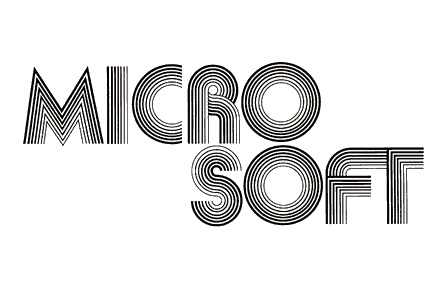
Спросите вы: «Вот при чем здесь хард-рок к логотипу Microsoft?». Но если взглянуть на его первую вариацию можно подумать, что дизайнер вдохновлялся обложками рок-альбомов тех времен. Много узоров и линий, достаточно сложная для восприятия типографика и разделение лого на две строки. Как-то больше ассоциируется не с технологиями, а реально с концертной историей.
Первый логотип Microsoft имел много узоров и линий. Источник — Wikipedia
Первый логотип называли ещё «groovy logo», потому что он отражает тенденции конца 70-х начала 80-х годов. И создавали его тоже основатели компании — Билл Гейтс и Пол Аллен. По их словам: им тогда было не до изысков: главное было сделать хоть какой-то знак, чтобы показать клиентам, что они существуют. Заявить о себе это конечно дело чрезвычайной важности! Как например сделала компания Pepsi: их первые логотипы значительно отличаются от современников. Но тогда им важно было заявить всем, особенно компании Coca-coca, что у тех появились конкуренты на этом рынке.
Время восьмидесятых и новых идей
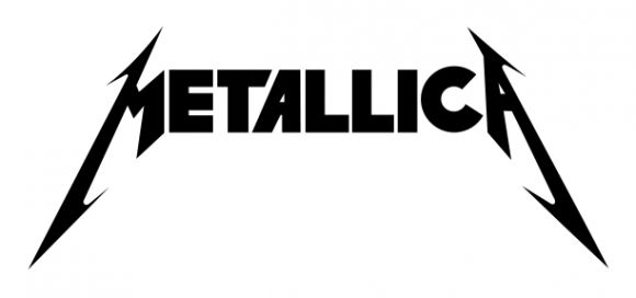
В период 1980-1986 годов логотип компании менялся несколько раз. Например, логотип 1980 года выглядел как будто его рисовали школьным маркером, но аккуратно под линеечку. И уже в одну линию, вместо двух, как у прошлого варианта. Он имел заостренные края букв, но при этом они сохраняли некую воздушность. Интересно, что стиль сильно напоминает логотип группы Metallica, основанный в 1981 году. Конечно кто у кого украл идею — неясно. Может дизайнеры имели похожие мудборды и стиль для создания?
Забавно, что в этот период компания запустила первый Word — программный аналог тех «маркеров», которыми был создан логотип. И разработали новый шрифт под названием Microgramma, который стал символом развития технологий этой эры. Надпись «Microsoft» выглядела в этом варианте более профессионально, но не слишком запоминающейся. Как-будто ей чего-то не хватало. Но вопрос, чего?
Второй лого был очень похож по стилю на логотип группы Metallica. Источник — Wikipedia
Чтобы ответить на этот вопрос понадобилось буквально два года. И вот в 1982 году логотип ожидал редизайн. Он приобретает четкие, строгие линии, прямое и простое начертание и становится более консервативным. Но где же добавить эту изюминку? В компании решили поставить акцент на букве «О». С добавлением к ней узоров, она причудливо выбивалась из общей картины других букв.

Компания решила добавить изюмику в виде акцента на букве «О» на зеленом фоне. Источник — Wikipedia
Цветовая палитра тоже была пересмотрена: теперь буквы логотипа были желтого оттенка на темно-зеленом фоне. Как по мне, вариант не такой и плохой, но с цветами я бы ещё поработала.
Эпоха Pac-Man или поворот к серьёзности
Настоящий дизайнерский прорыв Microsoft случился в 1987 году. Логотип преобразился полностью: строгий, лаконичный, с «отсечённой» частью буквы «O», которую тут же прозвали Pac-Man. Это вариант был создан графическим дизайнером Скоттом Бейкером и был символом движения и скорости, подчёркивающий амбиции компании.
Настоящим прорывом стал логотип, который прозвали Pac-Man. Источник — Logovector
Логотип прослужил Microsoft более 25 лет, сопровождая такие знаковые продукты, как Windows 95, Windows XP и Office. Кстати, именно в этот период Windows стал узнаваемым брендом: знаменитое четырёхцветное «окно» символизировало разнообразие и возможности системы.
Минимализм и роль квадратов
В 2012 году Microsoft представила новый логотип, который совпал с выходом Windows 8. Слоган можно было бы сформулировать так: «Меньше — лучше». Пропал знаменитый Pac-Man, а на его место пришло четырёхцветное окно. В этом варианте весь акцент был именно на цвет, а точнее четыре цвета: оранжевый, голубой, зеленый и красный.
Знаменитое четырёхцветное «окно» в новом лого символизировало разнообразие системы. Источник — Logovector
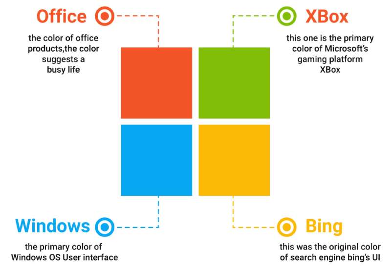
Эти четыре фрагмента — не просто прямоугольники, они несут огромный смысл в своих цветах. Четыре разноцветных квадрата в логотипе Microsoft олицетворяют главные направления работы компании:
- Оранжевый символизирует линейку Office, акцентируя внимание на продуктивности и бизнес-решениях.
- Зелёный ассоциируется с игровыми технологиями, такими как Xbox, отражая значимость индустрии развлечений.
- Жёлтый напоминает о поисковой платформе Bing и её роли в прошлом.
- Голубой передаёт основное предназначение Windows, подчеркивая её важность как центрального продукта экосистемы.
Вроде всё просто, но в то же время решение универсальное и со смыслом. А логотип не просто стал частью flat-design, который к тому времени завоевал мир, а символом надежности и многофункциональной системы.
Влияние коллабораций на компанию
Microsoft + Minecraft: блоки для всего мира
Microsoft также известна своими коллаборациями. Одна из самых запоминающихся — покупка Minecraft за 2,5 миллиарда долларов в 2014 году. Сначала сделка казалась странной: зачем технологической корпорации покупать пиксельный мир? Однако эта коллаборация открыла новые горизонты.
Это решение позволило компании выйти на рынок молодёжных пользователей и добавить яркие пиксели в свой «строгий» имидж.
Microsoft + Apple: враги или партнеры?
В 90-х Microsoft и Apple считались главными конкурентами. Тем не менее, их сотрудничество началось довольно рано, в 1981 году, когда Microsoft предоставила Apple свой язык программирования для Apple II. Самым громким шагом стало соглашение 1997 года, когда Microsoft инвестировала $150 млн в Apple, который тогда находился на грани краха. Эта инвестиция помогла компании вернуться на рынок, а Microsoft закрепила свои продукты, включая Office, на macOS.
Иронично, но сегодня обе компании признают друг друга важными игроками, поддерживая совместимость своих продуктов, например, Office 365 и iCloud на Windows.
Microsoft + OpenAI: Искусственный интеллект в массы
Microsoft вложила миллиарды долларов в OpenAI — разработчика GPT. А результат? Искусственный интеллект теперь интегрирован в продукты компании, такие как Office Copilot, Bing Chat и Azure AI.

Чат GPT поможет вам во многих вопросах
Microsoft + Xbox + Bethesda: будущее индустрии игр
В игровом сегменте Microsoft не только развивает Xbox, но и активно сотрудничает с игровыми студиями. Покупка Bethesda в 2021 году позволила корпорации добавить такие хиты, как The Elder Scrolls и Fallout, в свою библиотеку. Подписка Game Pass стала главным предложением для геймеров, объединяя разработчиков и игроков на одной платформе.
Топ интересных фактов и новостей о Microsoft
- Искусственный интеллект и интеграции
В 2024 году Microsoft активно развивает Copilot — инструмент, который интегрирует искусственный интеллект в повседневные задачи. Copilot уже включает модели OpenAI и возможности генерации изображений через DALL-E 3, что усиливает его функциональность и привлекает больше пользователей. - Фокус на природе и климате
Microsoft активно инвестирует в технологии, связанные с климатом. Компания планирует стать углеродно-нейтральной к 2030 году, а к 2050 году полностью устранить все свои выбросы углекислого газа с момента основания в 1975 году. - Инновации в интерфейсах
Microsoft тестирует функцию Recall, которая позволяет искать информацию по «фотографической памяти». Это подчеркивает стремление компании внедрять инновации даже в базовые пользовательские инструменты. - Разные лозунги компании с логотипом Pac-Man
Логотип компании Pac-Man за время существования, а это с 1987 по 2012 год, не попал под редизайн. Но за это время компания поменяла три лозунга. С 1987 по 2006 год использовался лозунг «Куда вы хотите пойти сегодня?». Позже был вариант «Ваши способности. Наше вдохновение». И в период 2011—2012 годом Microsoft использовали: «Будь что будет дальше». - Кибербезопасность и помощь
В 2024 году Microsoft отразила одну из крупнейших DDoS-атак в истории, продемонстрировав высокую степень защиты своих сервисов и инфраструктуры.
Microsoft не теряет своих позиций
Возможно их стратегия — не полного конкурирования, а партнерства и объединения идей. Всё чтобы заложить хороший фундамент, что и делает компанию одной из самых востребованных на рынке технологий. Ведь вместо того чтобы стремиться полностью доминировать, компания часто выбирает путь кооперации.
Будь то союз с Apple в 90-х, покупка Minecraft или развитие искусственного интеллекта с OpenAI. Я считаю, что так Microsoft показывает, что успех часто возможен, когда все работают вместе. И тогда технологии могут быть простыми, а дизайн — гениальным в своей ясности.
Imagine the pulse of technology at your fingertips, the thrum of innovation coursing through your veins. Now, visualize a symbol that encapsulates all that power: the Microsoft logo.
It’s more than just a trademark; it’s a beacon of modern corporate identity, a window into the soul of tech giant Microsoft Corporation.
Dive into the DNA of this iconic emblem. Witness its evolution, understand its design philosophy, and grasp its pivotal role in brand recognition.
As a web connoisseur, I’ve seen firsthand how a visual identity shapes user experience and interfaces.
By the end of this article, you’ll have unraveled the fabric of this ubiquitous symbol. The insights offered here will transcend mere aesthetics and delve into the intricate ballet of graphics, branding strategies, and the resultant digital footprint.
Step inside the circle; let’s decode the mysteries of those four colorful squares.
You’ve seen it, you know it. That iconic symbol pops up on your computer screen. Let’s delve deep into what the Microsoft Logo means, yeah?
Create Stunning Color Combos
Need color inspiration? Our generator offers endless palette combinations to bring your projects to life!
Create Your Color Palette →
Windows to the World
The logo, mate, it’s a window! Not just any window – it’s the window to the universe of Microsoft. A world packed full of technology, innovation, and ambition. It’s your doorway into their universe, and all you gotta do is open it!
Simplicity & Approachability
A rectangle split into four smaller ones. That’s it! This simplicity screams accessibility and approachability. The logo isn’t just for tech gurus, it’s for everyone – you, me, your grandma, everyone.
Unity in Diversity
Each color, right, represents a different product. The blue for Windows, the red for Office, green for Xbox, and yellow for Bing. Despite the diversity, they’re brought together, symbolizing unity. Ain’t that neat?
The History of the Microsoft Logo
Let’s take a trip down memory lane and see how the Microsoft logo has evolved.
The Early Days
First off, Microsoft wasn’t always about windows. It started off with a funky logo with a disco-era vibe. This was in the ’70s, mate, a wild time indeed!
Window of Opportunity
Fast forward to the ’80s, the introduction of Windows called for a logo upgrade. They introduced a window logo to match the product name. That’s where the sleek, minimalist approach started.
The Modern Day
A blast of color! They decided to color up the logo in 2012, adding the vibrant colors we know and love today. It’s not just a logo, it’s a symbol of evolution, adaptation, and growth.
The Colors of the Microsoft Logo
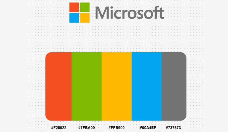
Four squares, four colors. Let’s break ’em down.
Blue: The Steady Rock
Blue stands for trust, reliability, and security. It’s the core color of the Microsoft Logo and represents Windows, their OG product.
Red: The Power Player
Red symbolizes energy and passion. It’s the color of Office, their suite of productivity tools that are indispensable to the world.
Green: The Fun Side
Green stands for freshness, creativity, and fun. No wonder it’s Xbox’s color, their gaming console.
Yellow: The Bright Spark
Finally, yellow, representing Bing. The spark of curiosity, knowledge, and brightness. It’s your guide in the vast world of internet information.
The Font Used in the Microsoft Logo
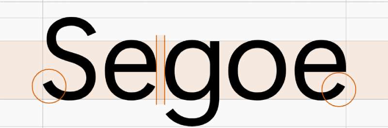
Let’s talk about the typeface, the letters that spell out ‘Microsoft’. It’s all in the font, man!
The Magic of Segoe
The font is Segoe, and let’s just say, it’s pretty cool. It’s got a modern, clean vibe, a look that says “We’re all about progress and innovation here.”
Expressive Minimalism
It’s minimalist but not lacking personality, expressing a sense of precision and elegance. It’s not just letters, it’s a statement.
The Impact of the Microsoft Logo
Why is it important, you ask? Let’s find out.
Recognition
This logo is recognizable all around the globe. It carries the weight of Microsoft’s reputation. That’s some heavy lifting for a logo!
A Mark of Trust
Every time you see it, you’re reminded of the brand’s promise – delivering top-notch, reliable technology. It’s not just a logo, it’s a badge of trust.
The Future of the Microsoft Logo
Is it going to stay the same or morph into something new? Let’s speculate!
Consistency is Key
Microsoft has kept its logo pretty consistent in the last few years. With the brand’s strong global presence, a sudden shift might be too risky. So chances are, they’ll keep it as it is.
Adapting to Changes
On the other hand, they’ve been known to change it up to match their product evolutions. So if they launch something groundbreaking, we might just see a new logo in town!
The Legacy of the Microsoft Logo
Finally, what legacy does this logo leave behind?
A Journey of Innovation
The logo’s evolution tells a story of continual innovation. It’s a reminder of the brand’s journey from a small start-up to a global tech giant.
Setting a Design Standard
The design has set a standard in the industry, demonstrating how simplicity can pack a punch. It’s not just a logo, it’s a design masterpiece!
And there you go! Now when you look at the Microsoft Logo, you’re not just seeing a bunch of colored squares, you’re seeing a world of meaning, a story of evolution, a statement of trust, a legacy of innovation. You’re seeing Microsoft!
FAQ On The Microsoft Logo
What does the Microsoft logo symbolize?
The four colorful squares represent a window—literal and figurative—onto the world, conveying Microsoft’s diverse suite of products and services. It’s a nod to Windows, but it also implies openness, innovation, and possibilities within the tech landscape.
Has the Microsoft logo always been the same?
Far from it. It’s evolved numerous times since Microsoft’s inception in 1975. What started as a groovy, disco-era design has morphed into the sleek, simplified tiles we recognize today.
Each iteration kept pace with its era’s essence, integrating contemporary design trends and company growth.
Why did Microsoft choose the colors in their logo?
Each hue has purpose—blue for Windows, green for Xbox, red for Office, and yellow to evoke a sense of energy and optimism. Collectively, they paint a picture of Microsoft’s diverse ecosystem, underpinning its spectrum of technologies.
How often has the Microsoft logo been redesigned?
It’s gone through significant overhauls about five times. While minor tweaks have occurred intermittently, the major redesigns reflect pivotal shifts in Microsoft’s branding strategy and its adaptation to the evolving tech industry’s demands.
Who designed the current Microsoft logo?
The 2012 incarnation, boasting a clean and straightforward look, was born from Microsoft’s internal design team. It heralded a new era, introducing a modern interface across Microsoft 365, signaling unity across their product range, from Surface to Bing.
What are the guidelines for using the Microsoft logo?
As with all hallowed tech symbols, rules abound—Microsoft mandates clear space, size specifications, and prohibits alterations or distortions. Basically, you respect the logo’s integrity to preserve brand recognition and consistency.
Is Microsoft’s logo a registered trademark?
Absolutely, and fiercely protected at that. The logo is a legal emblem of Microsoft Corporation and using it conflictingly could land you in hot legal water. Trademark icon, indeed.
What significance does the font in the Microsoft logo have?
Simplicity rules—not a single serif in sight. The Microsoft logo’s font, Segoe, mirrors the straightforward, user-friendly nature inherent in the brand’s philosophy. It’s tailored, accessible, without the fuss.
Can the Microsoft logo be used in personal projects?
Tread carefully. Personal projects can use it only with explicit permission and in alignment with Microsoft’s guidelines. Always best to check with the big guns before you find yourself a logo outlaw.
In what ways has the Microsoft logo influenced corporate branding?
This logo’s transforms set a benchmark for companies far and wide. A masterclass in versatility, it has inspired rebrands galore—showing that a logo can remain recognizable and yet adapt with the times, effectively leveraging the power of visual identity in the corporate sector.
Conclusion
As we’ve unpacked the essence of the Microsoft logo, witnessed its transformation across decades, delved into the rationale behind its hues, and navigated the do’s and don’ts of wielding it in the wild—there’s an undeniable takeaway.
This isn’t just a tech company’s stamp—it’s a banner under which innovation thrives and beckons users worldwide with its promise of:
- Tech synergy,
- Digital empowerment, and
- A universe of services at our fingertips.
Beyond pixels, it’s a symbol stitched into the very fabric of our digital lives. From the vibrant tiles on your Windows start screen to the soft glow of an Xbox powering on—each is a testament to Microsoft Corporation’s saga, its influence on user interface design, brand recognition, and how these shapes and shades can so deeply etch themselves into our collective consciousness.
So here we stand, at the tale’s end, acknowledging a legacy that will continue to evolve, just as we do, alongside the technology that shapes our world.
If you liked this article about the Microsoft logo, you should check out this article about the new Patreon logo.
There are also similar articles discussing the Facebook logo, the Amazon logo, the Apple logo, and the Twitter logo.
And let’s not forget about articles on the Netflix logo, the Samsung logo, the Airbnb logo, tech company logos, and the IBM logo.
- Author
- Recent Posts
Bogdan Sandu, a seasoned designer with 15 years of diverse experience, has been designing websites since 2008.
Renowned for his expertise in logo design and visual branding, Bogdan has developed a multitude of logos for various clients.
His skills extend to creating posters, vector illustrations, business cards, and brochures. Additionally, Bogdan’s UI kits were featured on marketplaces like Visual Hierarchy and UI8.